Prius console monitors the product’s energy

Prius’ console allow users (and passengers) to see what happens under the hood. The console sports an energy monitor (among other controls) that transparently provides information to the user (and passengers) so they can understand how the ups-and-downs of gas and break pedals impact the hybrid’s fuel usage and battery charging.
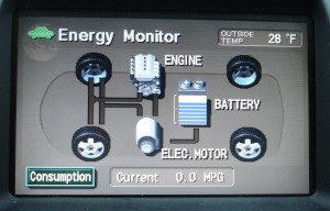
Prius Energy Transfer map

Using simple visuals and motion graphics, the console maps how energy is used, and shows how the battery gets recharged.  What results is the ultimate in immediate user-feedback.
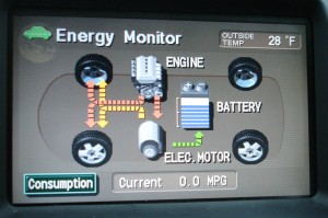
Map of Prius Energy Usage in motion

In addition to helping the riders to understand what exactly a hybrid is, and how it works, this system helps users drive more eco-efficient because they get immediate feedback. As a driver, you can start to understand what’s going on, and how your driving techniques impact the fuel-efficiency of the vehicle. This model integrates enough feedback loops so a driver can learn to adjust their own driving to help the system optimize how it runs.

An added layer of feedback on newer Prius models is a chart that records energy consumption over the last 30 minutes of use – enabling the user to compete against themselves for improvement.
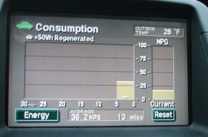
Graph charts energy consumption

Products should be designed to showcase some level of their inner-workings. Even if the vehicle was not a hybrid, it’s a great step toward product transparency. Just imagine if more of our energy-devouring equipment incorporated similar feedback mechanisms.

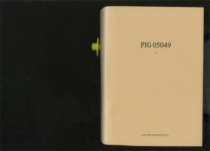
Showing the Full Story

First: show it all. Then let people zoom into the pieces of information that interest them. A visual story can be overwhelming if it doesn’t provide some context.

A good background story makes it clear what information is found in what part of a product’s background.

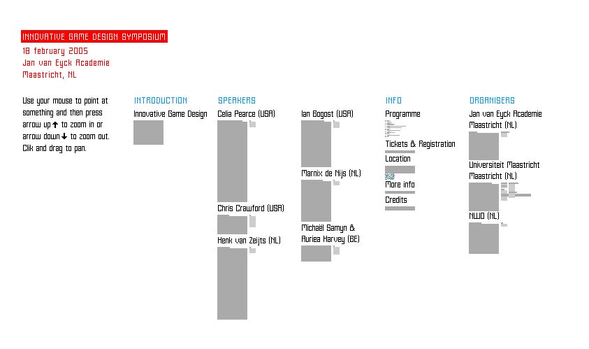
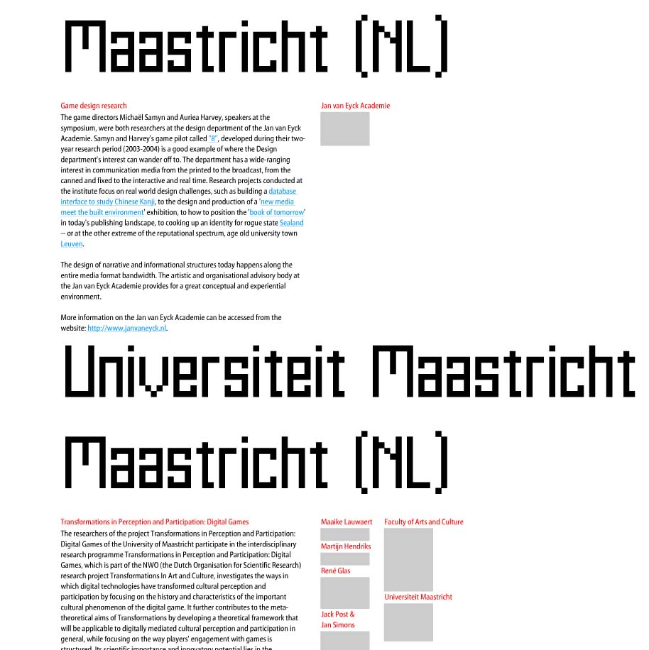
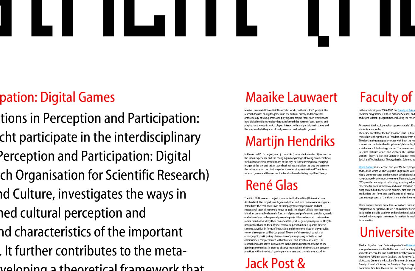
This example makes excellent use of spacial relationships to put increasingly detailed information in context: and help the viewer understand that context in a visual way. Shown are 3 levels of zoom into a site for a symposium at the Jan Van Eyck Academie in the Netherlands. The keystrokes needed to zoom in and out of the information are a bit clunky, but the overall concept is an intriguing way to communicate layers of information.

overview of all information zoom level 2 zoom level 3

Such is the concept of transparency – a viewer should be able to access even the most minute details of data: It’s all part of the big picture.

Stuff has a Story

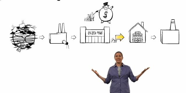
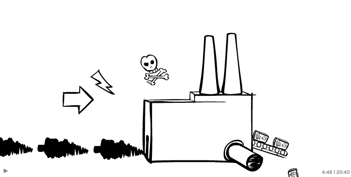
Story of Stuff Life CycleStuff goes into a factory

‘The story of stuff’ is an animation/video that strolls through the ‘big picture’ of the production/consumption life cycle.

Story of Stuff exposes the connections behind products (and really behind our whole economic system). It paints a relatively dreary outlook, and thereby inspires action. It has been out for a while, and fortunately they’ve recently added an update to the website now allows the start of an outlet for ideas on what a consumer can do about the situation. (An earlier version of the animation left out the last step “Another Way,” lacking details on what the everyday consumer can do about the situation.)

The visualization of the system is impeccable: Black & white sketched and stylized drawings with simple animation leave enough room for the viewer to get their own ideas and apply the concept to their own situation. When people can see the possibilities, they can more easily understand how their own everyday decisions impact the big picture. Story of Stuff does a great job at establishing that connection.

Ba Baa Baacode

Baa code entry

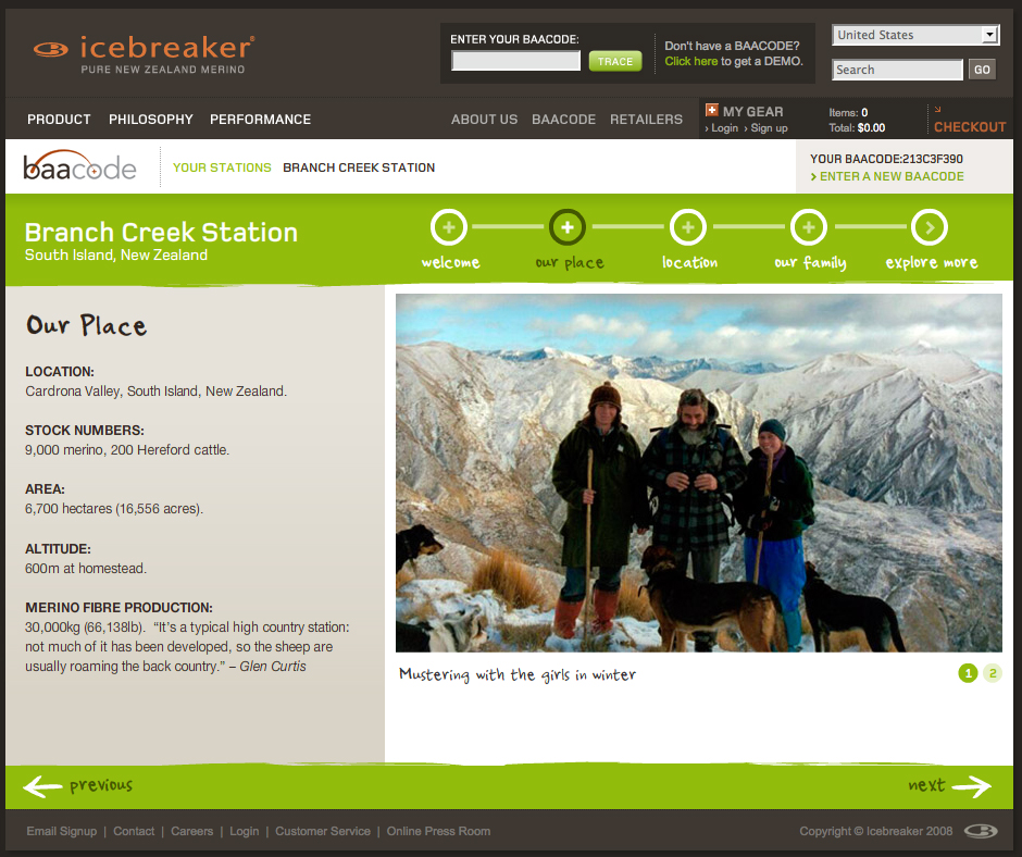
Consumers can track the back story of their Icebreaker product through a portal on the company’s homepage.

BaaCode micro site screengrab

Entering a ‘baacode’ reveals pictures and video clips of the people that raise the sheep and the place they roam.

The information for the sample code paints only a picture around the actual beast (sheep) that the wool fibers come from – not the full production cycle or other components of the clothing. But it’s a good start and an intriguing, at least partially interactive space.

It’s great to offer a sample code, but it would be even better to further incorporate the theme of transparency into the application by opening up the archives so that anyone perusing the website can see details behind all the products. (Only having viewed one sample location upon many visits, I’m also skeptical about how many different stories are actually covered in the online application).

The concept is ripe with potential to give the consumer cues to the product’s backstory at point-of-sale.

The world on your coffee cup

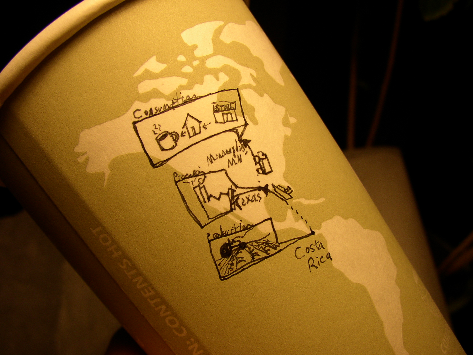
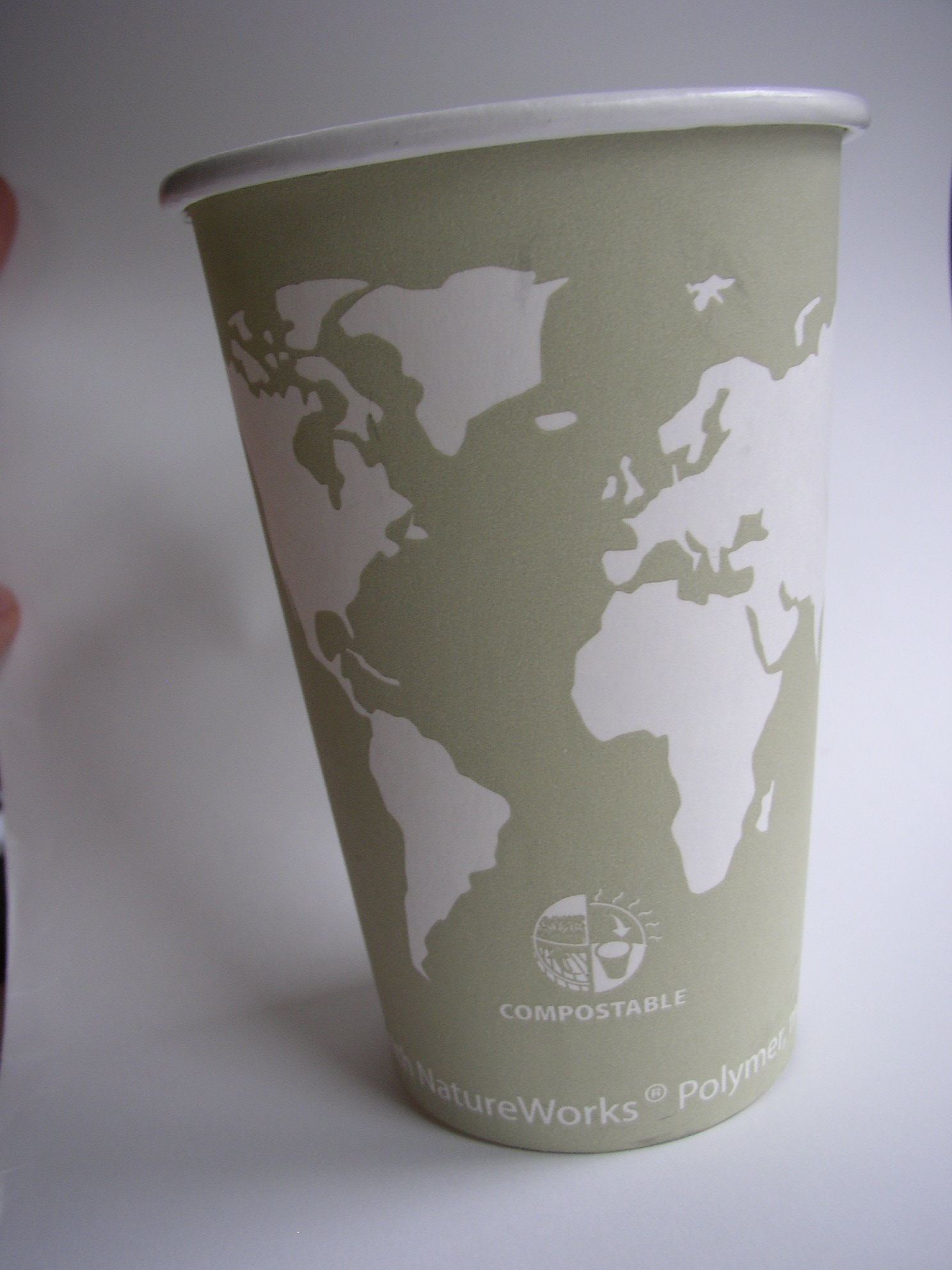
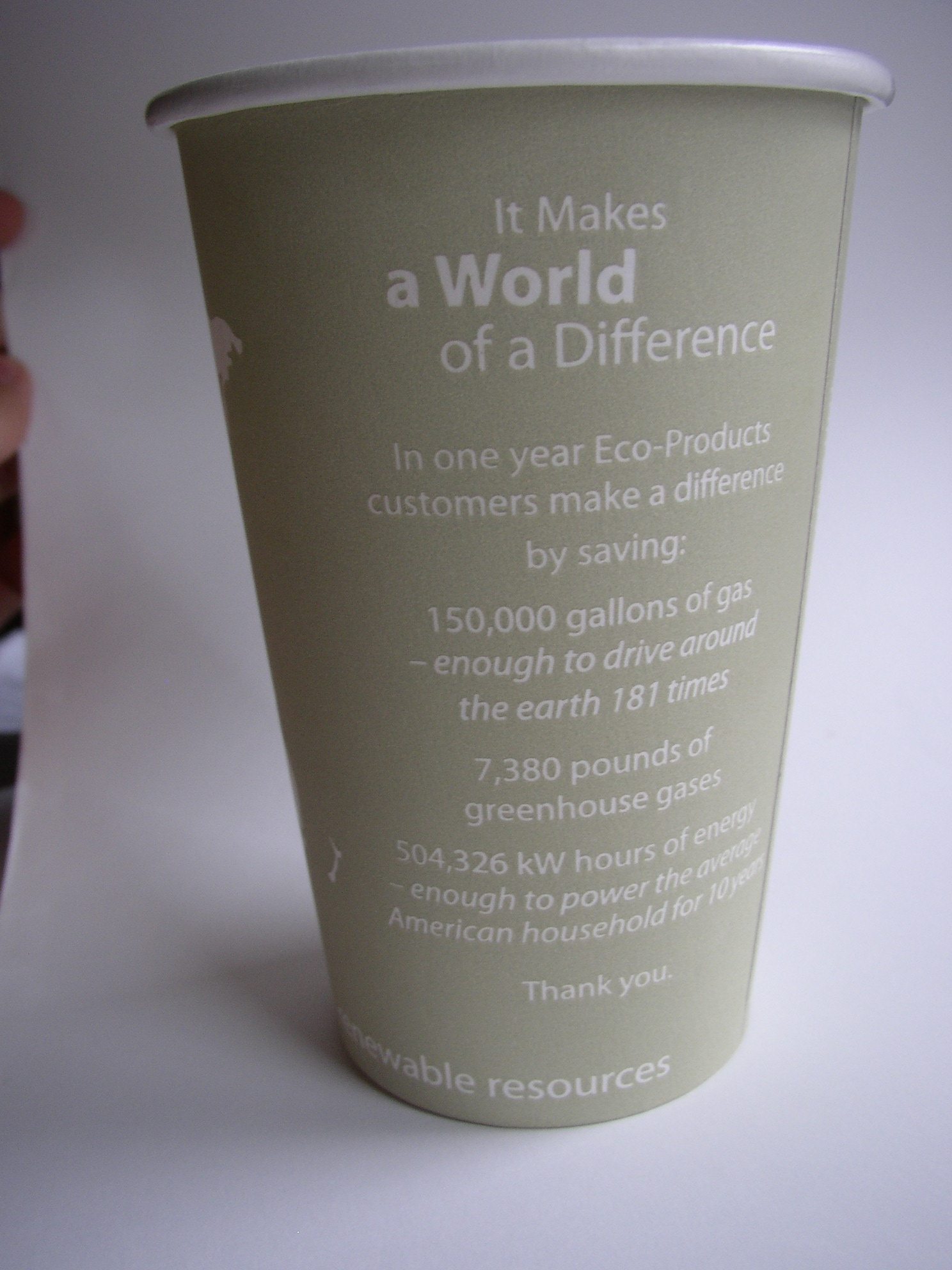
continents outlined on a coffee cupback side of world on coffee cup

Details on the eco-efficiencies of the company that produced this cup are printed right on it. (Along with an intriguing blank world map: which could lend itself to some sketches to show where the coffee inside came from.)

I’m not sure that many take the time to read the details of eco-efficiencies on the back of the cup- no matter how intriguing they are. However, one thing that really helps is translation from data points into increments that the user can start to comprehend. For example, I’ve no idea what 150,000 gallons of gas means…but by telling me that it’s enough to drive around the earth 181  times, this makes the data more real to me.

By having the ‘world’ on the cup, this could be a unique opportunity to further compare some of the text-based data with the size of the world (for example: how about 181 lines around the cup?, or a sphere to represent what 7,380 pounds of gas would take up [though this may need to be on the scale of a  house rather than to the world])

The ‘compostable’ icon under the continents is a start to some nice information design in itself -though this could have been further simplified, or even tied into some of the text on the cup’s reverse.

Overall, lots of potential, but data is left separate from visuals: even when the visuals are ripe with potential.

Cup by Eco-Products Inc.

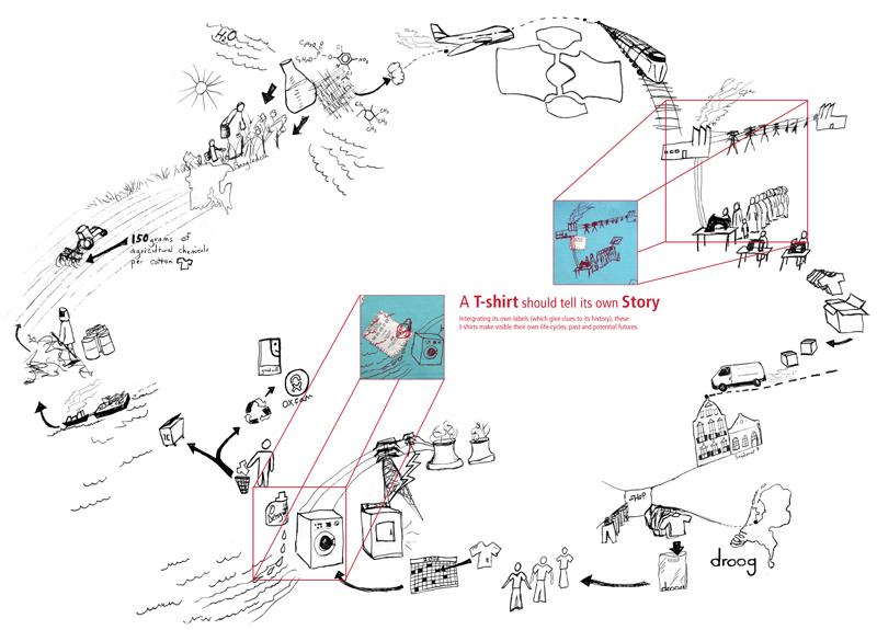
T shirt tells its own life cycle.

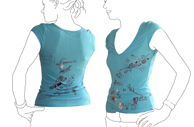
Tshirt printed with it\'s own life cycleLife cycle of a T-shirt: Droog Design

This t-shirt tells its own back story: the t-shirt tags are cut from the inside and stitched into the screenprint graphic of an imagined life of the product. The shirt was put into production in 2006 by Droog Design.

This is a more illustrative, conceptual version of a background story – less data based. The graphic is customized based on available information at the time (this includes where the cotton comes from, and where the t-shirt is sold). More quantitative figures on distance and carbon footprint could be input with the right data available.

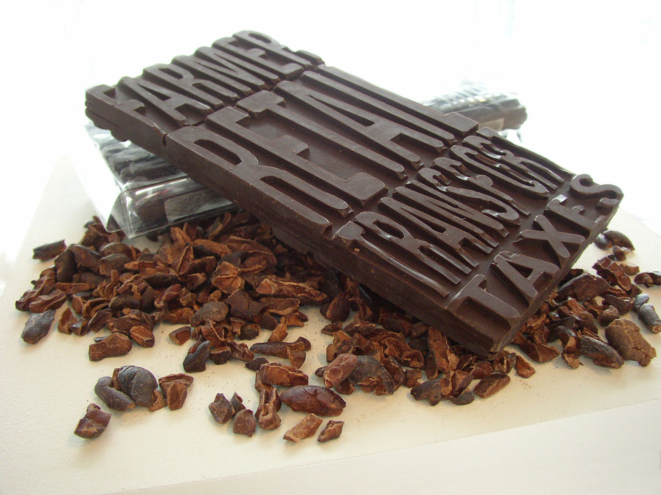
Economic Breakdown: Chocolate

chocolate bar with its economics imprinted

The economics of this (fair trade) chocolate bar are molded into it. The consumer can readily see what percentage of the money they paid went to the farmer vs. transportation. On the reverse is another set of the same text; this time representing non-fair trade chocolate (the farmer gets only half as much as the fair trade example).

Part of a 2006 thesis project on communicating product backgrounds.

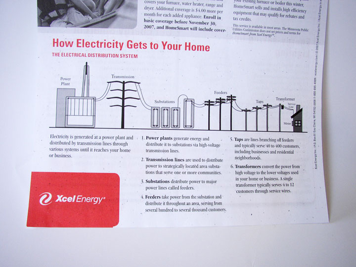
Electricity Loses Its Way Home

How Electricity Gets to Your Home

How Electricity Gets to Your Home. Context is everything. Without a direct connection with the interests of the intended audience, any information graphic – no matter how well-rendered – will fall flat.

This graphic came with a newsletter that my electric company sends out. But they missed the boat: What do I, as a consumer of electricity, care about “feeders” or “taps”? Though not a bad representation, this graphic feels more like it belongs in an introductory text book for engineers. If the graphic were to explain itself (such as why “taps” are important) and include interesting factoids, I would be glad for the mini education session.

Graphics like these, if splattered with relevant information, offer an interesting insight into the world of electric power. But it’s a fine line between providing superfluous information, and providing information that’s relevant an inspiring for a particular audience.