Frowning Utility Bills

A utility company is literally establishing an emotional connection with the audience: via smiley or frowning faces on their utility bills.
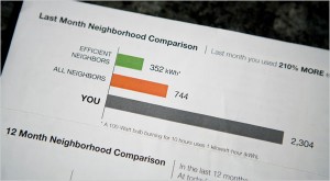
Visual Comparison, photo by Max Whittaker for The New York Times

A New York Times article reports how a Sacramento utility is inspiring residents to lower their energy usage by providing them visual feedback on their utility bills…and it doesn’t hurt that the bill compares them with their neighbors. A little competition can go a long way – it puts people’s own actions in context to their peers.

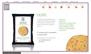
Chips with visual crisp

Good info-design requires consistency and repetition in order to establish a visual pattern. This site does both well.

Using a small-multiples-like approach that allows the viewer to compare the chips at-a-glance, the designer has clearly paired color pallet with the chips. The miniature chips (color, texture and all) are both a reference to the chip variety, and a visual navigation to additional information on the product.

Website with chip navigation
Small multiples of chips, color-coded

And they taste good too.

www.foodshouldtastegood.com