
We're often asked, "What type of graph should I use for this data?" We also see a lot of variety in how similar data sets are visualized (some working better than others). There's plenty of debate out there, so how do you decide?
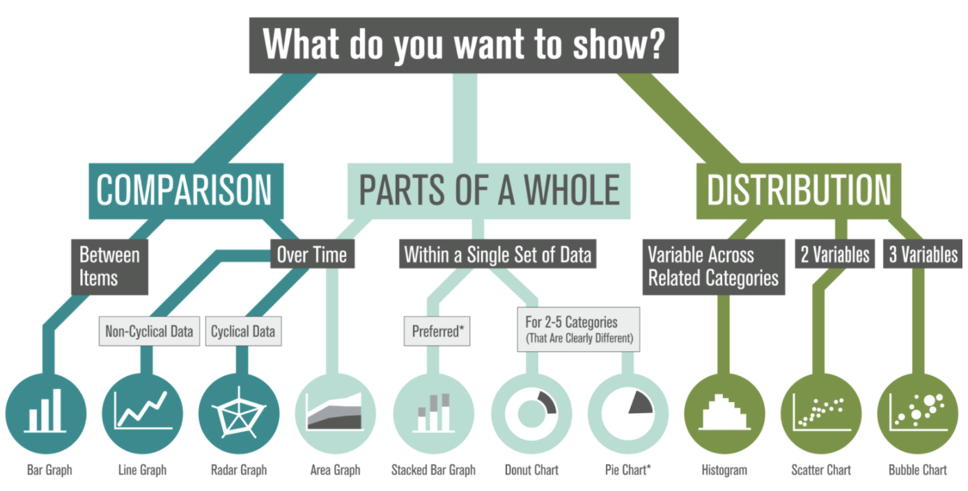
 We've created this visual guide to recommend best practices, which starts with a clear understanding of your content — what are you trying to show? There are options within each category based on the type of data in your set (and ironically, many of the standard graph types tend to share food-based titles... by the time you decide between Pies, Bars, and Donuts, you might be tempted to hit the bakery!). Which graph will you apply to your next datavis project?
 We've created this visual guide to recommend best practices, which starts with a clear understanding of your content — what are you trying to show? There are options within each category based on the type of data in your set (and ironically, many of the standard graph types tend to share food-based titles... by the time you decide between Pies, Bars, and Donuts, you might be tempted to hit the bakery!). Which graph will you apply to your next datavis project?