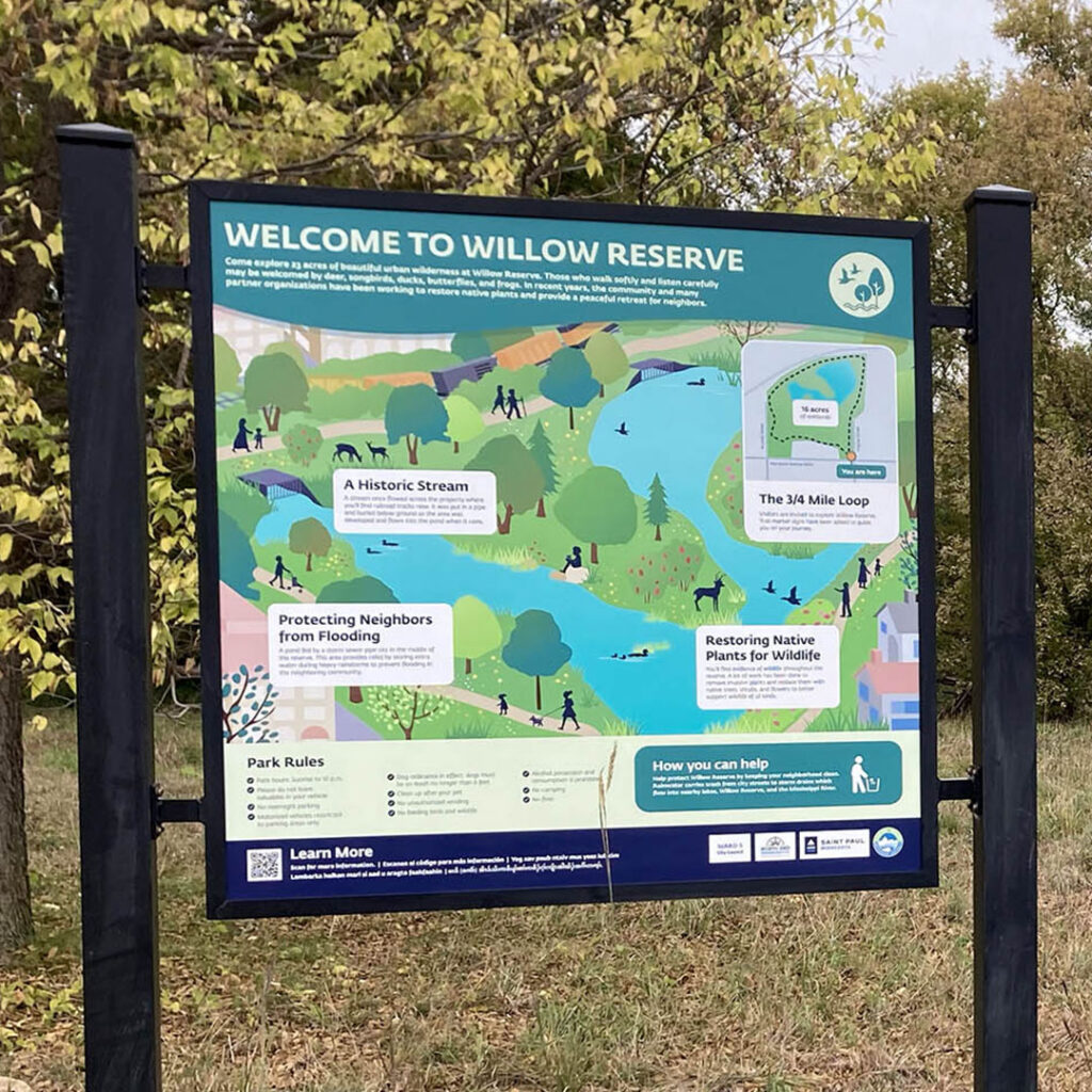
Using visual language to connect upstream communities to Florida bays
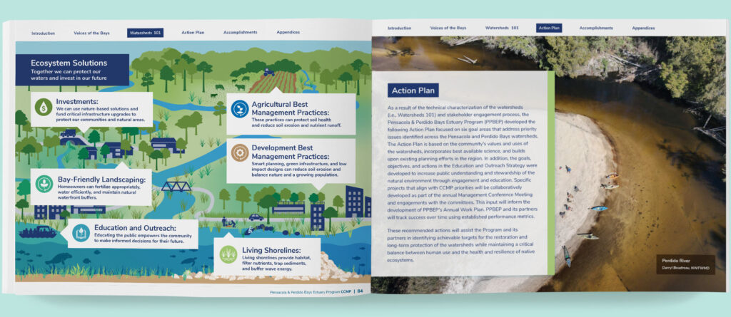
Since 2022, we have supported PPBEP’s research and advocacy by creating engaging designs for various audiences. From interactive water quality tracking to comprehensive management plans, we prioritize showing the interconnected nature of the bays and PPBEP’s mission. Illustrations emphasizing water flows are used strategically to help audiences understand the connections and take pride in the beauty of their local ecosystems.
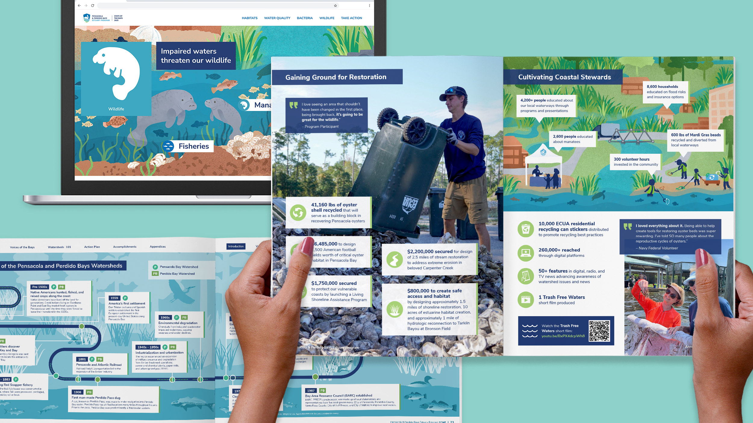
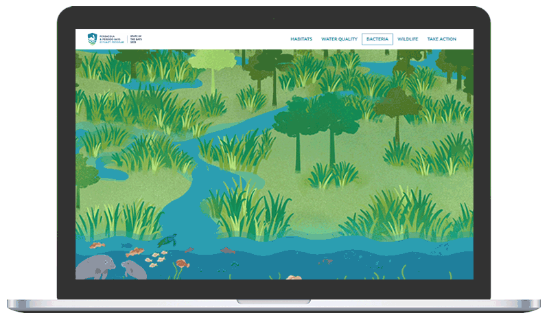
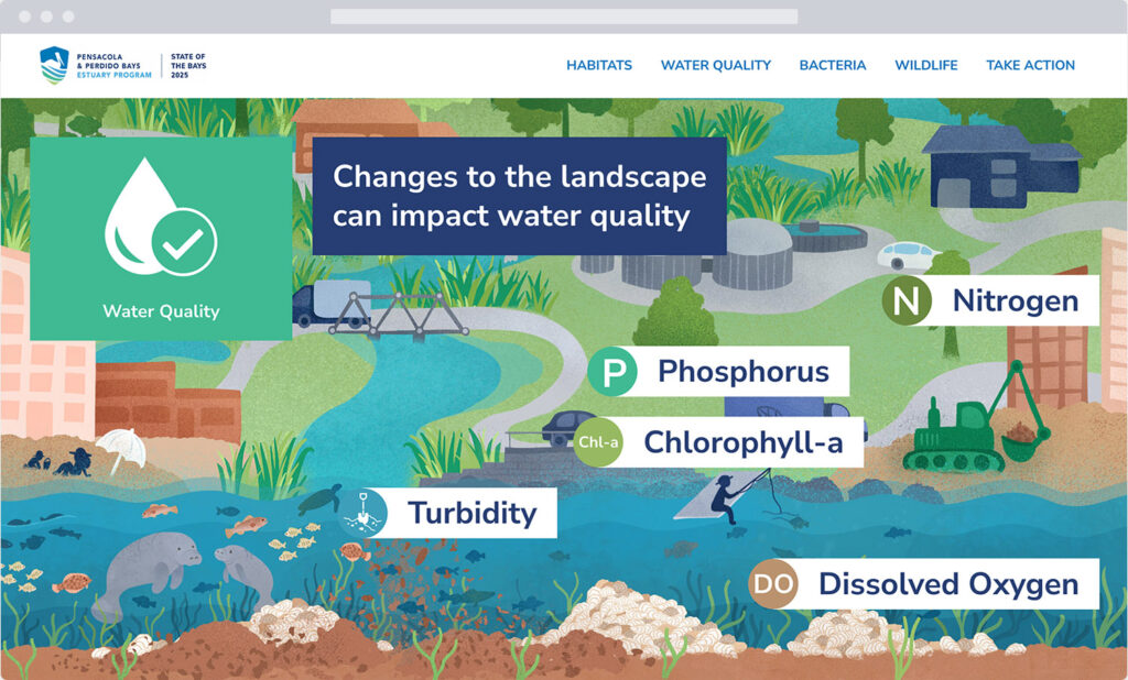
The State of the Bays website summarizes the health of Pensacola and Perdido Bays and puts their statuses into context.
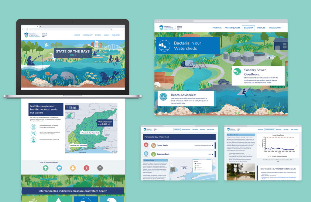
Engaging audiences with visuals and scroll animations
We used illustrations, maps, and photos combined with attention-grabbing scroll transitions to tell the visual story.
The project is compliant with web accessibility standards
This includes:
- Heading tags applied consistently
- Good color contrast for text and graphics
- Alternative text for non-decorative graphics

Explore the visual story
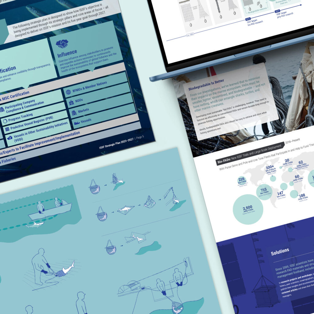
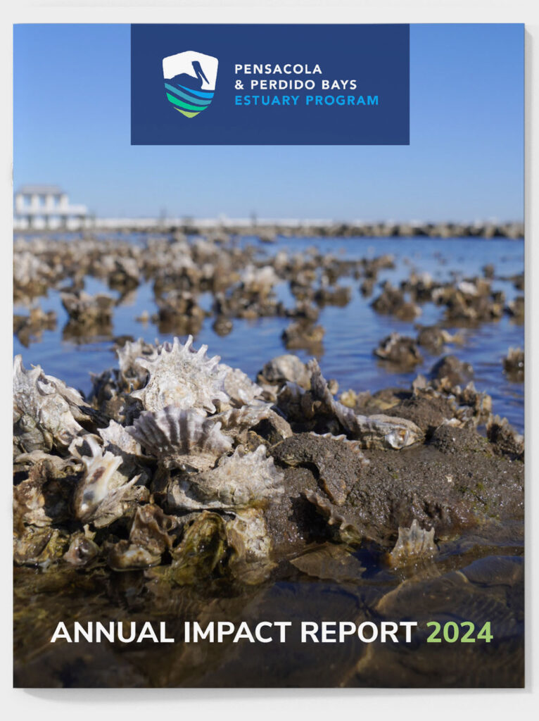
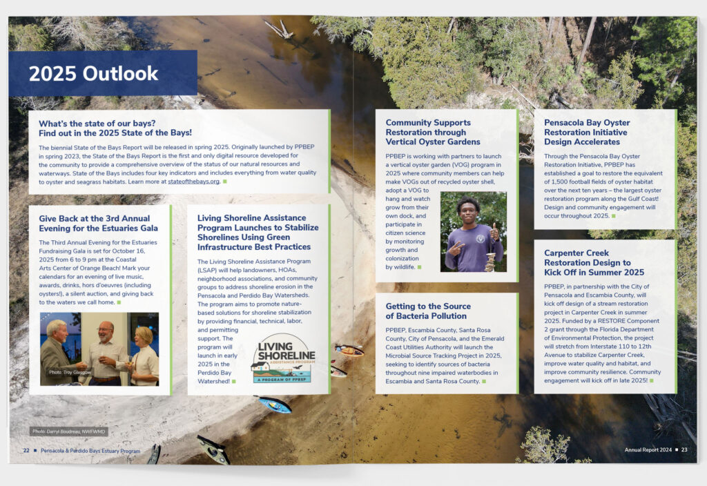
Engaging photography, callouts, icons, and infographics tell the stories of PPBEP in their annual impact report.
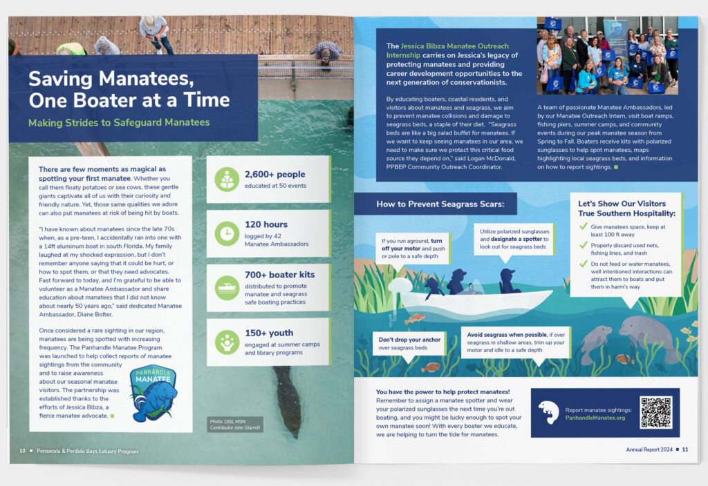
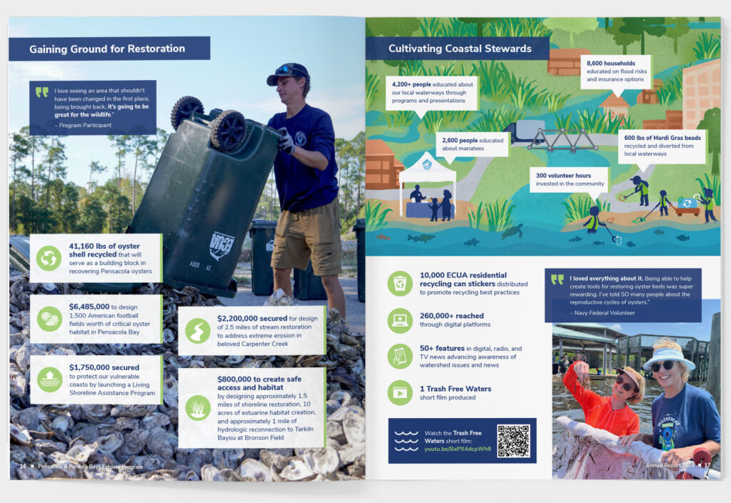
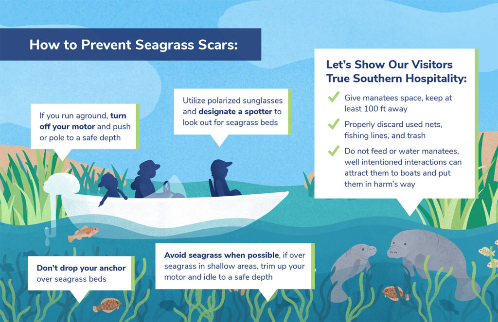
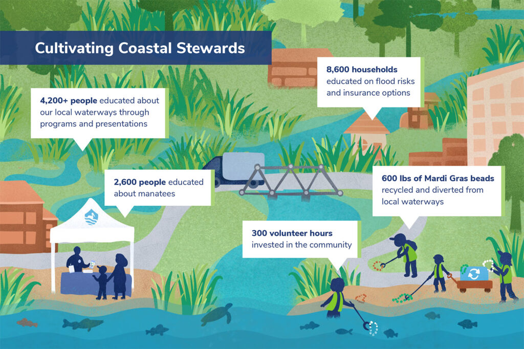
Illustrated infographics highlight important takeaways
Two mini infographics, illustrated in the same playful style as other recent PPBEP materials, help the reader understand key points.
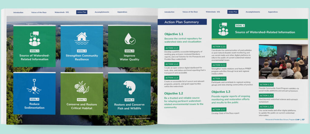
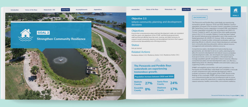
The Comprehensive Conservation & Management Plan conveys PPBEP’s strategic vision to a broad range of stakeholders.
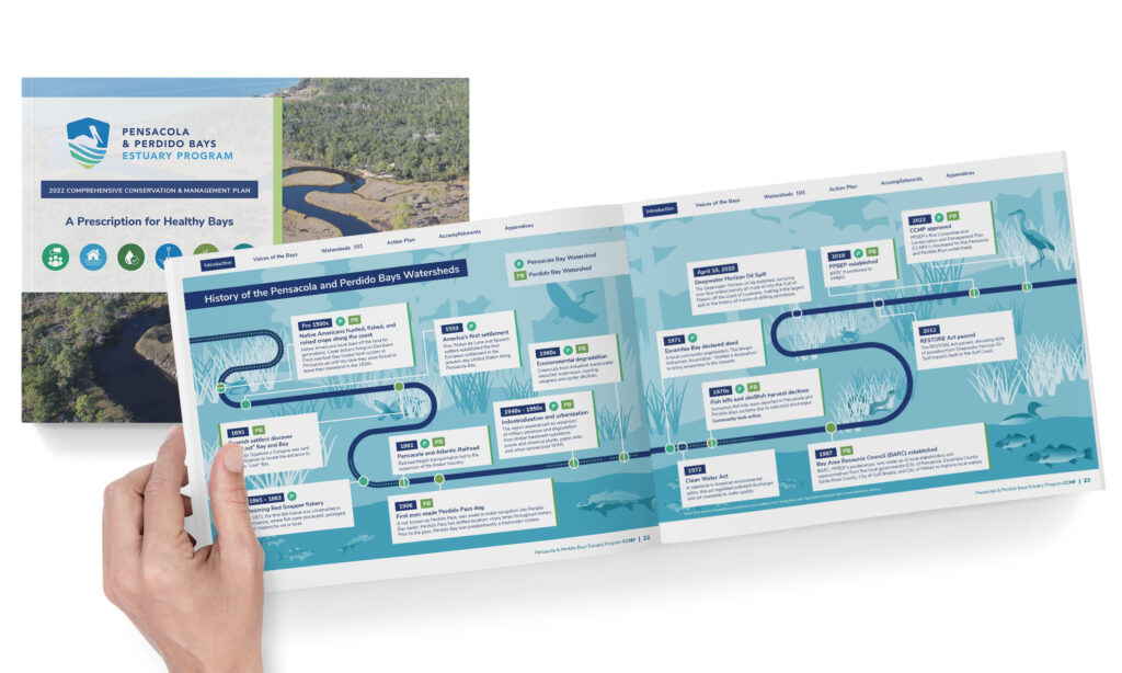
Color-coding and icons help readers easily navigate the document
We designed the 200+ page layout to orient around the 6 major goals for the bays.