Audience is a key ingredient in our design process, and no audience is a monolith. In our work, “accessible design” means that everyone within the target audience can access, understand, and engage with the information. In the same way that curb cuts benefit wheelchair users and people pushing strollers, striving for accessible design benefits not just people with disabilities, but everyone in the audience.
We think about accessibility in three categories: content, visual, and technical. The following steps are examples of how we make our designs accessible.
Content
Planning & content development stage
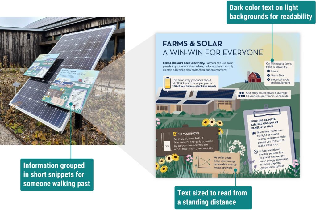
- Use concise and plain language if the audience is non-specialized. When designing for a general audience, we use short, actionable text and avoid unnecessary jargon.
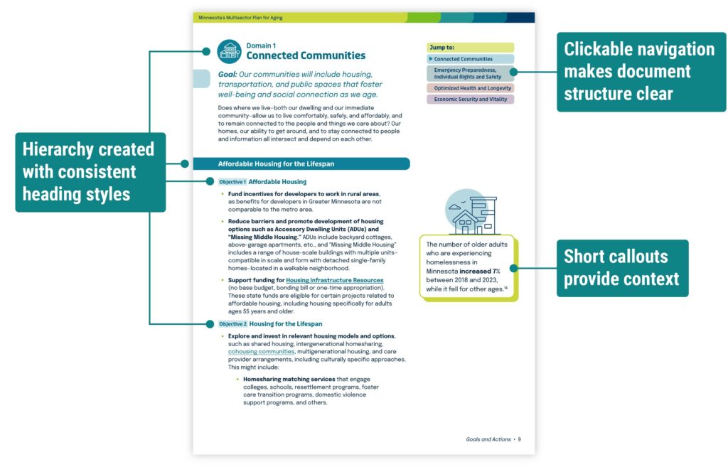
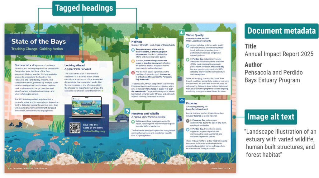
- Establish a heading hierarchy to help viewers find information quickly. Most people don’t read all the text in a document or graphic; clear hierarchy helps viewers find relevant content at a glance.
- Provide navigation that is easy for the viewer to follow. In a document, this could mean a table of contents or a sidebar that links to other sections. On a website, this often means a navigation bar with familiar page names (such as “About” or “Contact”).

Tool spotlight
Hemingway Editor analyzes the reading level of text and identifies phrases that could be simplified.
Cognitive Accessibility Guidance provides advice for meeting the needs of people with cognitive and learning disabilities.
Visual
Design stage
- Meet color contrast standards set by the Web Content Accessibility Guidelines (WCAG). When designing for print, we also consider how the printing process might affect color contrast.
- Check that text is legible by viewing the design in the way that it will be delivered. This could mean test printing the document or opening it on a phone. Avoid using decorative fonts for long portions of text, and use a larger font size when the viewer will see it from a distance.
- Optimize for the delivery method and consider the viewer’s physical setting. For example, if a design will be presented on a screen to a large crowd, we avoid a solid white background to reduce eye strain. If it will be shared through social media, we prioritize visuals and adjust image dimensions to align with the platform’s guidelines.
Tool spotlight
WebAIM Contrast Checker calculates the contrast ratio of two colors and confirms whether it meets WCAG standards.
WhoCanUse demonstrates how someone with colorblindness or low vision might see color.
Technical
Wrap-up & file delivery stage
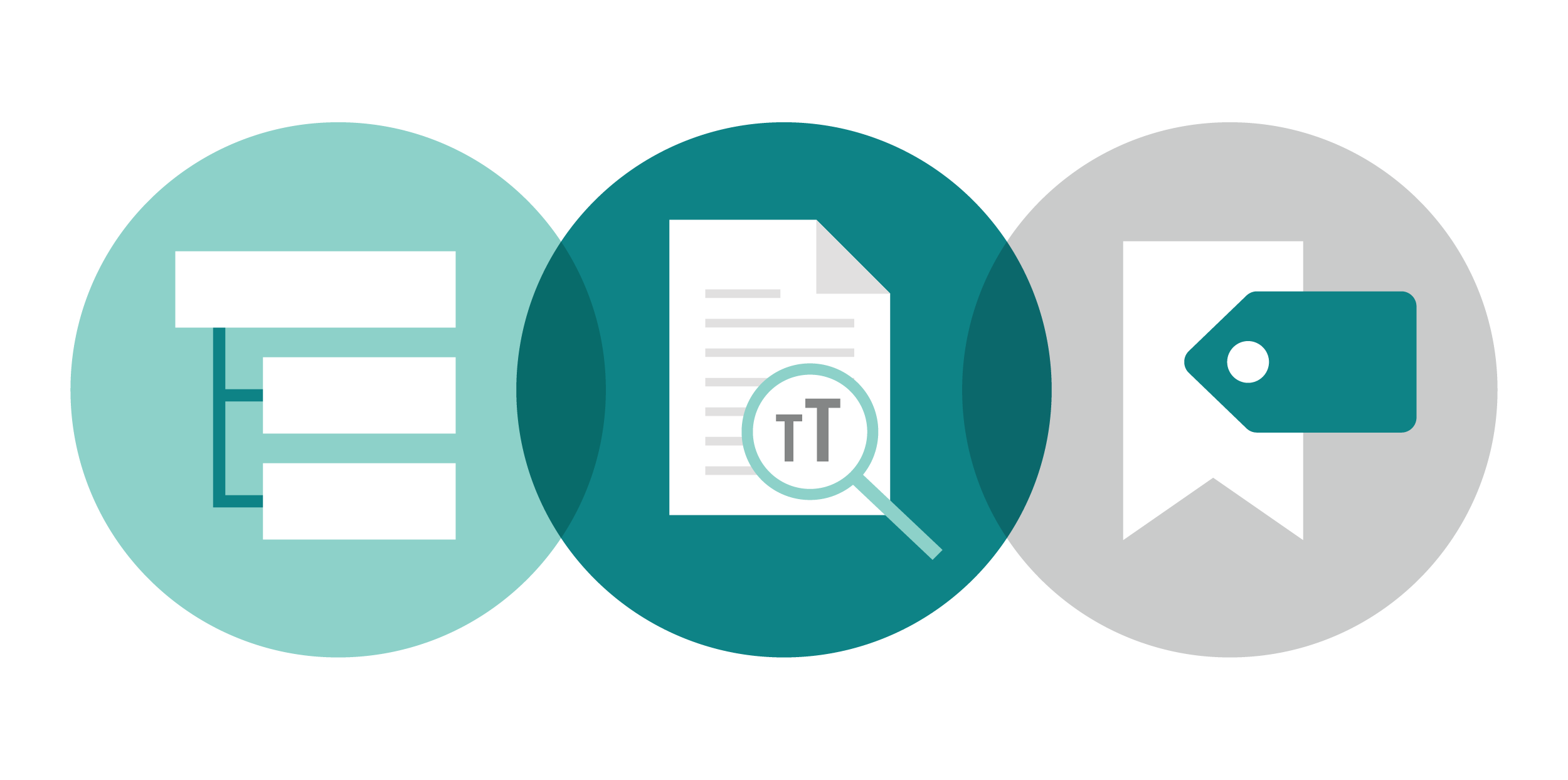
- Fill in metadata to give users information about the document within their viewing software. In a PDF, this means assigning a Document Title and Author. On a website, this includes adding a descriptive title to the <head> section.
- Use appropriate tags and bookmarks. Assistive tools like screen readers use these markers to interpret the document structure. We use Adobe Acrobat to walk through the tags and confirm accuracy.
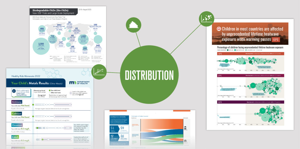
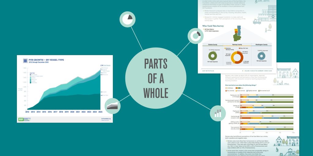
- Add alternative text to images that contain important content. Alt text is read aloud by assistive tools and shows up if the image fails to load. We keep alt text as short as possible while still being descriptive. When an image is for decoration only, or it repeats information already present on the page, we tag it as decorative (a signal for screen readers to skip).
Tool spotlight
HeadingsMap is a browser plugin that shows the heading structure on websites and highlights any errors.
W3’s Alt Decision Tree is a useful flowchart to determine if an image requires alt text.
Budgeting for technical steps
While content and visual accessibility are our baseline for every project, technical accessibility needs to be considered in the budget. We’re always happy to take these steps when they are included in the project scope.
Accessibility is a growing field of study, and guidance is always improving. Our team continues to learn about best practices and look for ways to include them in our process. By taking these steps, we aim to make our designs usable and enjoyable for all.