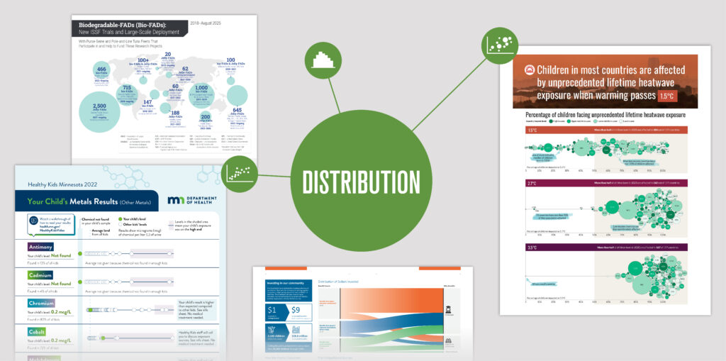
How we convey the meaning behind the numbers
We’re continuing our exploration of how to frame your data. In our previous post, we discussed the story behind “comparison” data: how thoughtfully designed visuals can help audiences make sense of differences across groups, time periods, or outcomes.
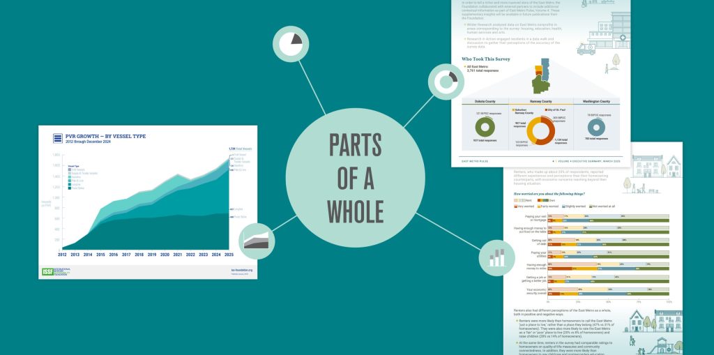
Now, how can we best visualize “parts of a whole” data sets? These types of graphics show how a complete total of something is divided into categories, contributors, or segments.
Catch up on part one: “Telling Stories with Comparison Data”
Visualizing key findings from the East Metro Pulse Survey
Case study: Saint Paul & Minnesota Foundation
The Story
The East Metro Pulse survey highlights the strengths and challenges facing the region. But a community’s story goes beyond numbers—in this example, more than 19,000 data points provide deep insight into how people feel about where they live. Respondents differ not only by location and background but also in the economic and quality-of-life concerns they report, which vary according to factors like race, ethnicity, living situation, education, occupation, and income.
The Data
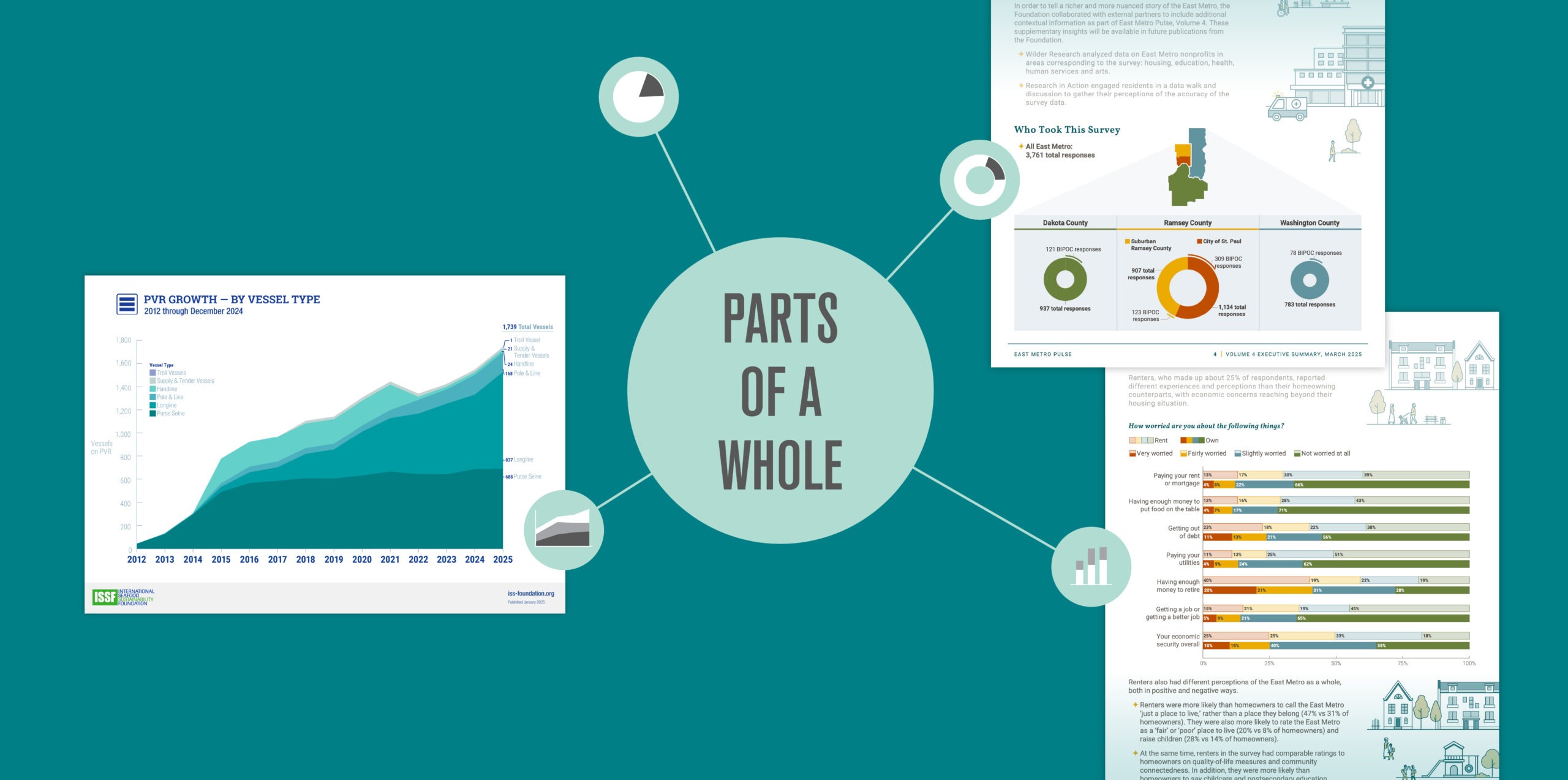
Breakdowns of who took the survey by location, race/ethnicity, and primary languages spoken in the household

The Result
To show where responses came from geographically, we used color coding to link a regional map with donut charts displaying the response breakdown. The size of each donut chart represents the relative number of responses from that region, while a secondary outer line indicates the portion of responses from BIPOC respondents.
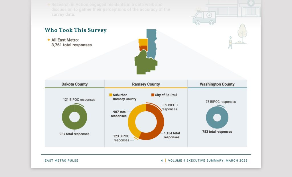
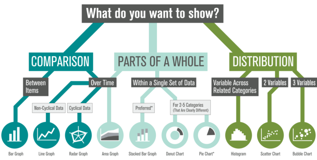
Donut charts vs. Pie charts
Though both pie and donut charts sound delicious, we used donut charts because their open center reduces visual clutter and makes it easier to compare slice sizes.
However, both donut charts and pie charts share some limitations. They work best for data with 2–5 categories that have clearly different quantities. Otherwise, the slice comparisons become difficult to perceive because humans have a hard time understanding area as quantity. In general, stacked bar charts provide a clearer, more accurate alternative.
The Data
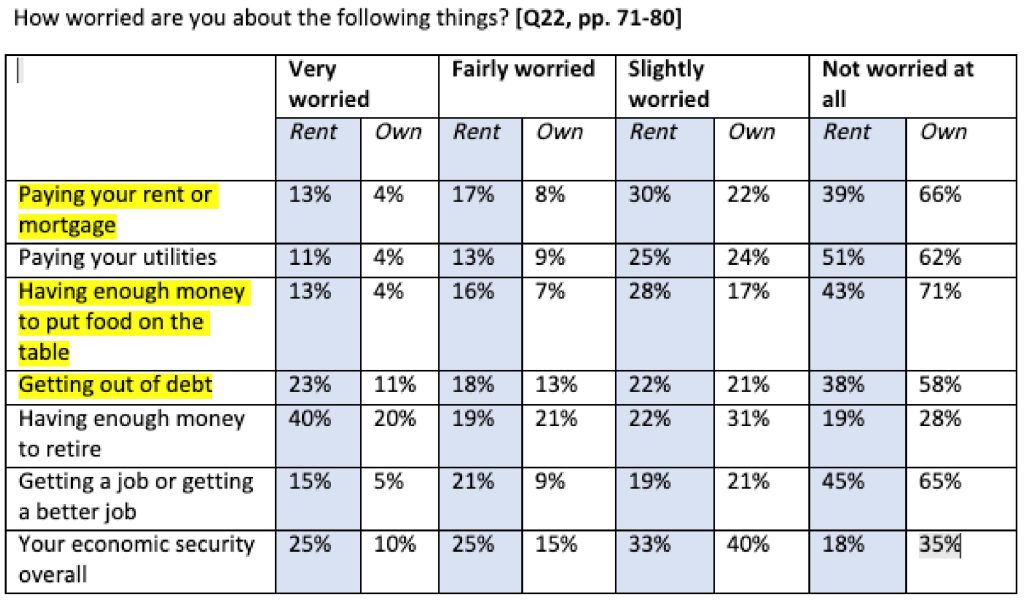
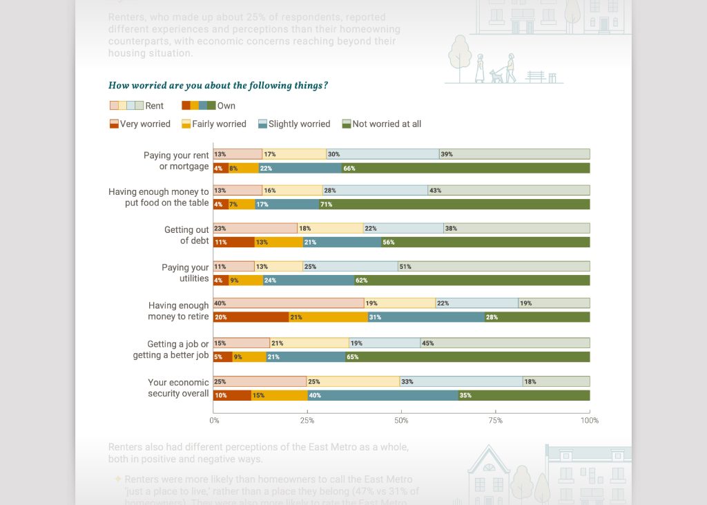
Percentage of renters vs. homeowners who are worried about specific economic challenges
The Result
While challenging to convey so much data in a single space, pairs of stacked bar charts enable viewers to compare responses between renters and homeowners. Renters are more likely to express negative feelings (“very” or “fairly worried”), while homeowners tend to respond more positively (“slightly” or “not worried”).
Showing comparison data measured in “parts of a whole”
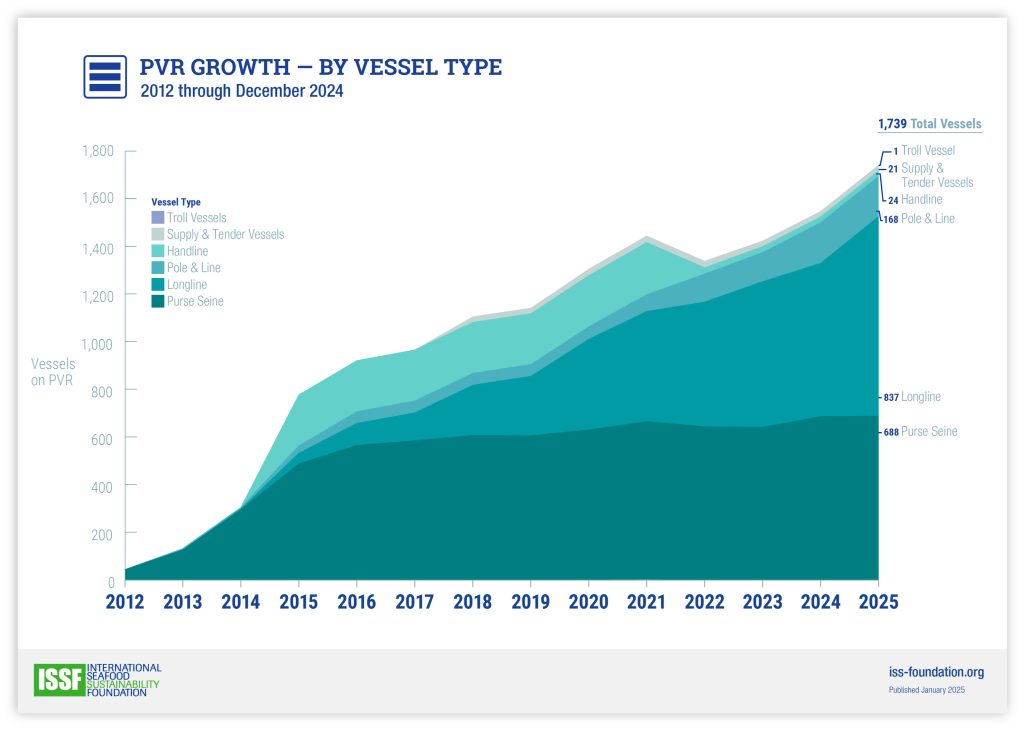
Case study: International Seafood Sustainability Foundation
The Story
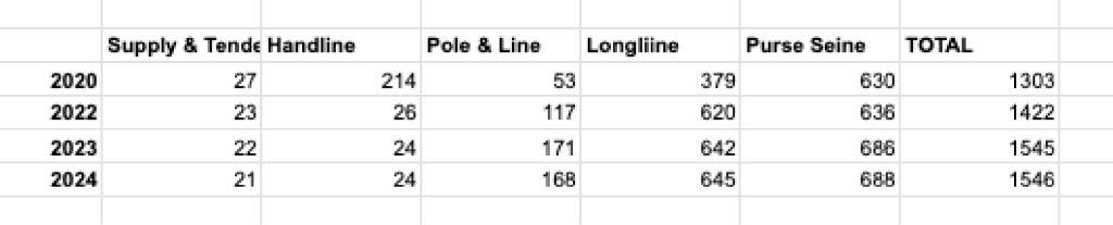
The International Seafood Sustainability Foundation’s (ISSF) ProActive Vessel Register is one of four public lists of vessels that ISSF provides to promote transparency in tuna fishing. The growing number of registered fishing vessels over time reflects ISSF’s success in growing sustainable practices in tuna fisheries worldwide.
The Data
Growing number of vessels participating over time, across specific categories of vessels
The Result
This area graph illustrates how the “whole” grows over time (comparison data). It is color coded to call out each specific type of vessel within the list of vessel types (“parts of a whole” data).
These examples show what happens when data meets story. The next time you share data, don’t just show the numbers—shape the narrative to help your audience truly connect.