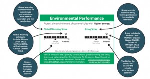
Effective since January 1st, California has launched a clean air label required on every new car produced and sold in California. The label rates ‘Smog’ and ‘Global Warming’ on a scale of 1-10 (5 being the average car, 10 being the cleanest). Though there has been a smog index label since 1998, this marks the first time such information has been available to the consumer at point-of-sale – though it seems you’ll have to pop the hood to find the label.
The best part is that the implementation of the label signifies a step toward transparency and ultimately sustainability: a system is now in place to transfer information from car producers, 3rd party reviewers, auto dealers and to communicate that to consumer.
However, the visual representation of the label leaves a lot to be desired. Very little actual information is communicated in these graphics – despite the seemingly substantial space allocated. A simple line makes up the ranking, but portrays very little detail about what the vague titles are all about. I’d like to see this label make use of the technique of layering: to call out the most basic important information (what’s already shown), while incorporating another level of supporting information to further educate viewers.
The ‘global warming’ score actually includes some interesting elements to touch on the larger life-cycle of the system – a stance not often acknowledged in products. But although this label touches on some issues related to sustainability, it leaves many questions in the viewer’s mind. For many audiences that already have a basic understanding of the principles of sustainability, the infographic neglects to transparently inform what the ‘smog’ and ‘global warming’ rankings actually include. [smog-producing emissions from use of the car for the former, and greenhouse gas emissions from fuel production, vehicle operation, and the car’s A/C system for the latter.] It’s also unclear whether average car score will adjust as cars are built cleaner in the coming years.
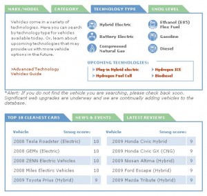
An online website clears up some of the vagueness: Consumers can also see the top 10-rated cars and check another vehicle’s rating on the DriveClean website. But as information design, it certainly would be nice if the visual representation took the opportunity to communicate more substantive information to potential buyers, educate them on the potential environmental outcome of their purchases, or even motivate them toward sustainability.

