Chips with visual crisp

Good info-design requires consistency and repetition in order to establish a visual pattern. This site does both well.

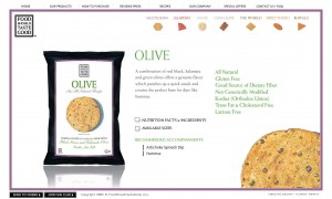
Using a small-multiples-like approach that allows the viewer to compare the chips at-a-glance, the designer has clearly paired color pallet with the chips. The miniature chips (color, texture and all) are both a reference to the chip variety, and a visual navigation to additional information on the product.

Website with chip navigation
Small multiples of chips, color-coded

And they taste good too.

www.foodshouldtastegood.com

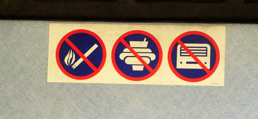
No Smoking. No Food. No Robots.

No Smoking. No Food. No Robots.

A lesson in information and graphic design:Graphics need to be able to withstand the test of time.

This info-graphic inside a Minneapolis bus does alright communicating no smoking and no food or drink. But my only guess is that the ‘robot’ icon was intended to represent a tape deck (as a symbol for loud music) … a technology that has not withstood the test of time. At least not in this era.

This lends a lack-of-trust and a sense of out-dated-ness to the first 2 graphics – which are quite comprehensible by themselves.

It’s important that an audience be able to comprehend a visual icon. An infographic must be able to capture the essence of the object/idea without being too detailed about age/brand/….etc. Naturally, this job is made difficult by the changing design of products, trends, etc.

Showing the Full Story

First: show it all. Then let people zoom into the pieces of information that interest them. A visual story can be overwhelming if it doesn’t provide some context.

A good background story makes it clear what information is found in what part of a product’s background.

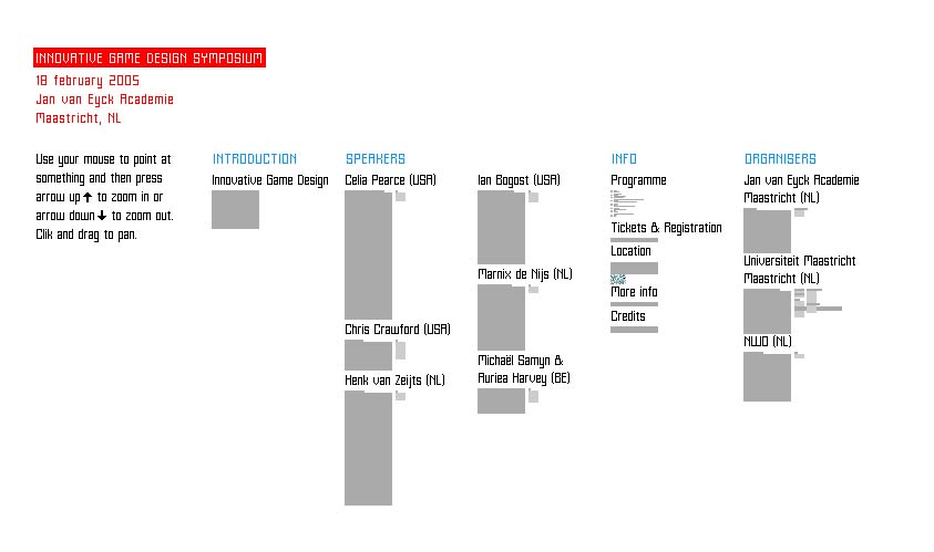
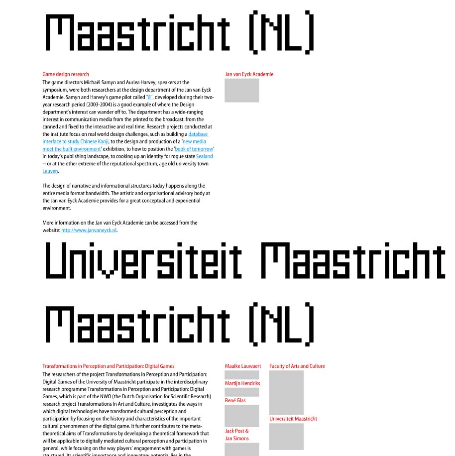
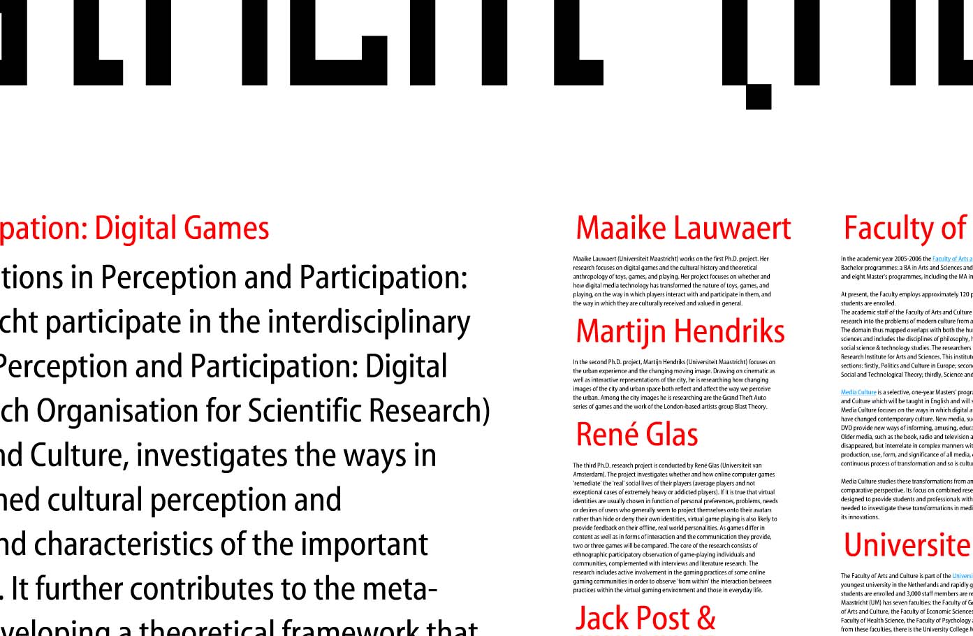
This example makes excellent use of spacial relationships to put increasingly detailed information in context: and help the viewer understand that context in a visual way. Shown are 3 levels of zoom into a site for a symposium at the Jan Van Eyck Academie in the Netherlands. The keystrokes needed to zoom in and out of the information are a bit clunky, but the overall concept is an intriguing way to communicate layers of information.

overview of all information zoom level 2 zoom level 3

Such is the concept of transparency – a viewer should be able to access even the most minute details of data: It’s all part of the big picture.

Apple Card

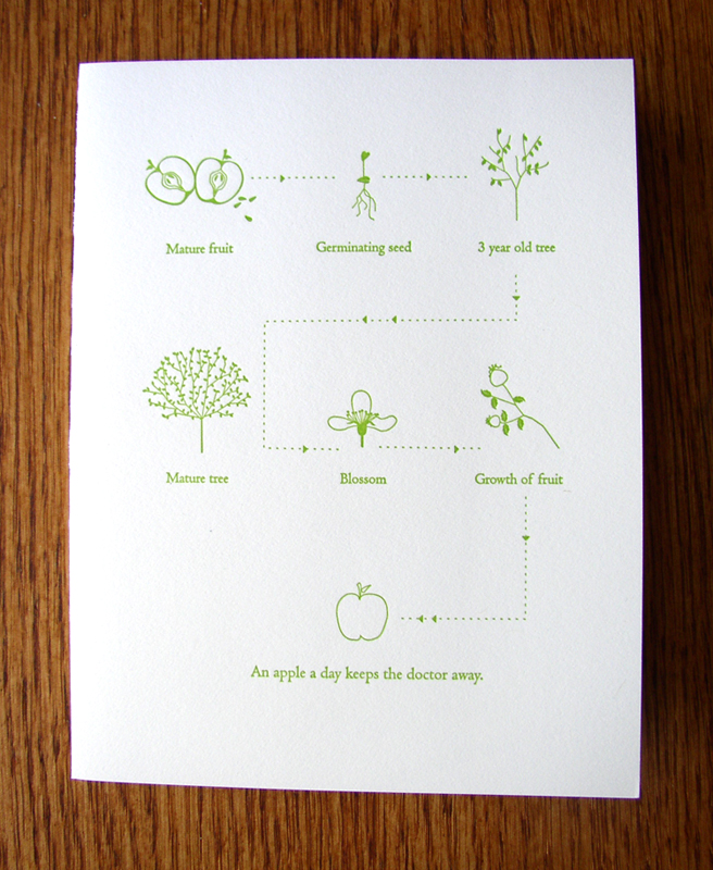
Greeting Card with graphic of Apple life-cycle

If an apple a day keeps the doctor away, this card is worth an entire year doctor-free.

The graphic on this greeting card describes the life-cycle of an apple seed/tree/fruit. The scale of each element is irrelevant because segment of illustration concentrates on the most important component of that part of the cycle; giving the viewer the appropriate zoomed-in or zoomed-out view.

The key words are a bit redundant (especially “Blossom”). Without these words the viewer would still understand that the story is about the cyclic growth of the apple. However, if the subject in question were more complex or unusual than the common apple, keywords would become essential.

Take it one step further: imagine how the graphic could get even better connected if the paper its printed on was made from apple tree pulp…then embed an apple seed inside so the disposal of the card grows another tree. The graphic could then expand to include the tree trunk’s second life as this card.

Card by Pancake & Franks.