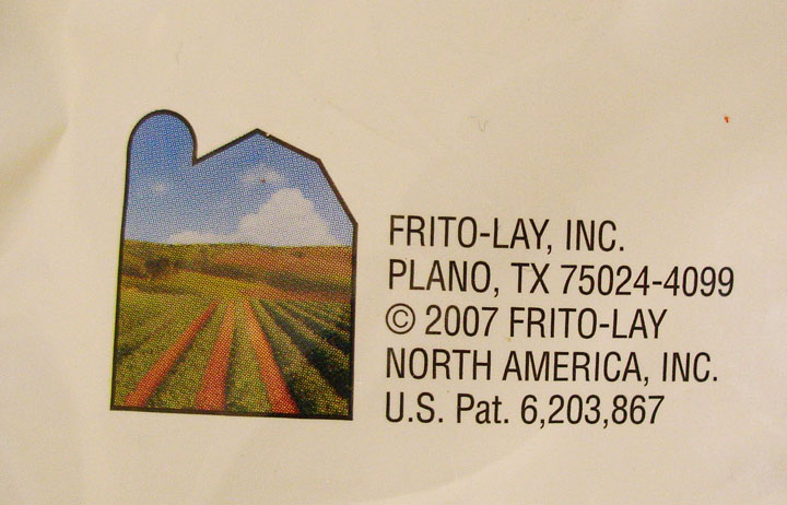
CNN BackStory

CNN BackStory screengrab

CNN has launched a new application to show how a story has developed over time. This is basically a collection of all CNN-posted stories associated with a particular event. The example they give is the Anthrax case. http://behindthescenes.blogs.cnn.com/

This allows readers to easily dig into the recent history of a story. The impact of a news service that offered such a view into history -AND incorporated stories from other key news media (CNN, BBC, and New York Times for example)- could be extremely powerful piece of online media to showcase varying perspectives. It will be interesting to see if partnerships emerge in this area – also incorporate other online media (video in addition to text-based stories).

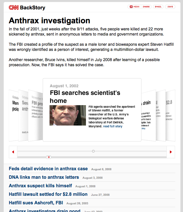
Fritos don’t grow in fields

Fritos grow in fields (or so they\'d like us to believe)

This graphic from the back-side of a Fritos chip bag seems to say that the company is farming-focused. The visual of peaceful farm landscape framed within the outline of a traditional barn is in direct contradiction with the accompanying address. (It’s also common knowledge that the company’s chips are about as processed and far from the farm as they can get.)

This is a case of graphics gone deceptive. Though Plano sounds like a perfectly nice place, from it’s wikipedia entry, it doesn’t seem to agricultural as this graphic suggests.

Plano (IPA: /ˈpleɪnoʊ/) is a city in Collin and Denton Counties in the U.S. state of Texas. Located mainly within Collin County, it is a wealthy northern suburb of Dallas. The population was 222,030 at the 2000 census, making it the ninth largest city in Texas.”

If Frito-Lay was trying to follow the criteria of corporate transparency by revealing their address in Plano, the company has also under-estimated the power of graphics. Their packaging’s contradictory stance will make any visually-aware consumer doubt their mixed messages.

Visual cues can add new dimension to text-based information, but when text and graphic are in direct contradiction to each other (and obviously wrong for the context of the product), the addition of visual information can do more harm to the image of the company than good.

The Beginning of the Blog

This catalog aims to feature existing designs and other forms of visual communication that inspire understanding about the big-picture impacts of the ordinary everyday. The examples posted are both found and self-generated.

Visual communication (often in the form of information graphics) can be a powerful tool to help people understand the big-picture impact of a product or service.

It’s my hope that this will serve as inspiration for visual display of product background stories.