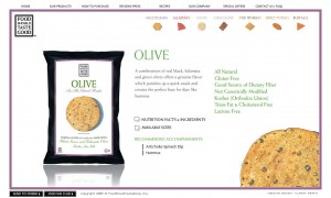
Good info-design requires consistency and repetition in order to establish a visual pattern. This site does both well.
Using a small-multiples-like approach that allows the viewer to compare the chips at-a-glance, the designer has clearly paired color pallet with the chips. The miniature chips (color, texture and all) are both a reference to the chip variety, and a visual navigation to additional information on the product.


And they taste good too.
