Age-Friendly Minnesota
Outlining the Path to a More Age-Inclusive Society
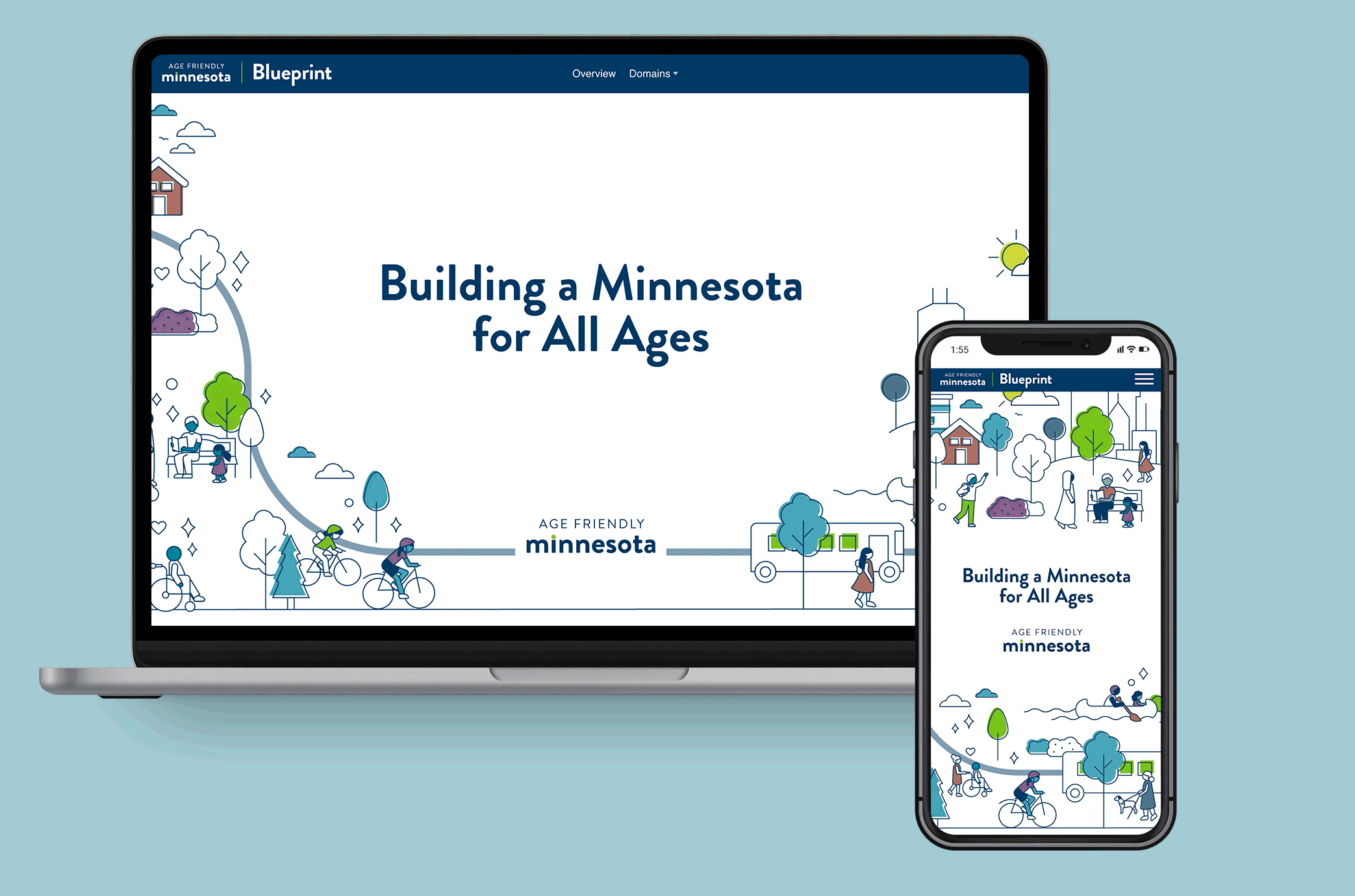
Engaging visuals for a ten-year plan
A narrative-focused microsite takes the viewer on a journey.
Age-Friendly Minnesota needed an accessible, welcoming platform to quickly explain the vision of their ten-year plan. We collaborated with their council to create a narrative-focused microsite using the web platform Shorthand.
The microsite takes the viewer on a journey through the domains of the Blueprint, featuring data visualizations that emphasize key messages. We also developed a visual language for the domains of their plan that the team can use in future materials.
At the end of the project, we provided recommendations for a data dashboard that will be implemented on the site in the future.
Our Work Includes: DATAVIS, ILLUSTRATION, STORY DEVELOPMENT, INTERACTIVITY, WEB DESIGN

PROJECT IMPACT
The Age-Friendly Minnesota council and its partners can use the microsite to introduce the Multisector Blueprint for Aging and jump-start conversations about their work.
Our Partner:

This Organization's Focus:


Each new piece of information is delivered through narrative pacing controlled by the viewer's scroll speed.
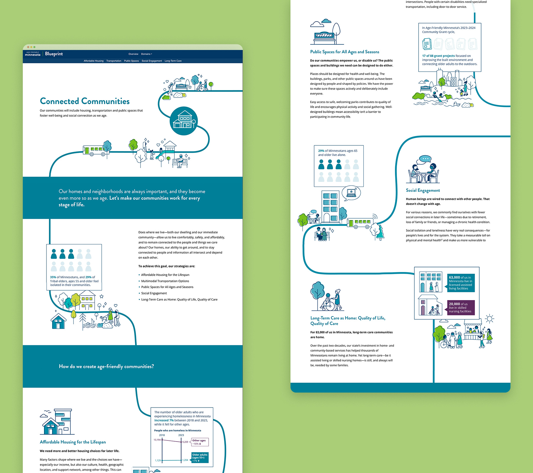
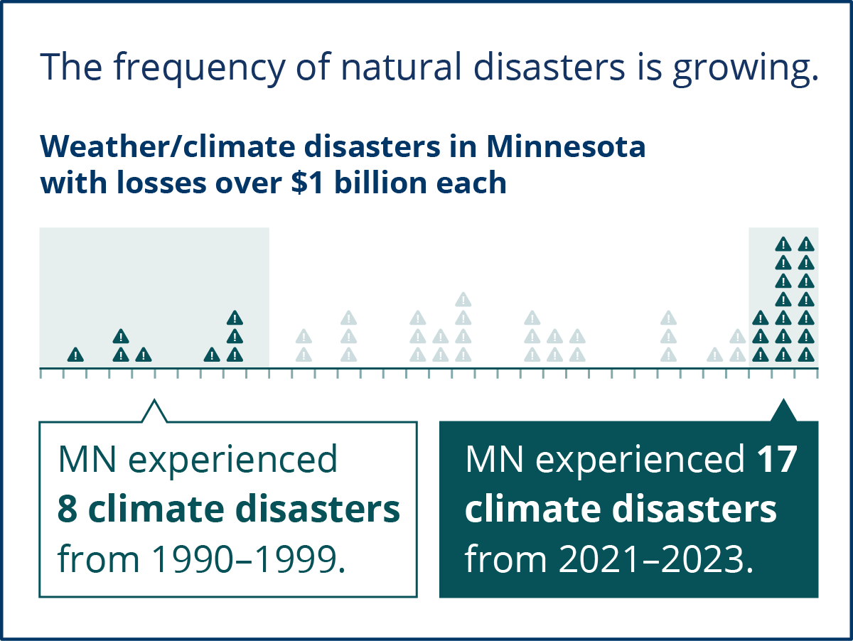
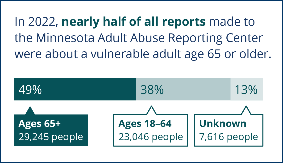
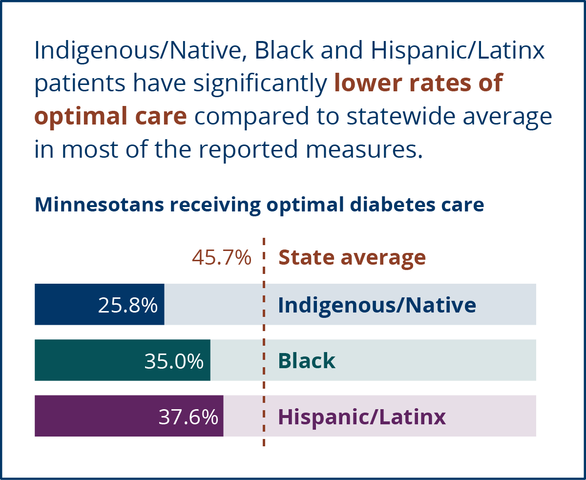
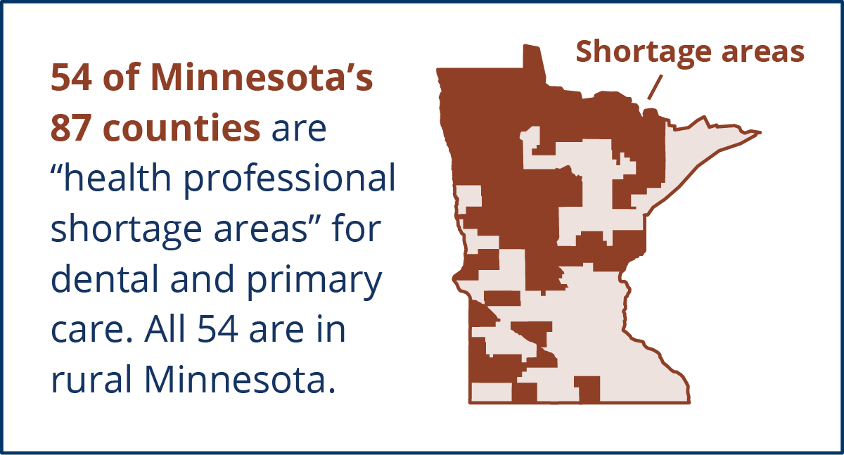
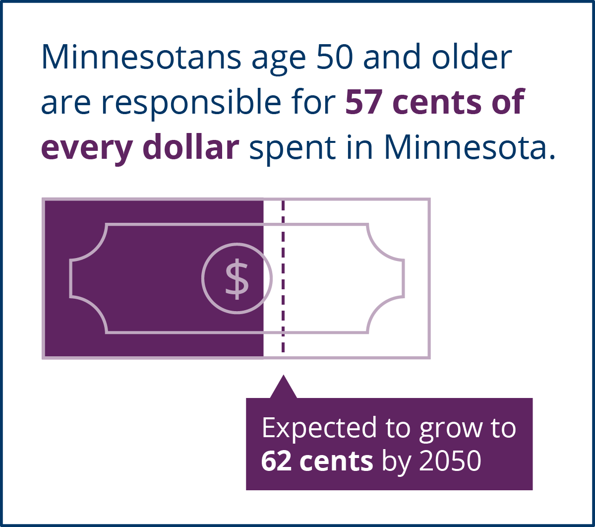
Data visualizations support
key messages
Each new topic is supported by a digestible data visualization to "set the stage" and provide the viewer with a statistic they can reference in their own work.
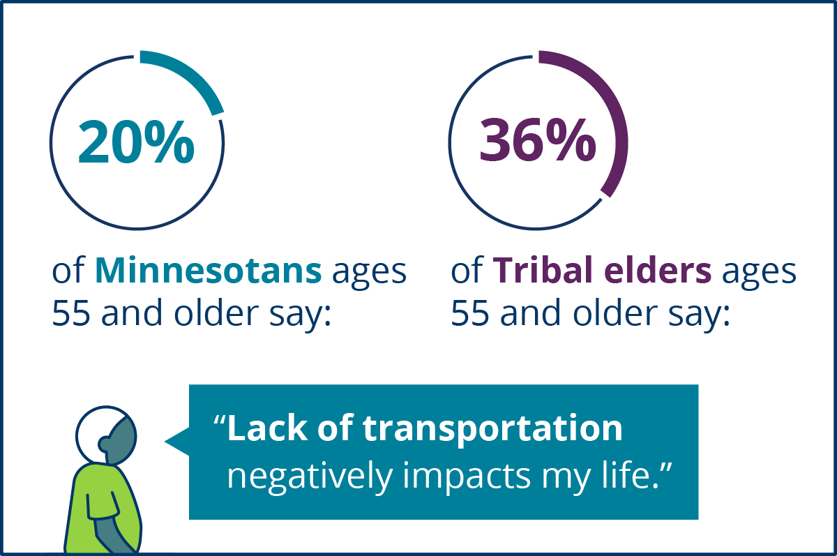
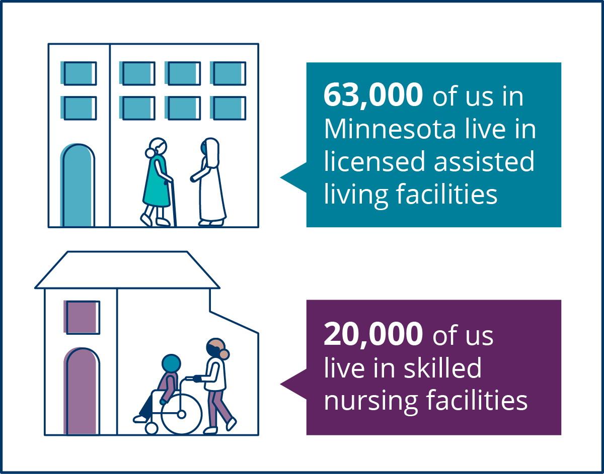
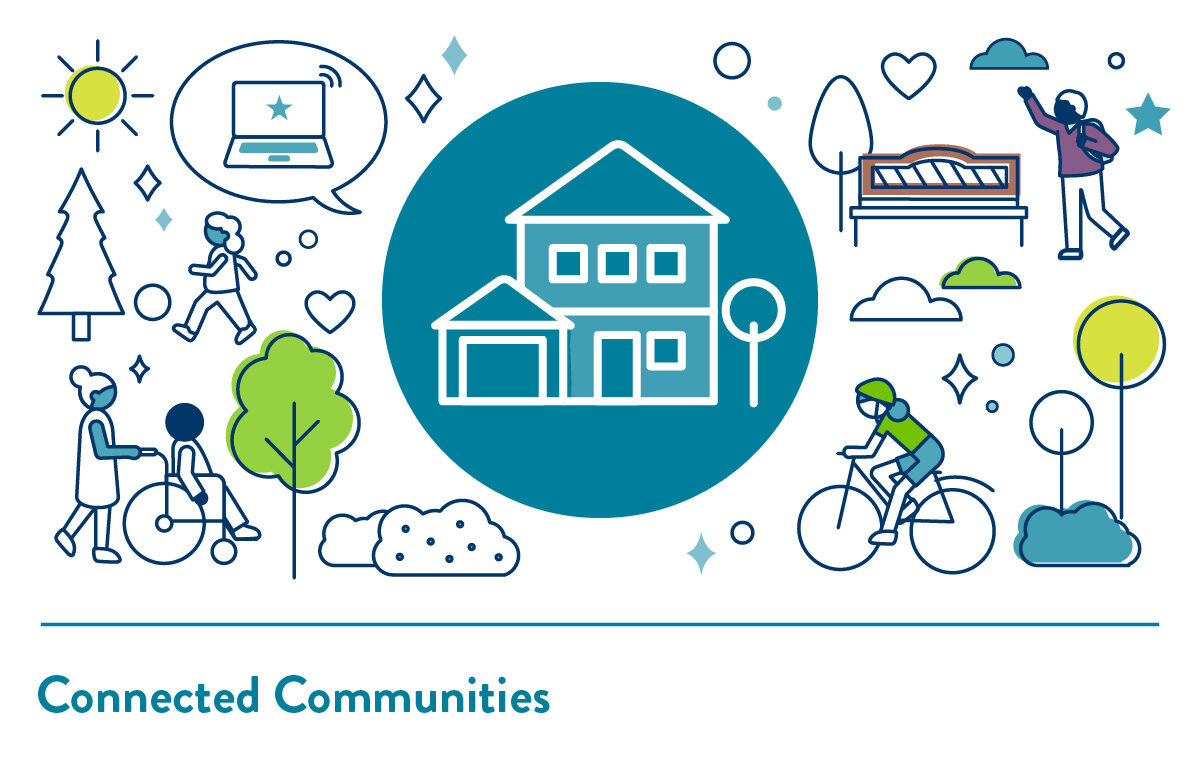
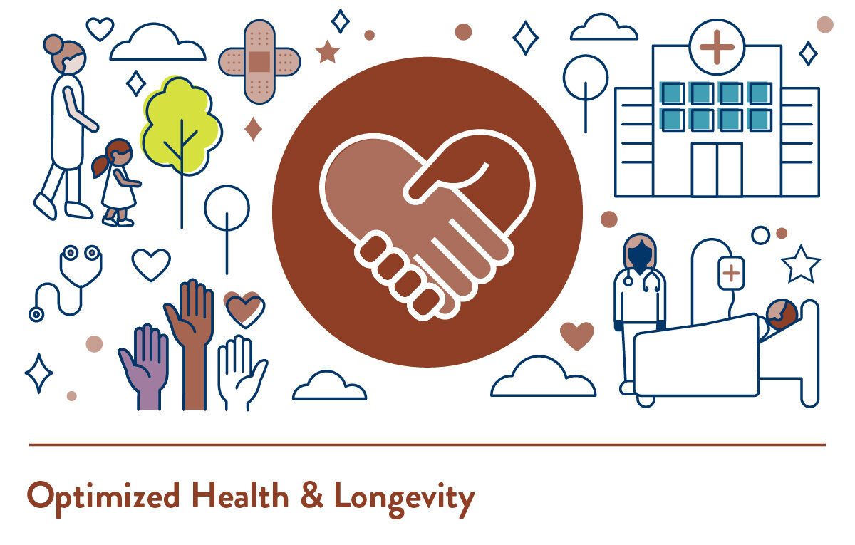
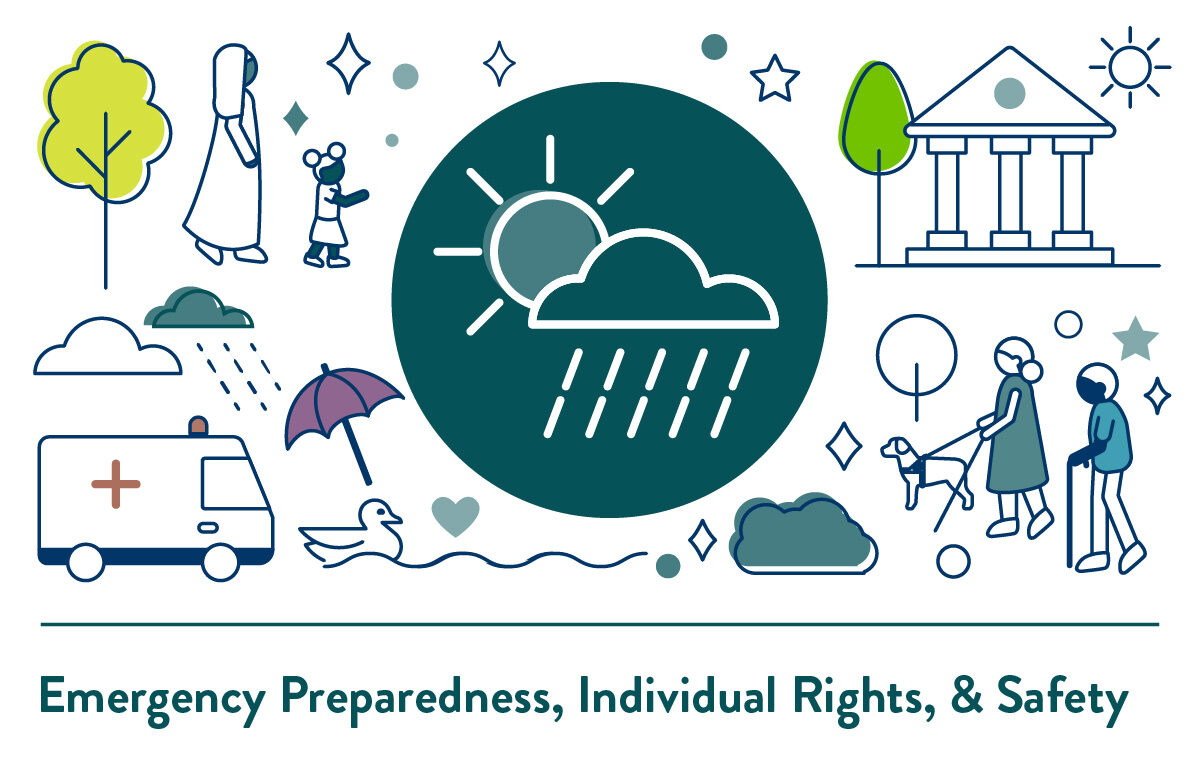
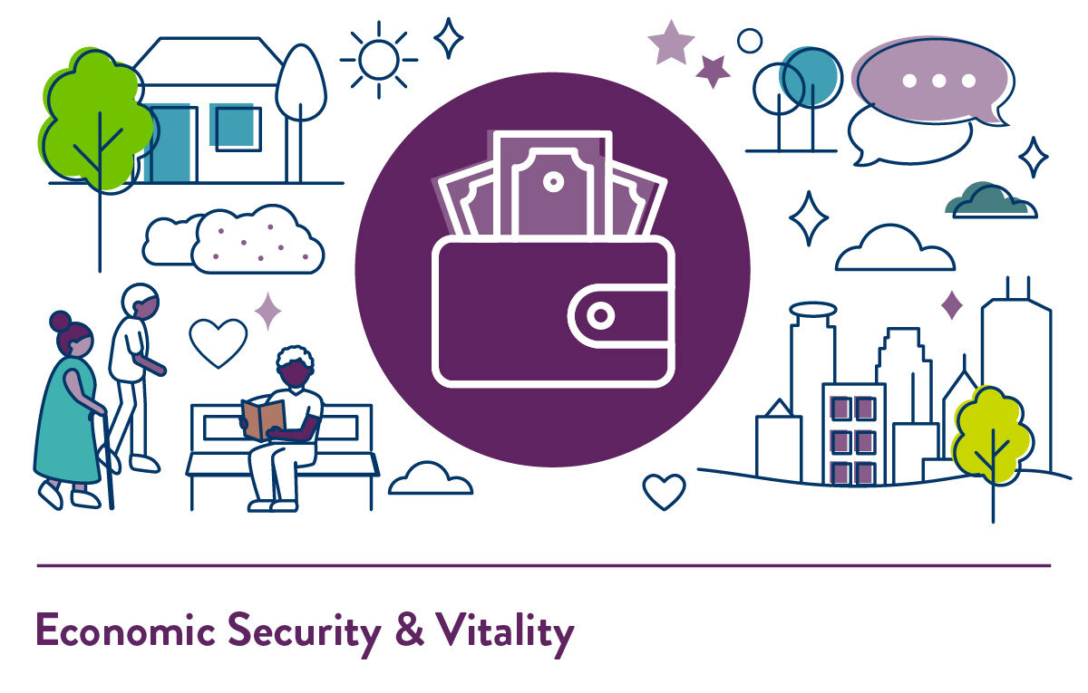
The consistent visual language makes complex content approachable for experts and non-experts alike.
![]()
The color and icon systems are reinforced through illustrations on each page of the microsite.
The microsite is compliant with web accessibility standards.
This includes:
- Applying heading tags consistently
- Ensuring sufficient color contrast for text and graphics
- Adding alternative text for non-decorative graphics

Read more about Creating Accessible Design on our blog!