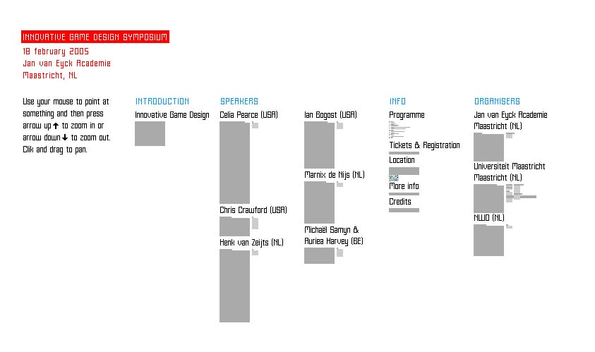
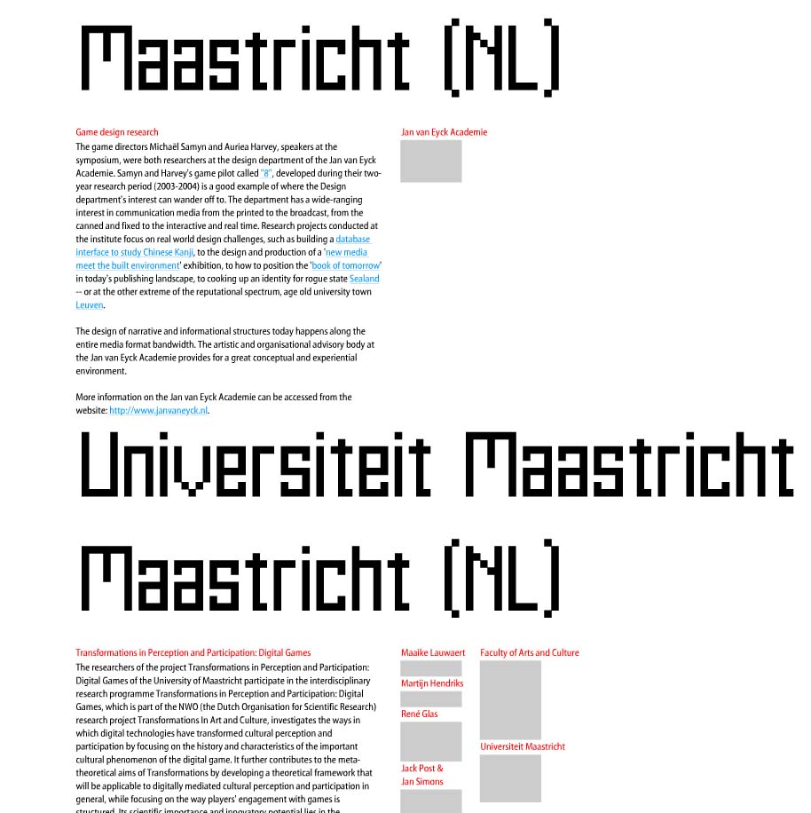
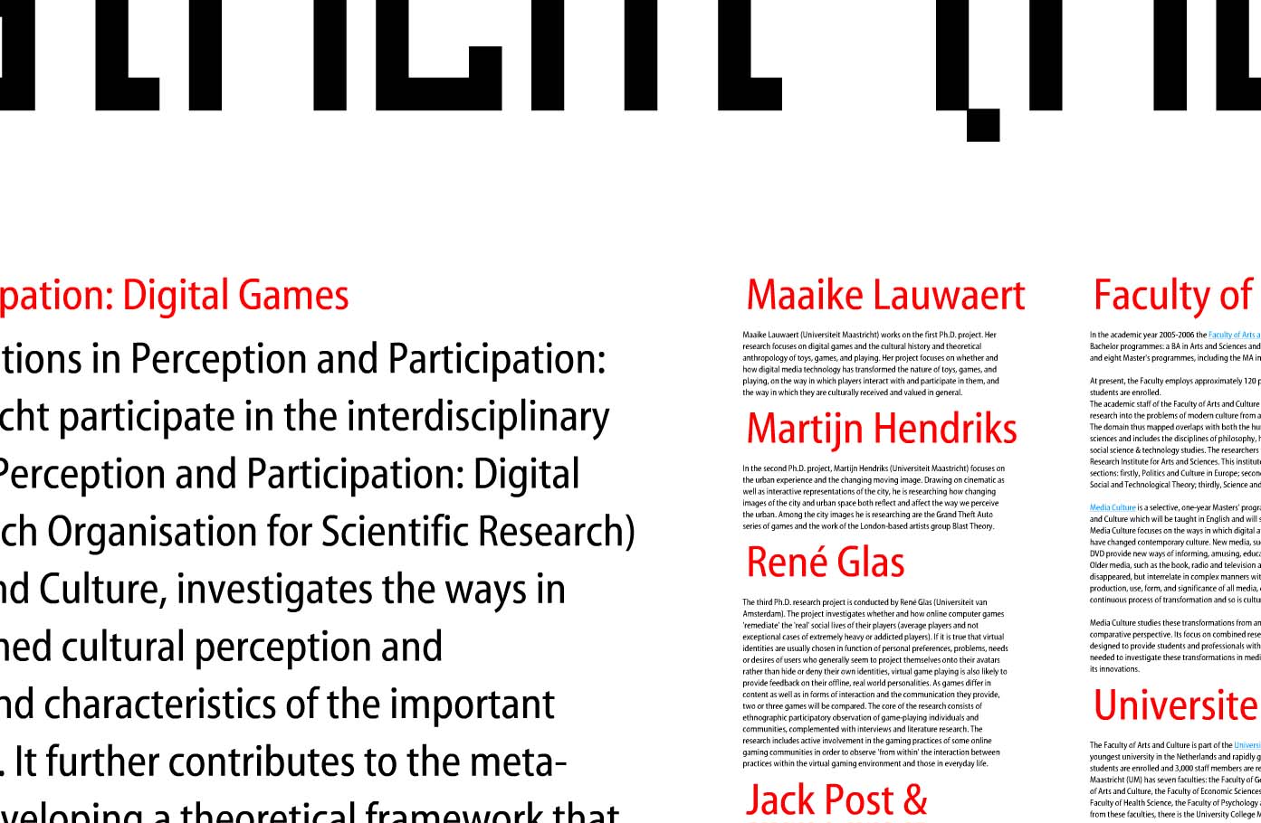
First: show it all. Then let people zoom into the pieces of information that interest them. A visual story can be overwhelming if it doesn’t provide some context.
A good background story makes it clear what information is found in what part of a product’s background.
This example makes excellent use of spacial relationships to put increasingly detailed information in context: and help the viewer understand that context in a visual way. Shown are 3 levels of zoom into a site for a symposium at the Jan Van Eyck Academie in the Netherlands. The keystrokes needed to zoom in and out of the information are a bit clunky, but the overall concept is an intriguing way to communicate layers of information.
Such is the concept of transparency – a viewer should be able to access even the most minute details of data: It’s all part of the big picture.


