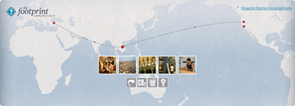
Patagonia’s Footprint Map

Footprint ChroniclesTravels of a Patagonia Dress - Footprint Chronicles

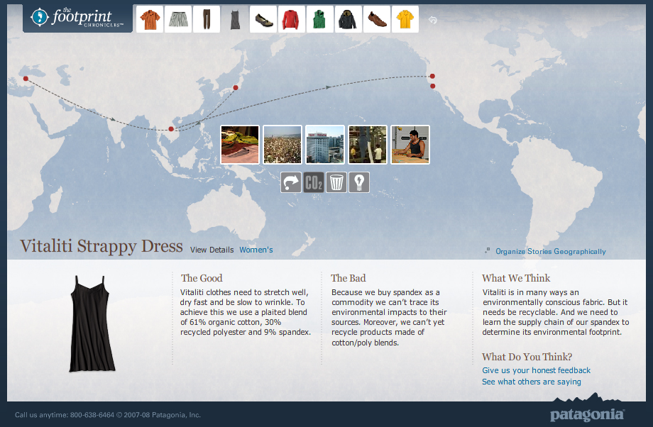
Companies are increasingly able to track the life of their products through their supply chains and trace the origins of even the smallest notion.

Patagonia’s Footprint Chronicles outlines the potential for a company to unveil its transparency in the name of promoting sustainability (and hence, appearing as a sustainable company). From an information standpoint, Patagonia is open about “The Good” and “The Bad” – admitting that, like any human, they’re not yet perfect, but they know where they need to improve.

The online tool carries the viewer through design, materials, manufacture, distribution (among others) of a handful of the company’s products, allowing the user to explore info both sequentially or geographically. Based on google-esque maps, the tool is well-designed as both a piece of information design and as an interactive tool.

Though included are a handful of data and other numbers, I’d like to see these numbers presented in a more visual way – nice parallels are drawn to perceivable concepts to make abstract quantities real. For example: where they say the CO2 generated from a specific shirt is equal to 100x the weight of the shirt, it would be nice to have a more standard reference: such as how many miles average driving…or how many trees need to be planted to counteract this release of CO2. This reference could in-turn, be illustrated in a more graphic format that would enable more direct comparison between various products.

Fritos don’t grow in fields

Fritos grow in fields (or so they\'d like us to believe)

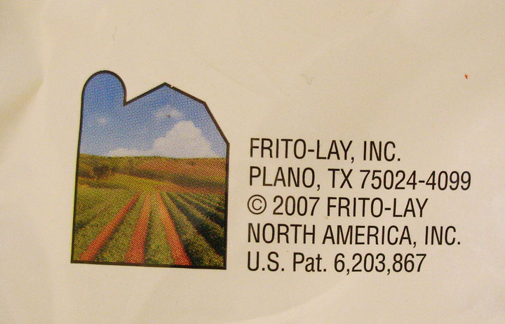
This graphic from the back-side of a Fritos chip bag seems to say that the company is farming-focused. The visual of peaceful farm landscape framed within the outline of a traditional barn is in direct contradiction with the accompanying address. (It’s also common knowledge that the company’s chips are about as processed and far from the farm as they can get.)

This is a case of graphics gone deceptive. Though Plano sounds like a perfectly nice place, from it’s wikipedia entry, it doesn’t seem to agricultural as this graphic suggests.

Plano (IPA: /ˈpleɪnoÊŠ/) is a city in Collin and Denton Counties in the U.S. state of Texas. Located mainly within Collin County, it is a wealthy northern suburb of Dallas. The population was 222,030 at the 2000 census, making it the ninth largest city in Texas.”

If Frito-Lay was trying to follow the criteria of corporate transparency by revealing their address in Plano, the company has also under-estimated the power of graphics. Their packaging’s contradictory stance will make any visually-aware consumer doubt their mixed messages.

Visual cues can add new dimension to text-based information, but when text and graphic are in direct contradiction to each other (and obviously wrong for the context of the product), the addition of visual information can do more harm to the image of the company than good.

Icy “ICE” sign

Ice for sale sign

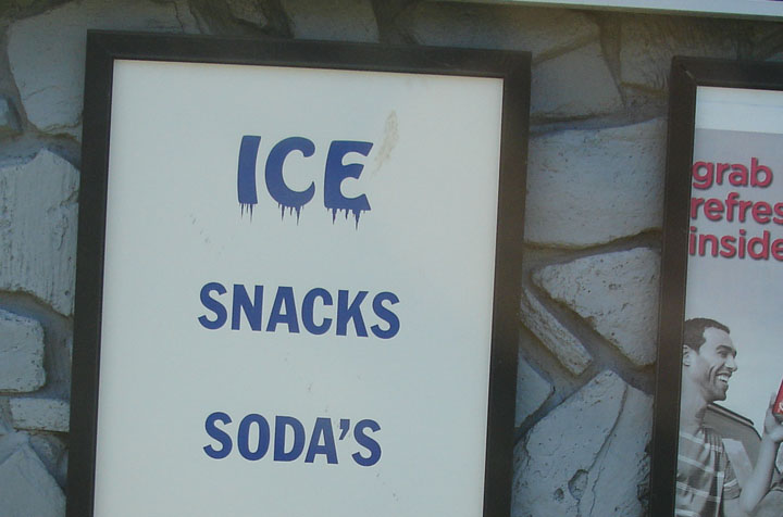
The “ICE” on this sign gives visual cues to the effect of the product itself.

Where the viewer may have understand what “SNACKS” and “SODA’S” mean, they will feel the meaning of “ICE”. This technique can also aid in understanding for low-literacy audiences.

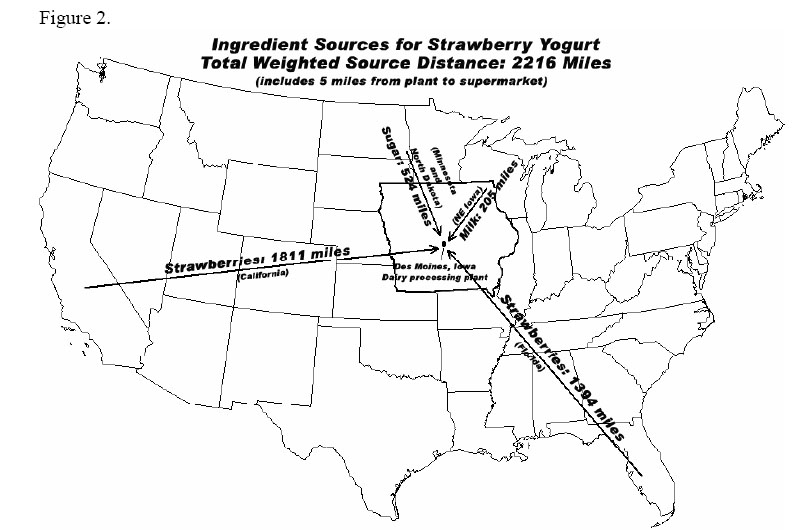
Strawberry Yogurt Sketch

Iowa Strawberry Yogurt IngredientsDistances of Strawberry Yogurt Ingredients

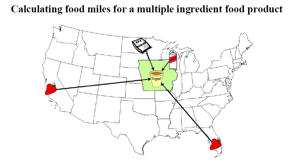
This pair of straight-forward graphics appear on separate pages of “Calculating food miles for a multiple ingredient food product” – a white paper from Iowa State University’s Leopold Center.

The graphics show where the ingredients of a specific Strawberry Yogurt have come from.

The first graphic is more visual, and thereby more enticing at first glance, but it does not convey the useful information of the 2nd graphic. The first graphic could be expanded to incorporate the detail of the second graphic: exactly how far each ingredient has traveled. And it could be further expanded to specify which method of travel (plane, train, truck, etc.), and with what carbon footprint.

A more detailed report (including stats on this yogurt’s Life-Cycle Assessment [LCA]) accompanies these graphic. Source: http://www.leopold.iastate.edu/pubs/staff/files/foodmiles_030305.pdf