Same Content: Different Audiences

When you design for everyone, you design for no one.

...so the saying goes.

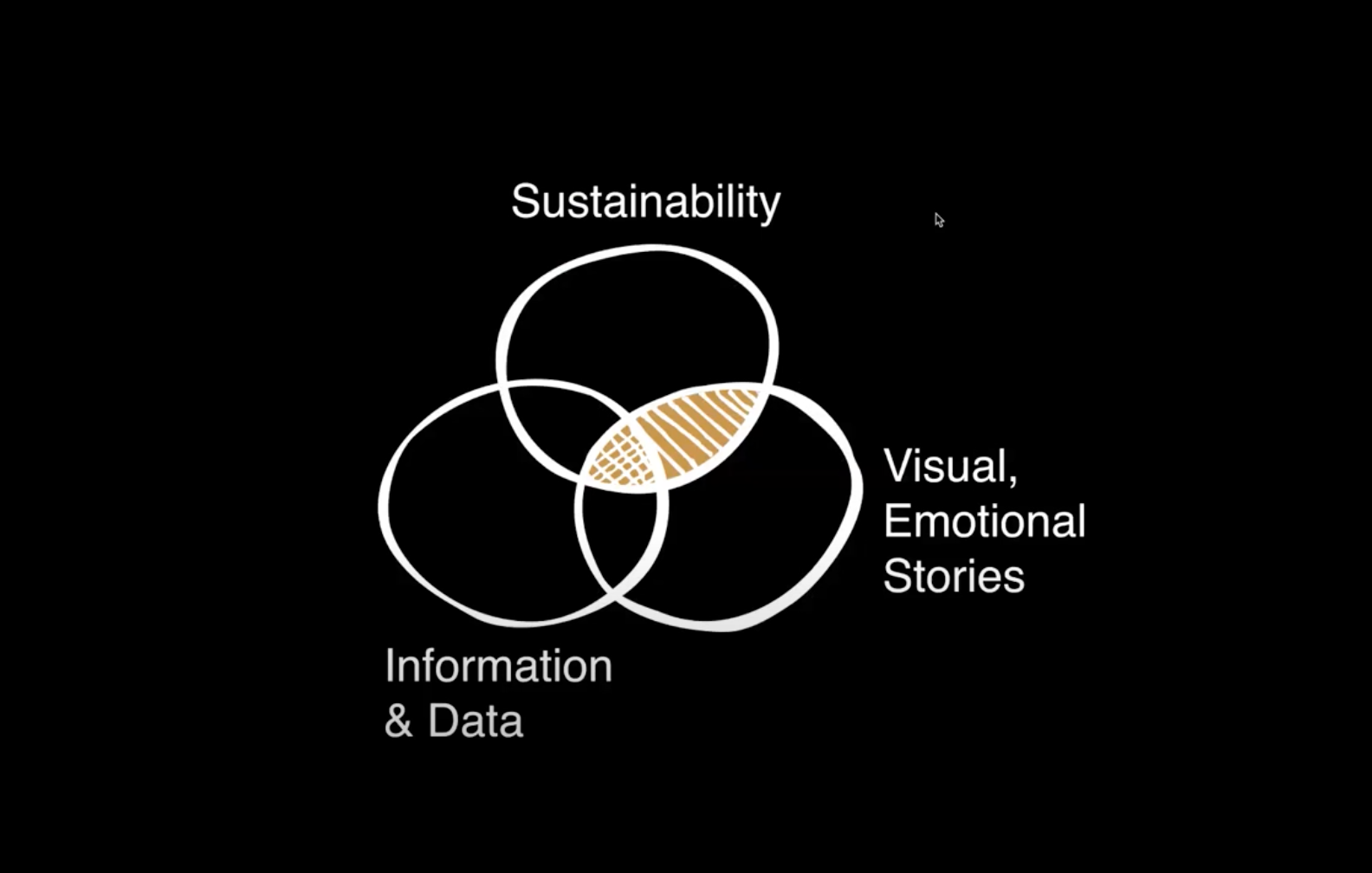
And we often find understanding the variety of audiences and media for a project can lead to efficiencies in designing the same content speak across multiple audiencesBy tailoring a design approach to suit the preferences, background knowledge, and expectations of different groups, —even while using the same content— we can enhance engagement, strengthen connections, and achieve communication goals.

The following case studies show the importance of selecting the appropriate communication method for a variety of target audiences and strategies for effective communication across different platforms.

Great Plains Institute (GPI)

Mockup showing GPI infographic documents, Powerpoint slide, and social media post

OVERVIEW

  • Audiences: Farmers, policymakers, general public
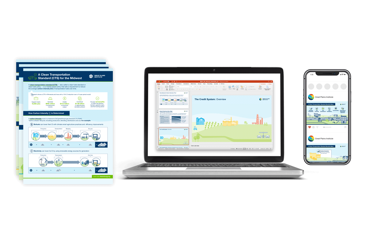
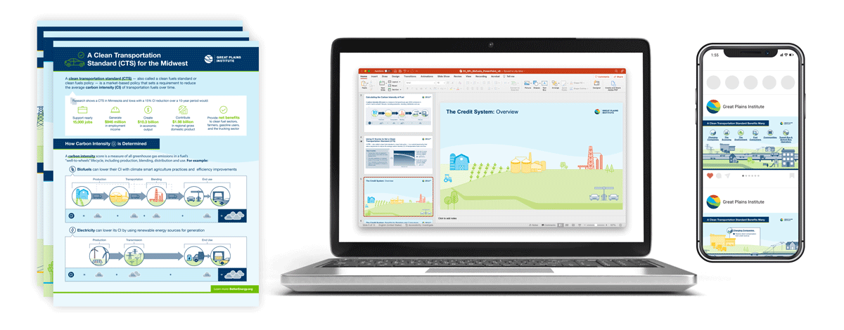
  • Deliverables: Powerpoint presentation, one-pagers, & social media graphics
  • Unique challenges: Complex scientific & economic concepts, nuances in perspectives, sensitivities of each target audience

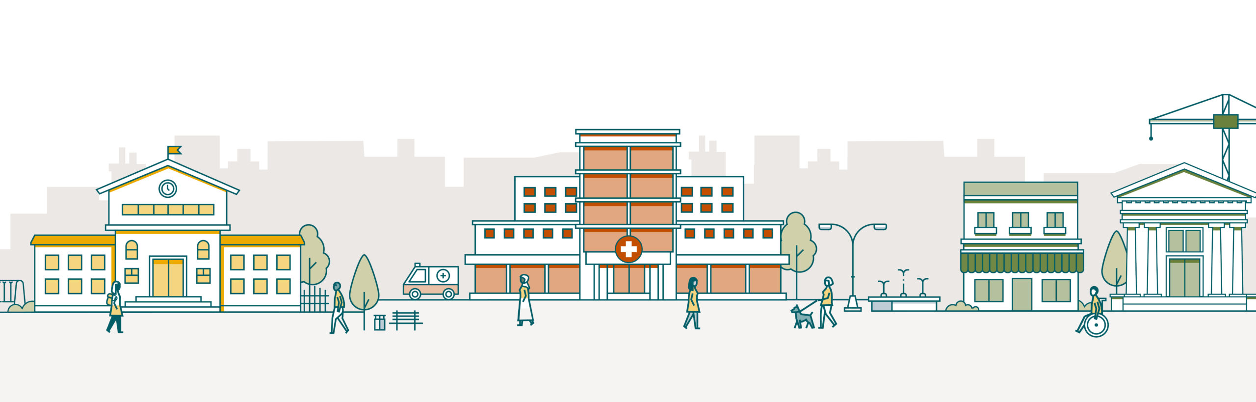
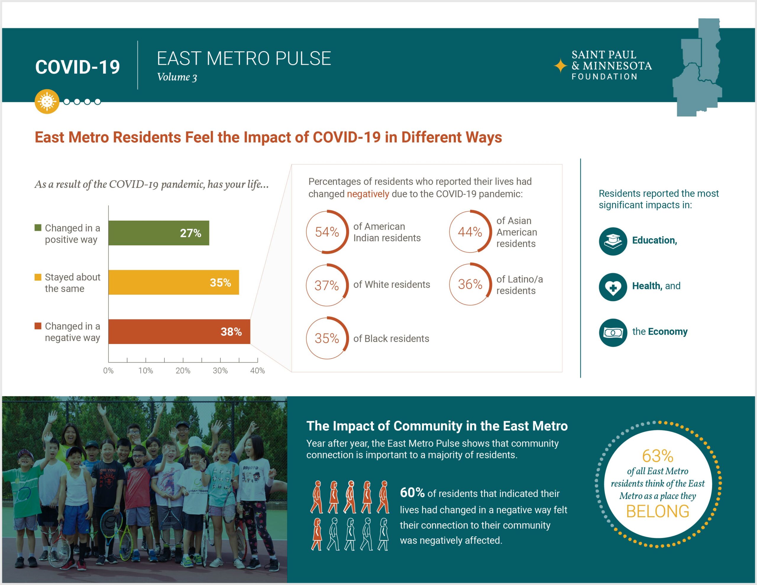
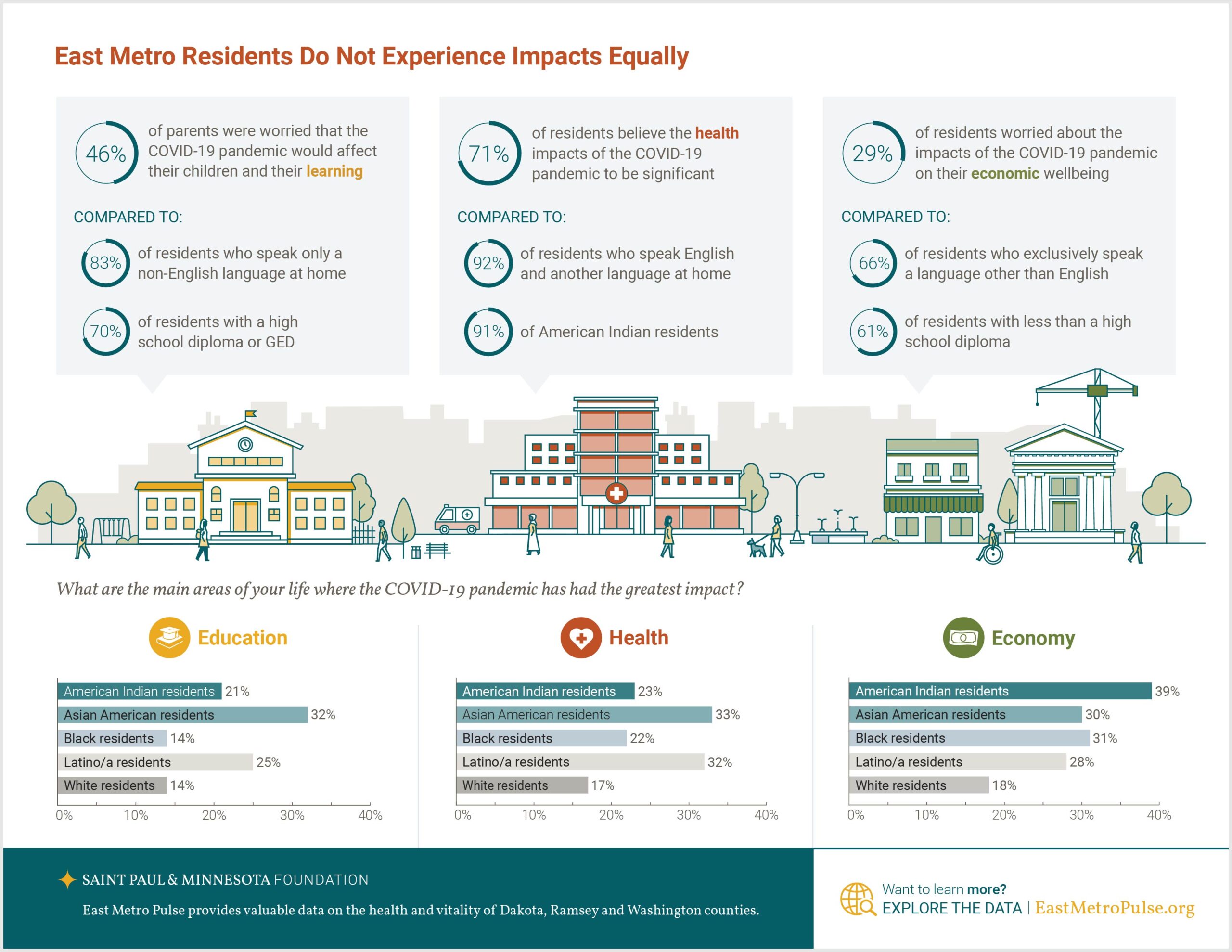
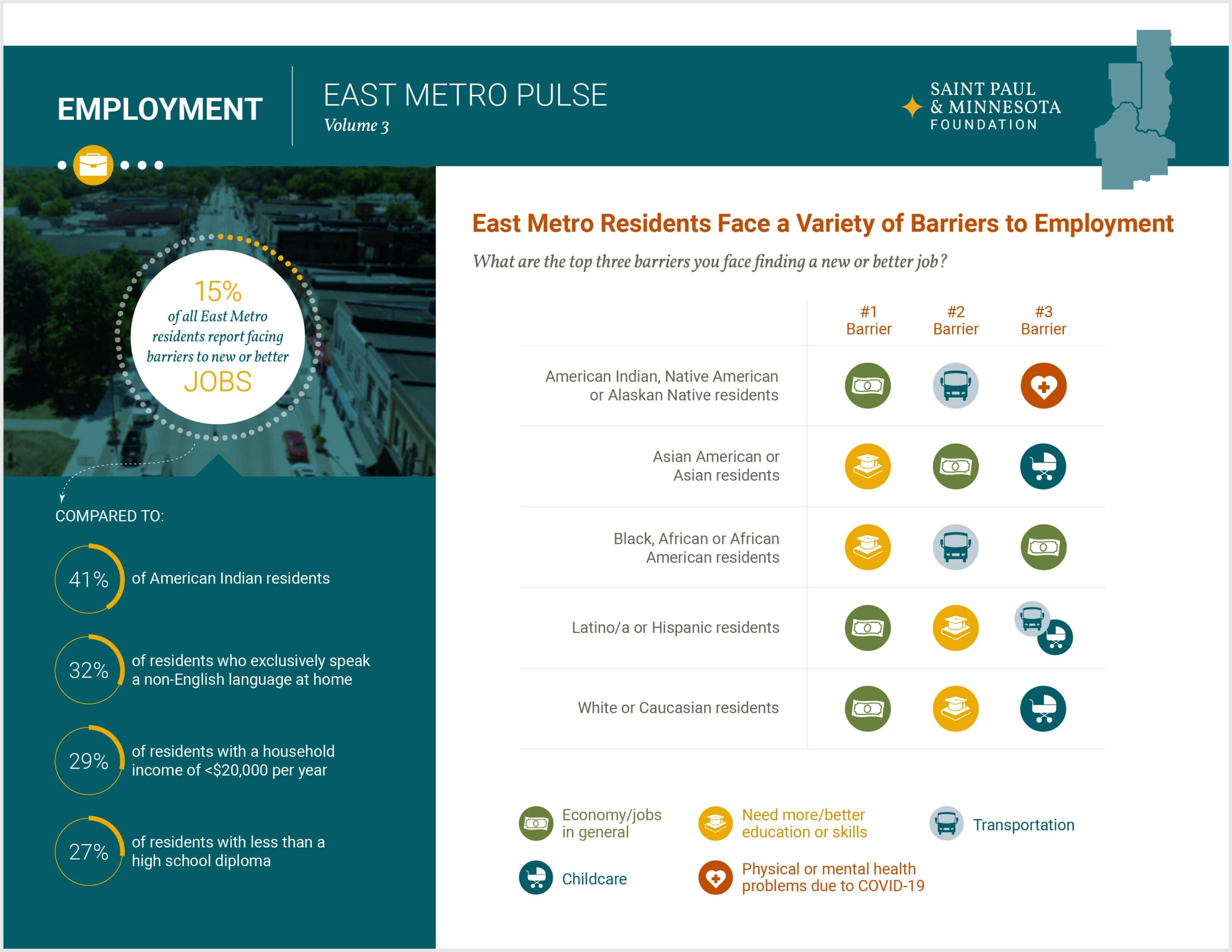
These infographics convey a Clean Transportation Standard (CTS): conveying complex information (including data, research, and policy details) through concise and appealing visuals. We worked directly with stakeholders to test the infographics for clarity and comprehension across audiences.

Mockup of a laptop showing GPI infographic in a Powerpoint slide

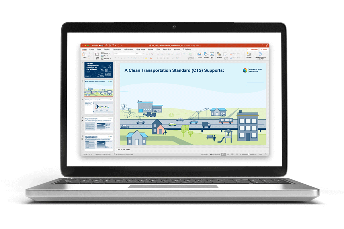
To communicate to farmers who grow grain for biofuels, we focused on potential cost savings, increased efficiency, and long-term benefits for farmers. Because there are nuances in what a Clean Fuels Standard (CFS) would look like state-to-state, all text in the design deliverables (presentation Powerpoints for meetings) was left editable so our client could make adaptations when sharing this resource across the Midwest.

GPI one-page infographics

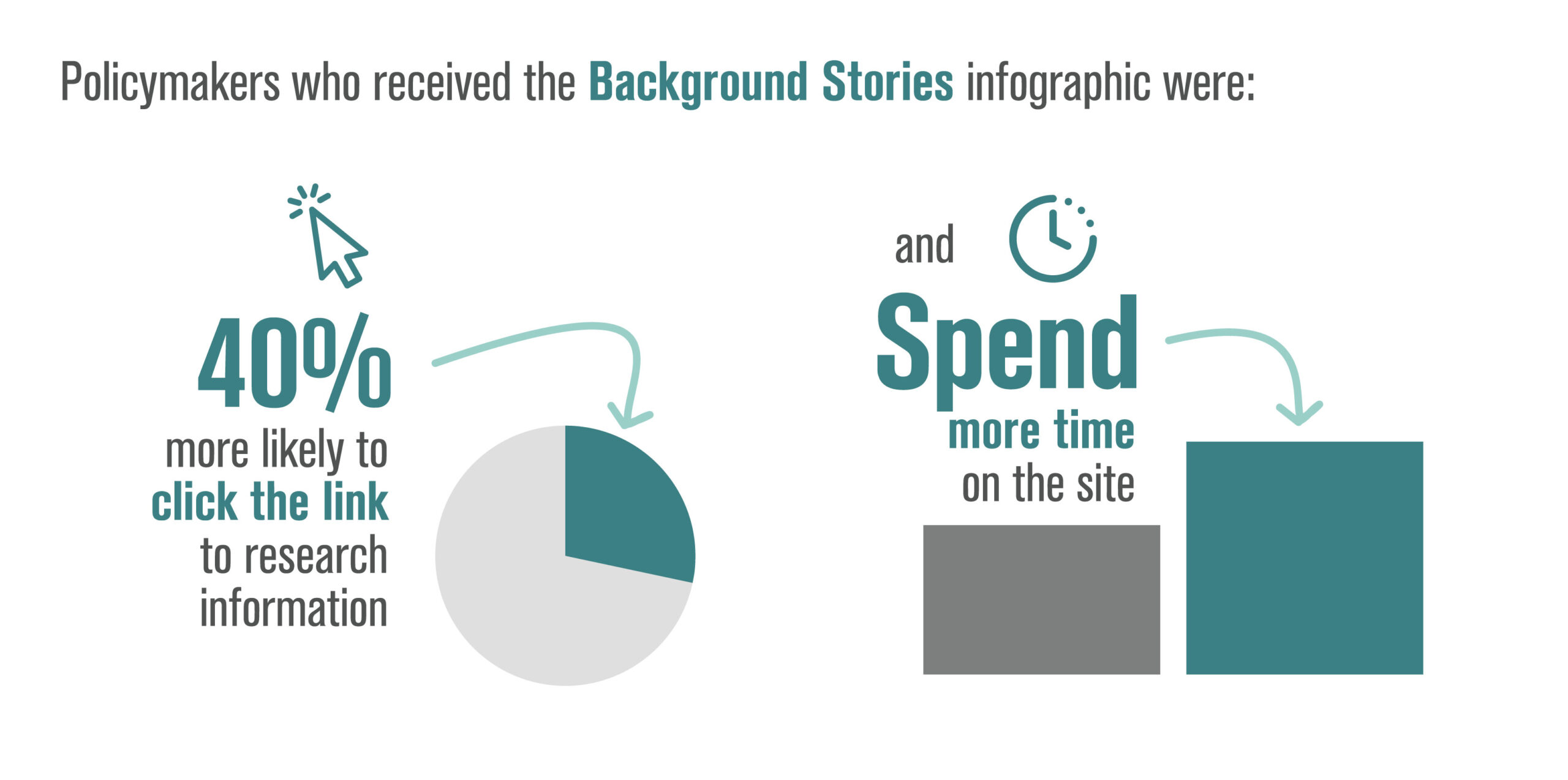
Policymakers have very little time to review new information and often do not have extensive background knowledge of new developments in environmental and social sustainability. To accommodate this type of audience, we worked with GPI to distill the most important content and structured it as a one-page document. This resource can be shared digitally, or printed and as a leave-behind for meetings with policymakers.

Mockup of a phone showing GPI infographic in a social media post

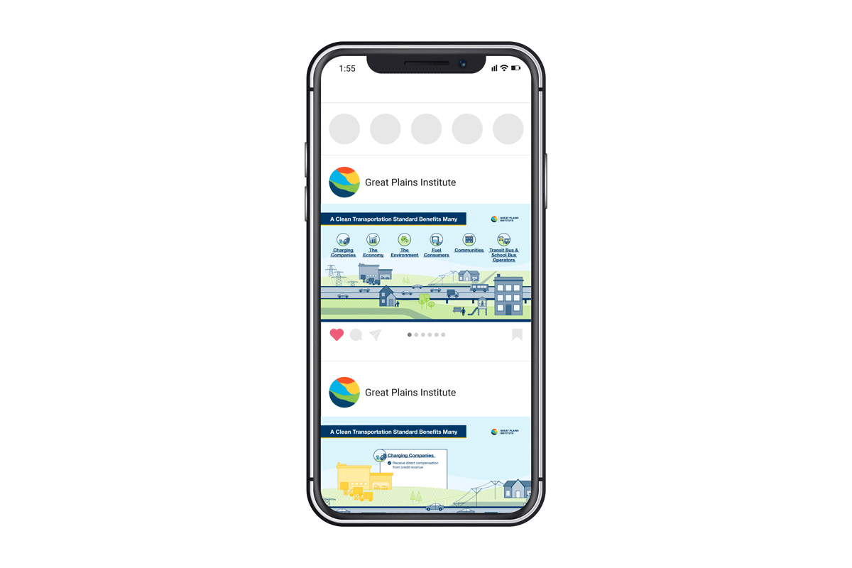
The expectations and background knowledge of a general audience varies significantly. If reaching people primarily through social media, it can be hard to compete with the large amounts of content shared daily. To combat this, we distilled the content of our graphics even further, pulling out only the most important, high-level content in small, highly visual graphics and short animations. Call to actions were added to visuals as a way to direct interested people to additional information.

International Institute for Democracy and Electoral Assistance (IDEA)

Infographics and social media showing democracy and Climate Vulnerability Index for countries in Asia

OVERVIEW

  • Audiences: Regional & international policymakers
  • Deliverables: Overview + conclusion infographics, infographic series for country-specific data, social media motion graphics
  • Unique challenges: Some data points not available consistently from one country to the next

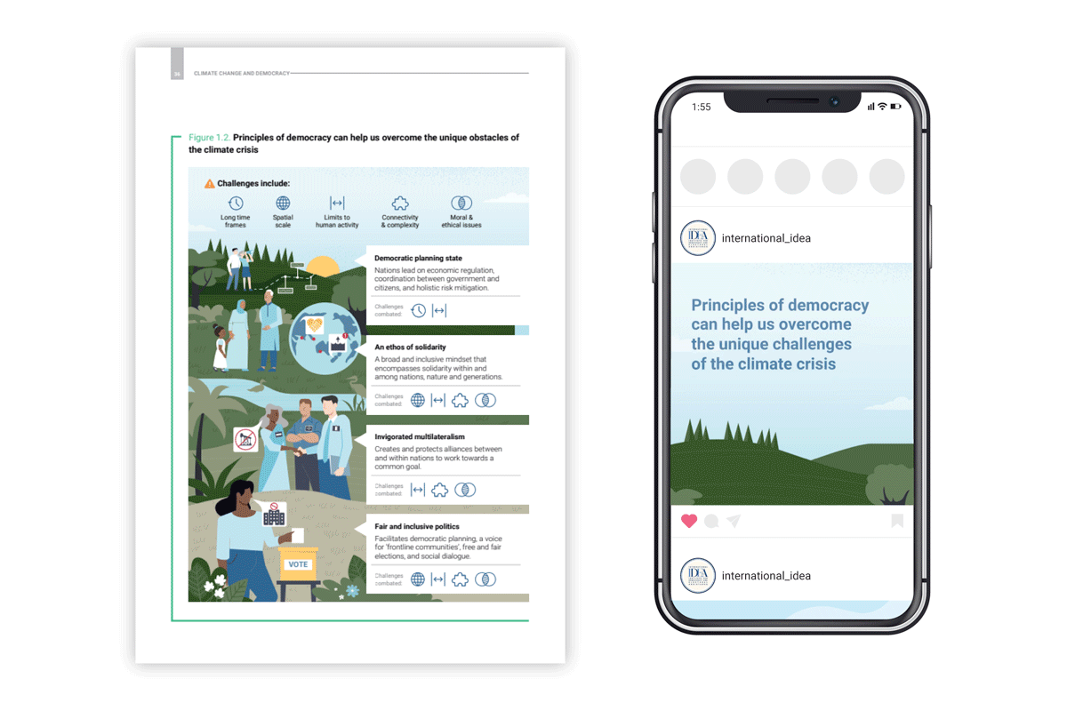
We were conscious of the needs of the audience (regional & international policymakers) when we designed the infographics summarizing findings of a report with the International Institute for Democracy and Electoral Assistance (IDEA).

Infographic of Climate Vulnerability Index for countries in Asia

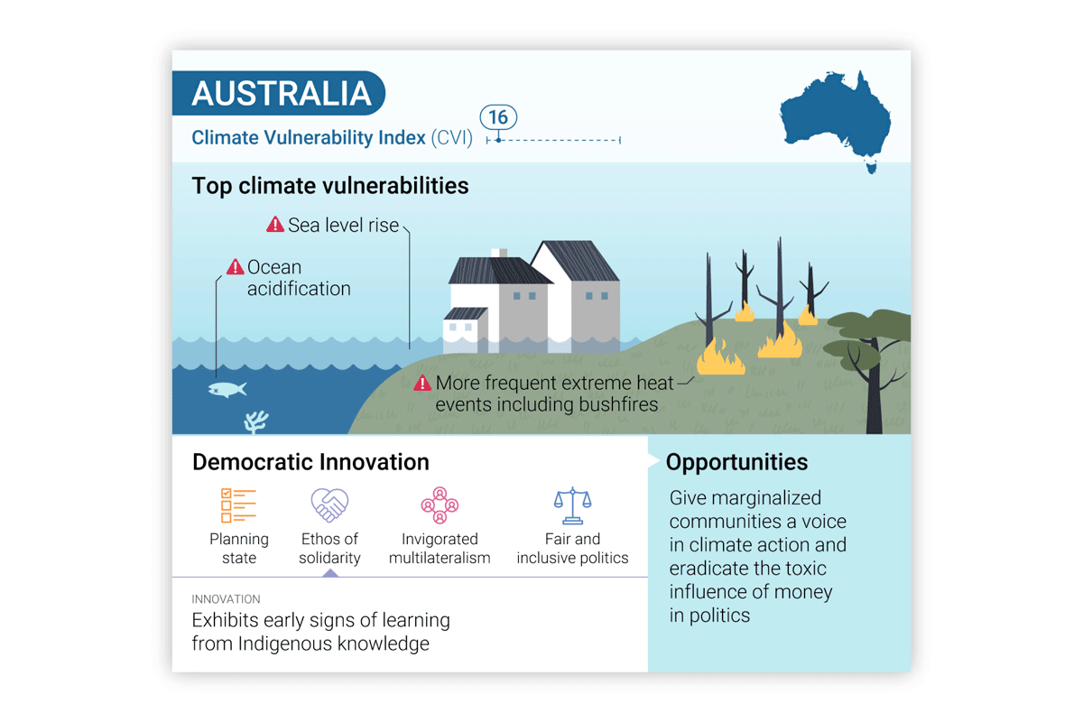
The series of infographics contain details on democratic innovation across 10 countries from the Asia and Pacific region and the audience needs both country-specific details as well as the ability to compare countries to one another. Our templated design facilitates this comparison and is structured so that data unavailable in some countries (due to the nuance of the information) doesn’t appear as a missing hole.

The infographics were developed so that a slight customization helps them work as both static graphics (for the report and presentations) as well as animated social media posts.

These 2 case studies demonstrate how –while it's impossible to design well for everyone– we can consciously design information and data to inform a variety of related audiances in an effective and budget-efficient manner. 

Recent Blog Posts

NASA climate legacies interactive tool to create climate generations

Create your Own Climate Generation Visual

Map your family's climate legacy We're excited that a UN Intergovernmental IPCC figure designed by our creative director has been adapted into a customizable digital...
Read More
BgStories_2023Wrapped_IntroVideo_6edited-ezgif.com-video-to-gif-converter

Happy 2024!

We're excited for another year of creating visuals people ‘get’ at a glance. Looking back at 2023, we’re really proud of the work we’ve done...
Read More

Path to a Successful Visual Story

A step-by-step guide to our collaborative process Visual storytelling is a powerful tool to help people understand and engage deeply with complex information. Whether developing...
Read More

The Power of Background Stories’ Visual Storytelling

Our visual storytelling makes an impact…and the science shows it. 

To better understand how people engage with a highly-visual infographic compared with a written fact sheet, we designed materials for an experiment done in collaboration with the Evidence-to-Impact Collaborative, using their SCOPE (Science Communication Optimizer for Policy Engagement) rapid-testing method.

“People who received the Background Stories infographic engaged more with the content across a number of meaningful metrics, suggesting they processed the information deeply and felt encouraged to learn more.”

- The Evidence-to-Impact Collaborative

With a sample size of 5,159 policymakers, half of recipients received an email directing them to an infographic designed by Background Stories and the other half received an email directing them to a text brief. Two weeks after the emails were sent, the Evidence-to-Impact Collaborative team analyzed how engagement compared.

Policymakers who received a Background Stories infographic were:

  • 16% more likely to open the email
  • 40% more likely to click the email link
  • 2.2x as likely to engage with the page
  • Half as likely to bounce from the page
  • Spent 60% more time on the page on average

Infographic created by Background Stories.

Written fact sheet.

Recent Blog Posts

NASA climate legacies interactive tool to create climate generations

Create your Own Climate Generation Visual

Map your family's climate legacy We're excited that a UN Intergovernmental IPCC figure designed by our creative director has been adapted into a customizable digital...
Read More
BgStories_2023Wrapped_IntroVideo_6edited-ezgif.com-video-to-gif-converter

Happy 2024!

We're excited for another year of creating visuals people ‘get’ at a glance. Looking back at 2023, we’re really proud of the work we’ve done...
Read More

Path to a Successful Visual Story

A step-by-step guide to our collaborative process Visual storytelling is a powerful tool to help people understand and engage deeply with complex information. Whether developing...
Read More

Data + Emotion = Memorable Messaging

Numbers are a useful way to quantify and understand the world around us. What numbers alone can’t do, however, is provide an emotional connection between the viewer and the data. To do this, we need to tell a story.

This spring, Background Stories worked with the St. Paul and Minnesota Foundation to create a series of mini-reports that highlight key data from the East Metro Pulse: a survey designed to reveal the strengths and challenges facing the residents in Dakota, Ramsey, and Washington Counties.

These reports integrated infographics, illustrations, and photographs to visualize not just the numbers of the survey results, but to also illustrate the people who contributed to the data and the places in which they live. Adding a human dimension to data connects viewers emotionally to the impact these numbers have, inspiring them to create change and address the numerically supported challenges that are revealed.

To help the St. Paul and Minnesota Foundation tie this storytelling together, our team created a series of motion graphics for social media use. The motion-based nature caught viewer attention and then encouraged them to visit the full reports online.

Recent Blog Posts

NASA climate legacies interactive tool to create climate generations

Create your Own Climate Generation Visual

Map your family's climate legacy We're excited that a UN Intergovernmental IPCC figure designed by our creative director has been adapted into a customizable digital...
Read More
BgStories_2023Wrapped_IntroVideo_6edited-ezgif.com-video-to-gif-converter

Happy 2024!

We're excited for another year of creating visuals people ‘get’ at a glance. Looking back at 2023, we’re really proud of the work we’ve done...
Read More

Path to a Successful Visual Story

A step-by-step guide to our collaborative process Visual storytelling is a powerful tool to help people understand and engage deeply with complex information. Whether developing...
Read More

Spotlight on Sustainable Forestry

Climate change has led many people and organization to explore how we can pull more carbon out of the atmosphere and store it (carbon sequestration). This carbon collection can happen in many forms, and growing plants are one key method for storing carbon. Plants use CO2 from the atmosphere to grow, and they release oxygen as their “waste product” - the opposite of animal metabolism. Carbon sequestration is more complex than just planting trees. Background Stories recently partnered with Dovetail Partners to visually show how humans can more effectively support carbon sequestration while also meeting human needs for forest products.

Carbon flows through an ongoing loop in forests: certain events cause carbon to be released, and other events cause carbon to be captured. This series of infographics captures the complex and dynamic nature of healthy forests.

Recent Blog Posts

NASA climate legacies interactive tool to create climate generations

Create your Own Climate Generation Visual

Map your family's climate legacy We're excited that a UN Intergovernmental IPCC figure designed by our creative director has been adapted into a customizable digital...
Read More
BgStories_2023Wrapped_IntroVideo_6edited-ezgif.com-video-to-gif-converter

Happy 2024!

We're excited for another year of creating visuals people ‘get’ at a glance. Looking back at 2023, we’re really proud of the work we’ve done...
Read More

Path to a Successful Visual Story

A step-by-step guide to our collaborative process Visual storytelling is a powerful tool to help people understand and engage deeply with complex information. Whether developing...
Read More
background image we created for the Minneapolis 2040 Comprehensive Plan

This Earth Day: Spotlighting Social Justice

Background Stories is known for our design work to visually communicate sustainability concepts.

When people think “sustainability,” environmental aspects often come to mind first.

Equity is a core part of sustainability and climate justice. So this Earth Day, we're spotlighting Social Justice. 

background image we created for the Minneapolis 2040 Comprehensive Plan

Our team is based in Minneapolis and surrounding areas. We're devastated by the loss of Black lives, and the systemic biases and inequities perpetuated against all BIPOC (Black, Indigenous, and People of Color) communities in Minnesota and around the world.

Unfortunately, inequity is nothing new for Minnesota. In work we did for the latest Minneapolis Comprehensive Plan, we highlighted some disturbing statistics on the region's status – in part due to a history of red-lining and racially restrictive housing policies.

image from design work we did for the Minneapolis 2040 Comprehensive Plan

In a profession that focuses on setting visual standards, we know we can help foster change. Here's how:

  • Represent diversity in the human figures we present in our visuals - particularly those representing positions of power. This includes race, gender, body types, and cultural characteristics.
  • Support and contribute to organizations that are furthering diversity, equity, and social justice initiatives.
  • Promote diversity in our own team.
  • Highlight the importance of empathy and community connections in the design process.
  • Apply behavior change strategies in our visual work – to increase impact.
  • Support each other as we continue to learn, advocate, and grow. 

We strive to add to this list, and we welcome your ideas!

Sketches that show Scenario

Process vs. Scenario Visuals

Beginning any infographic project, a big question is 'How do I make this information visual?’ Lucky for us, clues exist within the information itself. Once we determine what message we’re aiming to communicate to a specific audience, the form of the infographic begins to emerge.

Designers from all disciplines talk about ‘form follows function’. For infographics, visual form follows the content.

When working with narrative information (where we’re trying to explain something to the audience) there are two high-level visual structures that consistently re-occur: Processes and scenarios.

PROCESSES:


Sketches that show process

Processes include timelines and step-by-step flows of information. These can be visualized through any of the following sketches. A process has an entry/exit point (or points) and an order to the steps (at least some of them).

Examine your content and ask yourself:

  • Are we guiding the viewer through a series of steps?
  • Is the order of the elements important to the message we’re trying to communicate?

If so, you might have a visual process on your hands.  

Here's some examples of process-focused infographics:

SCENARIOS: 


Sketches that show Scenario

Scenario-based visual structures include maps (both geographic and conceptual), systems, networks, and lay-of-the-lands. These show how pieces of info relate to other pieces, and to whole contexts. Scenarios are often annotated to help viewers understand the components of the visual.

Examine your content and ask yourself:

  • Is it important that viewers understand the big-picture of this message?
  • Is the organization of the pieces of content important?
  • Would a zoom-in or zoom-out of the information be interesting?

If so, a visual that shows the scenario could be useful.

Here's some examples of some scenario-focused infographics:

COMBO:


Sketches that show a combo of process and scenario

Sometimes, a combination of these two approaches leads to the most engaging and educational visual. In these cases, typically one or the other approach becomes the most prominent. 

Keep in mind that the more visual approaches you combine, the more complex your infographic gets: and the more careful you have to be about using the principles of design. And that’s a topic for another time 🙂 

Here are some examples of the combination of Scenarios & Processes used together in infographics:

Audience First: Behavior Change and Values-Based Climate Communication

Connecting with audiences based on the values that are behind a desired activity/behavior can be more powerful than highlighting benefits to the audience. This values-driven approach has been shown to have more impact than ‘saving the environment’ or even ‘cost savings’ messages, according to the founder of Climate Outreach, George Marshall, who presented at Behavior, Energy and Climate Change conference (BECC). (See a synopsis of Arlene’s ‘Public Engagement through Art’ presentation on our previous newsletter.)


For example, instead of touting the cost-savings and environmental benefits of home insulation, consider:

“Your home is great. It’s where you bring up your family. It’s where you share some of the best moments of your life. You want to keep it cozy. Insulation is a good way to do that.”

This ‘audience first’ approach closely resembles ‘Start with Why’ and the design and communication processes that I use in practice, and with my students.

In our communication work, we orient every aspect of a message around the intended recipient: story structure, visual style, and language used. So, I can relate to focusing on an audience’s need.

Marshall’s presentation made the point that prioritizing the audiences’ values (even above the benefits of a product/service) throughout this messaging, can create impact on sustainability-related behavior change. 


Collaboration at the National Council for Science and the Environment Conference

“We need more multi-disciplinary… communication… social science… storytelling.” I was struck by the reoccurring mention of these terms while attending the National Council for Science and the Environment (NCSE) annual conference in Washington, D.C. in late January.

NCSE is a conference of scientists (primarily earth & physical scientists) who do highly specialized research related to environment and climate. At this year’s event, I presented as part of a MN-based symposium on “Artists as Partners in Infrastructure Education.” (More details on our symposium here.) It was refreshing to hear the desire for collaboration coming from both scientists and the worlds I inhabit — communication and creativity.

NCSE Conference

For research findings to be accepted and acted upon by communities, scientists and policymakers need to draw more personal ties between policies and how individuals interact with them. An important step in this is helping the public understand a bit more of the system (and the ‘why’) behind a particular policy. Because 65% of people are visual learners, and because graphics are an important method of showing complex systems, visuals are an excellent tool to help audiences relate to and connect with content. It’s why at science conferences, you’ll find me advocating for design, creativity and the arts. At design conferences, I’m the advocate for science, data and content!

Our symposium group hopes to continue the dialogue of how artists can contribute to the great work these scientists are already doing — and help give their findings a relevant and emotional hold on communities around the world.

– Arlene

Planning for Growth

Online engagement tool shapes the City’s future

The latest phase of our work with the City of Minneapolis launched this week: A new online, interactive engagement tool designed to involve residents in shaping the next 20 years of City development.

Minneapolis 2040

This visual story utilizes a scrolling technique called “parallax,” which creates a deeper, more immersive online experience. Visitors to the page will be introduced to City planning information in a new & fun way, and have the opportunity to leave feedback on the action items presented. Their comments will inform Minneapolis planners’ decision-making on future City policies.

Feedback collected during this phase of development will go into the City’s Comprehensive Plan, titled Minneapolis 2040. The plan will cover topics such as housing, job access, the design of new buildings, as well as how we use our streets — all in the name of smart, sustainable development.

Check out the live site at growth.minneapolis2040.com