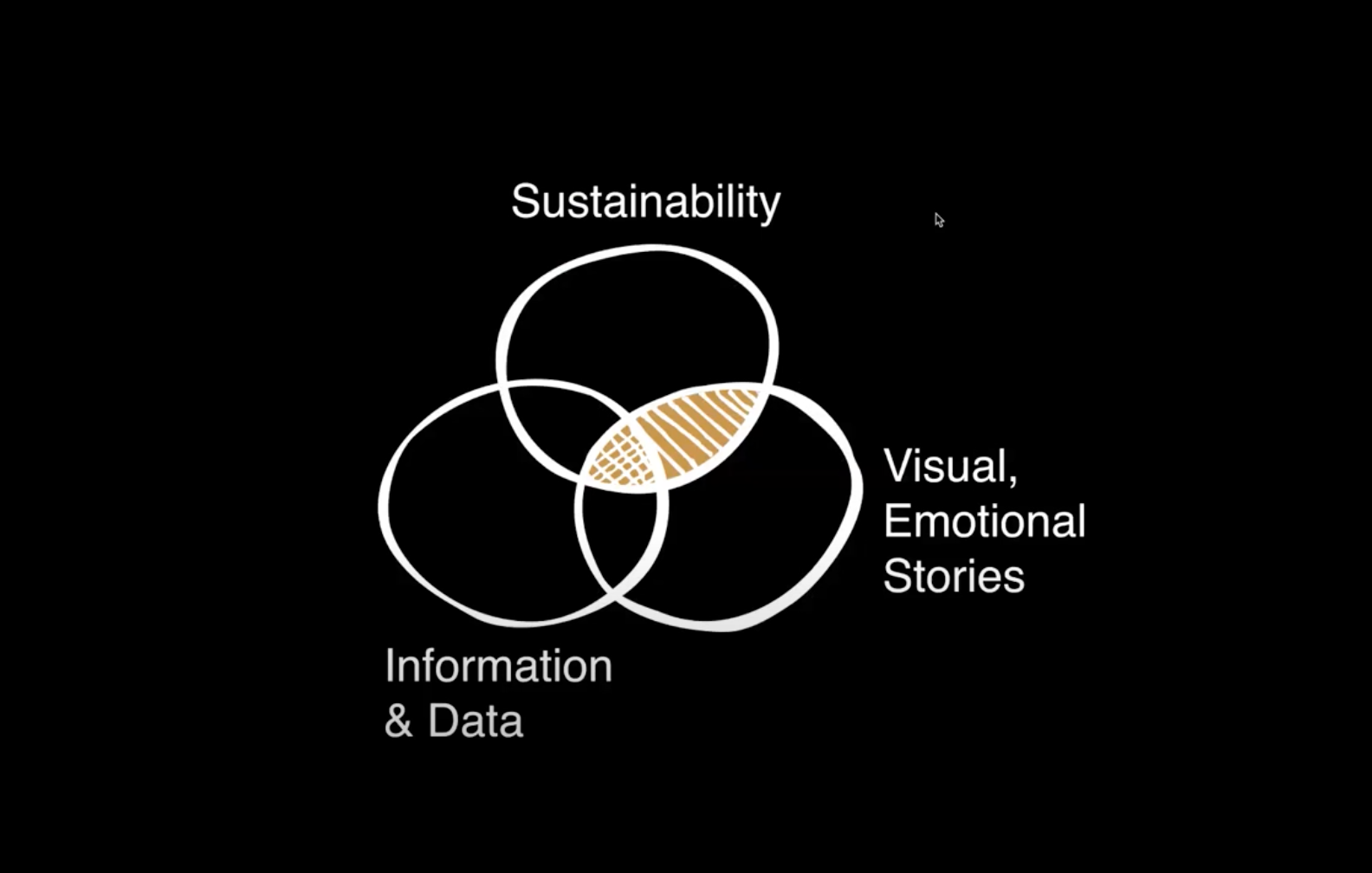
Notes From the GreenID Conference
Recently presenting at the International Institute of Information Design’s (IIID) GreenID conference in Vienna, I was struck by the phrase, “Context brings understanding.” As information designers, we seek to clarify complex information. And sustainability is certainly a topic area that involves a lot of complexities in communicating related social, ecological and financial attributes of a product or service.

My work focuses on developing ‘visual stories’ to help consumers understand how their individual actions play into the ‘big picture’ of sustainability. In my mind, it’s the communication of the context of sustainability that brings understanding to consumers.
To this aim, I presented research and techniques for communicating sustainability – gleaned through my work on narrative life cycles and with students at the Minneapolis College of Art and Design’s (MCAD) sustainability program. I aimed to demonstrate how a visually-compelling story can present complex sustainability data in an approachable, layered format that can act as a tool for consumer education.
The conference covered a wide variety of topics and projects related to the overlap of info design and sustainability. Three areas of interest for my work and the upcoming visual communication course at MCAD include techniques of designing for understanding, measuring impacts and questions on the effectiveness of info design in changing behavior.
Designing for Understanding:
When setting out to design information to aid in understanding, and to clarify context, there are a number of strategies to consider.
Presenter Angela Morelli, who has done a thorough analysis of the hidden water footprints embedded behind everyday foods and activities, made a case for emotional connection with an audience. She presented 4 guidelines for designing for understanding: utilize empathy, reference cognitive science, observe beauty and play on an audiences’ interest.
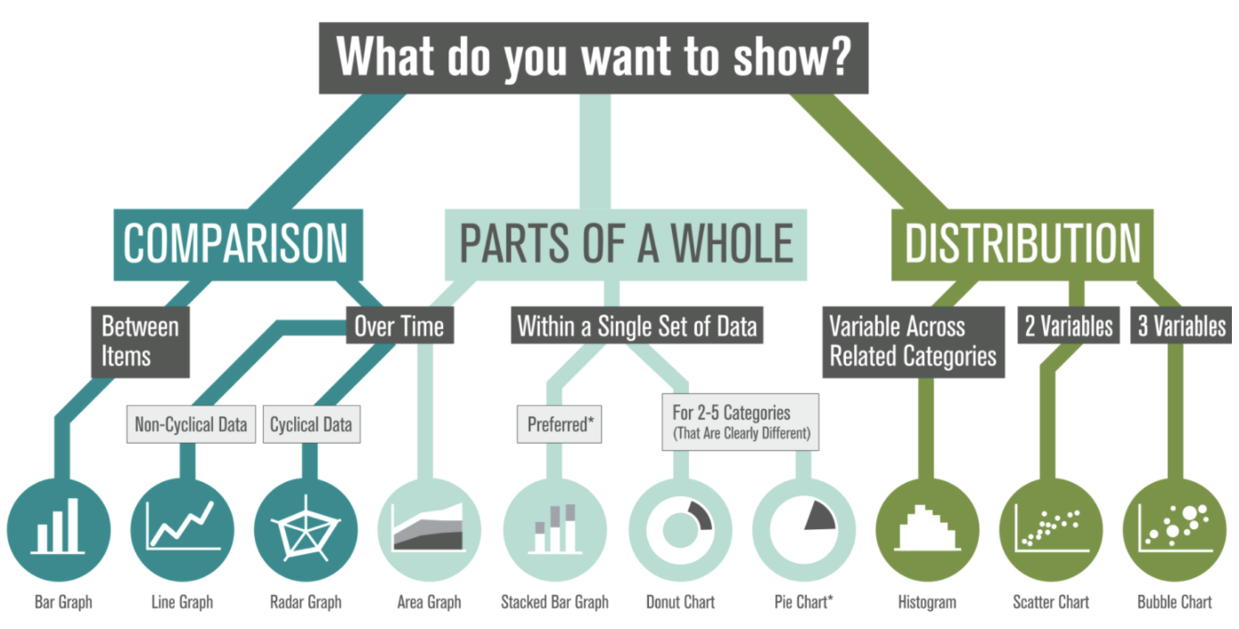
To design for understanding, one must first thoroughly understand the content of what is being designed. In a workshop Morelli gave on data visualization, she also outlined the steps to creating information design: first we ‘look,’ then ‘read,’ ‘organize’ information then ‘cut & paste’ it into a format which communicates a message to others. This process mirrored the 4 steps of visual thinking outlined in Dan Roam’s book, “Back of the Napkin”: first we ‘look’ to scan what’s in our vision. Then we ‘see’ to make sense of that which is visible, and then ‘imagine,’ to use our mind to guess that which is not visible. At this point we ‘show’ to share with others (this is the actual stage of creating a visual info design).
Measuring Our Impacts:
Discussion at the conference considered methods of measurement for each of the 3 legs of sustainability in order to visualize data in a holistically-balanced way.
Data obviously exists for financial measurement– all companies financial reports go into depth on this very important topic.
The ecological dimension is –relatively more recently- available through processes such as Life Cycle Analysis (LCA). In fact, my presentation showcased a variety of visual narrative approaches to information design, including examples from client work, creative practice and student work from a course I teach that concentrates on visualizing product life cycles and the more technical ecological measurements of sustainability known as Life Cycle Analysis (LCA).
However, defining measurement for the social component is much more slippery. (How exactly does one measure ‘happiness’?) As this field of ‘quality of life’ is based on qualitative research and varies based on cultural norms and individual expectations, it’s hard to make inclusive visualizations of the ‘social’ on-par with its financial and ecological counterparts.
Can Data Visualization Lead to Behavior Change?
Overwhelmingly, questions throughout conference discussion centered on ‘can visualization of information lead to behavior change?’ Fortunately, there was an environmental psychologist among the presenters to provide some guidelines for our research into this question. Dr. Karen Stanbridge of the University of Reading presented some theories to reference when designing for behavior change:
- Theory of Planned Behavior – (Ajzen & Fishbein, 1980)
- Stages of Change Model – (Prochaska & Diclemente, 1982)
- Theory of Social Dilemmas
These theories can act as a starting point for research into measuring the effectiveness of this emerging field of information design for the communication of sustainability.


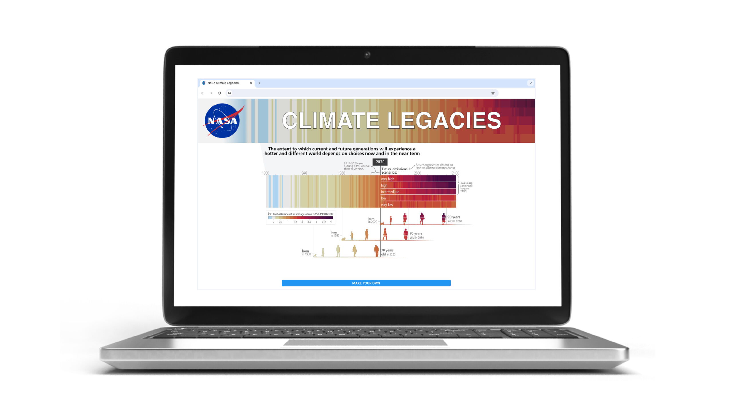
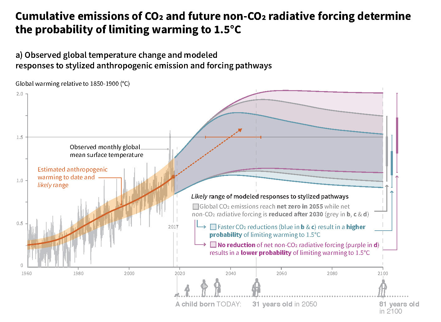
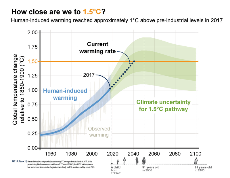 ABOVE: A visual human lifespan is added to contextualize a series of future dates.
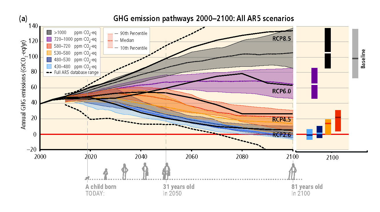
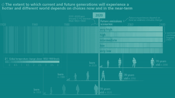