We're excited for another year of creating visuals people ‘get’ at a glance.
Looking back at 2023, we’re really proud of the work we’ve done — thanks to our amazing partners.
Recent Blog Posts
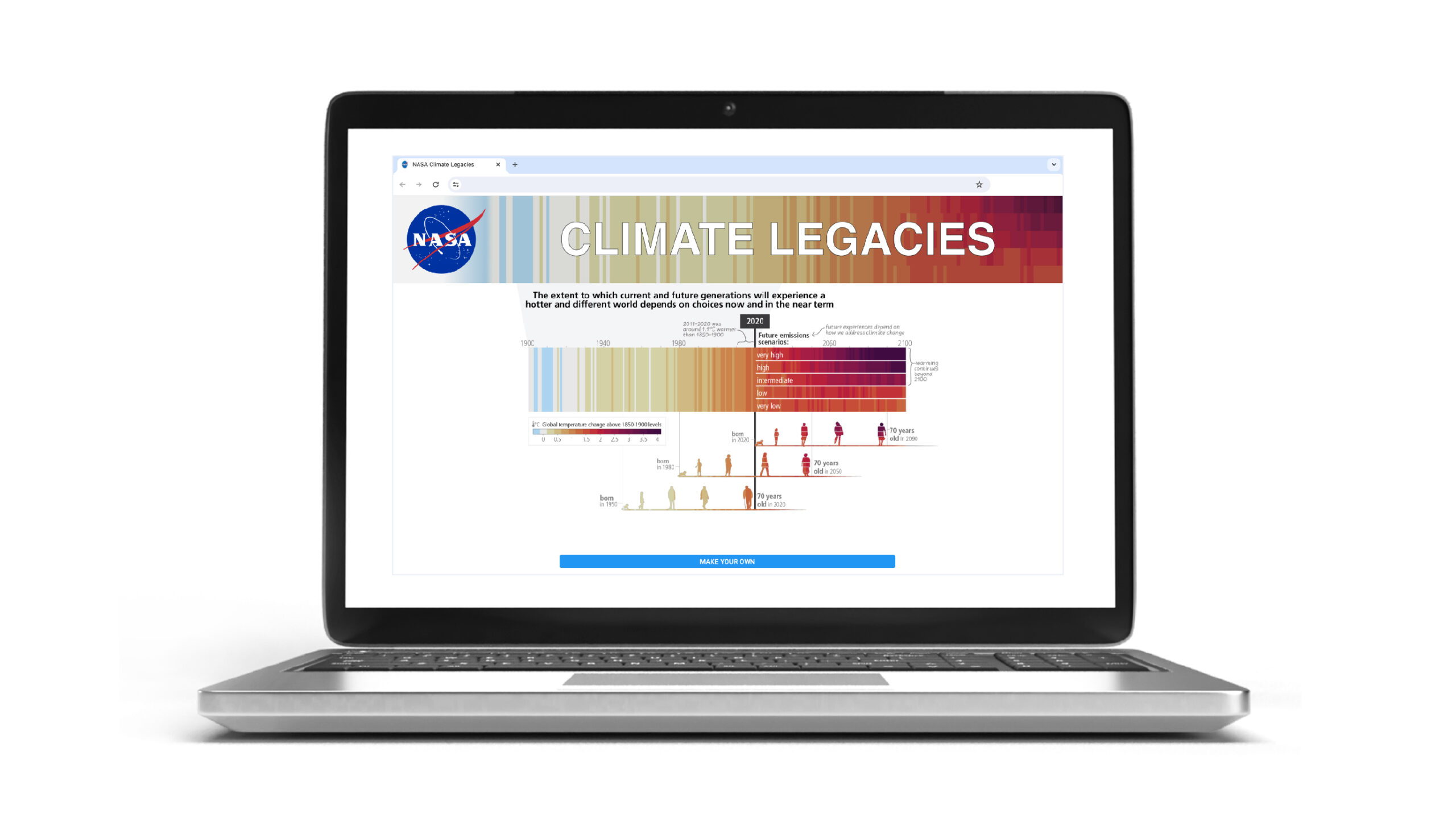
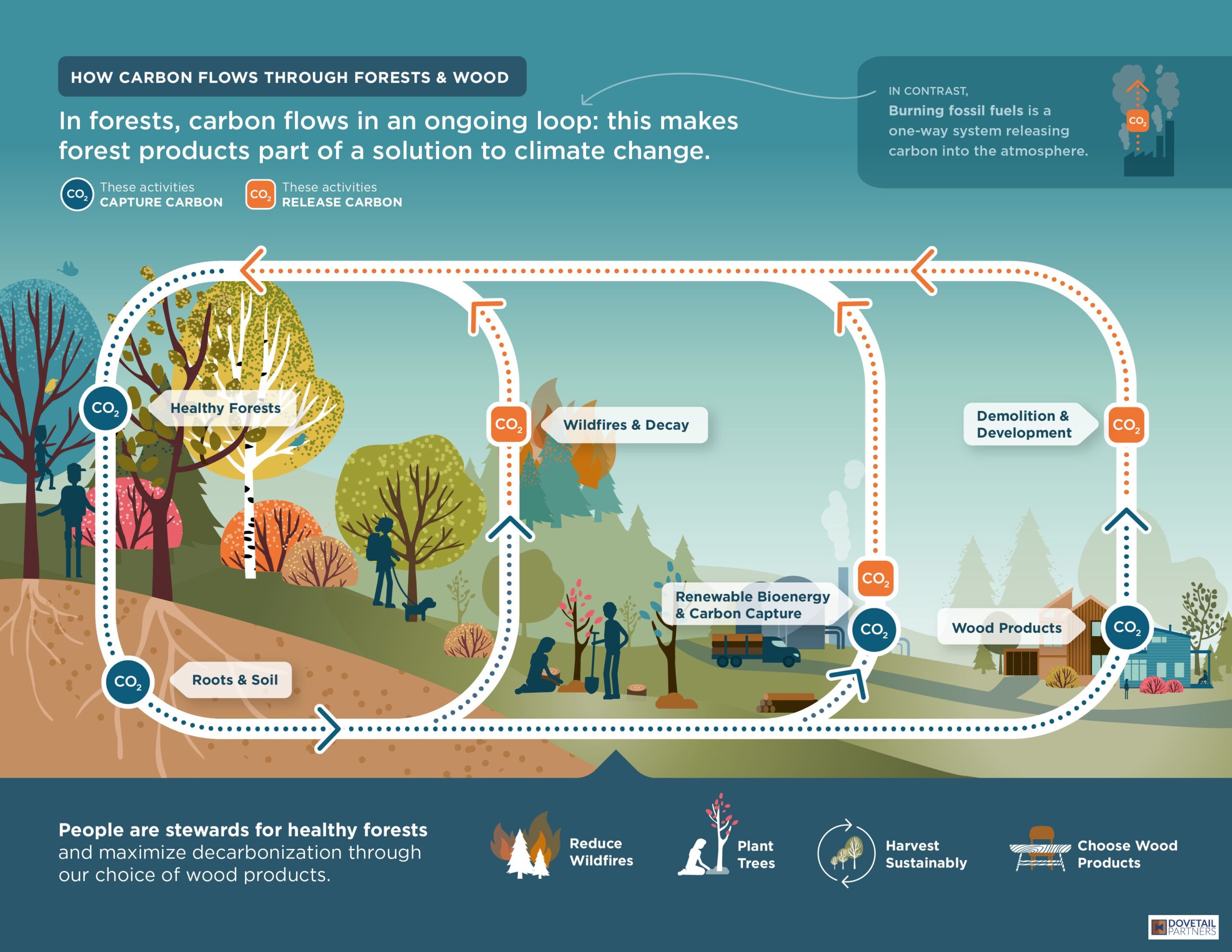
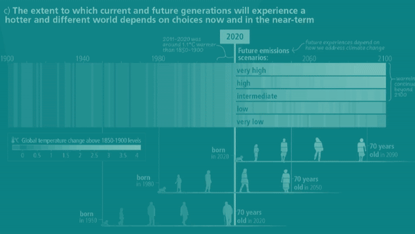
Map your family's climate legacy We're excited that a UN Intergovernmental IPCC figure designed by our creative director has been adapted into a customizable digital...
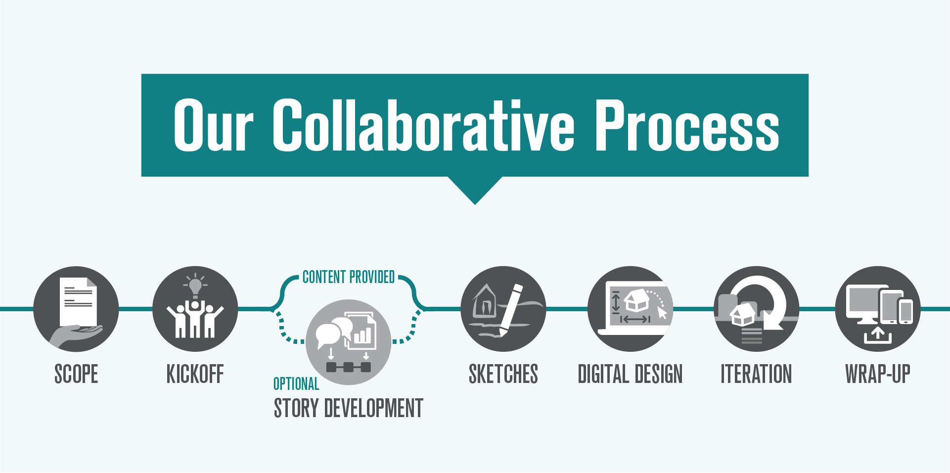
A step-by-step guide to our collaborative process Visual storytelling is a powerful tool to help people understand and engage deeply with complex information. Whether developing...
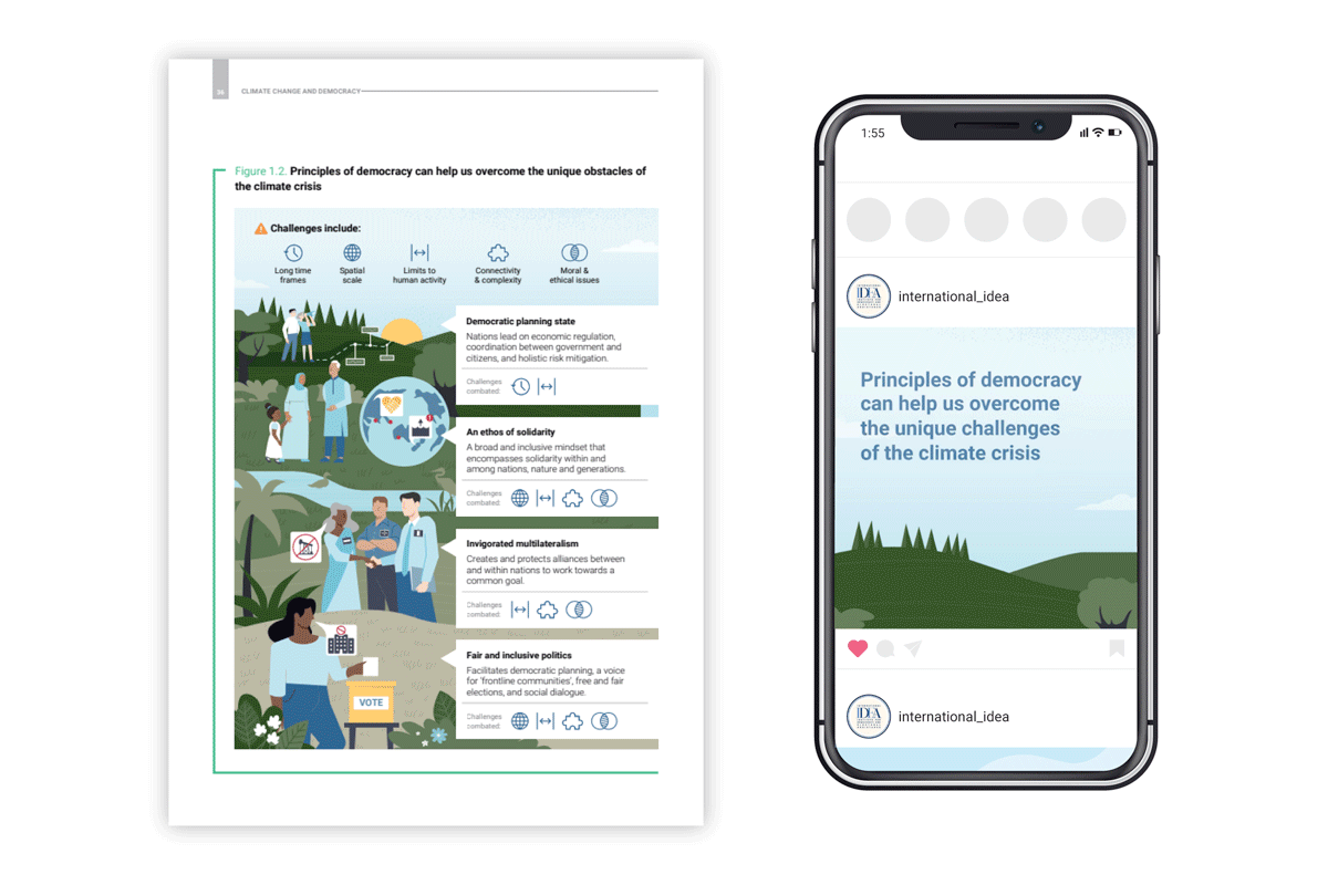
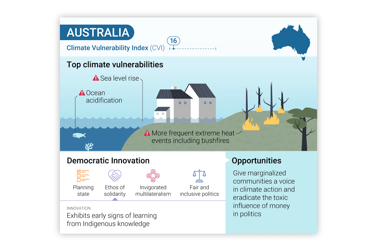
Our founder/creative director, Arlene Birt, collaborated with more than 60 scientists on data visualizations for the Intergovernmental Panel on Climate Change (IPCC) climate report. She...