
Our visual storytelling makes an impact…and the science shows it.
To better understand how people engage with a highly-visual infographic compared with a written fact sheet, we designed materials for an experiment done in collaboration with the Evidence-to-Impact Collaborative, using their SCOPE (Science Communication Optimizer for Policy Engagement) rapid-testing method.
“People who received the Background Stories infographic engaged more with the content across a number of meaningful metrics, suggesting they processed the information deeply and felt encouraged to learn more.”
- The Evidence-to-Impact Collaborative


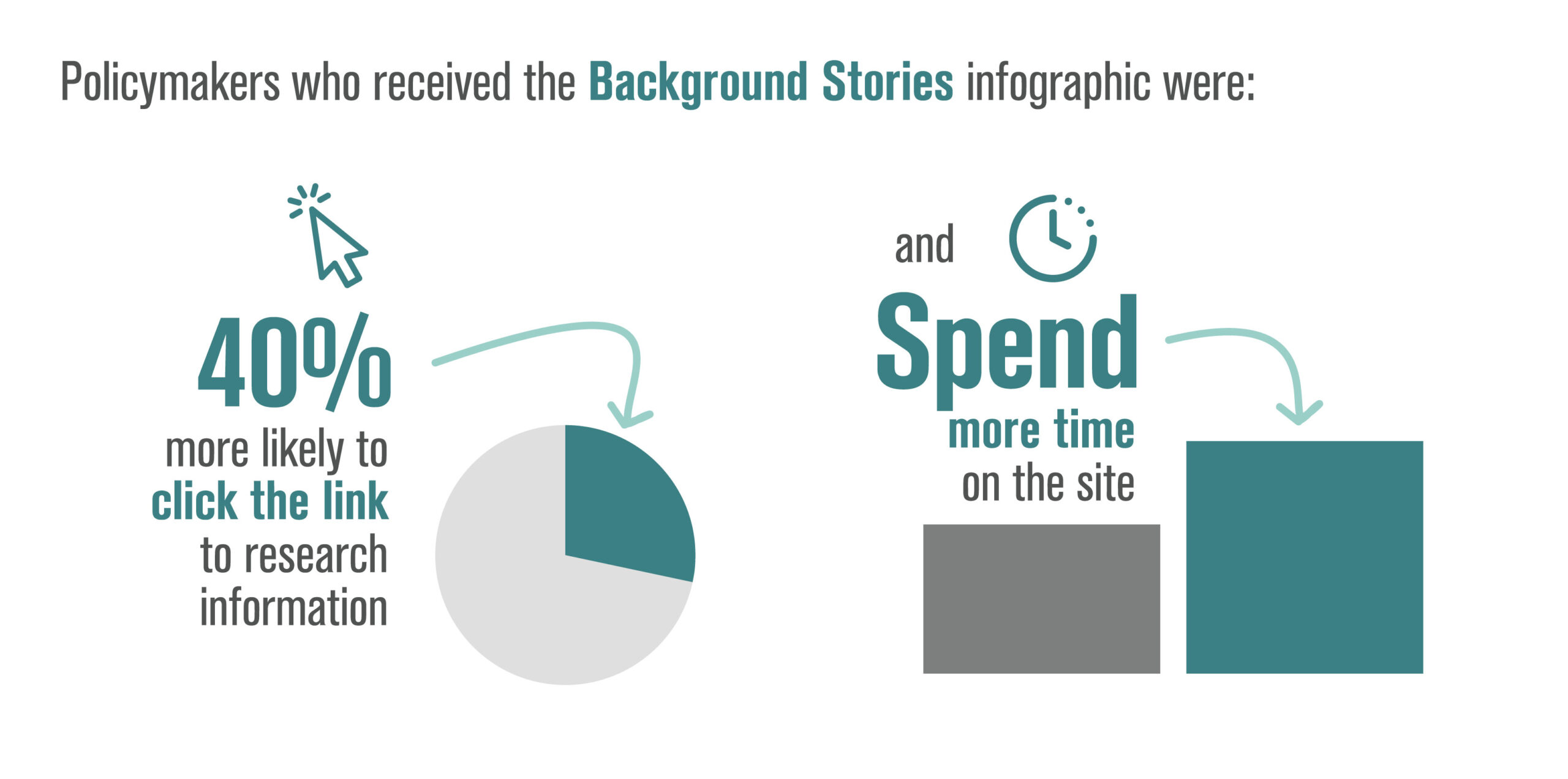
With a sample size of 5,159 policymakers, half of recipients received an email directing them to an infographic designed by Background Stories and the other half received an email directing them to a text brief. Two weeks after the emails were sent, the Evidence-to-Impact Collaborative team analyzed how engagement compared.
Policymakers who received a Background Stories infographic were:
- 16% more likely to open the email
- 40% more likely to click the email link
- 2.2x as likely to engage with the page
- Half as likely to bounce from the page
- Spent 60% more time on the page on average

Infographic created by Background Stories.

Written fact sheet.
Recent Blog Posts
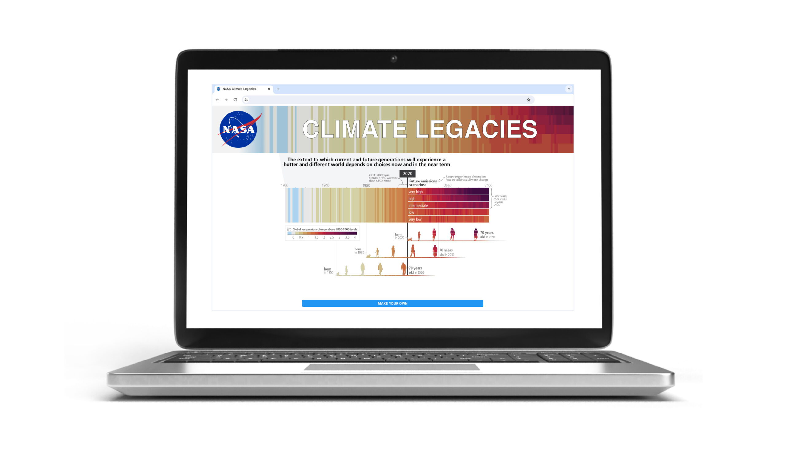
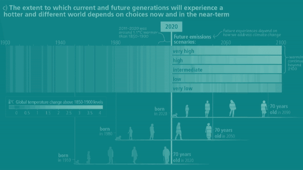
Map your family's climate legacy We're excited that a UN Intergovernmental IPCC figure designed by our creative director has been adapted into a customizable digital...
We're excited for another year of creating visuals people ‘get’ at a glance. Looking back at 2023, we’re really proud of the work we’ve done...
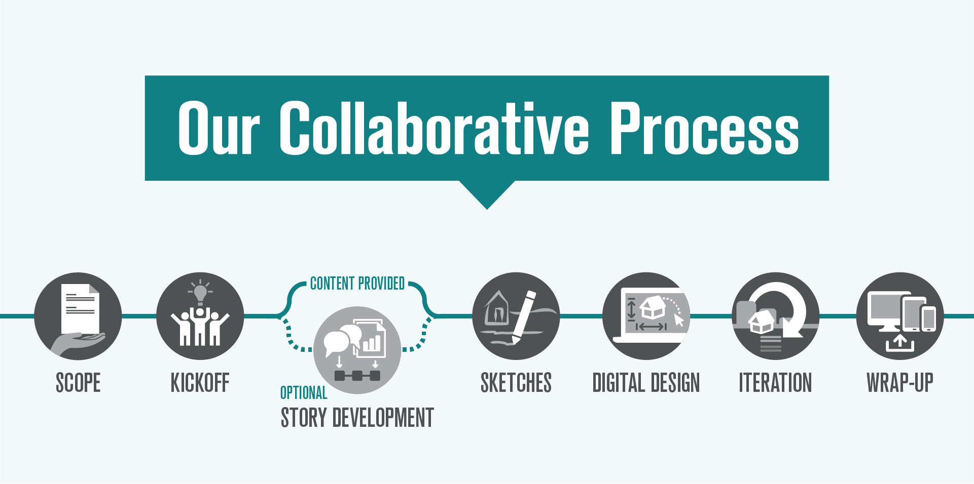
A step-by-step guide to our collaborative process Visual storytelling is a powerful tool to help people understand and engage deeply with complex information. Whether developing...