Balancing Science and Story

Effectively communicating sustainability across sectors

What do European climate scientists, Midwest U.S. organic farmers, and small arts organizations have in common? They all have a huge amount of data (or potential for it) and battle with balancing science and more personal, emotional messages in their communications.

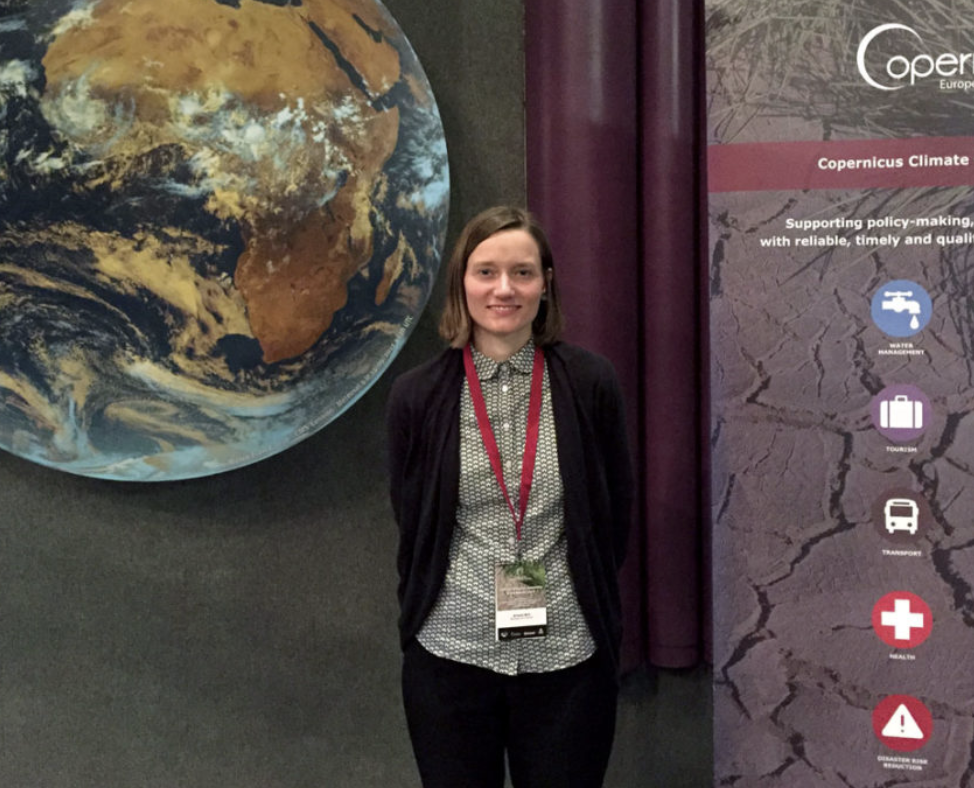
In the past few months, I’ve presented to scientists at the Copernicus Climate Change Service general assembly in Europe, to organic farmers at the Midwest Organic Farming Conference (MOSES), and to artists and arts organizations as a panelist at Data for Art.

Copernicus Climate Change Service
Arlene at Copernicus Climate Change Service General Assembly

In order help audiences grasp the very complex scenarios involved in each of these industries, we have to both produce solid, objective research about these subjects and provide more subjective entry points into the information. Our goal: Help non-experts grasp the concepts and navigate the content. These entry points should show how the data can be understood from a variety of different perspectives, and aim to tell stories with the data. Visual stories reach audiences and help people connect with these complex concepts.

We have to improve how we communicate this important information, so that our audiences — policymakers, stakeholders, businesses, consumers, and citizens — can more fully engage and ultimately take action. Because if people can’t grasp the information, they default to ‘Business as Usual’: they ignore the information and do nothing (and that won’t help our planet one bit!). We can do better, and when audiences are more engaged, our organizations benefit and so does our common cause. — AB

‘Emotional’ Sustainability for a Post-Truth World

Visual storytelling reveals context and appeals to our individual beliefs

Riding the tails of Brexit and the U.S. presidential election, Oxford Dictionaries has selected “post-truth” as 2016’s international word of the year.

Emotional Appeal
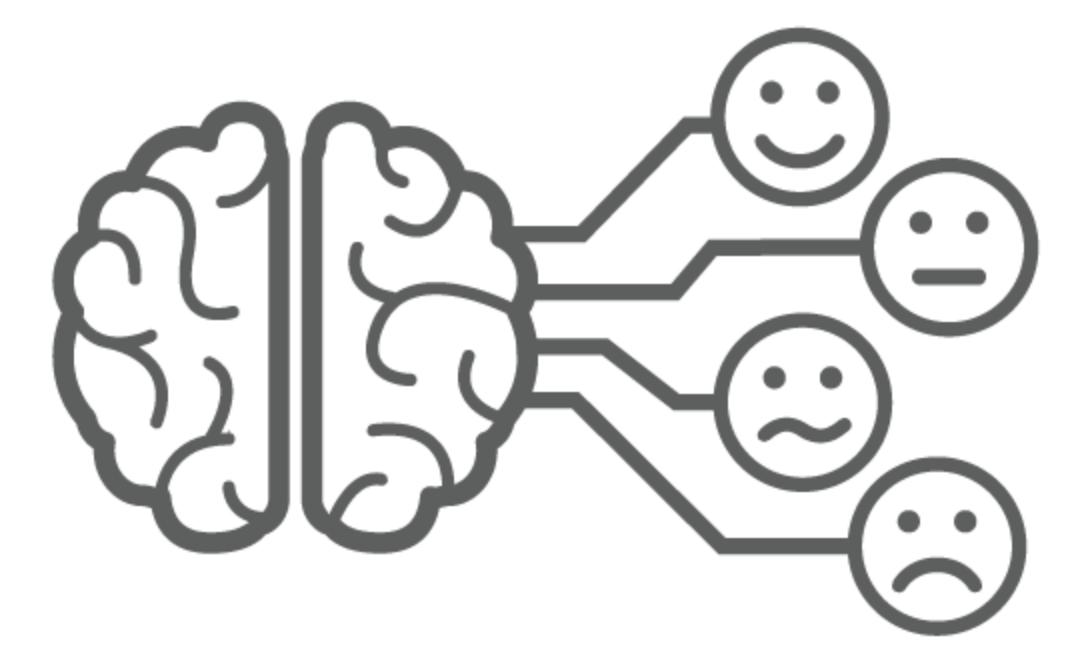
It’s not hard to believe, given the events of the past year, to see how people do not make decisions based purely on fact. Appeals to our personal beliefs and emotional centers are important. Data alone does not influence decisions. To a large portion of society, facts simply do not matter.

Feelings matter. Connection matters.
I can spout off statistics and information, but unless you — my audience — feel connected to it, it won’t make a difference. The author of ‘How to Convince Someone When Facts Fail’ also describes the mental stress that we endure when we hold two conflicting beliefs at the same time (a.k.aCognitive Dissonance). He acknowledges the need for a calm discussion when presenting new information — and new facts — to an individual with a strong pre-determined worldview. So what are some ways visual communication can help make sustainability information appeal to our emotions, and allow us to gradually open our minds to new information?

Here are a few key points and resources: 

Show & Tell Data as a Story
Numbers, by themselves, are not generally very welcoming. Deciphering numbers and comparisons requires a lot of effort and time — particularly given that 65% of the population are visual learners (Mind Tools, 1998). Icons and illustrations can provide context for the numbers. Diagrams can show how a set of data flows over time.

Use Visuals that Connect to Individuals
This research shows how people interpret visual images of climate change. The report finds, for example, that protest images do not resonate, however images of real people taking action in a local context do resonate.

Communicate the Context of your Social or Environmental Goal
Show individuals how bigger picture climate consequences will impact their personal lives. This can mean mapping out the narrative in a visual infographic or developing a diagram to walk audiences through how a larger goal is connected to individuals and their families.

The [Unequal] Power of Images

When to use a photo vs. an icon

There are many style options available when it comes to communicating information visually. Photos excel at evoking emotion in individual scenarios, when the photograph literally represents what is being communicated.

Photograph of a tree Icon of a tree

Icon-focused infographics tend to group information on a more broad level: reflecting general patterns and information rather than specific, individual – and quite often emotional – experiences.

Consider this example: This tree photo points to a very specific situation and can evoke memories. Maybe it reminds you of one that you played under growing up. Alternatively, perhaps the species of tree on this rolling, green landscape looks nothing like where you live. That makes it harder to relate to.

An icon, on the other hand, is more versatile. The icon evokes the idea of ‘tree’ regardless of your own memories. It is perceived more generally as ‘tree’ rather than ‘deciduous tree’ or ‘kinda-like-our-climbing-tree’.


In short: 

  • Use a photo for specific circumstances, details, case studies and people
  • Use an icon for general concepts, broad mapping, global systems and universal ideas.

Case studies are a great place to use photographs because they need to communicate details of a specific story. When the desire is to communicate a more global, standardized concept or structure, icons are generally a better choice. The 2 approaches can certainly be combined in a well-thought-out visual.

Visualizing Complex Systems

The way the world works as a complex science. 

Most of what I do is related to communicating complexity: helping audiences understand systems to locate themselves within sustainability solutions. Complexity science is a field that was recently brought to my attention. In sustainability, we’re familiar with systems thinking and the complexity of the human interactions between society, the environment and economics.

According to complexity.ecs.soton.ac.uk

“Complexity science is the scientific study of complex systems, systems with many parts that interact to produce global behaviour that cannot easily be explained in terms of interactions between the individual constituent elements.”

Complexity science is an interesting lens through which to consider the intricate systems behind sustainable design solutions  – natural, technological and social.

MEDEA Talk on ‘Visualizing Sustainability’

Arlene Birt presenting at MEDEA in Malmö, Sweden on Dec.10 (15:00-17:00 Central European time).

Arlene will present two projects that she’s done as artist-in-residence at MEDEA and a behind-the-scenes view on her work on how to visualize ‘background stories’. One project is a visual mapping of the sustainability-oriented systems at work within the Västra Hamnen area of the city through a collaboration with Unsworn Industries to show this information using the parascope technology they’ve developed. Another project visually communicates the benefits of bicycling – in terms of CO2 saved, money saved and calories burned.

Details on the talk here. There will also be a live-stream of the talk.

Artist Residency to Visualize Impacts in Malmö, Sweden

Arlene has begun an artist residency at interactive center for new media MEDEA, where she will develop work to visualize the impacts/benefits of bicycling for the Västra Hamnen area of Malmö in order to encourage and celebrate a culture of bicycling.

More on the progress of the project, which will run Oct-Dec 2010, is posted on the MEDEA site.

sketch of visualizing sustainaiblity in bicycling

WORK-IN-PROGRESS

Chipotle Veggs Out Locally

Food retailer Chipotle has an online animated map showing the locality and seasonality of produce used in their menu items.

Though buried at the bottom of the page (click ‘integrity’, then scroll down), the graphic is a good educational tool: teaching about seasonality in produce.

From the perspective of informational design, it would be great to see it containing more specific data (rather than just being a visual description): I’d like to see what % of the onion used in Midwestern stores is local in the winter.

Regardless, it’s a good place to start communicating sustainability to consumers.

Seasonal Local Vegetables
SEASONAL LOCAL VEGETABLES ANIMATION

Cell Size Comparison

This nifty flash tool from the University of Utah’s Genetic’s lab lets viewers zoom into an image to experience the size of increasingly small cells relative to each other. Such an interactive and immersive experience helps people understand more about the world around them – the very, very small world.

Zooming into increasingly small size comparison of cells.

A useful application based on some of the same principles behind the Eames’ Powers of 10.

Sourcemap for product ingredients

Sourcemap, developed by an MIT-based team, uses Google Earth to map the origins of materials in products. A view inside the open-source application also showcases each ingredient’s carbon footprint – which I hope is an indication that it is only a matter of time until tools like this will expand to highlight other Life-Cycle Analysis data.

Computer components as mapped by a Sourcemap user.

This tool does a great job communicating that ‘ingredients’ in our products are connected to the world around us. As a next step, it would be great to show the carbon impacts in terms that are relevant to consumers – ‘showing’ what the quantity means rather than just stating the number. And to tell more of a story to help consumers frame these big-picture ideas within their everyday experience.