Communication Design Recognized in Back-Story-Telling Project

For the first time, the prestigious INDEX Design Award has a winner from the field of communication design. ‘PIG 05049’ is a primarily-visual book, designed and conceived by Christien Meindertsma, that traces all the products made from one pig.

Visual spread from the book 'Pig 05049'
Visual spread from the book

Meindertsma’s intent for the project:

Help people in a highly mechanized and “packaged” world understand how things are made and where they come from so that the resources involved can be cared for by enlightened, informed people.

It’s nice to see the role of communication design to build awareness being recognized within the design community.

Read a previous entry on Meindertsma’s project here.

Frowning Utility Bills

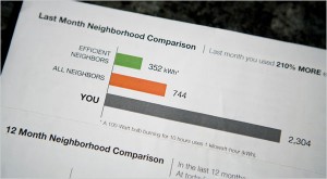
A utility company is literally establishing an emotional connection with the audience: via smiley or frowning faces on their utility bills.

Visual Comparison, photo by Max Whittaker for The New York Times

A New York Times article reports how a Sacramento utility is inspiring residents to lower their energy usage by providing them visual feedback on their utility bills…and it doesn’t hurt that the bill compares them with their neighbors. A little competition can go a long way – it puts people’s own actions in context to their peers.

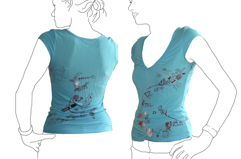
T shirt tells its own life cycle.

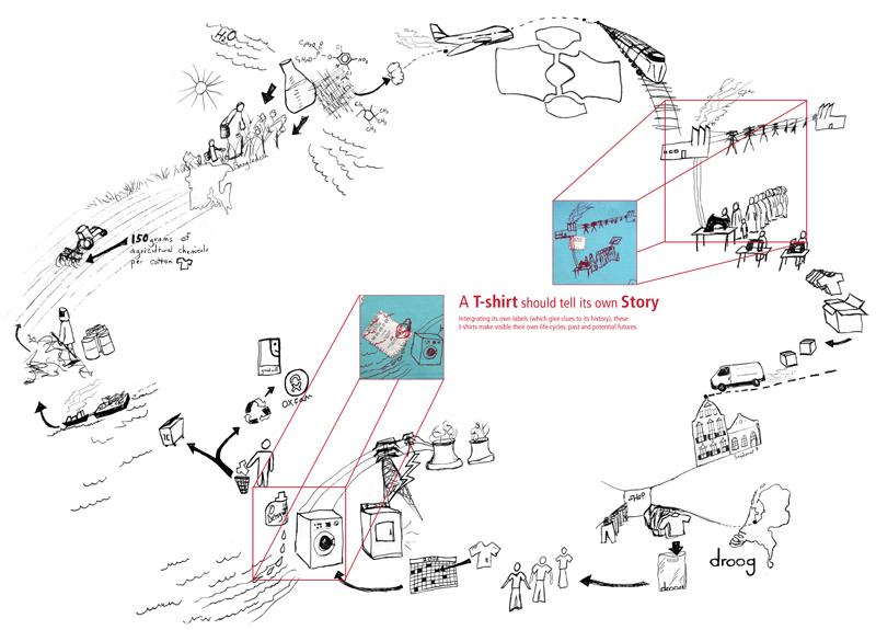
Tshirt printed with it\'s own life cycleLife cycle of a T-shirt: Droog Design

This t-shirt tells its own back story: the t-shirt tags are cut from the inside and stitched into the screenprint graphic of an imagined life of the product. The shirt was put into production in 2006 by Droog Design.

This is a more illustrative, conceptual version of a background story – less data based. The graphic is customized based on available information at the time (this includes where the cotton comes from, and where the t-shirt is sold). More quantitative figures on distance and carbon footprint could be input with the right data available.

Electricity Loses Its Way Home

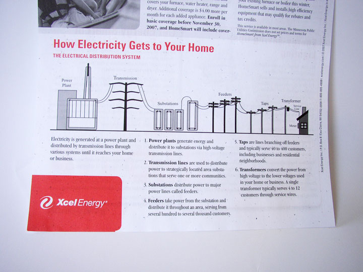
How Electricity Gets to Your Home

How Electricity Gets to Your Home. Context is everything. Without a direct connection with the interests of the intended audience, any information graphic – no matter how well-rendered – will fall flat.

This graphic came with a newsletter that my electric company sends out. But they missed the boat: What do I, as a consumer of electricity, care about “feeders” or “taps”? Though not a bad representation, this graphic feels more like it belongs in an introductory text book for engineers. If the graphic were to explain itself (such as why “taps” are important) and include interesting factoids, I would be glad for the mini education session.

Graphics like these, if splattered with relevant information, offer an interesting insight into the world of electric power. But it’s a fine line between providing superfluous information, and providing information that’s relevant an inspiring for a particular audience.

Icy “ICE” sign

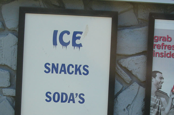
Ice for sale sign

The “ICE” on this sign gives visual cues to the effect of the product itself.

Where the viewer may have understand what “SNACKS” and “SODA’S” mean, they will feel the meaning of “ICE”. This technique can also aid in understanding for low-literacy audiences.

Strawberry Yogurt Sketch

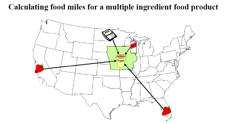
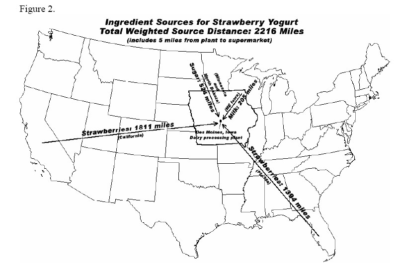
Iowa Strawberry Yogurt IngredientsDistances of Strawberry Yogurt Ingredients

This pair of straight-forward graphics appear on separate pages of “Calculating food miles for a multiple ingredient food product” – a white paper from Iowa State University’s Leopold Center.

The graphics show where the ingredients of a specific Strawberry Yogurt have come from.

The first graphic is more visual, and thereby more enticing at first glance, but it does not convey the useful information of the 2nd graphic. The first graphic could be expanded to incorporate the detail of the second graphic: exactly how far each ingredient has traveled. And it could be further expanded to specify which method of travel (plane, train, truck, etc.), and with what carbon footprint.

A more detailed report (including stats on this yogurt’s Life-Cycle Assessment [LCA]) accompanies these graphic. Source: http://www.leopold.iastate.edu/pubs/staff/files/foodmiles_030305.pdf

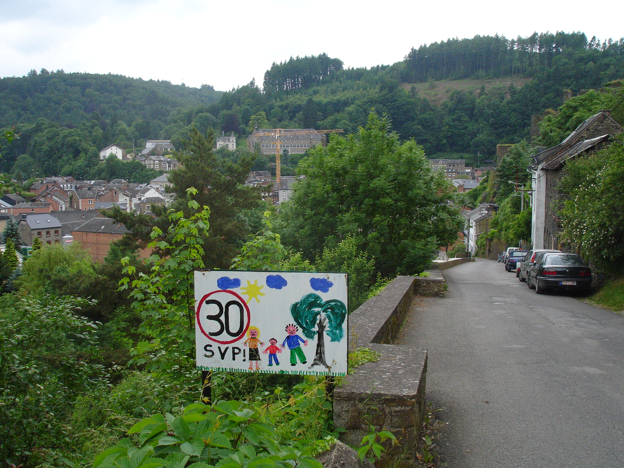
Slow down for the children

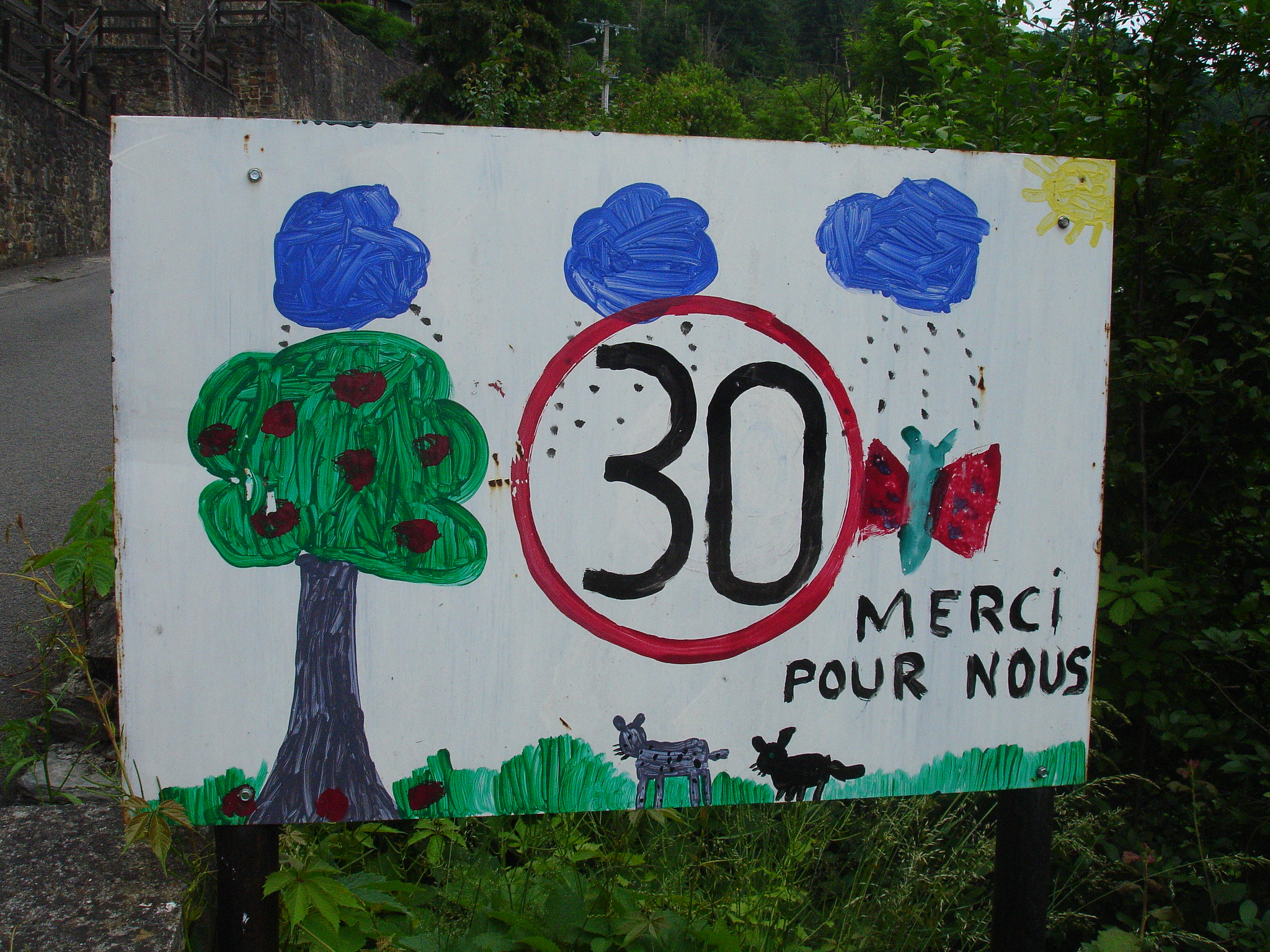
30km/hour Thanks. It\'s for us. 30km/hour Please!

We came upon several of child-designed ‘slow down’ in a neighborhood area of this picturesque Southern Belgian village.

Not only do these signs get you to slow down to enjoy the art, they also are strong reminders of the reason one should reduce speed:as one sign distinctly puts it “for us”.

The circled ’30’ (the European symbol for speed limit) is consistent on sign. Painted on the white board surrounding this ‘slow down’ symbol are the happy indications of childhood in the area: sunshine, trees, swings, families, dogs, cats, and a myriad of other animals. Personalized, these tell the story of neighborhood life from kid-view.

Such a request for speed reduction is more effective and easier to obey when it comes direct from the pint-sized residents of the street than from the typical sterile government-issued signs. These factory-stamped signs only serve to remind a driver that there are staunch rules to conform to. Sure, the objective of each style of sign is the same, but by including an indication of the reason ‘why’ behind a request for conformity, drivers are more likely to adopt the concept as their own and ride the breaks.

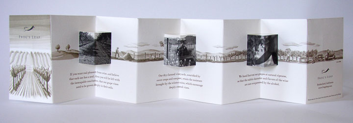
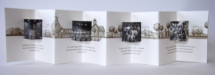
Illustrated Story of Wine

Story of wine at a vineyard - frontStory of wine at a specific vineyard - back

This accordion-fold brochure from a vineyard pulls the viewer through the story a bottle of wine from planting to enjoying – in 3 parallel formats: written storyline, photographs and a background illustration which ties the piece together. As a viewer, I’m right there walking with the grapes as they pass from farm to glass. Definitely more of a marketing piece than data-driven information design, but the brochure makes creative use of folding and visual design elements to evoke an emotional response.