Planning for Growth

Online engagement tool shapes the City’s future

The latest phase of our work with the City of Minneapolis launched this week: A new online, interactive engagement tool designed to involve residents in shaping the next 20 years of City development.

Minneapolis 2040

This visual story utilizes a scrolling technique called “parallax,” which creates a deeper, more immersive online experience. Visitors to the page will be introduced to City planning information in a new & fun way, and have the opportunity to leave feedback on the action items presented. Their comments will inform Minneapolis planners’ decision-making on future City policies.

Feedback collected during this phase of development will go into the City’s Comprehensive Plan, titled Minneapolis 2040. The plan will cover topics such as housing, job access, the design of new buildings, as well as how we use our streets — all in the name of smart, sustainable development.

Check out the live site at growth.minneapolis2040.com

Balancing Science and Story

Effectively communicating sustainability across sectors

What do European climate scientists, Midwest U.S. organic farmers, and small arts organizations have in common? They all have a huge amount of data (or potential for it) and battle with balancing science and more personal, emotional messages in their communications.

In the past few months, I’ve presented to scientists at the Copernicus Climate Change Service general assembly in Europe, to organic farmers at the Midwest Organic Farming Conference (MOSES), and to artists and arts organizations as a panelist at Data for Art.

Copernicus Climate Change Service
Arlene at Copernicus Climate Change Service General Assembly

In order help audiences grasp the very complex scenarios involved in each of these industries, we have to both produce solid, objective research about these subjects and provide more subjective entry points into the information. Our goal: Help non-experts grasp the concepts and navigate the content. These entry points should show how the data can be understood from a variety of different perspectives, and aim to tell stories with the data. Visual stories reach audiences and help people connect with these complex concepts.

We have to improve how we communicate this important information, so that our audiences — policymakers, stakeholders, businesses, consumers, and citizens — can more fully engage and ultimately take action. Because if people can’t grasp the information, they default to ‘Business as Usual’: they ignore the information and do nothing (and that won’t help our planet one bit!). We can do better, and when audiences are more engaged, our organizations benefit and so does our common cause. — AB

‘Emotional’ Sustainability for a Post-Truth World

Visual storytelling reveals context and appeals to our individual beliefs

Riding the tails of Brexit and the U.S. presidential election, Oxford Dictionaries has selected “post-truth” as 2016’s international word of the year.

Emotional AppealIt’s not hard to believe, given the events of the past year, to see how people do not make decisions based purely on fact. Appeals to our personal beliefs and emotional centers are important. Data alone does not influence decisions. To a large portion of society, facts simply do not matter.

Feelings matter. Connection matters.
I can spout off statistics and information, but unless you — my audience — feel connected to it, it won’t make a difference. The author of ‘How to Convince Someone When Facts Fail’ also describes the mental stress that we endure when we hold two conflicting beliefs at the same time (a.k.aCognitive Dissonance). He acknowledges the need for a calm discussion when presenting new information — and new facts — to an individual with a strong pre-determined worldview. So what are some ways visual communication can help make sustainability information appeal to our emotions, and allow us to gradually open our minds to new information?

Here are a few key points and resources: 

Show & Tell Data as a Story
Numbers, by themselves, are not generally very welcoming. Deciphering numbers and comparisons requires a lot of effort and time — particularly given that 65% of the population are visual learners (Mind Tools, 1998). Icons and illustrations can provide context for the numbers. Diagrams can show how a set of data flows over time.

Use Visuals that Connect to Individuals
This research shows how people interpret visual images of climate change. The report finds, for example, that protest images do not resonate, however images of real people taking action in a local context do resonate.

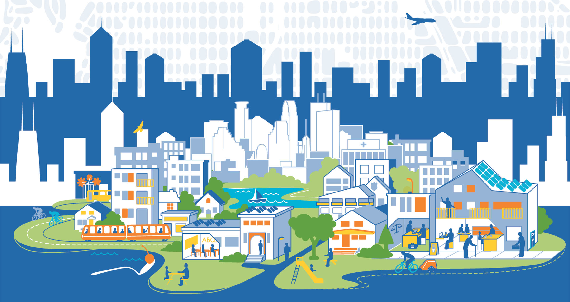
Communicate the Context of your Social or Environmental Goal
Show individuals how bigger picture climate consequences will impact their personal lives. This can mean mapping out the narrative in a visual infographic or developing a diagram to walk audiences through how a larger goal is connected to individuals and their families.