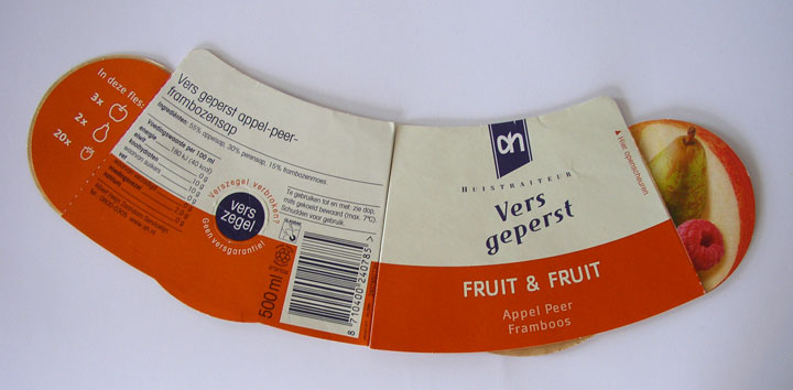
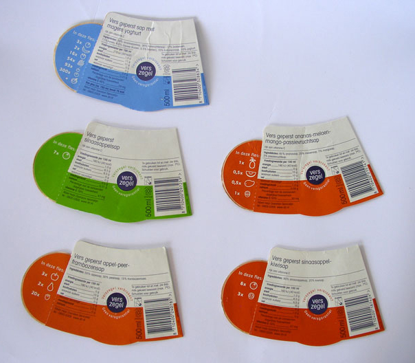
I don’t know if Albert Heijn grocery stores in the Netherlands still use this style of label for the juice, but I was instantly intrigued by the way they present the ingredients using cute little fruit icons on the back side of the labels. The front of the label also sports photographs of the main fruits. Without reading text, the icons on the back tell what quantity of which fruits are found in each juice. In addition to providing information, these graphics re-enforce marketing messages that the juice is 100% fruit. Lekker!


