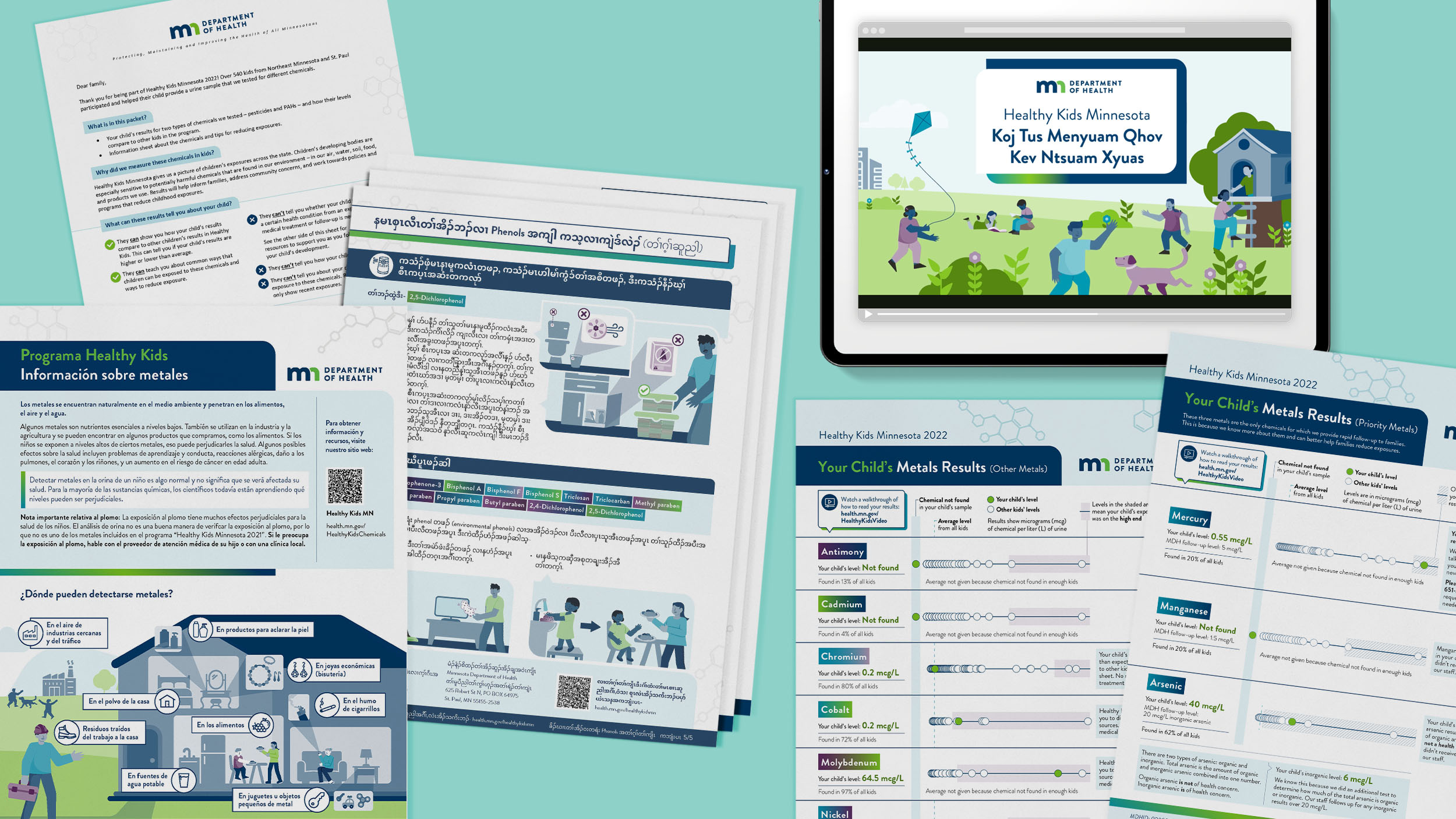
Making complex health information clearer — and more reassuring — for families
In partnership with the Healthy Kids Minnesota program, we created a suite of multilingual materials to help families understand their children’s test results — what they mean, why they matter, and what to do next.
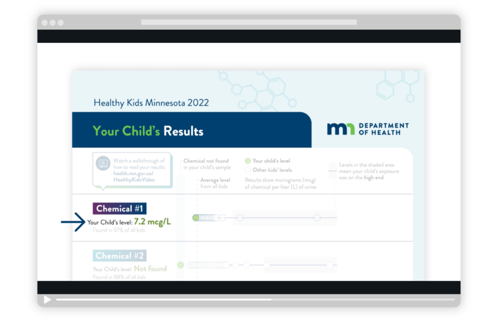
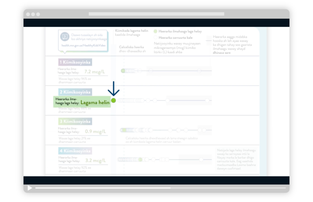
Participants in MDH Biomonitoring’s Healthy Kids Minnesota program submit a urine sample from their child so MDH can test for the presence of potentially harmful chemicals. Families then receive individualized results showing whether their child has elevated levels and how those levels compare to other children in the program. A key part of this project was showing where a child’s results landed while avoiding unnecessary alarm if levels were higher than others.
Deliverables included:
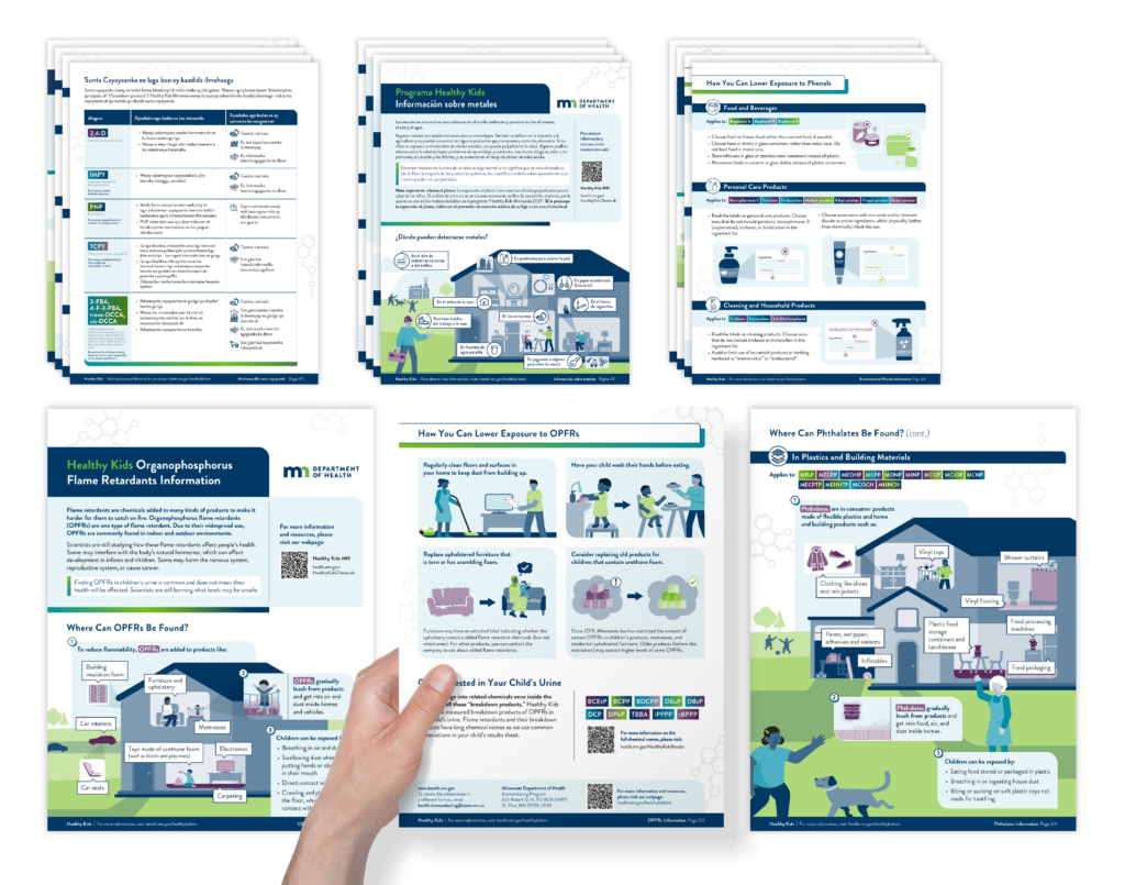
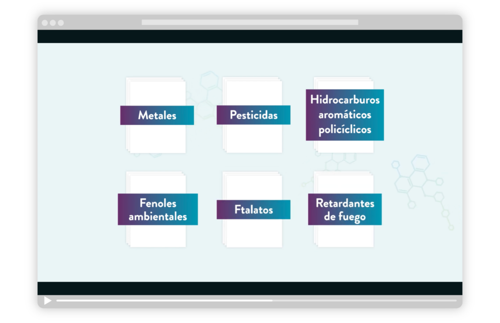
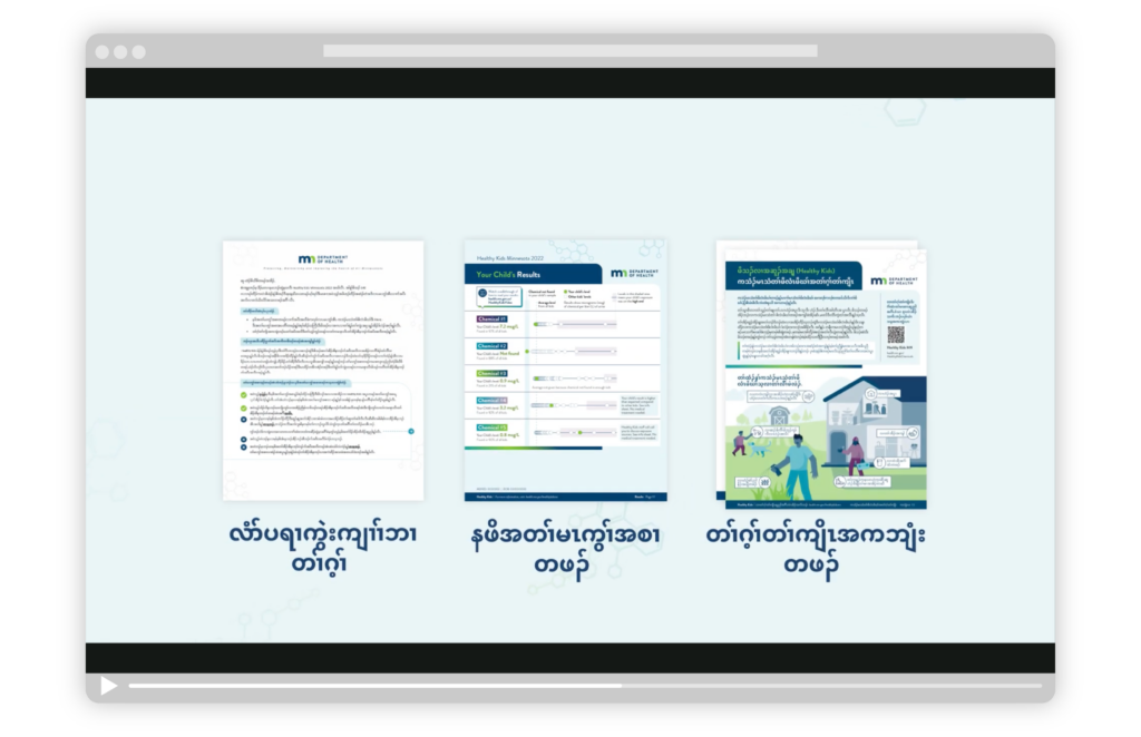
- Information sheets for six chemical groups
- Result pages for the six chemical groups, created in collaboration with a developer to allow MDH to easily generate visualizations of results for each individual participant for future program cycles
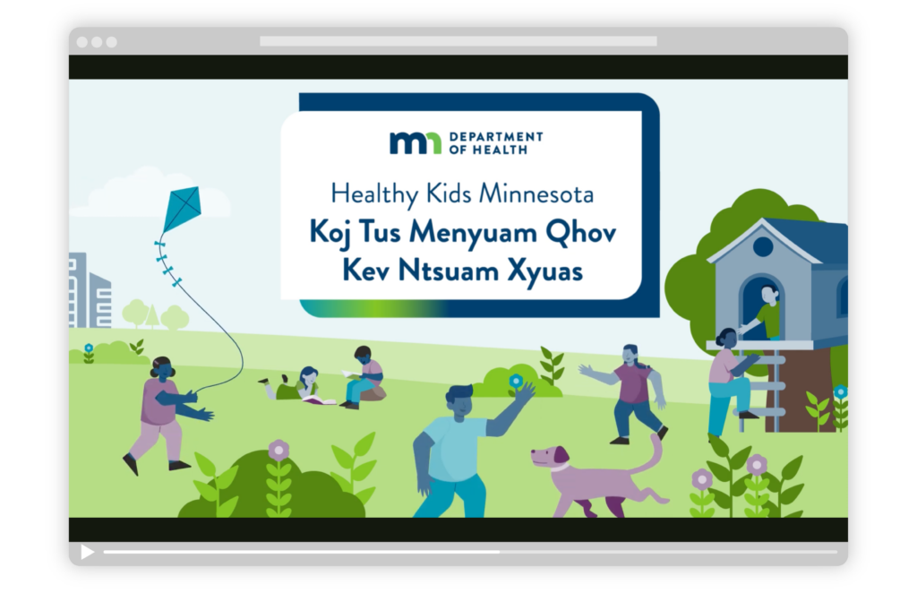
- Informational video
- Cover letter template
A key part of this project was showing where a child’s results landed without creating unnecessary worry if levels were higher than others.
Versions of all materials were designed in 5 languages: English, Hmong, Karen, Somali, and Spanish.
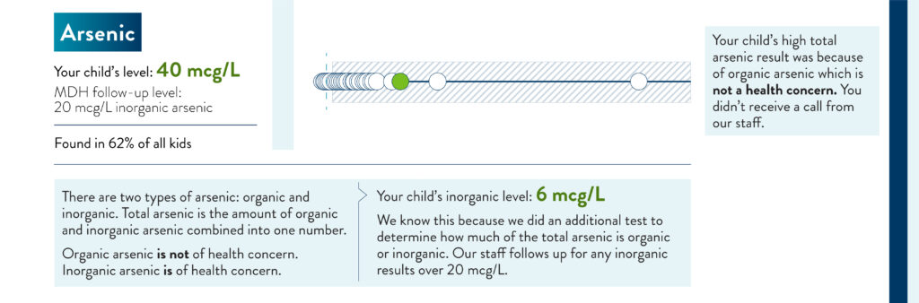
A modified dot plot visualizes individual results within a larger story.
(Placeholder data shown)
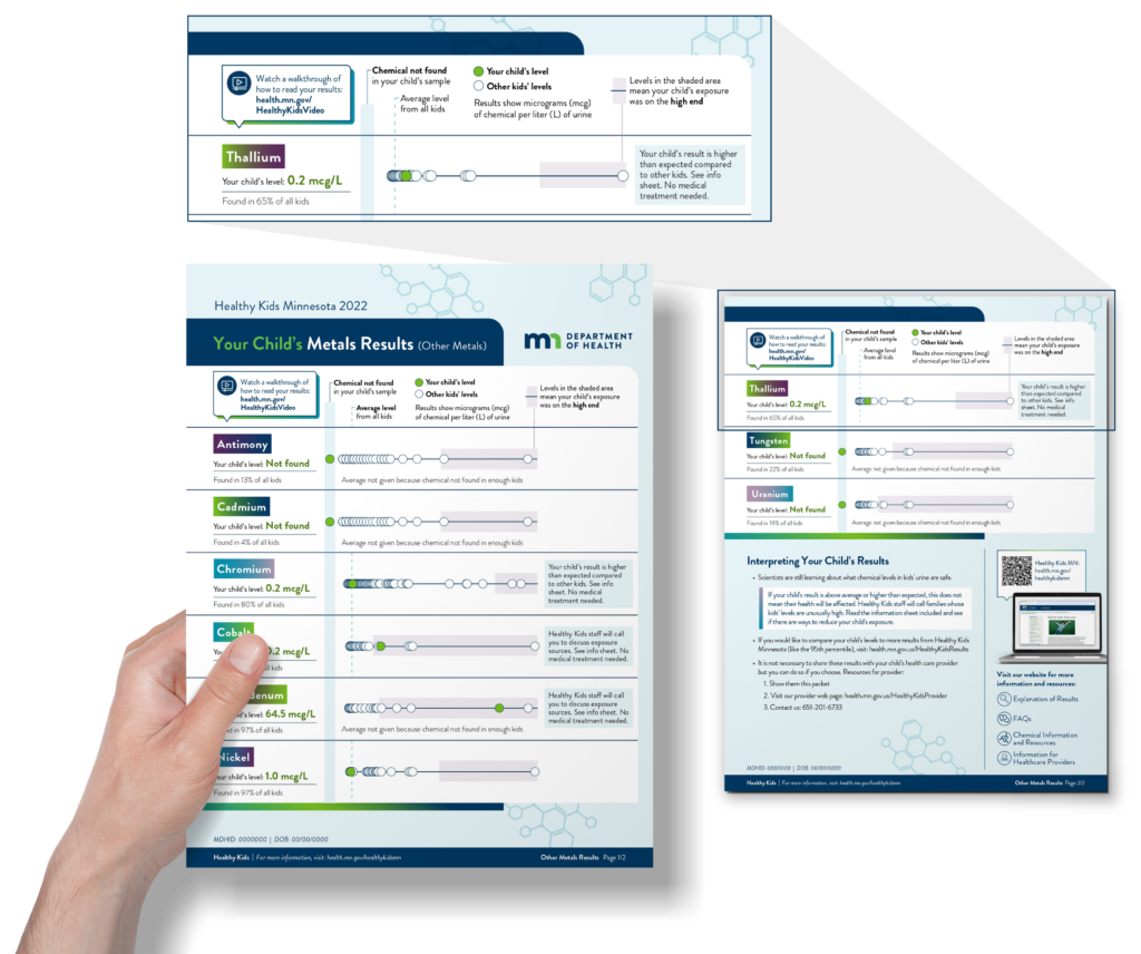
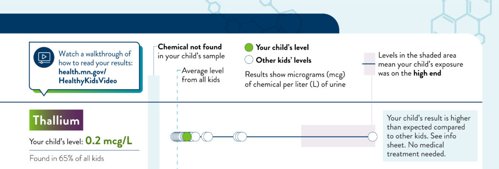
The results are intentionally shown without a numerical axis — centering helpful guidance and avoiding unnecessary alarm.
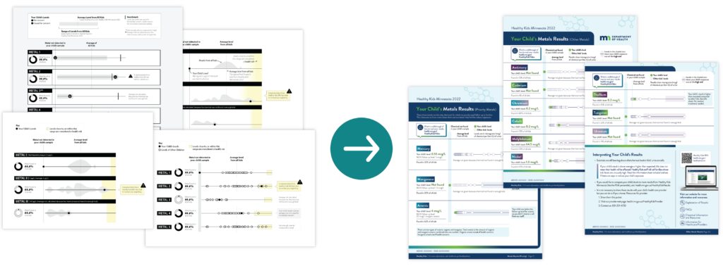
Iterative design and collaboration led to effective solutions.
Our collaborative process involved exploring multiple visual approaches during the sketching and mock-up phase.
We worked closely with the client team to accurately represent sensitive data and co-authored an audience survey to help validate the design’s effectiveness. We also partnered with R developers and translators to support accessibility across languages and formats.
The updated materials were tested with the audience, and results showed improvement in comprehension (compared to a previous iteration of the project materials) among participants with a wide range of language and cultural backgrounds.
Info sheets help families take action to reduce chemical exposure.
An informational video walks families through how to read their child’s results.
Produced in five languages, the video walks through the results step-by-step — making the information clear for families of all backgrounds and pointing them to the additional resources included in their packet.
All materials were designed to be accessible across a wide range of educational backgrounds.
- Plain language was used throughout to make complex information easier to understand and to support accurate translation, particularly where Western medical terminology lacks direct equivalents.
- Where technical terms were unavoidable—such as chemical names—they were paired with recognizable graphic elements (gradient “tags”), allowing parents to navigate between results pages and informational materials using visual cues rather than relying on the terminology itself.
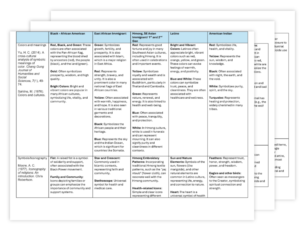
- Collaboration with cultural researchers at the outset of the project helped ensure that materials were culturally considerate and appropriate for the communities involved.

Standard accessibility includes:
- Heading tags applied consistently
- Good color contrast for text and graphics
- Alternative text for non-decorative graphics