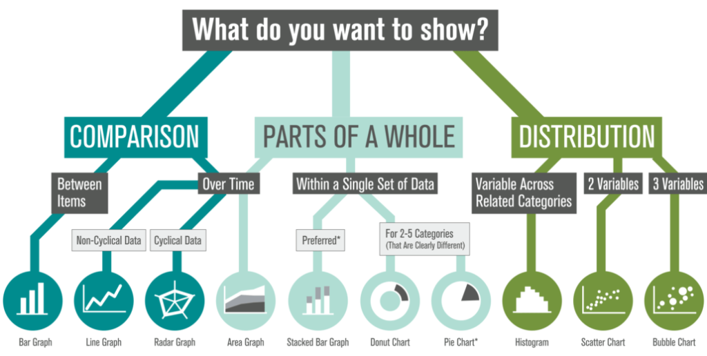
How we convey the meaning behind the numbers
This is our third exploration of how to frame your data. In earlier posts, we looked at how thoughtfully designed visuals can help audiences make sense of:
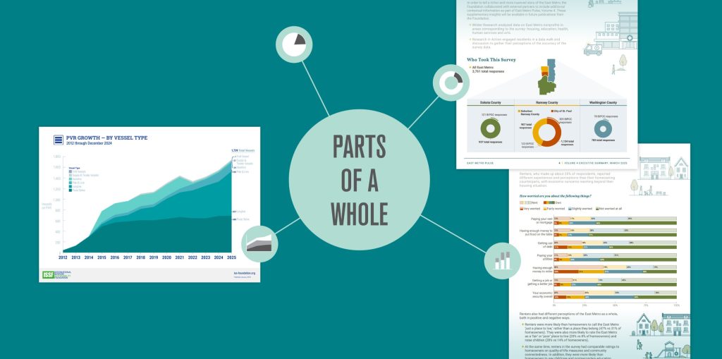
- Comparison data that highlights differences across groups, time periods, or outcomes
- “Parts of a whole” data that shows how a total breaks down into categories, contributors, or segments
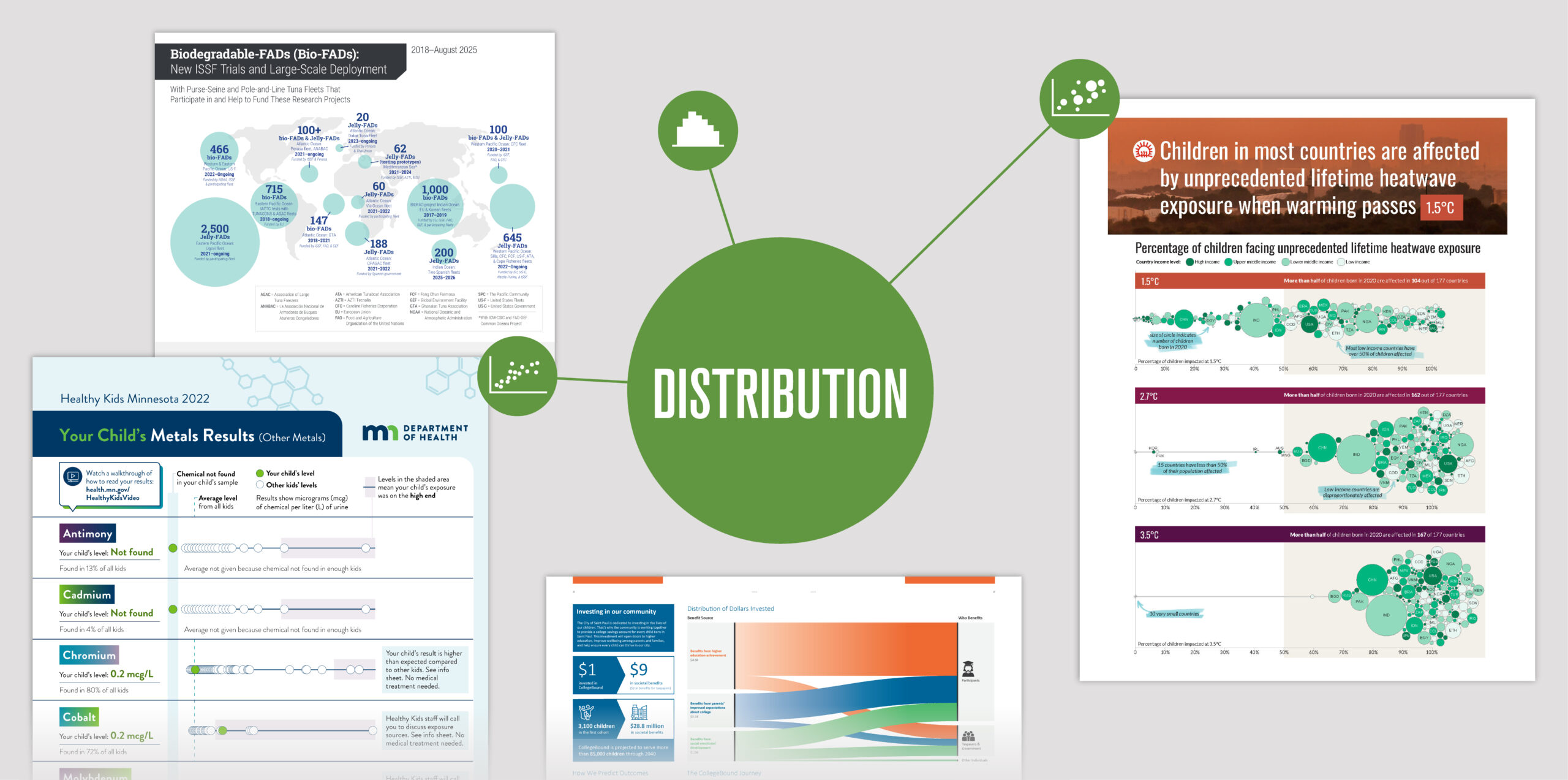
Visualizing individual results within a larger story
Case study: Minnesota Department of Health (MDH): Biomonitoring
The Story
Participants in MDH Biomonitoring’s Healthy Kids Minnesota program submit a urine sample from their child so MDH can test for the presence of potentially harmful chemicals. Families receive individualized results showing whether their child has elevated levels and how those levels compare to other children in the program.
An important part of this project was showing where the participant’s child’s results landed without causing fear if it was higher than other children’s.
The Data
Placeholder data shown due to HIPAA restrictions.
The Result
Families can quickly see where their child’s chemical level (green dot) falls in relation to other participants (white dots) and the program average (dashed blue line). If a child’s level appears on the higher end of the distribution (purple area), Healthy Kids staff follow up with families by phone to help identify potential sources of exposure.

Scatter plots
This is a type of scatter plot. Scatter plots can also compare two variables using both horizontal and vertical axes. When the data set includes only one variable (as in this example, the level of chemical present), the data can be plotted along a single axis.
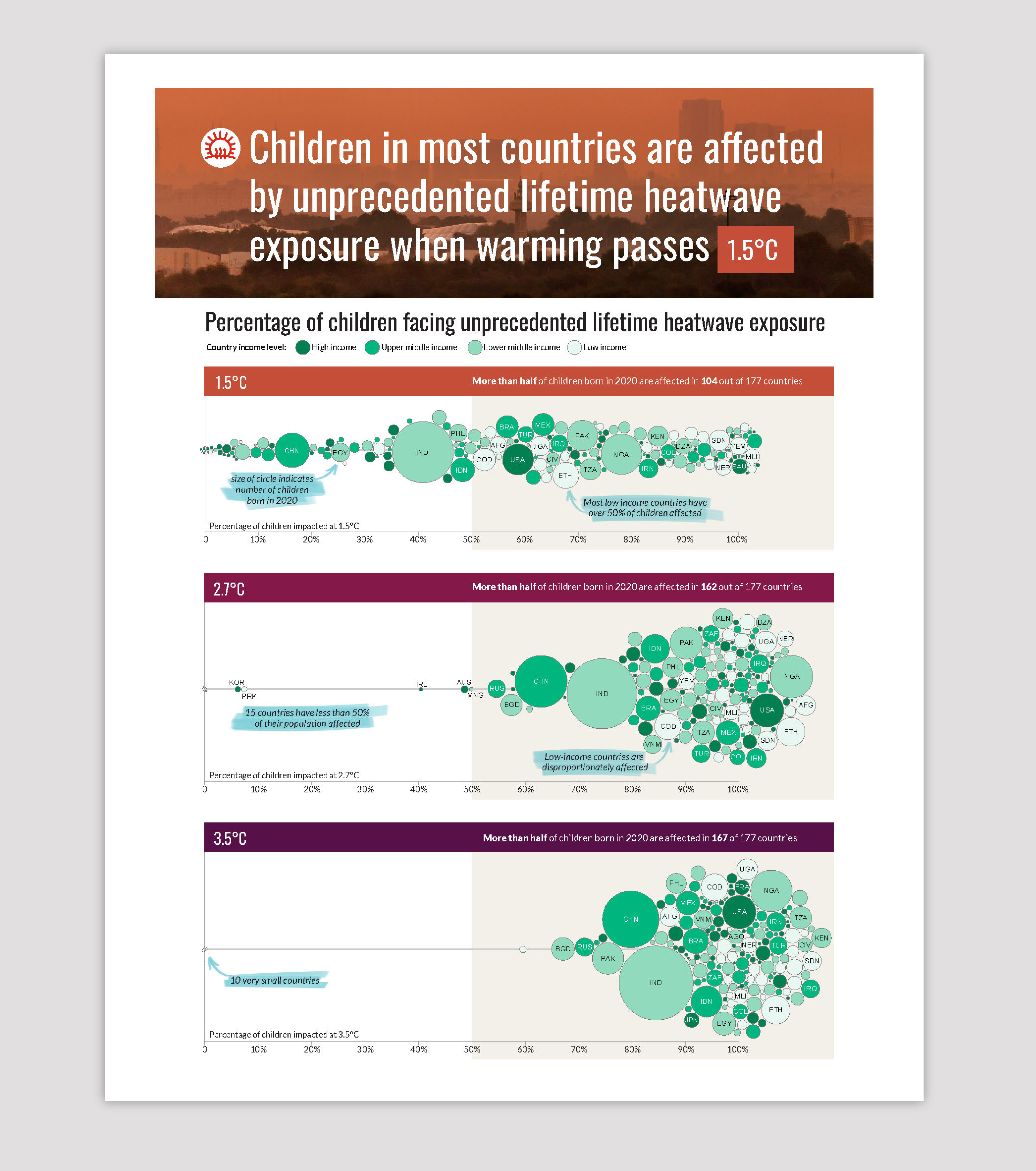
Revealing who bears the greatest burden of rising temperatures
Case study: Save the Children
The Story
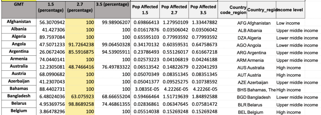
Data collected for the publication Born Into the Climate Crisis 2 revealed that children around the world will not experience the impacts of rising temperatures equally — lower income countries will feel the effects far greater. And as global temperatures reach higher warming scenarios, the scale of this risk grows dramatically across the globe.
The Data
Percent of child population affected for three warming scenarios, income level, and population size by country.
The Result
A color-coded bubble chart brings clarity to this complex data. Bubble size reflects each country’s child population, horizontal placement shows the percentage of children affected, and color indicates the country’s income level.
This layered design makes it easy to see two critical patterns:
- The number of children exposed to unprecedented heat increases across warming scenarios.
- Low-income countries consistently face a higher exposure to unprecedented heat compared to weather nations.
The result is a visual that helps audiences grasp both the scale of the issue and the inequities underlying it.
Annotations (shown highlighted in blue in the visual below) use plain language to make complex data approachable, helping viewers grasp the nuances behind each visualization.
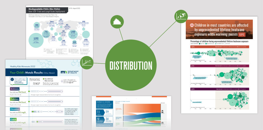
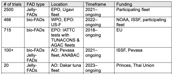
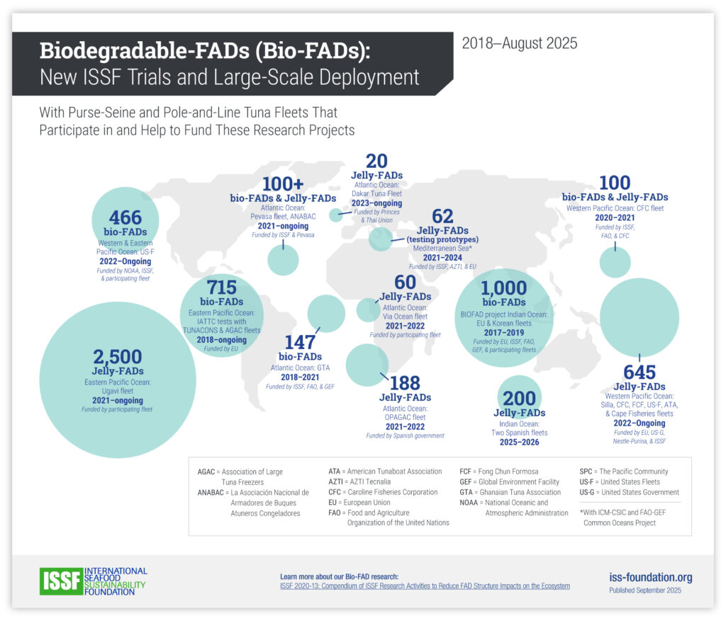
Mapping the worldwide distribution of Bio-FAD trials
Case study: International Seafood Sustainability Foundation (ISSF)
The Story
Since 2018, ISSF has conducted trials of Biodegradable-FADs (Bio-FADs) — a tool used in fishing that naturally attract marine life — around the world in collaboration with multiple partner organizations.
The Data
Number of trials by FAD type, location, timeframe, and funding partners
The Result
A bubble map visualizes both the frequency and geographic spread of these trials: the larger the bubble, the greater the number of trials conducted in that area. Additional details — such as FAD type, partners involved, and project timelines — are layered in as supporting text.
Following the flow from investment to impact
Case study: CollegeBound Saint Paul
The Story
Community investment in CollegeBound — a program dedicated to providing a college savings account for every child born in Saint Paul — opens doors to higher education and improves the wellbeing of the city’s residents.
The Data
Amount invested by benefit sources and amount invested by beneficiary type
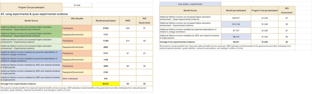
The Result
A Sankey diagram illustrates how each dollar invested creates multiple positive outcomes for participants and society, with participants benefitting the most from the program.
When paired with accompanying illustrations, viewers can also see how each child’s savings account grows over the course of their life, providing a full picture of both immediate and long-term impact.
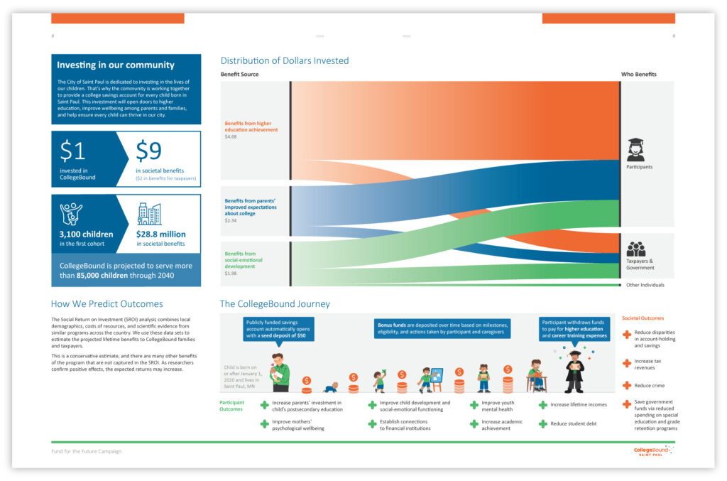
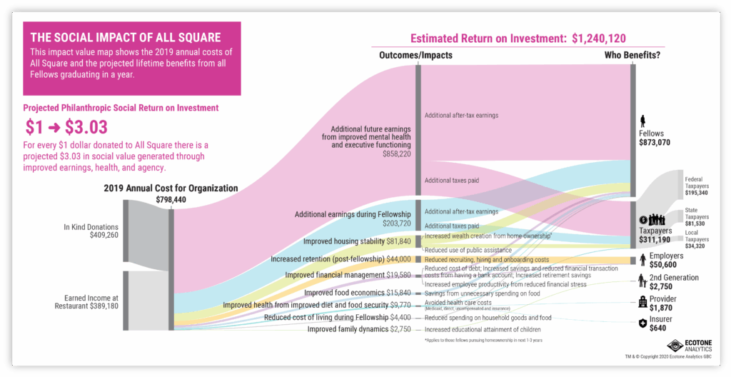
Sankey diagrams
Sankey diagrams are ideal for visualizing Social Return on Investment (SROI) data. They can show how an organization’s various funding sources flow into multiple outcomes and impacts, making complex relationships easy to understand at a glance.

Histograms show the shape of data
A histogram helps you visualize the distribution of data across a continuous numerical range. Each bar represents an interval on the horizontal axis, and its height shows the frequency of values that fall within that interval. The resulting “shape” can reveal where values cluster and where there are gaps or unusual patterns.
Although histograms are less commonly used than bar charts or line graphs, they are well suited to situations where understanding the spread or shape of data is important. Examples include:
- The age distribution of a region’s population
- Treatment outcomes or age distribution in a medical study
- The distribution of sales, customer ages, or product quality for a business
Interval sizes (or “bins”) are chosen during the design process, and this choice matters. Too many bins can make the data look noisy; too few can flatten important patterns.
These examples highlight the power of pairing data with story. The next time you present data, don’t just show the numbers — think about how narrative elements can guide your audience through key insights.