Home energy usage via Google

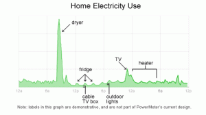
Google is in the development stages of a power meter that enables users to monitor real-time feedback on their household energy consumption. This kind of instantaneous feedback gets to the basic premise of why it’s important to show & tell background stories. This power meter is tool that enables the customer to make their own choices: in this case, the customer can make the connection between more energy usages= more $.

Google's plan to meter home energy consumption
Google's plan to meter home energy consumption.

Follow google’s developments on www.google.org/powermeter.

Perhaps this precision monitoring of the background of products also paves the way for technologies enabling people to generate their own power – and sell it back to utilities.

Prius console monitors the product’s energy

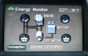
Prius’ console allow users (and passengers) to see what happens under the hood. The console sports an energy monitor (among other controls) that transparently provides information to the user (and passengers) so they can understand how the ups-and-downs of gas and break pedals impact the hybrid’s fuel usage and battery charging.

Prius Energy Transfer map

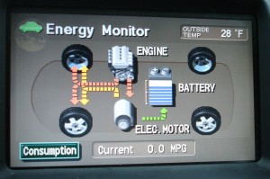
Using simple visuals and motion graphics, the console maps how energy is used, and shows how the battery gets recharged.  What results is the ultimate in immediate user-feedback.

Map of Prius Energy Usage in motion

In addition to helping the riders to understand what exactly a hybrid is, and how it works, this system helps users drive more eco-efficient because they get immediate feedback. As a driver, you can start to understand what’s going on, and how your driving techniques impact the fuel-efficiency of the vehicle. This model integrates enough feedback loops so a driver can learn to adjust their own driving to help the system optimize how it runs.

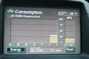
An added layer of feedback on newer Prius models is a chart that records energy consumption over the last 30 minutes of use – enabling the user to compete against themselves for improvement.

Graph charts energy consumption

Products should be designed to showcase some level of their inner-workings. Even if the vehicle was not a hybrid, it’s a great step toward product transparency. Just imagine if more of our energy-devouring equipment incorporated similar feedback mechanisms.

The world on your coffee cup

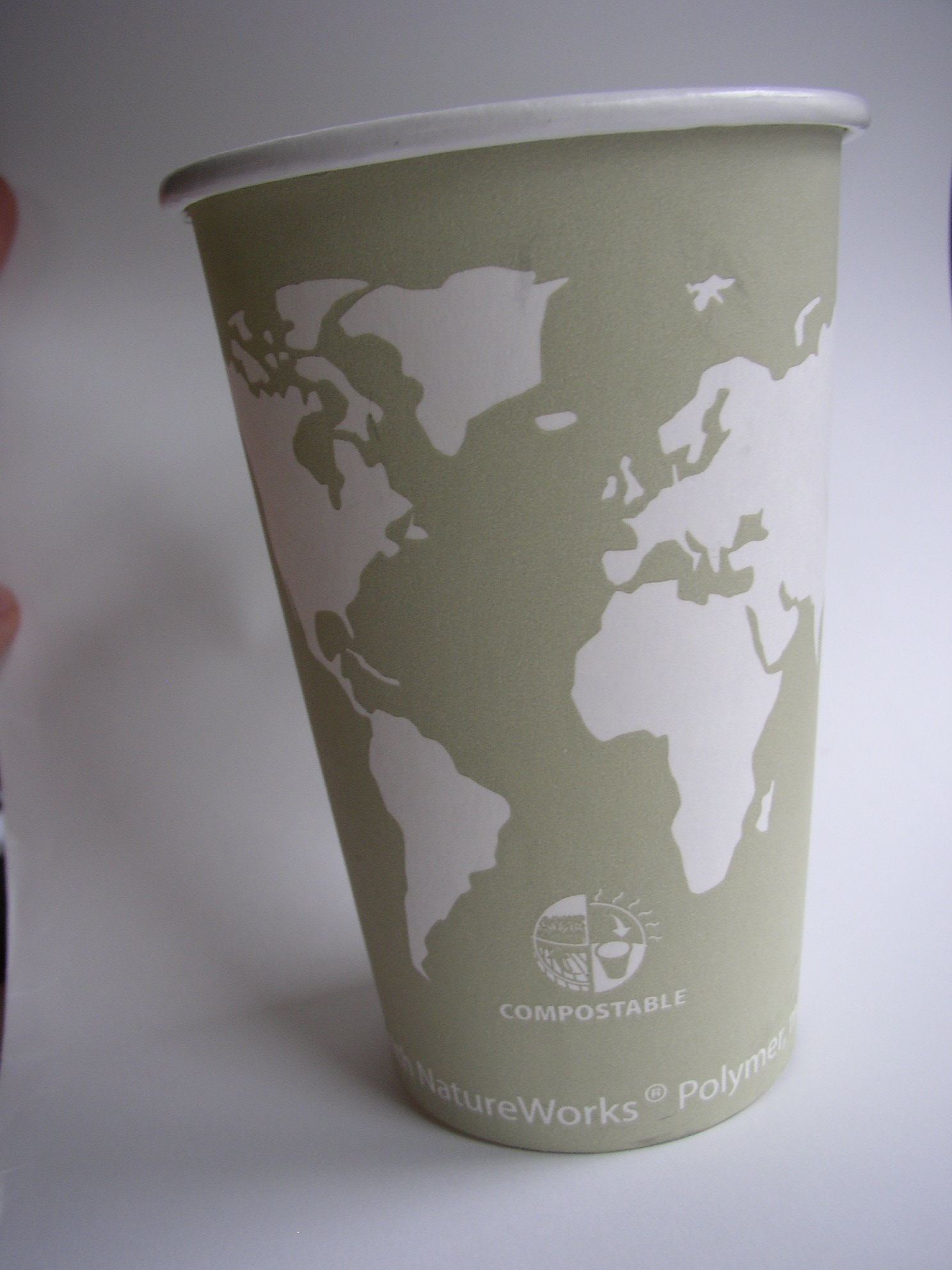
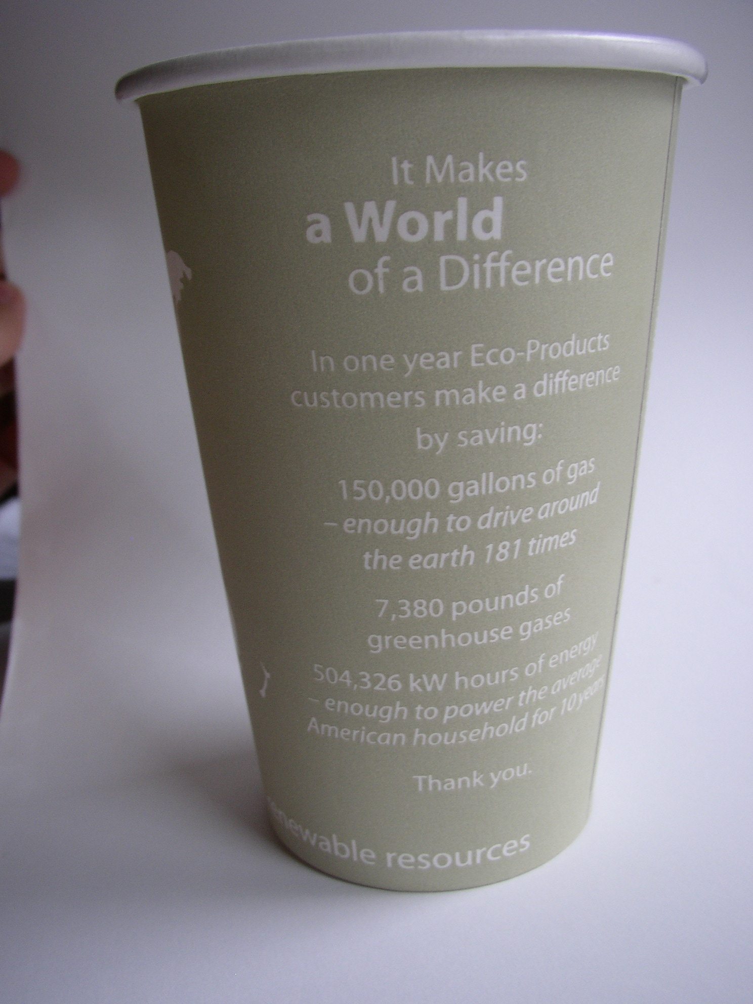
continents outlined on a coffee cupback side of world on coffee cup

Details on the eco-efficiencies of the company that produced this cup are printed right on it. (Along with an intriguing blank world map: which could lend itself to some sketches to show where the coffee inside came from.)

I’m not sure that many take the time to read the details of eco-efficiencies on the back of the cup- no matter how intriguing they are. However, one thing that really helps is translation from data points into increments that the user can start to comprehend. For example, I’ve no idea what 150,000 gallons of gas means…but by telling me that it’s enough to drive around the earth 181  times, this makes the data more real to me.

By having the ‘world’ on the cup, this could be a unique opportunity to further compare some of the text-based data with the size of the world (for example: how about 181 lines around the cup?, or a sphere to represent what 7,380 pounds of gas would take up [though this may need to be on the scale of a  house rather than to the world])

The ‘compostable’ icon under the continents is a start to some nice information design in itself -though this could have been further simplified, or even tied into some of the text on the cup’s reverse.

Overall, lots of potential, but data is left separate from visuals: even when the visuals are ripe with potential.

Cup by Eco-Products Inc.

Economic Breakdown: Chocolate

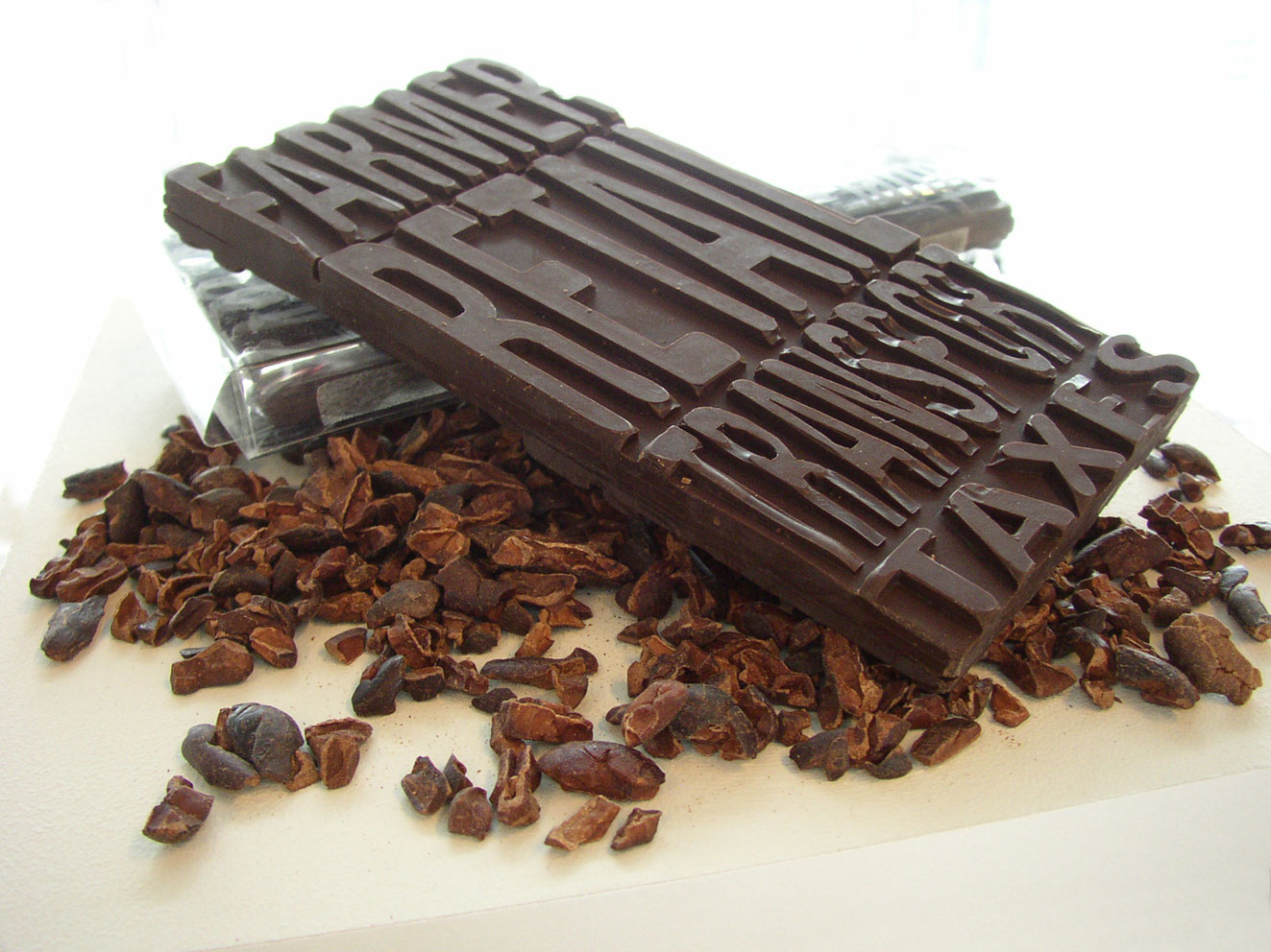
chocolate bar with its economics imprinted

The economics of this (fair trade) chocolate bar are molded into it. The consumer can readily see what percentage of the money they paid went to the farmer vs. transportation. On the reverse is another set of the same text; this time representing non-fair trade chocolate (the farmer gets only half as much as the fair trade example).

Part of a 2006 thesis project on communicating product backgrounds.

Timberland

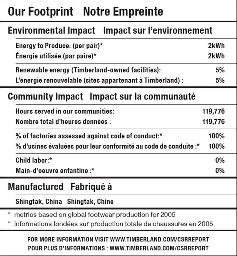
Timberland footprint label

This much-hailed label from Timberland was one of the first to label a product with details on the social and sustainability footprint of the product. It was a good start, but not nearly the level of detail that is possible – nor the level that consumers are clamoring for.

It’s a laudable first effort — in theory, at least. In real life, it’s not very helpful. Simply put: there’s less going on here than meets the eye. –Timberland Reveals Its “Nutritional” Footprint, Worldchanging

Though approachable because the label is created in the format of a nutrition label, beyond that, it’s not very visually satisfying. More depth and emotion could have been portrayed had they gone more into infographics.

Fruit and Juicy Quantities

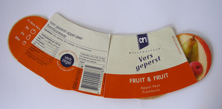
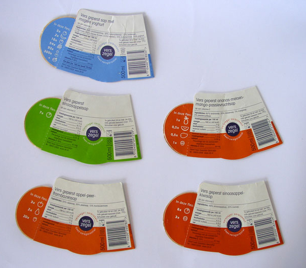
Albert Heijn juiceReverse side: fruit juice labels

I don’t know if Albert Heijn grocery stores in the Netherlands still use this style of label for the juice, but I was instantly intrigued by the way they present the ingredients using cute little fruit icons on the back side of the labels. The front of the label also sports photographs of the main fruits. Without reading text, the icons on the back tell what quantity of which fruits are found in each juice. In addition to providing information, these graphics re-enforce marketing messages that the juice is 100% fruit. Lekker!

Building an Information Bridge

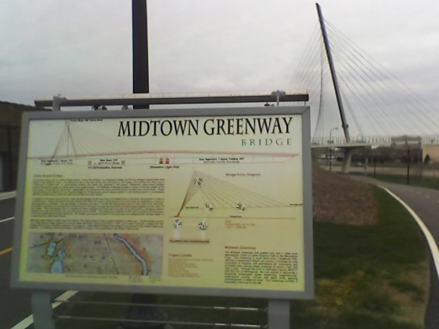
Midtown Greenway bridge signageThere’s a new bike/pedestrian bridge on the Midtown Greenway; and with it, a new sign that gives details about the bridge’s construction. (The mast of the cable bridge shown in background.) Specific data -angles of the cables- is highlighted in the graphic, as well as a map pin-pointing the location on the route across the city, and additional text about the construction. Just the kind of information a passer-by might be interested in for such a unique construction.

Such information gives meaning to our surroundings and encourages ownership.

Next step to further communicate? – include a visual tag so a passer-by can link directly to a website with more info via their camera phone.