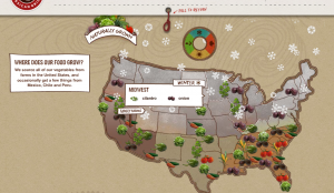
Food retailer Chipotle has an online animated map showing the locality and seasonality of produce used in their menu items.
Though buried at the bottom of the page (click ‘integrity’, then scroll down), the graphic is a good educational tool: teaching about seasonality in produce.
From the perspective of informational design, it would be great to see it containing more specific data (rather than just being a visual description): I’d like to see what % of the onion used in Midwestern stores is local in the winter.
Regardless, it’s a good place to start communicating sustainability to consumers.

