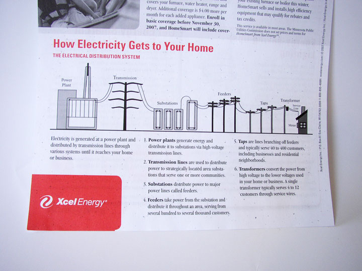
How Electricity Gets to Your Home. Context is everything. Without a direct connection with the interests of the intended audience, any information graphic – no matter how well-rendered – will fall flat.
This graphic came with a newsletter that my electric company sends out. But they missed the boat: What do I, as a consumer of electricity, care about “feeders” or “taps”? Though not a bad representation, this graphic feels more like it belongs in an introductory text book for engineers. If the graphic were to explain itself (such as why “taps” are important) and include interesting factoids, I would be glad for the mini education session.
Graphics like these, if splattered with relevant information, offer an interesting insight into the world of electric power. But it’s a fine line between providing superfluous information, and providing information that’s relevant an inspiring for a particular audience.

