This pair of straight-forward graphics appear on separate pages of “Calculating food miles for a multiple ingredient food product” – a white paper from Iowa State University’s Leopold Center.
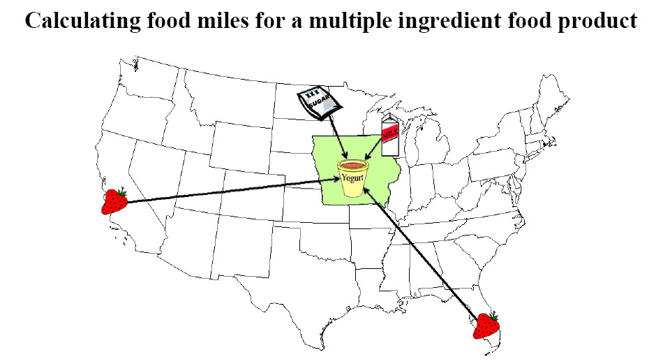
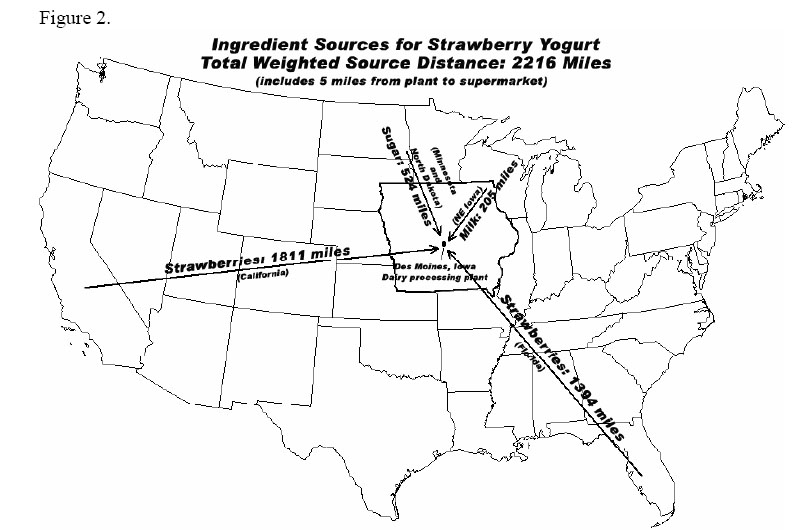
The graphics show where the ingredients of a specific Strawberry Yogurt have come from.
The first graphic is more visual, and thereby more enticing at first glance, but it does not convey the useful information of the 2nd graphic. The first graphic could be expanded to incorporate the detail of the second graphic: exactly how far each ingredient has traveled. And it could be further expanded to specify which method of travel (plane, train, truck, etc.), and with what carbon footprint.
A more detailed report (including stats on this yogurt’s Life-Cycle Assessment [LCA]) accompanies these graphic. Source: http://www.leopold.iastate.edu/pubs/staff/files/foodmiles_030305.pdf


