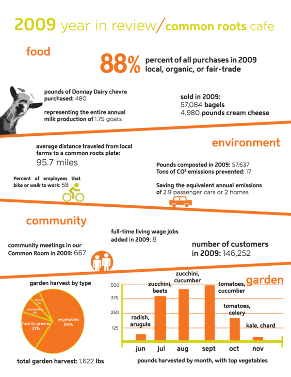
A local cafe has compiled a somewhat-visual depiction of their activities over the year. The focus is on communicating data as it relates to the sustainability initiatives of the cafe.

This is a great initiative toward transparency to collect data and communicate it. From the same cafe, see also a previous post.
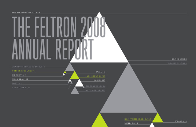
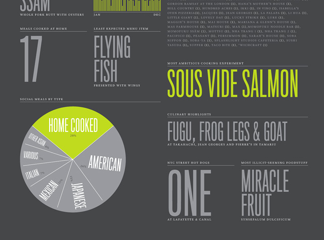
And it isn’t the first time an individual/organization has documented their own consumption throughout the year: Nicholas Felton creates his own annual report to document his personal impacts throughout his year as a designer.

He tracks both the more interesting, (and the more mundane) elements of his life for a year – and puts out his own annual report which is presented as data visualization and statistics.

