Putting Climate Data into the Context of Human Lifespan

We humans have a hard time comprehending our future.

Fortunately, there's a lot of great science being done about our collective future. Unfortunately, this data is typically presented in a way that feels removed from our human experience. No matter how real data is — if we don't perceive it as having a direct, tangible impact on our own lives (and those of our friends and family) it will continue to be viewed as abstract and removed from our life experience.

Creativity can help answer the call to connect seemingly abstract data to people's emotions.

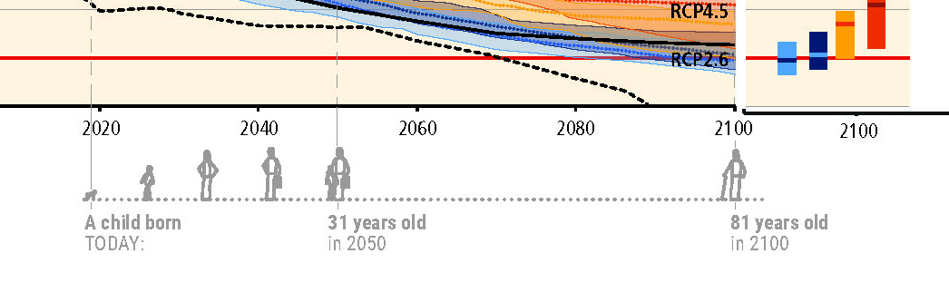
Arlene is exploring opportunities to annotate existing climate data to help people see themselves within the data. During a recent artist residency at MASS MoCA, Arlene worked on a series of projects to put our own life spans into climate data.

How Close Are We to 1.5˚C?
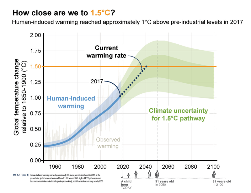
ABOVE: A visual human lifespan is added to contextualize a series of future dates.

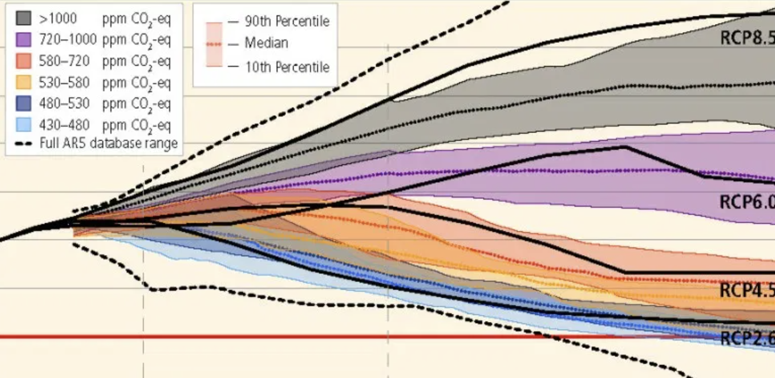
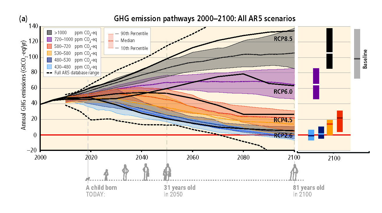
One project was to annotate graphs from Intergovernmental Panel on Climate Change (IPCC) reports that denote future climate trends. The graphs are annotated with a small illustration of an average human lifespan — starting with a child born today. The annotation shows how old the child will be in key years that are in the data. The inclusion of a human life span with this data helps remind us of the grand scale of the global changes that are being graphed, and how these changes will continue to impact our children, grandchildren, nieces and nephews long after we're gone.

BELOW: Additional examples of human life spans visualized as part of a graph's timeline.

Cumulative Emissions of CO2

GHG Emission Pathways

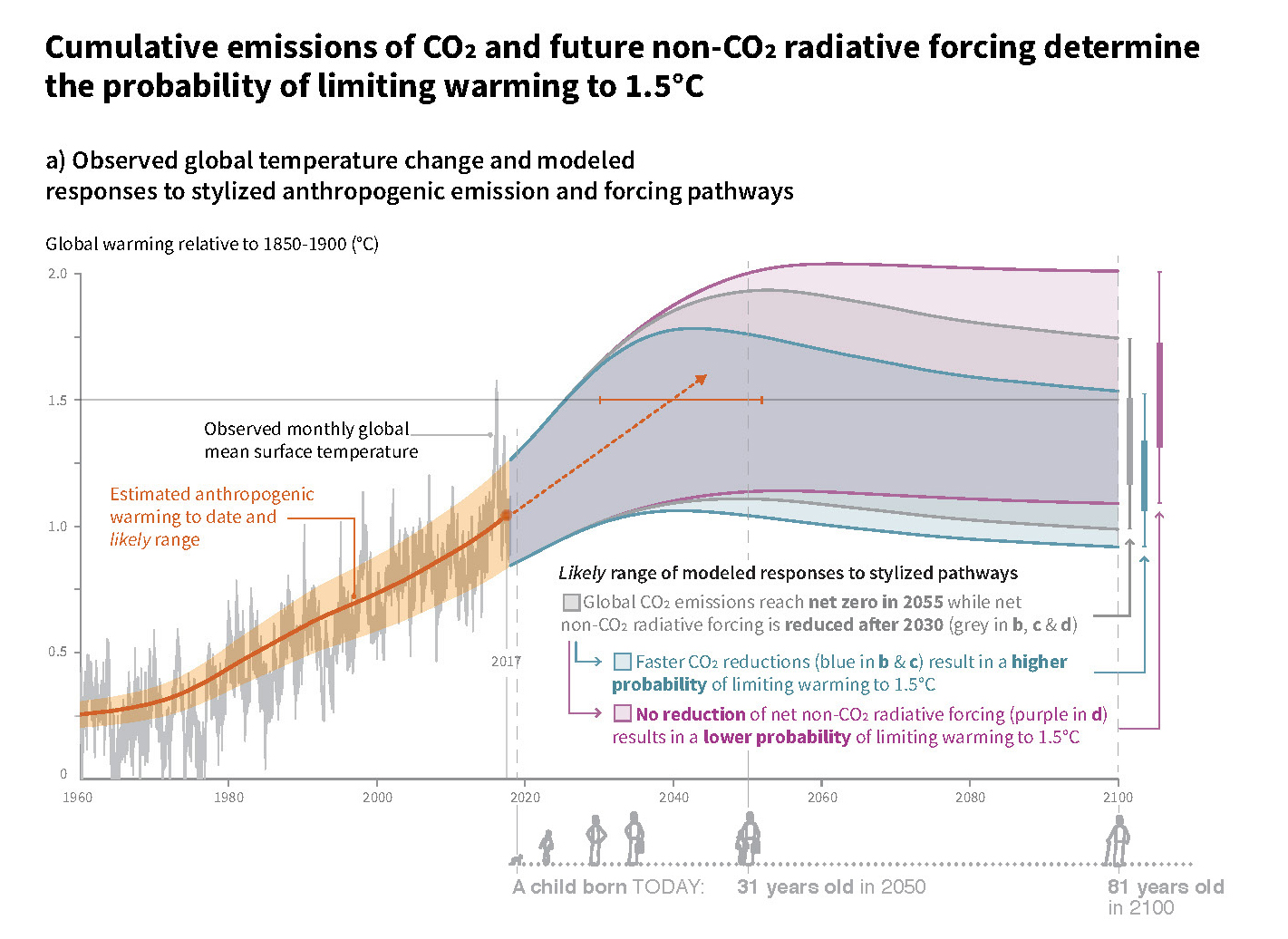
BELOW: Detail of the timeline with life span.

Detail of GHG Emission Pathways

Audience First: Behavior Change and Values-Based Climate Communication

Connecting with audiences based on the values that are behind a desired activity/behavior can be more powerful than highlighting benefits to the audience. This values-driven approach has been shown to have more impact than ‘saving the environment’ or even ‘cost savings’ messages, according to the founder of Climate Outreach, George Marshall, who presented at Behavior, Energy and Climate Change conference (BECC). (See a synopsis of Arlene’s ‘Public Engagement through Art’ presentation on our previous newsletter.)


For example, instead of touting the cost-savings and environmental benefits of home insulation, consider:

“Your home is great. It’s where you bring up your family. It’s where you share some of the best moments of your life. You want to keep it cozy. Insulation is a good way to do that.”

This ‘audience first’ approach closely resembles ‘Start with Why’ and the design and communication processes that I use in practice, and with my students.

In our communication work, we orient every aspect of a message around the intended recipient: story structure, visual style, and language used. So, I can relate to focusing on an audience’s need.

Marshall’s presentation made the point that prioritizing the audiences’ values (even above the benefits of a product/service) throughout this messaging, can create impact on sustainability-related behavior change. 


Pollinator-Friendly Solar at the Fair

For this year's Minnesota State Fair, we've teamed up with Fresh Energy and Connexus Energy to create a three-dimensional display to draw attention to a new way of thinking about renewable energy: Pollinator-friendly solar. Preserve Pollinators Our display, part of "The Common Table: Minnesota Eats" exhibit in the Agriculture Horticulture Building, highlights how our region is leading the way in policymaking and on-farm efforts to bring more pollinator habitat to otherwise underutilized land. You can see the exhibit in-person from August 23 through September 3, along with nearly two million other fair-goers (who famously flock to the event for all kinds of foods and creations "on a stick"). Of course, our sticks — a series of cutout landscape elements and hide-and-seek pollinators for you to find — will be glued down, but you're sure to learn a lot about the powerful partnership of pollinators and solar energy!

Selecting the Right Graph

We're often asked, "What type of graph should I use for this data?" We also see a lot of variety in how similar data sets are visualized (some working better than others). There's plenty of debate out there, so how do you decide? Selecting The Right Graph We've created this visual guide to recommend best practices, which starts with a clear understanding of your content — what are you trying to show? There are options within each category based on the type of data in your set (and ironically, many of the standard graph types tend to share food-based titles... by the time you decide between Pies, Bars, and Donuts, you might be tempted to hit the bakery!). Which graph will you apply to your next datavis project?

Collaboration at the National Council for Science and the Environment Conference

“We need more multi-disciplinary… communication… social science… storytelling.” I was struck by the reoccurring mention of these terms while attending the National Council for Science and the Environment (NCSE) annual conference in Washington, D.C. in late January.

NCSE is a conference of scientists (primarily earth & physical scientists) who do highly specialized research related to environment and climate. At this year’s event, I presented as part of a MN-based symposium on “Artists as Partners in Infrastructure Education.” (More details on our symposium here.) It was refreshing to hear the desire for collaboration coming from both scientists and the worlds I inhabit — communication and creativity.

NCSE Conference

For research findings to be accepted and acted upon by communities, scientists and policymakers need to draw more personal ties between policies and how individuals interact with them. An important step in this is helping the public understand a bit more of the system (and the ‘why’) behind a particular policy. Because 65% of people are visual learners, and because graphics are an important method of showing complex systems, visuals are an excellent tool to help audiences relate to and connect with content. It’s why at science conferences, you’ll find me advocating for design, creativity and the arts. At design conferences, I’m the advocate for science, data and content!

Our symposium group hopes to continue the dialogue of how artists can contribute to the great work these scientists are already doing — and help give their findings a relevant and emotional hold on communities around the world.

– Arlene

Planning for Growth

Online engagement tool shapes the City’s future

The latest phase of our work with the City of Minneapolis launched this week: A new online, interactive engagement tool designed to involve residents in shaping the next 20 years of City development.

Minneapolis 2040

This visual story utilizes a scrolling technique called “parallax,” which creates a deeper, more immersive online experience. Visitors to the page will be introduced to City planning information in a new & fun way, and have the opportunity to leave feedback on the action items presented. Their comments will inform Minneapolis planners’ decision-making on future City policies.

Feedback collected during this phase of development will go into the City’s Comprehensive Plan, titled Minneapolis 2040. The plan will cover topics such as housing, job access, the design of new buildings, as well as how we use our streets — all in the name of smart, sustainable development.

Check out the live site at growth.minneapolis2040.com

Balancing Science and Story

Effectively communicating sustainability across sectors

What do European climate scientists, Midwest U.S. organic farmers, and small arts organizations have in common? They all have a huge amount of data (or potential for it) and battle with balancing science and more personal, emotional messages in their communications.

In the past few months, I’ve presented to scientists at the Copernicus Climate Change Service general assembly in Europe, to organic farmers at the Midwest Organic Farming Conference (MOSES), and to artists and arts organizations as a panelist at Data for Art.

Copernicus Climate Change Service
Arlene at Copernicus Climate Change Service General Assembly

In order help audiences grasp the very complex scenarios involved in each of these industries, we have to both produce solid, objective research about these subjects and provide more subjective entry points into the information. Our goal: Help non-experts grasp the concepts and navigate the content. These entry points should show how the data can be understood from a variety of different perspectives, and aim to tell stories with the data. Visual stories reach audiences and help people connect with these complex concepts.

We have to improve how we communicate this important information, so that our audiences — policymakers, stakeholders, businesses, consumers, and citizens — can more fully engage and ultimately take action. Because if people can’t grasp the information, they default to ‘Business as Usual’: they ignore the information and do nothing (and that won’t help our planet one bit!). We can do better, and when audiences are more engaged, our organizations benefit and so does our common cause. — AB

‘Emotional’ Sustainability for a Post-Truth World

Visual storytelling reveals context and appeals to our individual beliefs

Riding the tails of Brexit and the U.S. presidential election, Oxford Dictionaries has selected “post-truth” as 2016’s international word of the year.

Emotional Appeal
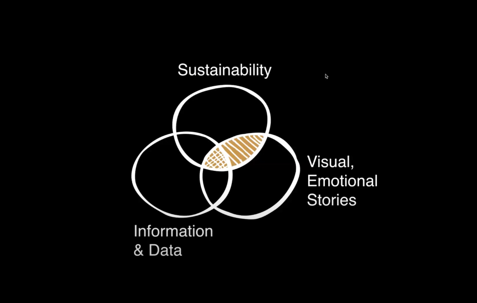
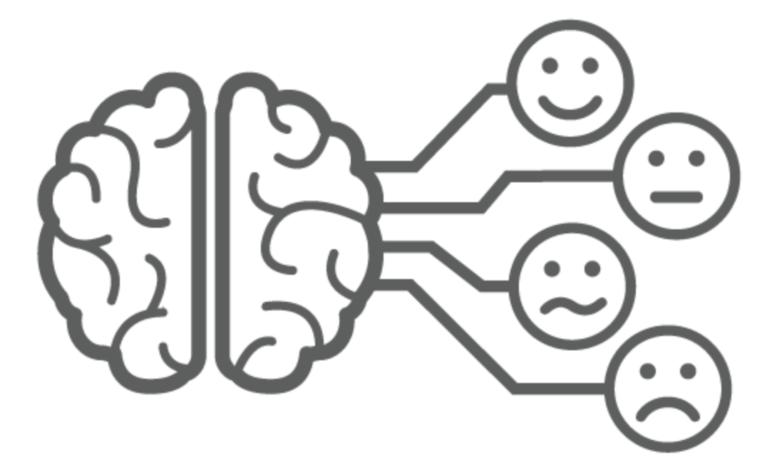
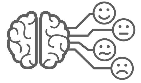
It’s not hard to believe, given the events of the past year, to see how people do not make decisions based purely on fact. Appeals to our personal beliefs and emotional centers are important. Data alone does not influence decisions. To a large portion of society, facts simply do not matter.

Feelings matter. Connection matters.
I can spout off statistics and information, but unless you — my audience — feel connected to it, it won’t make a difference. The author of ‘How to Convince Someone When Facts Fail’ also describes the mental stress that we endure when we hold two conflicting beliefs at the same time (a.k.aCognitive Dissonance). He acknowledges the need for a calm discussion when presenting new information — and new facts — to an individual with a strong pre-determined worldview. So what are some ways visual communication can help make sustainability information appeal to our emotions, and allow us to gradually open our minds to new information?

Here are a few key points and resources: 

Show & Tell Data as a Story
Numbers, by themselves, are not generally very welcoming. Deciphering numbers and comparisons requires a lot of effort and time — particularly given that 65% of the population are visual learners (Mind Tools, 1998). Icons and illustrations can provide context for the numbers. Diagrams can show how a set of data flows over time.

Use Visuals that Connect to Individuals
This research shows how people interpret visual images of climate change. The report finds, for example, that protest images do not resonate, however images of real people taking action in a local context do resonate.

Communicate the Context of your Social or Environmental Goal
Show individuals how bigger picture climate consequences will impact their personal lives. This can mean mapping out the narrative in a visual infographic or developing a diagram to walk audiences through how a larger goal is connected to individuals and their families.

The [Unequal] Power of Images

When to use a photo vs. an icon

There are many style options available when it comes to communicating information visually. Photos excel at evoking emotion in individual scenarios, when the photograph literally represents what is being communicated.

Photograph of a tree Icon of a tree

Icon-focused infographics tend to group information on a more broad level: reflecting general patterns and information rather than specific, individual – and quite often emotional – experiences.

Consider this example: This tree photo points to a very specific situation and can evoke memories. Maybe it reminds you of one that you played under growing up. Alternatively, perhaps the species of tree on this rolling, green landscape looks nothing like where you live. That makes it harder to relate to.

An icon, on the other hand, is more versatile. The icon evokes the idea of ‘tree’ regardless of your own memories. It is perceived more generally as ‘tree’ rather than ‘deciduous tree’ or ‘kinda-like-our-climbing-tree’.


In short: 

  • Use a photo for specific circumstances, details, case studies and people
  • Use an icon for general concepts, broad mapping, global systems and universal ideas.

Case studies are a great place to use photographs because they need to communicate details of a specific story. When the desire is to communicate a more global, standardized concept or structure, icons are generally a better choice. The 2 approaches can certainly be combined in a well-thought-out visual.