Visualizing Grocery Impacts – Artist Fellowship

Arlene Birt is selected for the 2010 Art(ists) On the Verge fellowship program for a project on Visualizing Grocery Impacts:

Visualizing Grocery Impacts is a data-driven and interactive installation that will help individuals better understand how their daily purchases have global social and environmental impact. In an installation which mimics a super-market, products with custom labels can be collected from the shelves by visitors, and scanned with a barcode reader that will project interactive and visual information on the productʼs background impacts (including global, ecological, political, social and cultural impacts) onto a nearby wall. The installation will provide an innovative approach to understanding sustainability: as an intersection between digital data and the physical world.

The project will be developed Jan – Sept 2010, and exhibited in October.

Art(ists) On the Verge (AOV2)  is an intensive, mentor-based fellowship program for 5 Minnesota-based, emerging artists or artist groups working experimentally at the intersection of art, technology, and digital culture with a focus on network-based practices that are interactive and/or participatory.

Posted in Uncategorized

Linking Everyday Gestures with Digital Details

Pranav Mistry combines standard, everyday gestures with digital information. His solutions -which include the SixthSense wearable computer – have potential to bring real transparency into sustainability, and enable people to literally immerse themselves in their own ecological footprints. Continue reading

Carbon Footprinting Transit

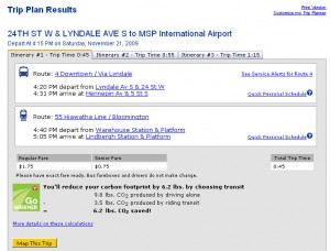
Twin Cities Metro Transit now links carbon footprint data with bus schedules when you plan a trip online.

Carbon Footprint Calculator
Public transit reduces carbon footprint

The  website averages bus CO2 emissions over the distance of your journey to show the visitor what positive impact they can contribute (in terms of carbon saved) for each public-transit journey made.

This is a great tool to help consumers understand the impact they have as an individual – even if the results are a bit ambiguous (it’s highly doubtful that most consumers understand what 6.2 lbs of CO2 means – and unfortunately no comparison is provided to help them put it into context).

Cell Size Comparison

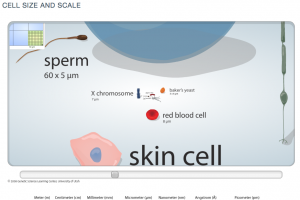
This nifty flash tool from the University of Utah’s Genetic’s lab lets viewers zoom into an image to experience the size of increasingly small cells relative to each other. Such an interactive and immersive experience helps people understand more about the world around them – the very, very small world.

Zooming into increasingly small size comparison of cells.

A useful application based on some of the same principles behind the Eames’ Powers of 10.

Tracing A Box’s Life

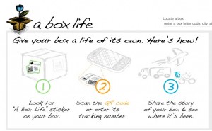
Colombia Sportswear is asking you to ‘Consider the box’ with their project: A Box Life. A Box Life brings awareness to an often-overlooked part of mail-order products’ life-cycles: the packaging.

Box life transparently tracks the back-stories of where boxes have traveled.

Not only is it a clever way to encourage people to reuse packing materials, but telling the stories behind the travels of things also acts as a tool for transparency, and reminds consumers of how individual actions impact sustainability.

read more: Springwise

Sourcemap for product ingredients

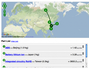
Sourcemap, developed by an MIT-based team, uses Google Earth to map the origins of materials in products. A view inside the open-source application also showcases each ingredient’s carbon footprint – which I hope is an indication that it is only a matter of time until tools like this will expand to highlight other Life-Cycle Analysis data.

Computer components as mapped by a Sourcemap user.

This tool does a great job communicating that ‘ingredients’ in our products are connected to the world around us. As a next step, it would be great to show the carbon impacts in terms that are relevant to consumers – ‘showing’ what the quantity means rather than just stating the number. And to tell more of a story to help consumers frame these big-picture ideas within their everyday experience.

Revealing Hidden Time

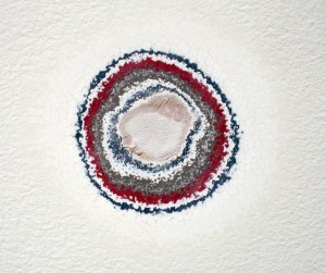
A work by artist Pierre Huyghe, entitled ‘Timekeeper’ uncovers a history of exhibits in this space at the Walker Art Center through sanding down layers of paint on the gallery walls.

Previous layers of gallery paint revealed through sanding.

This work is especially interesting in the context of a white-walled exhibition space: the walls are usually forced into the background in order to highlight the work hung on them. In this case, the very history of that back-drop is what’s highlighted.

The work is part of the Walker’s exhibition, The Quick and the Dead;

Surveying art that tries to reach beyond itself and the limits of our knowledge and experience, The Quick and the Dead seeks, in part, to ask what is alive and dead within the legacy of conceptual art.

Communication Design Recognized in Back-Story-Telling Project

For the first time, the prestigious INDEX Design Award has a winner from the field of communication design. ‘PIG 05049’ is a primarily-visual book, designed and conceived by Christien Meindertsma, that traces all the products made from one pig.

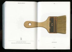
Visual spread from the book 'Pig 05049'
Visual spread from the book

Meindertsma’s intent for the project:

Help people in a highly mechanized and “packaged” world understand how things are made and where they come from so that the resources involved can be cared for by enlightened, informed people.

It’s nice to see the role of communication design to build awareness being recognized within the design community.

Read a previous entry on Meindertsma’s project here.

Mapping the Mississippi: Through Time

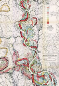
In a beautiful example of layered visual information, Harold Fisk mapped a portion of the Mississippi River in 1944. The series of plates show the changes in the path of the river through time. I’m drawn to the simple and clear detail, effective color palette and the amount of information communicated through this simple technique.

Fisk Map of the Mississippi through the ages
A portion of Fisk’s visually-stunning map of the Mississippi

The full map is available at the US Army Corp of Engineers.