Ba Baa Baacode

Baa code entry

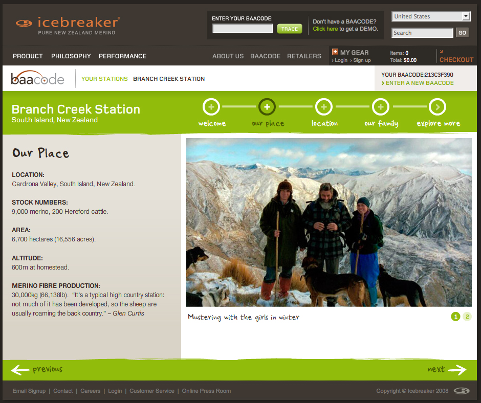
Consumers can track the back story of their Icebreaker product through a portal on the company’s homepage.

BaaCode micro site screengrab

Entering a ‘baacode’ reveals pictures and video clips of the people that raise the sheep and the place they roam.

The information for the sample code paints only a picture around the actual beast (sheep) that the wool fibers come from – not the full production cycle or other components of the clothing. But it’s a good start and an intriguing, at least partially interactive space.

It’s great to offer a sample code, but it would be even better to further incorporate the theme of transparency into the application by opening up the archives so that anyone perusing the website can see details behind all the products. (Only having viewed one sample location upon many visits, I’m also skeptical about how many different stories are actually covered in the online application).

The concept is ripe with potential to give the consumer cues to the product’s backstory at point-of-sale.

The world on your coffee cup

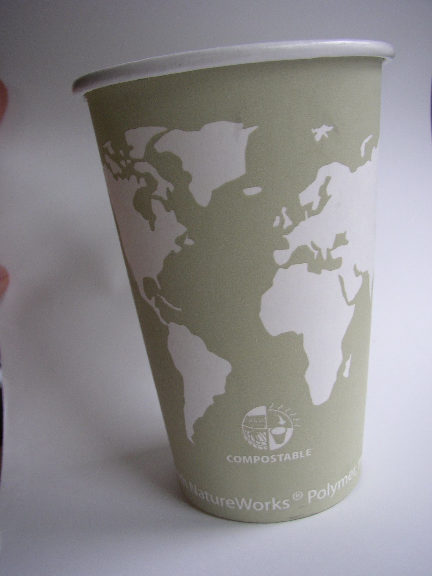
continents outlined on a coffee cupback side of world on coffee cup

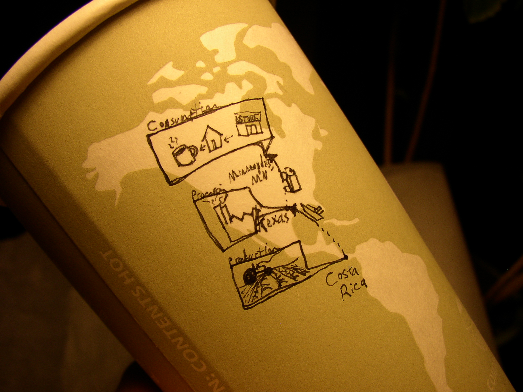
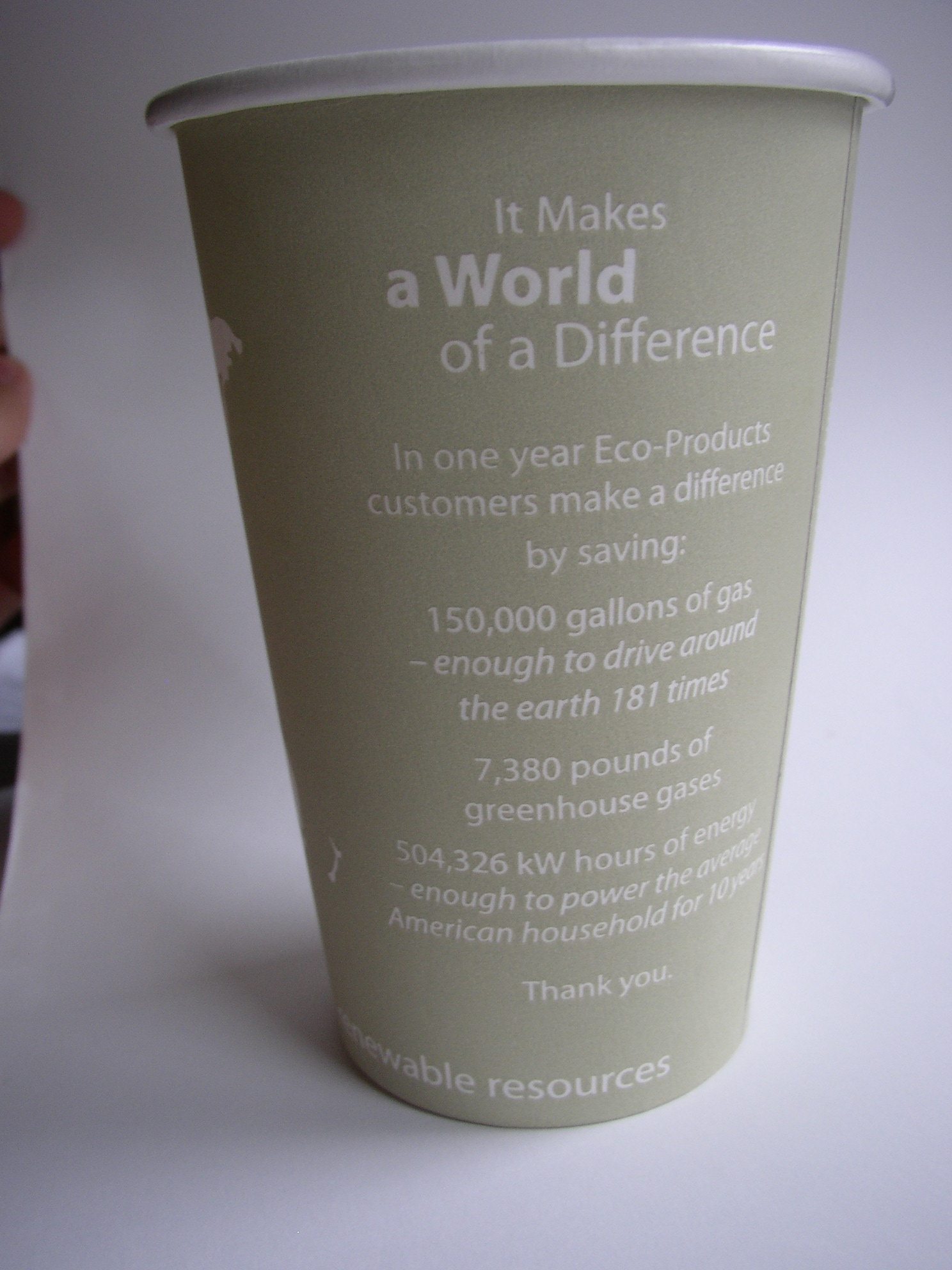
Details on the eco-efficiencies of the company that produced this cup are printed right on it. (Along with an intriguing blank world map: which could lend itself to some sketches to show where the coffee inside came from.)

I’m not sure that many take the time to read the details of eco-efficiencies on the back of the cup- no matter how intriguing they are. However, one thing that really helps is translation from data points into increments that the user can start to comprehend. For example, I’ve no idea what 150,000 gallons of gas means…but by telling me that it’s enough to drive around the earth 181  times, this makes the data more real to me.

By having the ‘world’ on the cup, this could be a unique opportunity to further compare some of the text-based data with the size of the world (for example: how about 181 lines around the cup?, or a sphere to represent what 7,380 pounds of gas would take up [though this may need to be on the scale of a  house rather than to the world])

The ‘compostable’ icon under the continents is a start to some nice information design in itself -though this could have been further simplified, or even tied into some of the text on the cup’s reverse.

Overall, lots of potential, but data is left separate from visuals: even when the visuals are ripe with potential.

Cup by Eco-Products Inc.

T shirt tells its own life cycle.

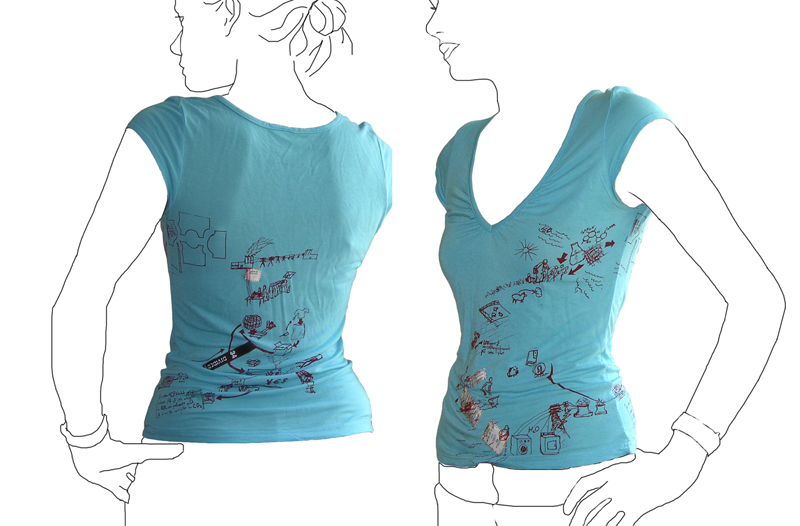
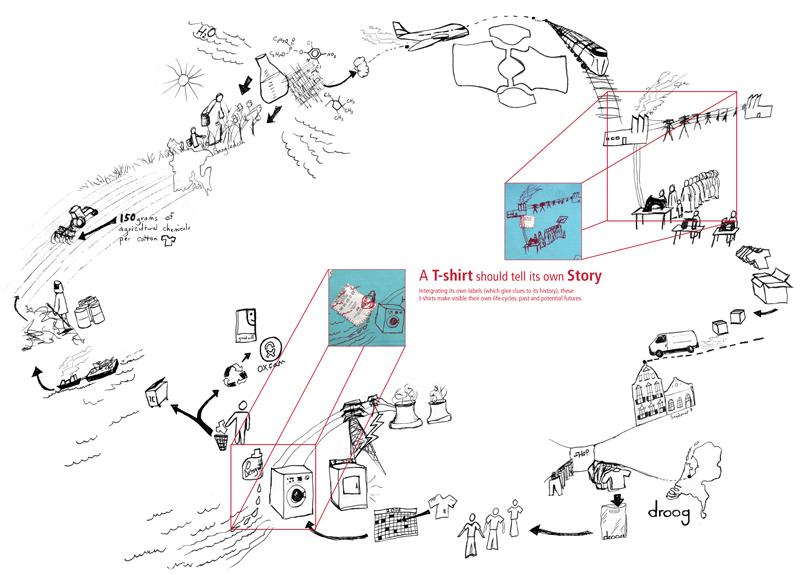
Tshirt printed with it\'s own life cycleLife cycle of a T-shirt: Droog Design

This t-shirt tells its own back story: the t-shirt tags are cut from the inside and stitched into the screenprint graphic of an imagined life of the product. The shirt was put into production in 2006 by Droog Design.

This is a more illustrative, conceptual version of a background story – less data based. The graphic is customized based on available information at the time (this includes where the cotton comes from, and where the t-shirt is sold). More quantitative figures on distance and carbon footprint could be input with the right data available.

Economic Breakdown: Chocolate

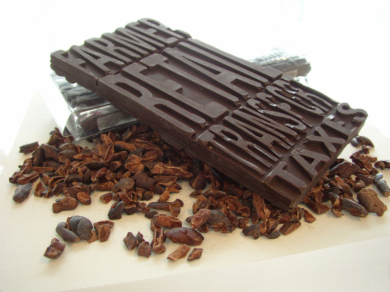
chocolate bar with its economics imprinted

The economics of this (fair trade) chocolate bar are molded into it. The consumer can readily see what percentage of the money they paid went to the farmer vs. transportation. On the reverse is another set of the same text; this time representing non-fair trade chocolate (the farmer gets only half as much as the fair trade example).

Part of a 2006 thesis project on communicating product backgrounds.

Electricity Loses Its Way Home

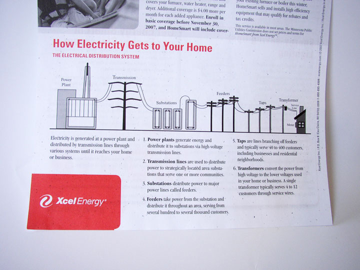
How Electricity Gets to Your Home

How Electricity Gets to Your Home. Context is everything. Without a direct connection with the interests of the intended audience, any information graphic – no matter how well-rendered – will fall flat.

This graphic came with a newsletter that my electric company sends out. But they missed the boat: What do I, as a consumer of electricity, care about “feeders” or “taps”? Though not a bad representation, this graphic feels more like it belongs in an introductory text book for engineers. If the graphic were to explain itself (such as why “taps” are important) and include interesting factoids, I would be glad for the mini education session.

Graphics like these, if splattered with relevant information, offer an interesting insight into the world of electric power. But it’s a fine line between providing superfluous information, and providing information that’s relevant an inspiring for a particular audience.

Timberland

Timberland footprint label

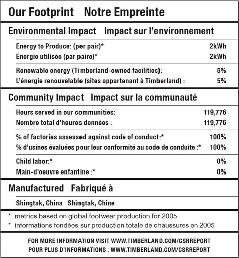
This much-hailed label from Timberland was one of the first to label a product with details on the social and sustainability footprint of the product. It was a good start, but not nearly the level of detail that is possible – nor the level that consumers are clamoring for.

It’s a laudable first effort — in theory, at least. In real life, it’s not very helpful. Simply put: there’s less going on here than meets the eye. –Timberland Reveals Its “Nutritional” Footprint, Worldchanging

Though approachable because the label is created in the format of a nutrition label, beyond that, it’s not very visually satisfying. More depth and emotion could have been portrayed had they gone more into infographics.

Water that Talks

Water Fountain Alcove Water Mosaic

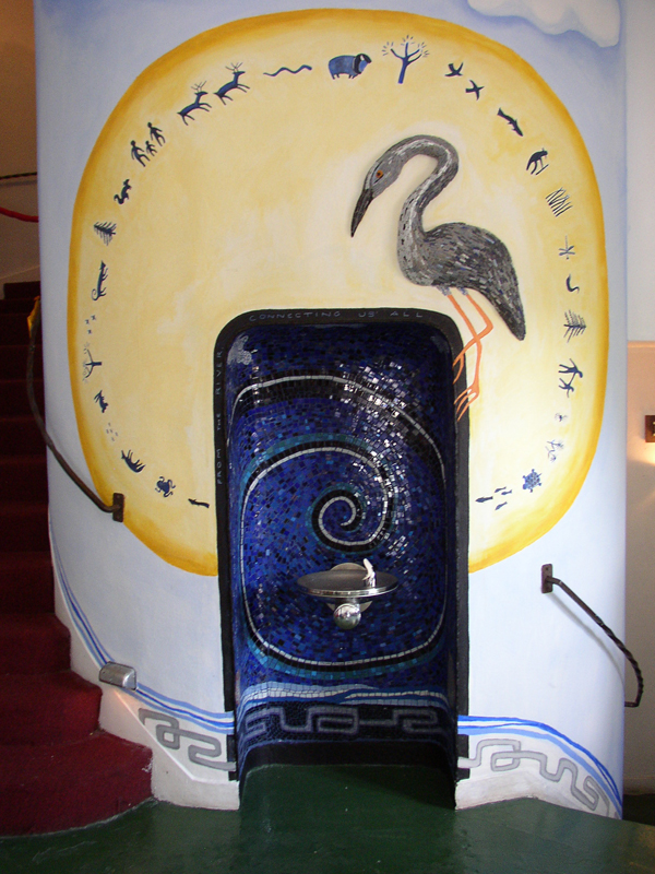
Heart of the Beast theater in Minneapolis held a festival to welcome the water back into the lobby. – For years, the drinking fountain in the building’s lobby had not been functioning. To support their belief that water should be a clean, free and part of the public commons, the theater has focused on water-themed programming to raise funds to repair their fountain. And at last, what a fountain it is.

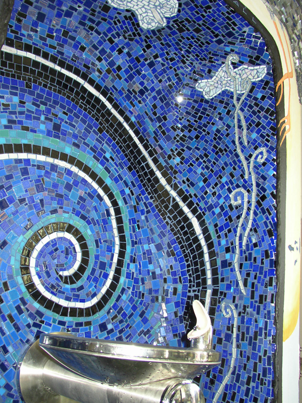
This is an example of a background story taken to the forefront: the mosaic visual magnificently overwhelms the source of initial inspiration. This is fitting as the concept the theater highlights is that water is the source of all life: direct from mother earth herself. The mural haloing the fountain quasi-indicates to the spirituality surrounding water.

If not entirely straight-forward, the visual illustration allows the viewer to create their own story about water: Whether that story is a quest for spirituality, native tradition, or catalogs the historical significance of H2O.

CNN BackStory

CNN BackStory screengrab

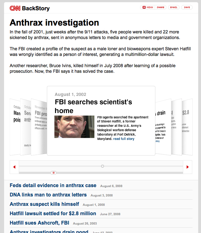
CNN has launched a new application to show how a story has developed over time. This is basically a collection of all CNN-posted stories associated with a particular event. The example they give is the Anthrax case. http://behindthescenes.blogs.cnn.com/

This allows readers to easily dig into the recent history of a story. The impact of a news service that offered such a view into history -AND incorporated stories from other key news media (CNN, BBC, and New York Times for example)- could be extremely powerful piece of online media to showcase varying perspectives. It will be interesting to see if partnerships emerge in this area – also incorporate other online media (video in addition to text-based stories).

Apple Card

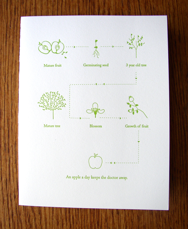
Greeting Card with graphic of Apple life-cycle

If an apple a day keeps the doctor away, this card is worth an entire year doctor-free.

The graphic on this greeting card describes the life-cycle of an apple seed/tree/fruit. The scale of each element is irrelevant because segment of illustration concentrates on the most important component of that part of the cycle; giving the viewer the appropriate zoomed-in or zoomed-out view.

The key words are a bit redundant (especially “Blossom”). Without these words the viewer would still understand that the story is about the cyclic growth of the apple. However, if the subject in question were more complex or unusual than the common apple, keywords would become essential.

Take it one step further: imagine how the graphic could get even better connected if the paper its printed on was made from apple tree pulp…then embed an apple seed inside so the disposal of the card grows another tree. The graphic could then expand to include the tree trunk’s second life as this card.

Card by Pancake & Franks.