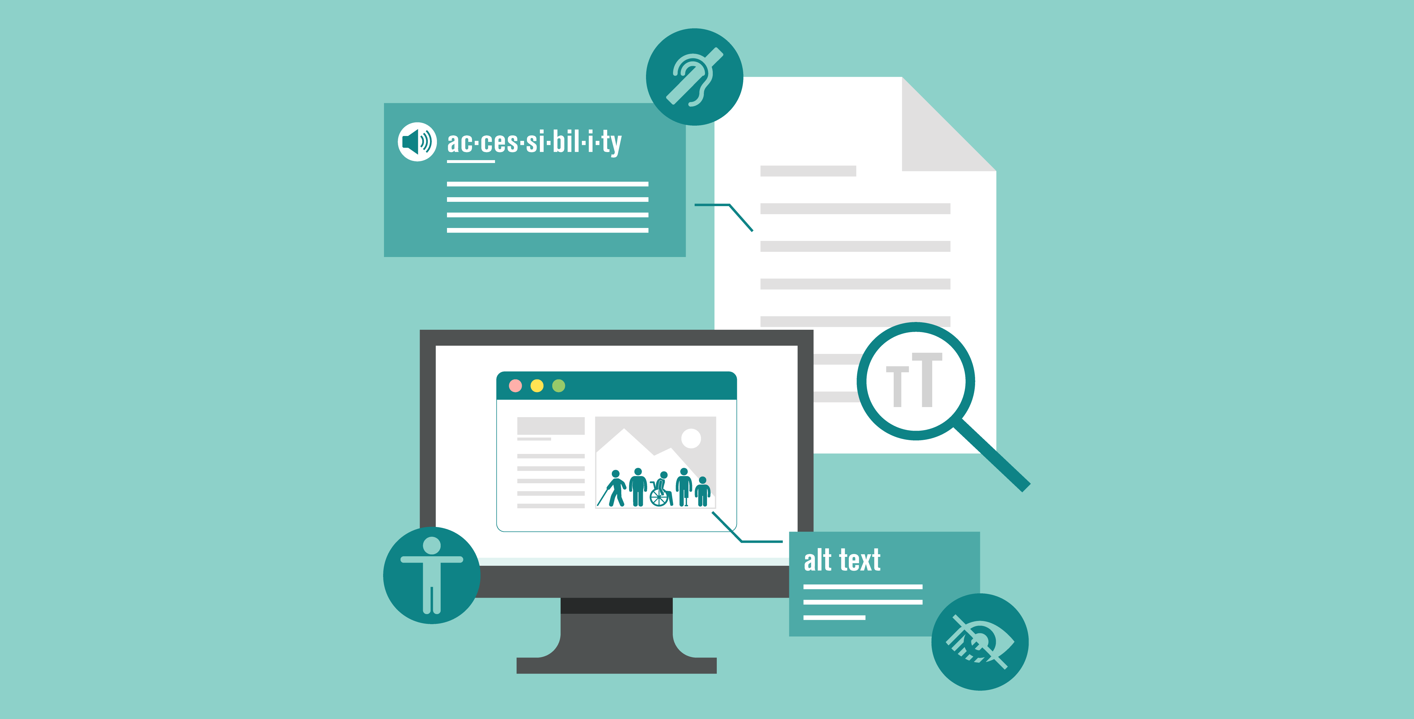
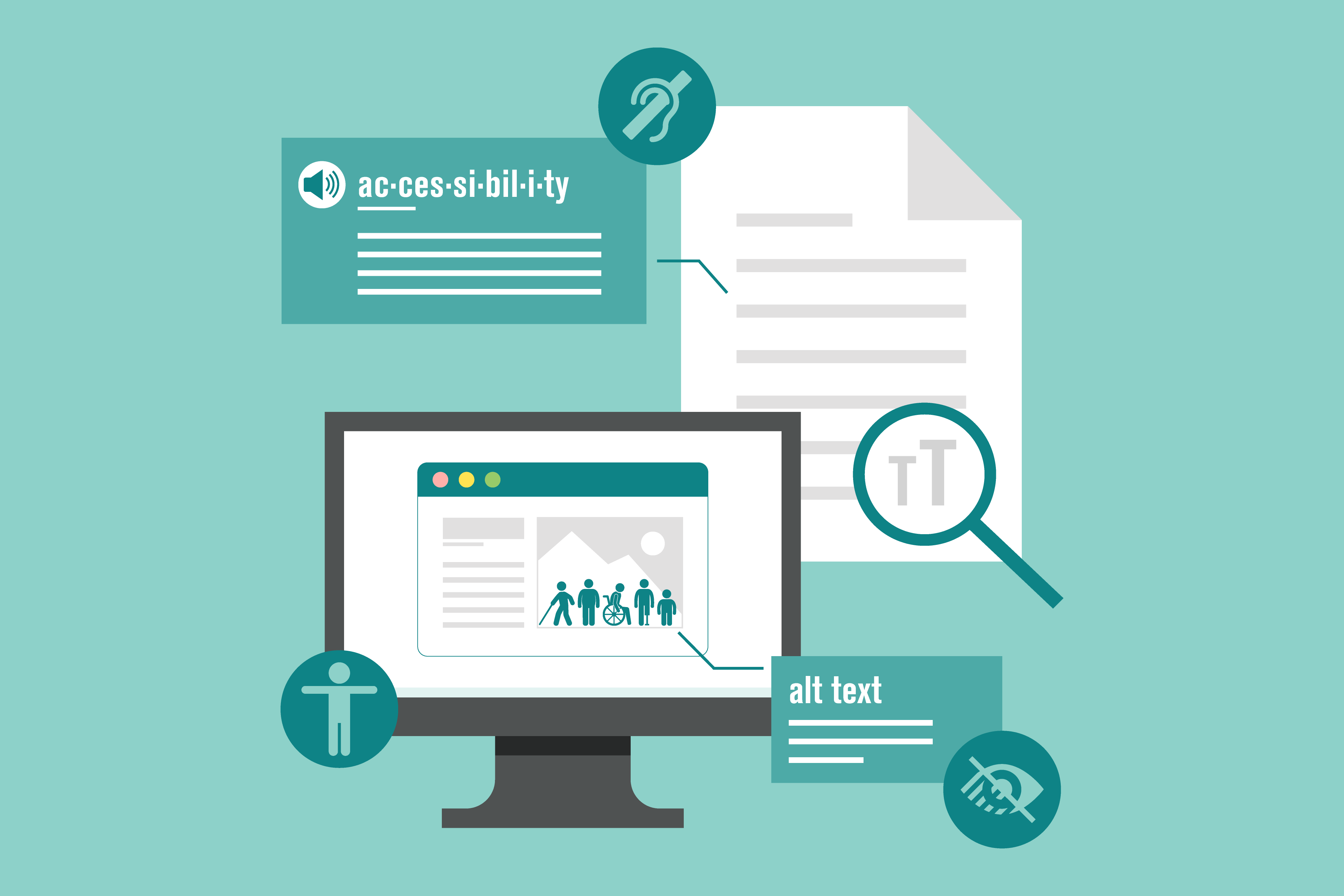
Accessibility is an important consideration throughout the design process: from layout, to font selection, to image tags. We want all relevant audiences – including people with disabilities – to be able to connect with the visuals that we create. Although accessibility guidelines vary, depending on the design output (digital, print, etc.), here is an overview of items the Background Stories team considers when designing for audiences.
Text
When developing text for design, our team focuses on writing short, clear sections of text that avoid overly complicated words. If technical words are important to understand the message, we define those words with short, clear descriptions. A tool we love – the hemingwayapp – helps designers check the reading level of a text. You can read more about this tool in an earlier blog post.
Legibility
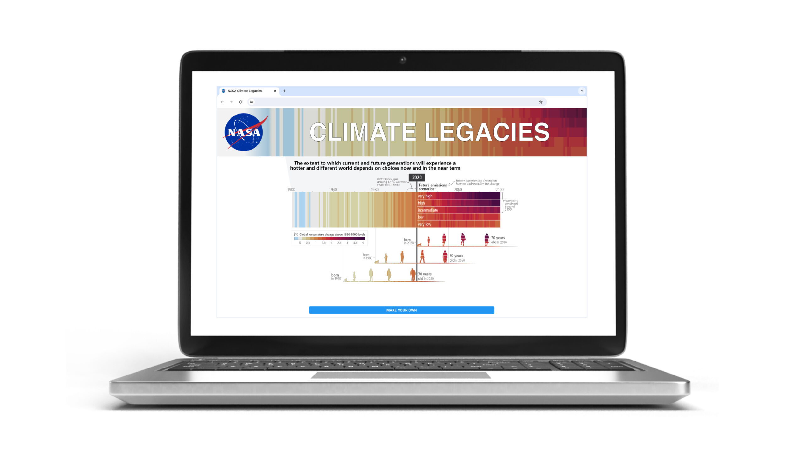
While part of legibility relates to text size and font selection, the legibility of visuals also requires careful consideration of design principles such as color, contrast, line weight, hierarchy, and spacing. Background Stories focuses on applying behavioral science principles to design in addition to design principles. We understand how humans perceive visual information (text and graphics), and we apply these principles to our work.
Visual Representation
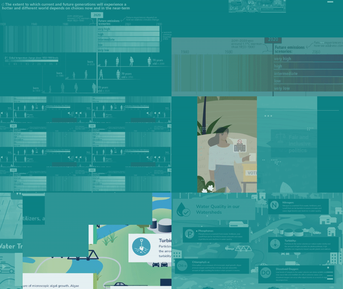
Within visuals, we also see representation as an extension of accessibility. The more that key audiences (including intended beneficiaries) can see themselves represented in visual design, the better the message will be initially received and resonate.
The design profession is directly involved in setting visual standards, and designers play a critical role in fostering positive change. Lack of diversity in mainstream media is well documented, and the Background Stories team works to counter this by representing a diversity of human figures in our visuals - especially those visuals that depict positions of power. Showing diverse human figures includes representing a variety of race, gender, body types, and cultural characteristics. Read a bit more about our focus here, in this recent article on Earth Day and social justice from our blog.
Additional Resources We Use
Assessing color contrast for ADA compliance: https://webaim.org/resources/
contrastchecker/ Creating Alt text for Images: https://accessibility.huit.
harvard.edu/describe-content- images Testing with screen-reader software: NonVisual Desktop Access (NVDA) (free)
