Cross Section of History

A Giant Sequoia in New York’s American Museum of Natural History reveals centuries of history juxtaposed with the tree’s growth rings. The pairing of dates of history with centuries of growth rings gives us deeper understanding of how time passes and things change: as seen both in nature and in civilization.
Historical events juxtaposed on growth rings

A definite ‘background story’ – pairing visual cues with data and textual information. This visual reference to nature’s growth is a peak into the life story of the tree: marking the years of fast and slow growth. The numerical years provide a reference to our own history: with additional stories of what happened in civilization corresponding with each growth ring. A good reminder that everything changes.

On the topic of trees, the image below is from the Moderna Museet in Stockholm (by an artist whose name I seem to have unfortunately misplaced…). Following growth rings, this artist carves away the ‘years’ of a length of log: revealing the shape of the tree’s younger self.
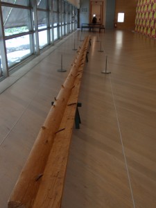

carved tree reveals it's younger self
carving reveals youth

Turning over a New Leaf (paper)

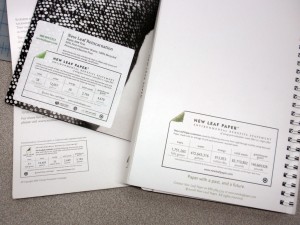
The New Leaf paper eco-audit is a well-thought out tool that communicates transparency, and -in a beautiful way- helps the end consumer understand the sustainability-positive impact of using a specific paper.

The eco-audit provides a place for data on resources that have been saved throughout the life-cycle of New Leaf’s paper (as compared to the industry standard). The eco-audit profiles the quantity of ‘saved’ trees, water, energy, solid waste and greenhouse gases. And an online portal allows companies to customize the quantities for their own print-jobs.

New Leaf labels on printed projects

Customizable background stories supported by sustainability statistics- what isn’t to love? A bit more visual reference could be incorporated into the eco-audit label, or the concept could have some accompanying publicity or other materials that really bring this idea to (visual) life. This may include developing an application to show comparisons online, or supplementing the numbers with visual representation.  I -for one- would like to see what an expanse of 118-saved trees actually looks like. Or a comparison to how many swimming pools 50,178 gallons would fill.

5lb. butter = How many cows?

My local, local-foods eatery, Common Roots, has launched the first of a series of profiles on the local farms from which the restaurant/coffee shop sources their ingredients. First up: Butter from Hope Creamery in Hope, MN.

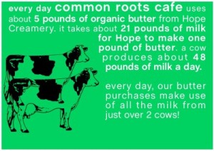
Nice story about the history of the creamery (though slightly lengthy for online attention spans) . And a short video (the first time I’ve seen 2500 pounds of butter churned). But what was most Background Story-esque is a graphic that was included in an email announcing the endeavor:

How many cows does it take...

Not only does this factoid give us a bit of background on butter production (by stating the average daily output of 1 cow), it also quantifies the cafe’s own usage in terms of cows. This kind of information puts data in context. I hope to see similar comparisons (especially in terms of land use, water use, etc.) in future showings of Common Roots’ farm/product profiles.

Reality, augmented. […sustainably?]

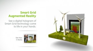
Merging analog and digital, this new tool allows users to use their webcam to make a simple printed page come to life. In 3 dimensions!
Augmented Reality: a virtually 3-d landscape unfolds via your computer's webcam.
Augmented Reality: a virtually 3-d landscape unfolds via your computer

An incredible display of technology, it’s not hard to imagine the communication possibilities for sustainability, communicating the background stories of products…or anything for that matter. However it’s not immediately clear how this technique is as exclusive to the future of sustainable communications as it would have us believe (the tool is introduced from within GE’s micro site promoting sustainable technologies like the smart grid and smart power meters). Though a extremely promising tool, a slight scent of greenwash clouds the air.
Watch the video, as presented by Adobe CTO, then try it for yourself.

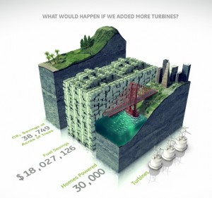
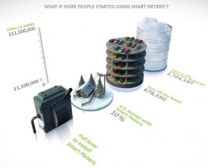
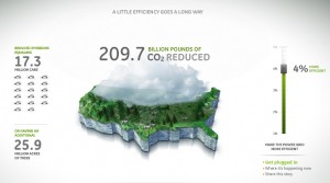
On the topic of eco-magination, there are some wonderfully communicative info-graphics throughout the micro site. However, overall the site is excessively flashy: lots of pretty pictures…but not much overall content.  It seems to have been created as a playground for cutting-edge graphics more than to support sustainability. (Though, one could argue that’s GE’s intent…) More easily accessible information to back up the claims that GE wants to communicate through such elaborate – and interactive- visuals would lend significantly more credibility to this site.
bar graphs bring information to life with visual virtual worlds
Bar graphs bring information to life with visual virtual worlds

Environmental and financial savings stack up in a bar graph.
GE infographic - Mapping CO2 Emissions

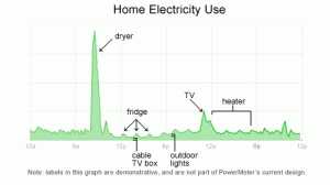
Home energy usage via Google

Google is in the development stages of a power meter that enables users to monitor real-time feedback on their household energy consumption. This kind of instantaneous feedback gets to the basic premise of why it’s important to show & tell background stories. This power meter is tool that enables the customer to make their own choices: in this case, the customer can make the connection between more energy usages= more $.

Google's plan to meter home energy consumption
Google's plan to meter home energy consumption.

Follow google’s developments on www.google.org/powermeter.

Perhaps this precision monitoring of the background of products also paves the way for technologies enabling people to generate their own power – and sell it back to utilities.

Frowning Utility Bills

A utility company is literally establishing an emotional connection with the audience: via smiley or frowning faces on their utility bills.

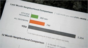
Visual Comparison, photo by Max Whittaker for The New York Times

A New York Times article reports how a Sacramento utility is inspiring residents to lower their energy usage by providing them visual feedback on their utility bills…and it doesn’t hurt that the bill compares them with their neighbors. A little competition can go a long way – it puts people’s own actions in context to their peers.

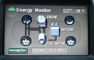
Prius console monitors the product’s energy

Prius’ console allow users (and passengers) to see what happens under the hood. The console sports an energy monitor (among other controls) that transparently provides information to the user (and passengers) so they can understand how the ups-and-downs of gas and break pedals impact the hybrid’s fuel usage and battery charging.

Prius Energy Transfer map

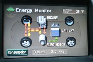
Using simple visuals and motion graphics, the console maps how energy is used, and shows how the battery gets recharged.  What results is the ultimate in immediate user-feedback.

Map of Prius Energy Usage in motion

In addition to helping the riders to understand what exactly a hybrid is, and how it works, this system helps users drive more eco-efficient because they get immediate feedback. As a driver, you can start to understand what’s going on, and how your driving techniques impact the fuel-efficiency of the vehicle. This model integrates enough feedback loops so a driver can learn to adjust their own driving to help the system optimize how it runs.

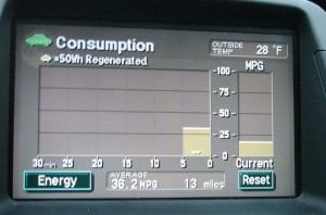
An added layer of feedback on newer Prius models is a chart that records energy consumption over the last 30 minutes of use – enabling the user to compete against themselves for improvement.

Graph charts energy consumption

Products should be designed to showcase some level of their inner-workings. Even if the vehicle was not a hybrid, it’s a great step toward product transparency. Just imagine if more of our energy-devouring equipment incorporated similar feedback mechanisms.

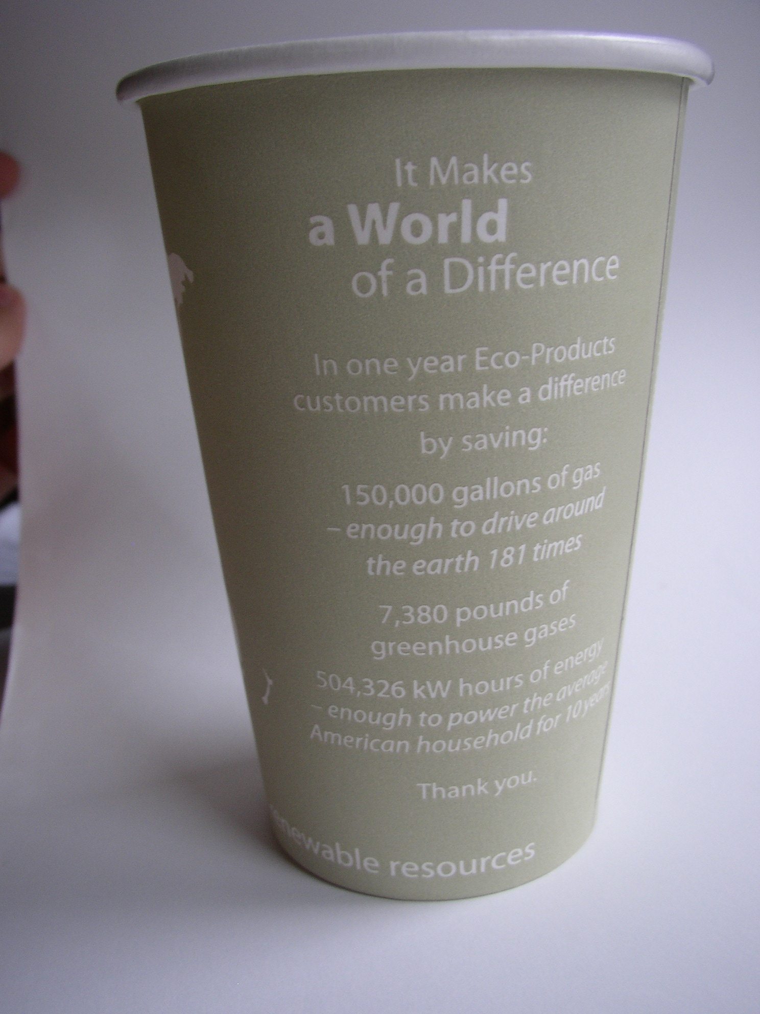
The world on your coffee cup

continents outlined on a coffee cupback side of world on coffee cup

Details on the eco-efficiencies of the company that produced this cup are printed right on it. (Along with an intriguing blank world map: which could lend itself to some sketches to show where the coffee inside came from.)

I’m not sure that many take the time to read the details of eco-efficiencies on the back of the cup- no matter how intriguing they are. However, one thing that really helps is translation from data points into increments that the user can start to comprehend. For example, I’ve no idea what 150,000 gallons of gas means…but by telling me that it’s enough to drive around the earth 181  times, this makes the data more real to me.

By having the ‘world’ on the cup, this could be a unique opportunity to further compare some of the text-based data with the size of the world (for example: how about 181 lines around the cup?, or a sphere to represent what 7,380 pounds of gas would take up [though this may need to be on the scale of a  house rather than to the world])

The ‘compostable’ icon under the continents is a start to some nice information design in itself -though this could have been further simplified, or even tied into some of the text on the cup’s reverse.

Overall, lots of potential, but data is left separate from visuals: even when the visuals are ripe with potential.

Cup by Eco-Products Inc.

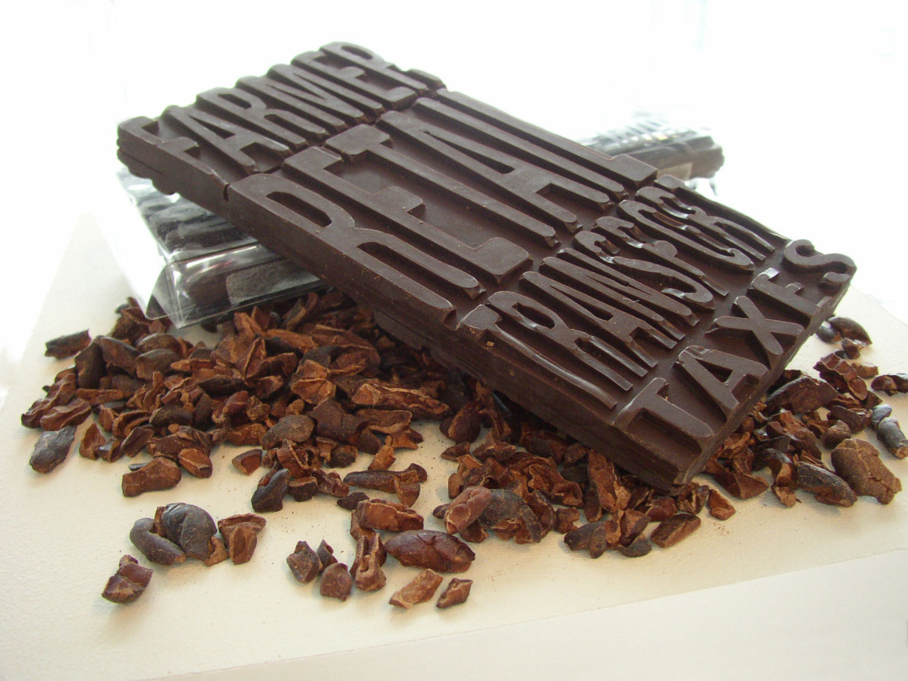
Economic Breakdown: Chocolate

chocolate bar with its economics imprinted

The economics of this (fair trade) chocolate bar are molded into it. The consumer can readily see what percentage of the money they paid went to the farmer vs. transportation. On the reverse is another set of the same text; this time representing non-fair trade chocolate (the farmer gets only half as much as the fair trade example).

Part of a 2006 thesis project on communicating product backgrounds.