Pollinator-Friendly Solar at the Fair

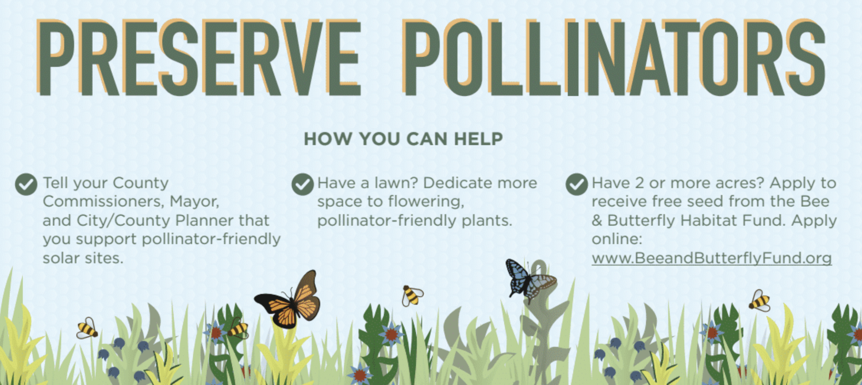
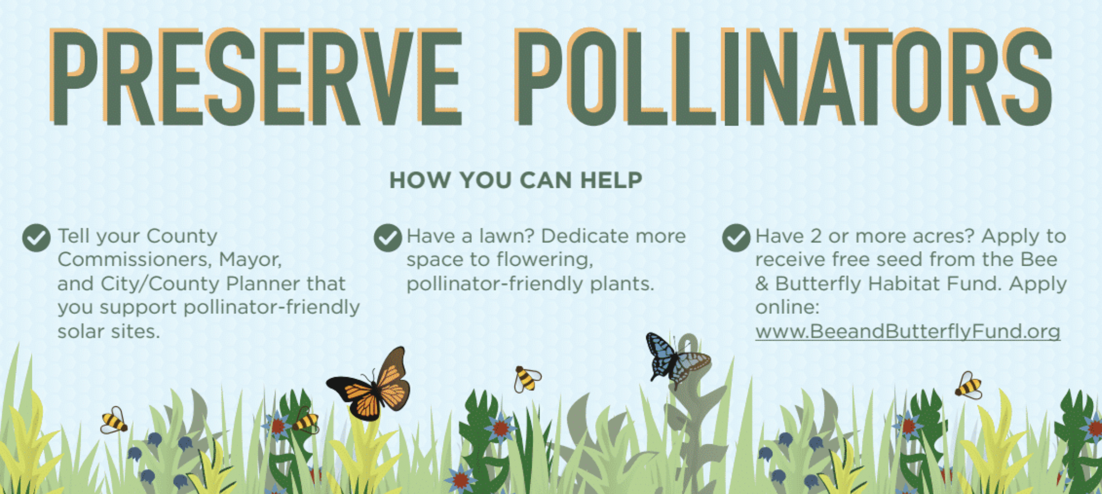
For this year's Minnesota State Fair, we've teamed up with Fresh Energy and Connexus Energy to create a three-dimensional display to draw attention to a new way of thinking about renewable energy: Pollinator-friendly solar. Preserve Pollinators Our display, part of "The Common Table: Minnesota Eats" exhibit in the Agriculture Horticulture Building, highlights how our region is leading the way in policymaking and on-farm efforts to bring more pollinator habitat to otherwise underutilized land. You can see the exhibit in-person from August 23 through September 3, along with nearly two million other fair-goers (who famously flock to the event for all kinds of foods and creations "on a stick"). Of course, our sticks — a series of cutout landscape elements and hide-and-seek pollinators for you to find — will be glued down, but you're sure to learn a lot about the powerful partnership of pollinators and solar energy!

Selecting the Right Graph

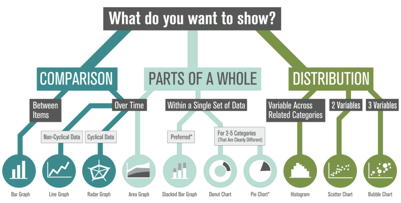
We're often asked, "What type of graph should I use for this data?" We also see a lot of variety in how similar data sets are visualized (some working better than others). There's plenty of debate out there, so how do you decide? Selecting The Right Graph We've created this visual guide to recommend best practices, which starts with a clear understanding of your content — what are you trying to show? There are options within each category based on the type of data in your set (and ironically, many of the standard graph types tend to share food-based titles... by the time you decide between Pies, Bars, and Donuts, you might be tempted to hit the bakery!). Which graph will you apply to your next datavis project?

The [Unequal] Power of Images

When to use a photo vs. an icon

There are many style options available when it comes to communicating information visually. Photos excel at evoking emotion in individual scenarios, when the photograph literally represents what is being communicated.
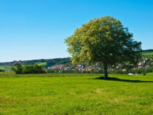
Photograph of a tree Icon of a tree

Icon-focused infographics tend to group information on a more broad level: reflecting general patterns and information rather than specific, individual – and quite often emotional – experiences.

Consider this example: This tree photo points to a very specific situation and can evoke memories. Maybe it reminds you of one that you played under growing up. Alternatively, perhaps the species of tree on this rolling, green landscape looks nothing like where you live. That makes it harder to relate to.

An icon, on the other hand, is more versatile. The icon evokes the idea of ‘tree’ regardless of your own memories. It is perceived more generally as ‘tree’ rather than ‘deciduous tree’ or ‘kinda-like-our-climbing-tree’.


In short: 

  • Use a photo for specific circumstances, details, case studies and people
  • Use an icon for general concepts, broad mapping, global systems and universal ideas.

Case studies are a great place to use photographs because they need to communicate details of a specific story. When the desire is to communicate a more global, standardized concept or structure, icons are generally a better choice. The 2 approaches can certainly be combined in a well-thought-out visual.
Motivating Sustainable Behavior

How can we help people act more sustainably?

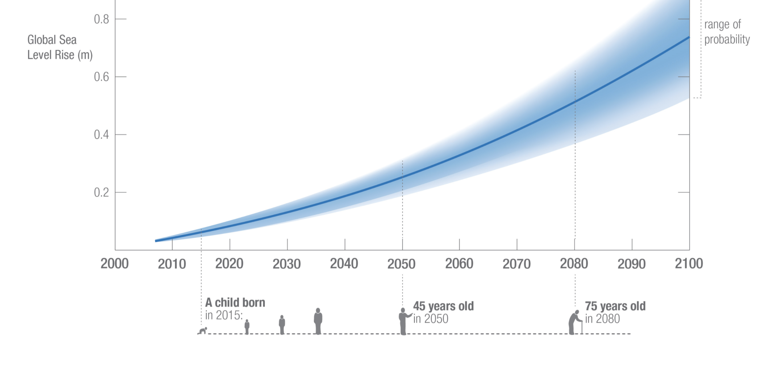
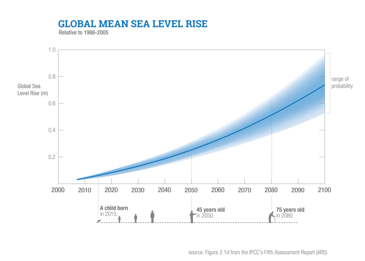
According to a series of studies from the Harvard Business Review, ‘seeing’ ourselves in the future helps us make decisions that prioritize long-term benefits to our future selves (over short-term gains).

One study had half of participants interview digitally-aged avatars of themselves. Then participants did a seemingly-unrelated exercise to divide a budget. Those who had interacted with their future selves allocated twice as much of the hypothetical budget to retirement.

There’s already a lot of literature showing that response is stronger when you people are given vivid examples -those that touch them emotionally. So these studies seem to suggest that long-term thinking can be accessed through establishing emotional connection with the future.

In sustainability, ’the future’ is already plastered throughout tag lines and campaigns: “for our children” or “without compromising the ability of future generations to meet their own needs” are common examples. However, these phrases often aren’t positioned in a way that helps the ‘future self’ of individuals become visible. Maybe instead of talking about the future in vague, society-oriented terms, we should spend more time helping people see themselves in their own future. This could involve helping people understand the ways in which data or information parallels with their own, individual future. Or how trends over time align with their children’s existence.

So let’s help people first envision their own futures; in order to prepare individuals to understand the important role that sustainability plays in life.

Global Mean Sea Level Rise

Linking Everyday Gestures with Digital Details

Pranav Mistry combines standard, everyday gestures with digital information. His solutions -which include the SixthSense wearable computer – have potential to bring real transparency into sustainability, and enable people to literally immerse themselves in their own ecological footprints. Continue reading

Cell Size Comparison

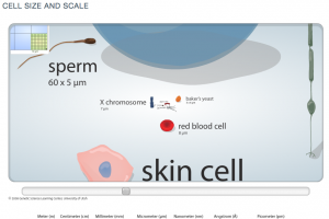
This nifty flash tool from the University of Utah’s Genetic’s lab lets viewers zoom into an image to experience the size of increasingly small cells relative to each other. Such an interactive and immersive experience helps people understand more about the world around them – the very, very small world.

Zooming into increasingly small size comparison of cells.

A useful application based on some of the same principles behind the Eames’ Powers of 10.

Communication Design Recognized in Back-Story-Telling Project

For the first time, the prestigious INDEX Design Award has a winner from the field of communication design. ‘PIG 05049’ is a primarily-visual book, designed and conceived by Christien Meindertsma, that traces all the products made from one pig.

Visual spread from the book 'Pig 05049'
Visual spread from the book

Meindertsma’s intent for the project:

Help people in a highly mechanized and “packaged” world understand how things are made and where they come from so that the resources involved can be cared for by enlightened, informed people.

It’s nice to see the role of communication design to build awareness being recognized within the design community.

Read a previous entry on Meindertsma’s project here.

Disclosing Dish Soap

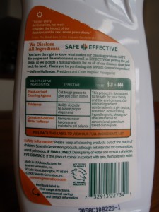
Seventh Generation’s liquid dish soap bottles are sporting an in-depth ingredient label – under the existing label.

Dish soap ingredient information label

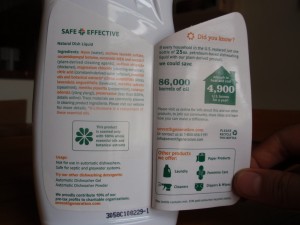
The peel-away outer back-panel gives a text-heavy overview of the company’s safety criteria and commitment to transparency. Inside, an extended eco-label takes the first steps toward integrating statistics: Minimally illustrated with a home icon, the statement reads that ‘if every household in the U.S. replaced petroleum-based dish soap with plant-based… we would save 86,000 barrels of oil (the equivalent to heat and cool 4,900 U.S. homes per year).

Its nice to see a comparison that puts so many barrels of oil into a meaningful perspective for the purchaser.

Stats and info revealed on Dish liquid bottle
Stats and info revealed on Dish liquid label

The peel-away label allows for 2 additional panels for the consumer to transparently uncover information, but the space could have been used even more effectively: I’d love to see a more life-cycle oriented approach applied to this design format, and the icons used to highlight information, rather than to advertise the company’s other product offerings.

Turning over a New Leaf (paper)

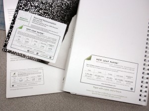
The New Leaf paper eco-audit is a well-thought out tool that communicates transparency, and -in a beautiful way- helps the end consumer understand the sustainability-positive impact of using a specific paper.

The eco-audit provides a place for data on resources that have been saved throughout the life-cycle of New Leaf’s paper (as compared to the industry standard). The eco-audit profiles the quantity of ‘saved’ trees, water, energy, solid waste and greenhouse gases. And an online portal allows companies to customize the quantities for their own print-jobs.

New Leaf labels on printed projects

Customizable background stories supported by sustainability statistics- what isn’t to love? A bit more visual reference could be incorporated into the eco-audit label, or the concept could have some accompanying publicity or other materials that really bring this idea to (visual) life. This may include developing an application to show comparisons online, or supplementing the numbers with visual representation.  I -for one- would like to see what an expanse of 118-saved trees actually looks like. Or a comparison to how many swimming pools 50,178 gallons would fill.