Disclosing Dish Soap

Seventh Generation’s liquid dish soap bottles are sporting an in-depth ingredient label – under the existing label.

Dish soap ingredient information label

The peel-away outer back-panel gives a text-heavy overview of the company’s safety criteria and commitment to transparency. Inside, an extended eco-label takes the first steps toward integrating statistics: Minimally illustrated with a home icon, the statement reads that ‘if every household in the U.S. replaced petroleum-based dish soap with plant-based… we would save 86,000 barrels of oil (the equivalent to heat and cool 4,900 U.S. homes per year).

Its nice to see a comparison that puts so many barrels of oil into a meaningful perspective for the purchaser.

Stats and info revealed on Dish liquid bottle
Stats and info revealed on Dish liquid label

The peel-away label allows for 2 additional panels for the consumer to transparently uncover information, but the space could have been used even more effectively: I’d love to see a more life-cycle oriented approach applied to this design format, and the icons used to highlight information, rather than to advertise the company’s other product offerings.

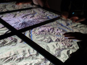
Tracking water droplets: Playing raincloud.

An exhibit on Water at the Science Museum of Minnesota contains an interactive display that allowed people to ‘become’ a raincloud. By rubbing a ‘raincloud’ tool over a series of screens displaying a topographic map, the cloud rains drops of water onto the topo-map. Visitors can see how the drops of water run down the sides of a topographic map to slow and pool together in the valleys between mountains. Colliding together, the blue drops create rivers which meander through valleys until falling off the screen.

Interactive table created interaction for watersheds

As a fun way for visitors to interact with the exhibit, this project helps people understand how water flows (the fact being downhill- which I thought was obvious, but apparently there is an overwhelming number of people who are surprised when rivers turn to flow North instead of South, as on maps they must have an idea that gravity makes the water flow off the page.)

Reality, augmented. […sustainably?]

Merging analog and digital, this new tool allows users to use their webcam to make a simple printed page come to life. In 3 dimensions!
Augmented Reality: a virtually 3-d landscape unfolds via your computer's webcam.
Augmented Reality: a virtually 3-d landscape unfolds via your computer

An incredible display of technology, it’s not hard to imagine the communication possibilities for sustainability, communicating the background stories of products…or anything for that matter. However it’s not immediately clear how this technique is as exclusive to the future of sustainable communications as it would have us believe (the tool is introduced from within GE’s micro site promoting sustainable technologies like the smart grid and smart power meters). Though a extremely promising tool, a slight scent of greenwash clouds the air.
Watch the video, as presented by Adobe CTO, then try it for yourself.

On the topic of eco-magination, there are some wonderfully communicative info-graphics throughout the micro site. However, overall the site is excessively flashy: lots of pretty pictures…but not much overall content.  It seems to have been created as a playground for cutting-edge graphics more than to support sustainability. (Though, one could argue that’s GE’s intent…) More easily accessible information to back up the claims that GE wants to communicate through such elaborate – and interactive- visuals would lend significantly more credibility to this site.
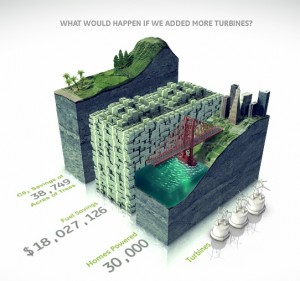
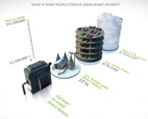
bar graphs bring information to life with visual virtual worlds
Bar graphs bring information to life with visual virtual worlds

Environmental and financial savings stack up in a bar graph.
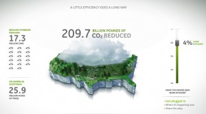
GE infographic - Mapping CO2 Emissions

Frowning Utility Bills

A utility company is literally establishing an emotional connection with the audience: via smiley or frowning faces on their utility bills.

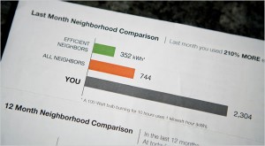
Visual Comparison, photo by Max Whittaker for The New York Times

A New York Times article reports how a Sacramento utility is inspiring residents to lower their energy usage by providing them visual feedback on their utility bills…and it doesn’t hurt that the bill compares them with their neighbors. A little competition can go a long way – it puts people’s own actions in context to their peers.

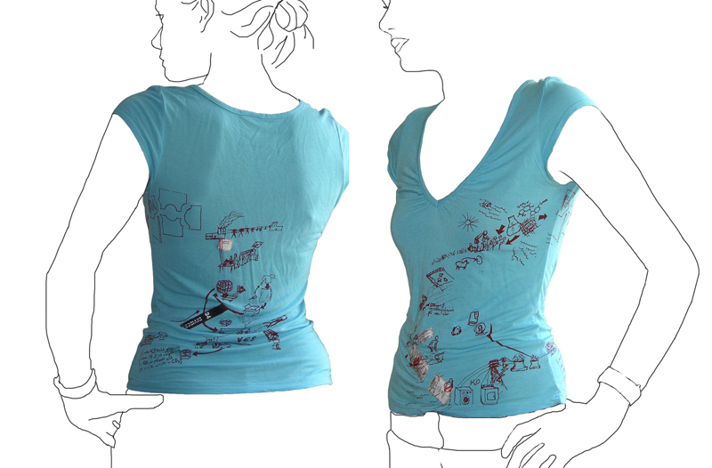
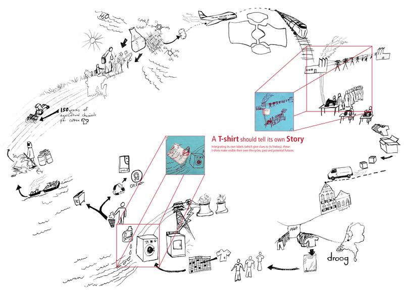
T shirt tells its own life cycle.

Tshirt printed with it\'s own life cycleLife cycle of a T-shirt: Droog Design

This t-shirt tells its own back story: the t-shirt tags are cut from the inside and stitched into the screenprint graphic of an imagined life of the product. The shirt was put into production in 2006 by Droog Design.

This is a more illustrative, conceptual version of a background story – less data based. The graphic is customized based on available information at the time (this includes where the cotton comes from, and where the t-shirt is sold). More quantitative figures on distance and carbon footprint could be input with the right data available.

Electricity Loses Its Way Home

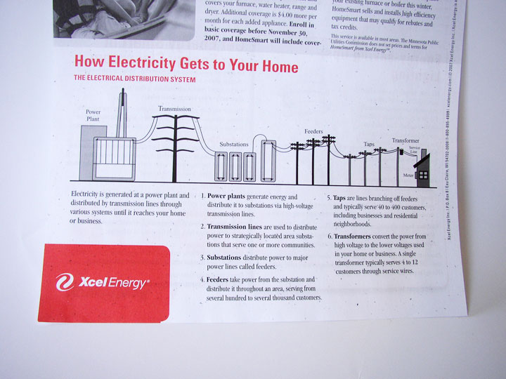
How Electricity Gets to Your Home

How Electricity Gets to Your Home. Context is everything. Without a direct connection with the interests of the intended audience, any information graphic – no matter how well-rendered – will fall flat.

This graphic came with a newsletter that my electric company sends out. But they missed the boat: What do I, as a consumer of electricity, care about “feeders” or “taps”? Though not a bad representation, this graphic feels more like it belongs in an introductory text book for engineers. If the graphic were to explain itself (such as why “taps” are important) and include interesting factoids, I would be glad for the mini education session.

Graphics like these, if splattered with relevant information, offer an interesting insight into the world of electric power. But it’s a fine line between providing superfluous information, and providing information that’s relevant an inspiring for a particular audience.

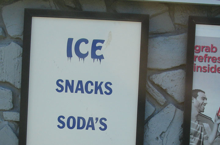
Icy “ICE” sign

Ice for sale sign

The “ICE” on this sign gives visual cues to the effect of the product itself.

Where the viewer may have understand what “SNACKS” and “SODA’S” mean, they will feel the meaning of “ICE”. This technique can also aid in understanding for low-literacy audiences.

Strawberry Yogurt Sketch

Iowa Strawberry Yogurt IngredientsDistances of Strawberry Yogurt Ingredients

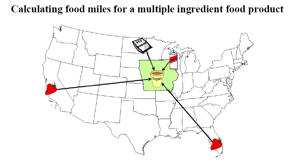
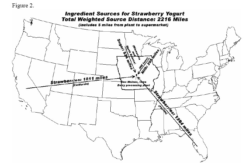
This pair of straight-forward graphics appear on separate pages of “Calculating food miles for a multiple ingredient food product” – a white paper from Iowa State University’s Leopold Center.

The graphics show where the ingredients of a specific Strawberry Yogurt have come from.

The first graphic is more visual, and thereby more enticing at first glance, but it does not convey the useful information of the 2nd graphic. The first graphic could be expanded to incorporate the detail of the second graphic: exactly how far each ingredient has traveled. And it could be further expanded to specify which method of travel (plane, train, truck, etc.), and with what carbon footprint.

A more detailed report (including stats on this yogurt’s Life-Cycle Assessment [LCA]) accompanies these graphic. Source: http://www.leopold.iastate.edu/pubs/staff/files/foodmiles_030305.pdf

Slow down for the children

30km/hour Thanks. It\'s for us. 30km/hour Please!

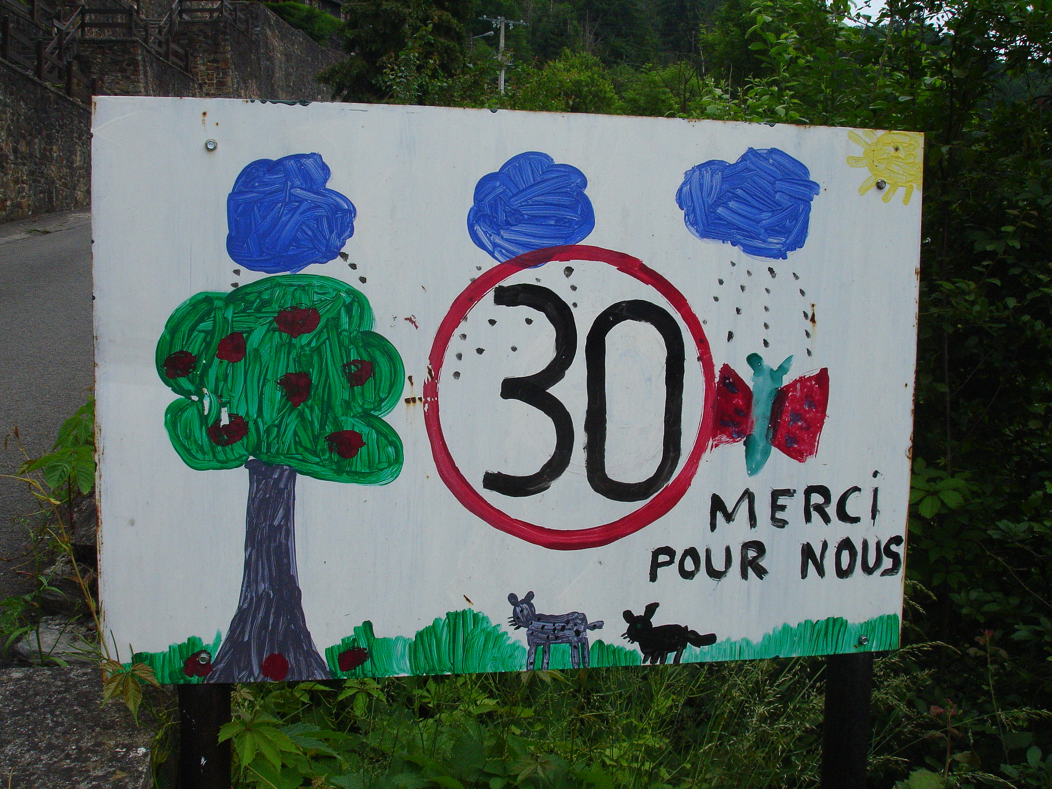
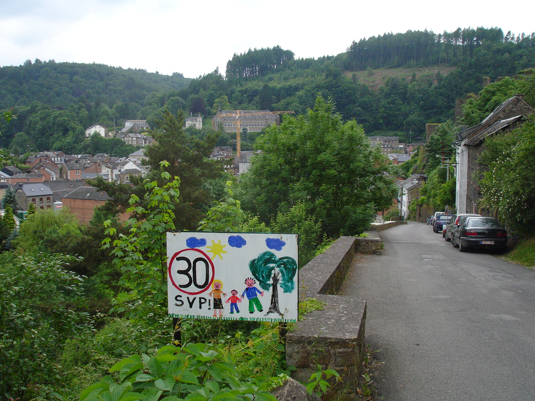
We came upon several of child-designed ‘slow down’ in a neighborhood area of this picturesque Southern Belgian village.

Not only do these signs get you to slow down to enjoy the art, they also are strong reminders of the reason one should reduce speed:as one sign distinctly puts it “for us”.

The circled ’30’ (the European symbol for speed limit) is consistent on sign. Painted on the white board surrounding this ‘slow down’ symbol are the happy indications of childhood in the area: sunshine, trees, swings, families, dogs, cats, and a myriad of other animals. Personalized, these tell the story of neighborhood life from kid-view.

Such a request for speed reduction is more effective and easier to obey when it comes direct from the pint-sized residents of the street than from the typical sterile government-issued signs. These factory-stamped signs only serve to remind a driver that there are staunch rules to conform to. Sure, the objective of each style of sign is the same, but by including an indication of the reason ‘why’ behind a request for conformity, drivers are more likely to adopt the concept as their own and ride the breaks.

The Beginning of the Blog

This catalog aims to feature existing designs and other forms of visual communication that inspire understanding about the big-picture impacts of the ordinary everyday. The examples posted are both found and self-generated.

Visual communication (often in the form of information graphics) can be a powerful tool to help people understand the big-picture impact of a product or service.

It’s my hope that this will serve as inspiration for visual display of product background stories.