Capturing the heart of an organization in a single model is no small feat. Now that it’s finished, how will you encourage your team and wider community to use it?
Visual storytelling is an effective tool to help audiences understand your organization. By transforming your Theory of Change into an easy-to-understand infographic, you’ll jump-start the process of adopting and sharing your new model with the world.
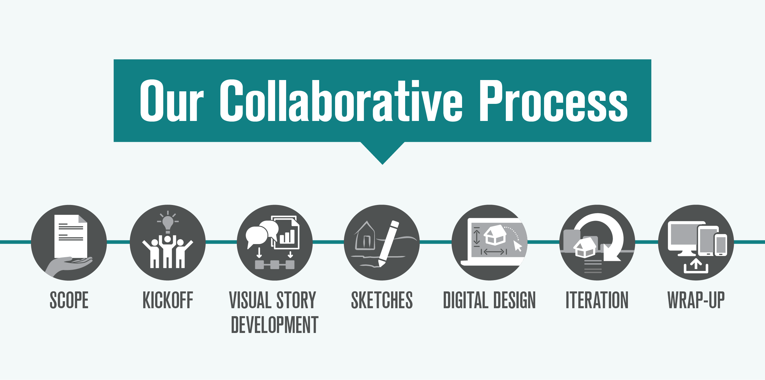
When an organization is ready to visualize their Theory of Change, we kick off our time-tested collaborative process by thinking about and discussing the following details.
Find your primary audience
- Quickly explain the organization to a potential donor at an in-person event
- Introduce the organization’s programs to a new employee in training
- Serve as a north star for leadership when making a big decision
Each of these uses has a different primary audience. Before starting to develop the Theory of Change infographic, it can be helpful to determine which audience is your main focus and which audiences are more secondary.
—Julie Hanus, University of Minnesota Institute on the Environment
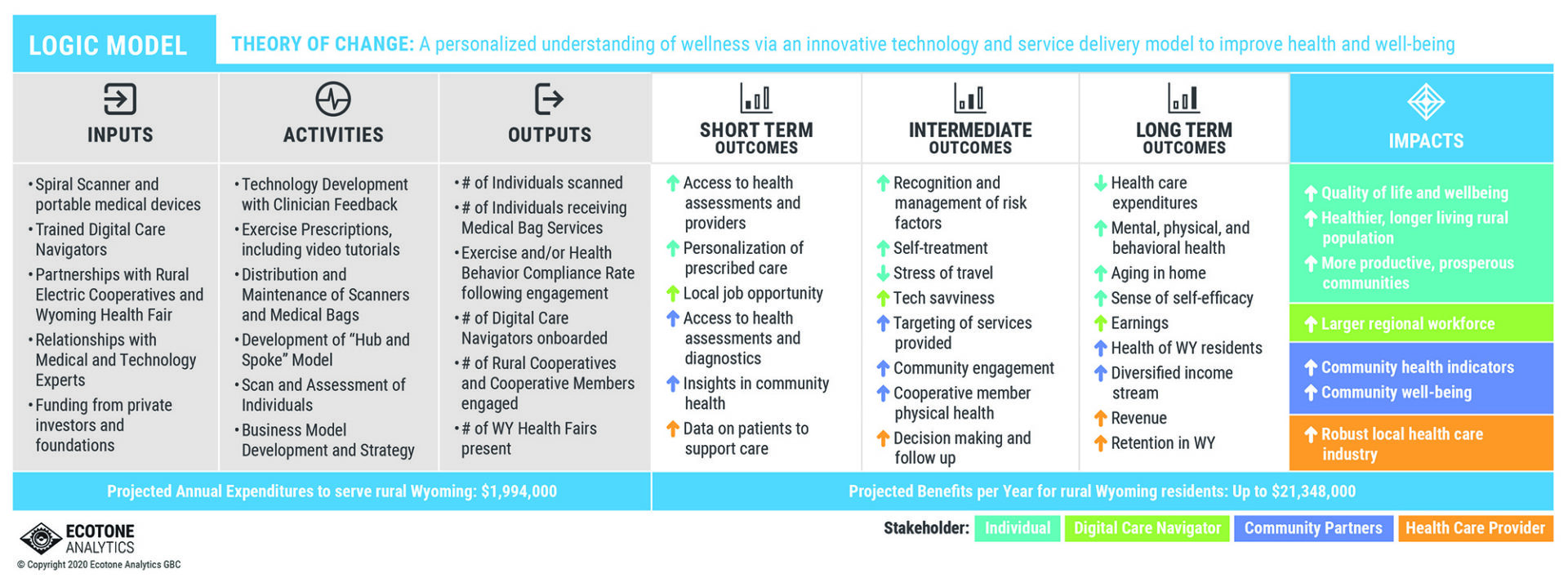
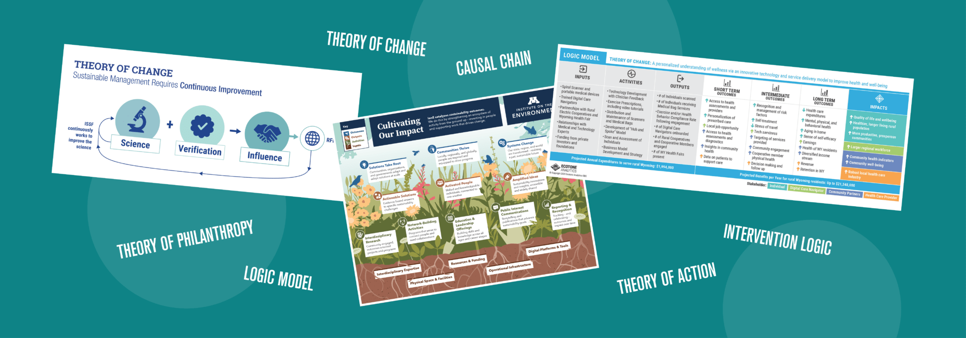
ABOVE: This SpiralHealth Theory of Change was included in an impact report for investors. We used color coding to explain which stakeholder is affected by each outcome, showing the reader how their support makes a difference to each group.
We’ve developed Theory of Change infographics that were for primarily external audiences—potential donors, new collaborators, and community members. The main goal of these infographics is to explain the organization’s mission and give a brief overview of what they are doing to achieve it.
For other clients, the audience was primarily internal—board members, investors, subscribers to the organization’s publication. In these cases, the Theory of Change infographic could assume background knowledge and dedicate more space to the details.
Narrow down the content
- Which parts of the Theory of Change do you want to prioritize? Which can be combined or left out for simplicity?
- What values and tone do you want to portray?
- Is your Theory of Change more linear (input leads to output), or is it more circular (inputs and outputs reinforce each other)?
- Does it make sense to use a visual metaphor, such as a garden?
For most projects, the client provides a content outline similar to the length of this example. Then, our design team makes recommendations to restructure—and sometimes condense—their text for a visual format. This process is collaborative and often takes back-and-forth discussions to find the right balance.
—Julie Hanus, University of Minnesota Institute on the Environment
Build in time for feedback
- Who worked closely with the Theory of Change and/or infographic design process?
- Who could tell you whether the infographic would work for your primary audience?
- Who hasn’t seen the Theory of Change before and doesn’t know much about your organization?
Each of these viewpoints will give you valuable insight into how you can tune the infographic for your audience.
—Julie Hanus, University of Minnesota Institute on the Environment
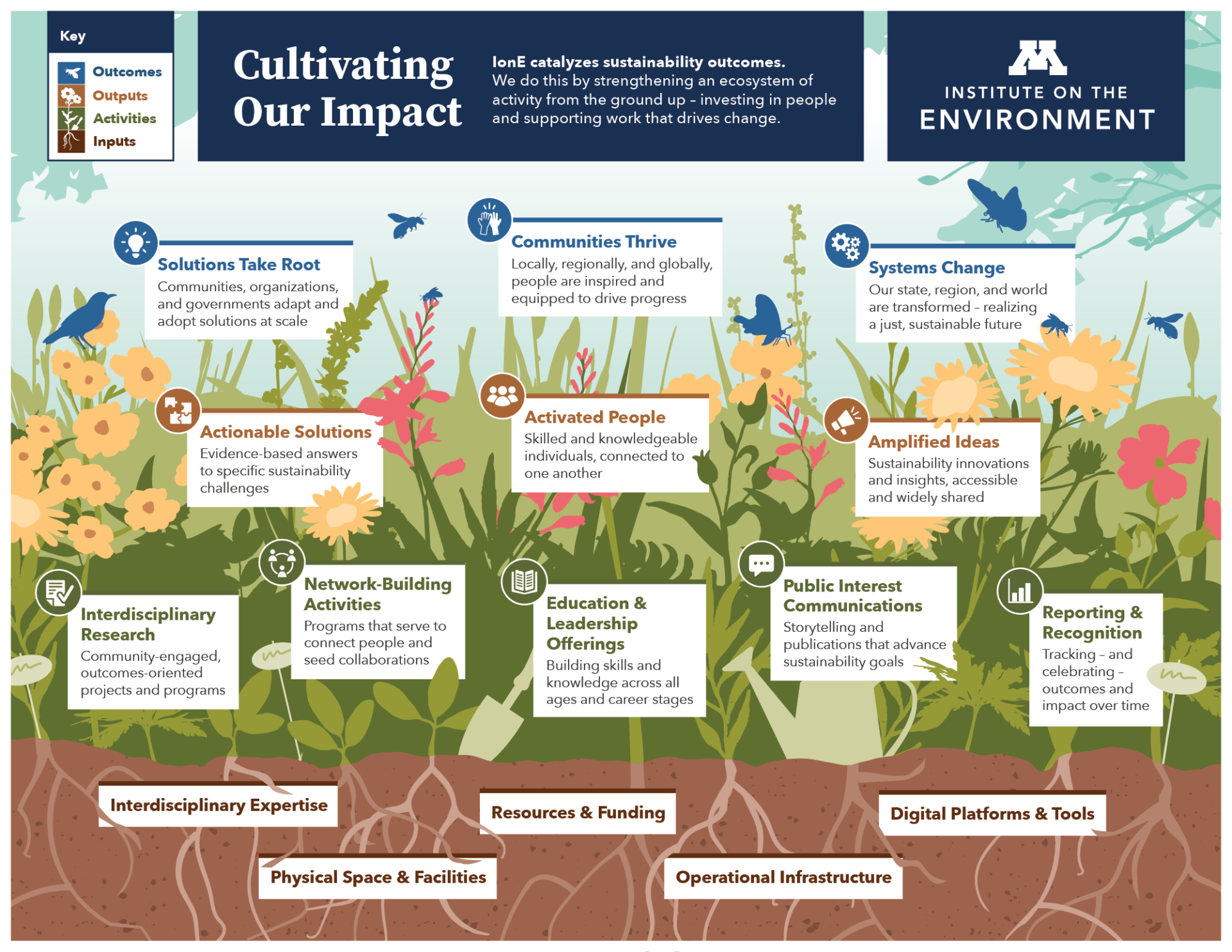
Focus group sessions are an excellent way to quickly gather first impressions and spark discussion. When we worked with the University of Minnesota Institute on the Environment to adapt their Theory of Change, we hosted two focus group sessions with team members and partners from across the organization. These conversations helped us understand how people might use it and how we could improve the design to make it more effective.
A Theory of Change is a versatile tool to reinforce the core values of your organization. By transforming it into an easy-to-follow infographic, you can jump-start the process of adopting it into your everyday work.