Revealing Hidden Time

A work by artist Pierre Huyghe, entitled ‘Timekeeper’ uncovers a history of exhibits in this space at the Walker Art Center through sanding down layers of paint on the gallery walls.
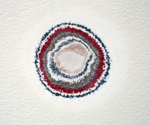
Previous layers of gallery paint revealed through sanding.

This work is especially interesting in the context of a white-walled exhibition space: the walls are usually forced into the background in order to highlight the work hung on them. In this case, the very history of that back-drop is what’s highlighted.

The work is part of the Walker’s exhibition, The Quick and the Dead;

Surveying art that tries to reach beyond itself and the limits of our knowledge and experience, The Quick and the Dead seeks, in part, to ask what is alive and dead within the legacy of conceptual art.

Communication Design Recognized in Back-Story-Telling Project

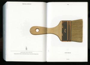
For the first time, the prestigious INDEX Design Award has a winner from the field of communication design. ‘PIG 05049’ is a primarily-visual book, designed and conceived by Christien Meindertsma, that traces all the products made from one pig.

Visual spread from the book 'Pig 05049'
Visual spread from the book

Meindertsma’s intent for the project:

Help people in a highly mechanized and “packaged” world understand how things are made and where they come from so that the resources involved can be cared for by enlightened, informed people.

It’s nice to see the role of communication design to build awareness being recognized within the design community.

Read a previous entry on Meindertsma’s project here.

Mapping the Mississippi: Through Time

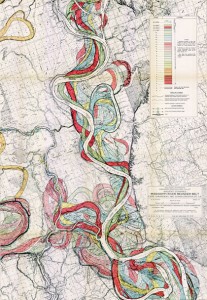
In a beautiful example of layered visual information, Harold Fisk mapped a portion of the Mississippi River in 1944. The series of plates show the changes in the path of the river through time. I’m drawn to the simple and clear detail, effective color palette and the amount of information communicated through this simple technique.

Fisk Map of the Mississippi through the ages
A portion of Fisk’s visually-stunning map of the Mississippi

The full map is available at the US Army Corp of Engineers.

Next Gen Barcode

A new type of barcode is coming.

As announced by a recent BBC Technology article, the tiny (3mm) bokodes can contain a much more information than traditional barcodes, or even other digital cousins like qr-codes.The codes use light and reflection to contain code, and will be readable by a standard cellphone camera.

Close up of the bokode.

The truly interesting part of this technology is the ability to send different information out to different directions. For example, viewing a product’s bokode head-on could tell you different details than a product further which you’re not looking directly at further down the aisle.

Bokodes are yet in development stage, but they are a strong indication of technologies emerging to make information on transparency accessible to the everyday consumer.

Toaster, from Scratch

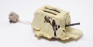
The Toaster Project: A design student’s fascinating project to make a toaster – starting with finding and processing small quantities of raw materials.The project took him all over the UK searching for raw minerals, and developing methods to process them at home.

His whole process was about re-creating the background story. I’d love to see a graphic outlining all of his steps.

the final toaster (photo Daniel Alexander)

The project is featured on we-make-money-not-art.com

GoodGuide coming to iPhones

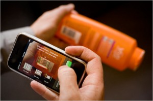
Via a New York Times article, barcode-reader iPhone apps will put product info in consumers hands at point-of-sale.

GoodGuide is already a beta database of info on products will help consumers know what is in the products they consider purchasing.

A Goodguide app on iPhone will let consumers access info via barcode.
A GoodGuide app on iPhone will let consumers access info via barcode. Image Credit: Peter DaSilva for The New York Times

The service reduces lots of complex info into a single number (the higher the number, the better the product overall). Though the purpose of the system is to create transparency on products, such a single-number approach lacks transparency. Consumers also need education on what’s behind the number. A more visual approach incorporating icons to reference each product’s background story could help.

Thanks Craig!

Disclosing Dish Soap

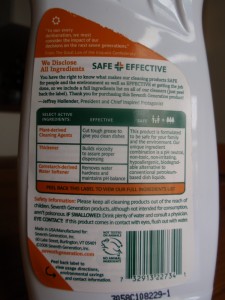
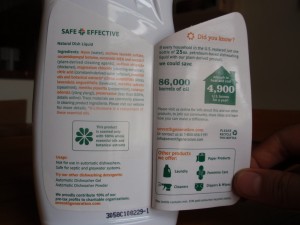
Seventh Generation’s liquid dish soap bottles are sporting an in-depth ingredient label – under the existing label.

Dish soap ingredient information label

The peel-away outer back-panel gives a text-heavy overview of the company’s safety criteria and commitment to transparency. Inside, an extended eco-label takes the first steps toward integrating statistics: Minimally illustrated with a home icon, the statement reads that ‘if every household in the U.S. replaced petroleum-based dish soap with plant-based… we would save 86,000 barrels of oil (the equivalent to heat and cool 4,900 U.S. homes per year).

Its nice to see a comparison that puts so many barrels of oil into a meaningful perspective for the purchaser.

Stats and info revealed on Dish liquid bottle
Stats and info revealed on Dish liquid label

The peel-away label allows for 2 additional panels for the consumer to transparently uncover information, but the space could have been used even more effectively: I’d love to see a more life-cycle oriented approach applied to this design format, and the icons used to highlight information, rather than to advertise the company’s other product offerings.

Cross Section of History

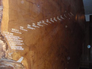
A Giant Sequoia in New York’s American Museum of Natural History reveals centuries of history juxtaposed with the tree’s growth rings. The pairing of dates of history with centuries of growth rings gives us deeper understanding of how time passes and things change: as seen both in nature and in civilization.

Historical events juxtaposed on growth rings

A definite ‘background story’ – pairing visual cues with data and textual information. This visual reference to nature’s growth is a peak into the life story of the tree: marking the years of fast and slow growth. The numerical years provide a reference to our own history: with additional stories of what happened in civilization corresponding with each growth ring. A good reminder that everything changes.

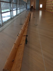
On the topic of trees, the image below is from the Moderna Museet in Stockholm (by an artist whose name I seem to have unfortunately misplaced…). Following growth rings, this artist carves away the ‘years’ of a length of log: revealing the shape of the tree’s younger self.

carved tree reveals it's younger self
carving reveals youth

Turning over a New Leaf (paper)

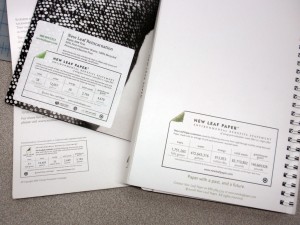
The New Leaf paper eco-audit is a well-thought out tool that communicates transparency, and -in a beautiful way- helps the end consumer understand the sustainability-positive impact of using a specific paper.

The eco-audit provides a place for data on resources that have been saved throughout the life-cycle of New Leaf’s paper (as compared to the industry standard). The eco-audit profiles the quantity of ‘saved’ trees, water, energy, solid waste and greenhouse gases. And an online portal allows companies to customize the quantities for their own print-jobs.

New Leaf labels on printed projects

Customizable background stories supported by sustainability statistics- what isn’t to love? A bit more visual reference could be incorporated into the eco-audit label, or the concept could have some accompanying publicity or other materials that really bring this idea to (visual) life. This may include developing an application to show comparisons online, or supplementing the numbers with visual representation.  I -for one- would like to see what an expanse of 118-saved trees actually looks like. Or a comparison to how many swimming pools 50,178 gallons would fill.