You’ve Finished Your Theory of Change – What’s Next?

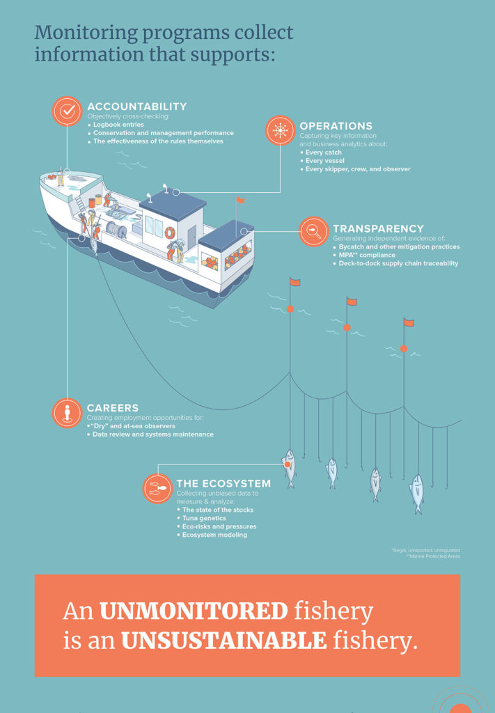
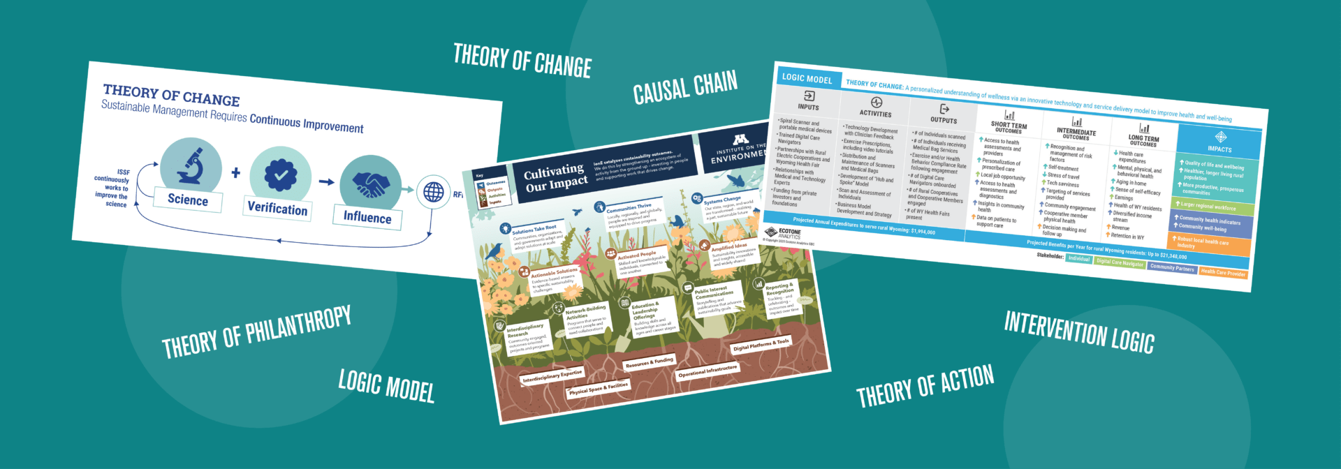
Three Theory of Change graphics surrounded by phrases that describe similar tools like Theory of Philanthropy, Logic Model, and Causal Chain
Congratulations on finishing your Theory of Change!

Capturing the heart of an organization in a single model is no small feat. Now that it’s finished, how will you encourage your team and wider community to use it?

Visual storytelling is an effective tool to help audiences understand your organization. By transforming your Theory of Change into an easy-to-understand infographic, you’ll jump-start the process of adopting and sharing your new model with the world.

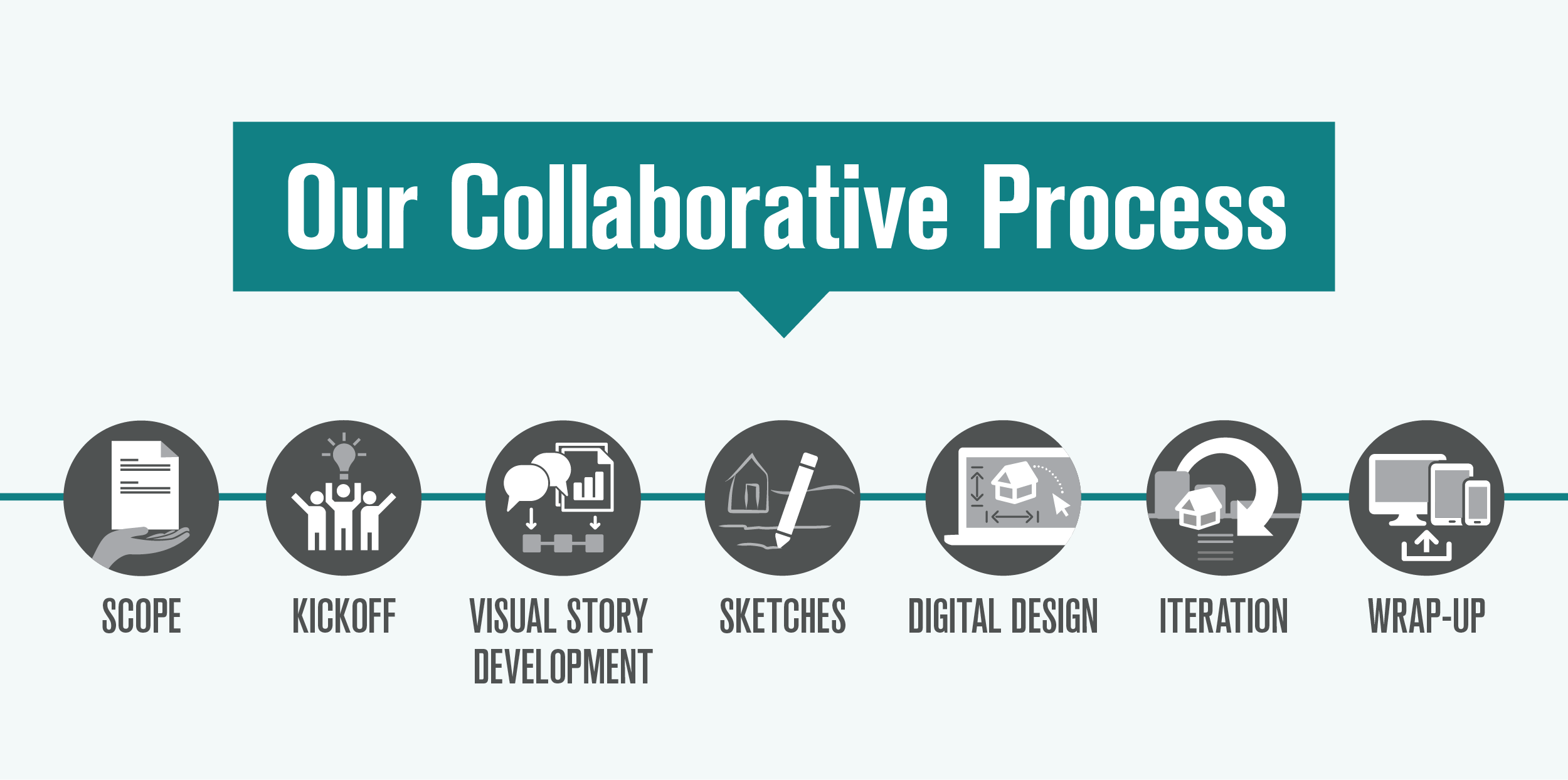
When an organization is ready to visualize their Theory of Change, we kick off our time-tested collaborative process by thinking about and discussing the following details.

Find your primary audience

Who is the most important viewer?
A Theory of Change infographic can be used in multiple ways:

  • Quickly explain the organization to a potential donor at an in-person event

  • Introduce the organization’s programs to a new employee in training

  • Serve as a north star for leadership when making a big decision

Each of these uses has a different primary audience. Before starting to develop the Theory of Change infographic, it can be helpful to determine which audience is your main focus and which audiences are more secondary.
“If I had to pick one measure of success in this project, it would be how quickly – and widely – this work has been adopted across [our organization].”

—Julie Hanus, University of Minnesota Institute on the Environment
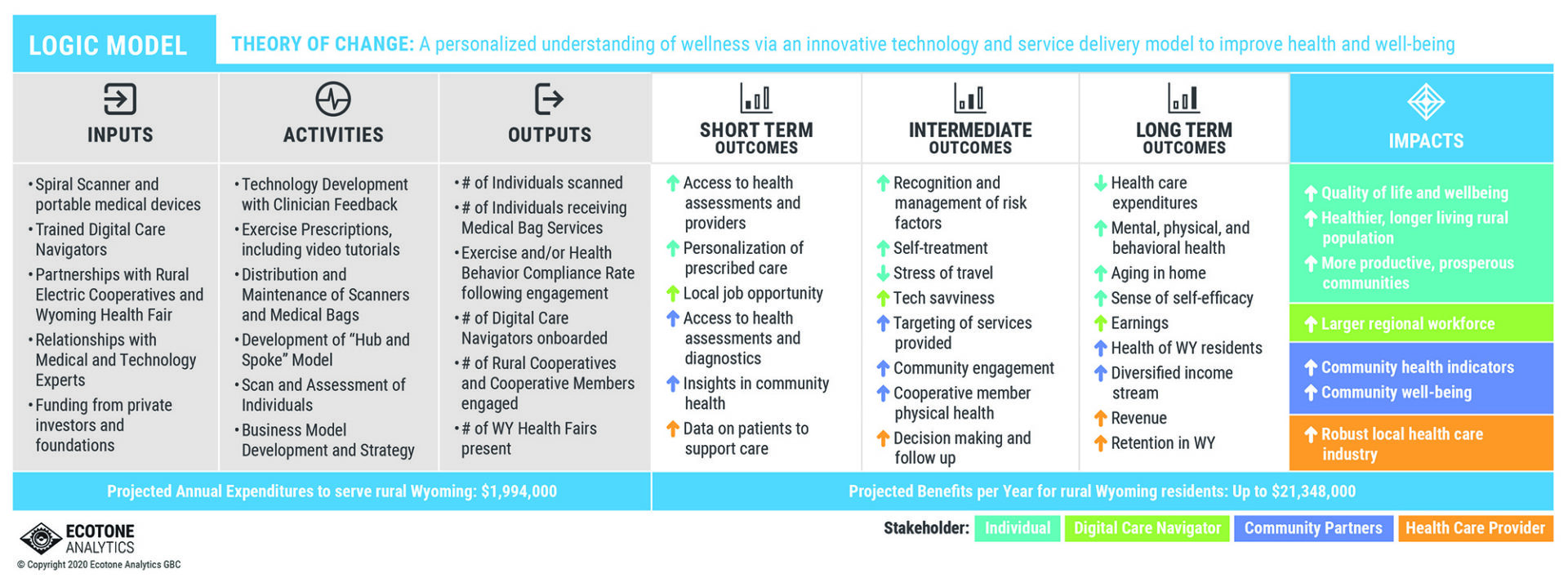
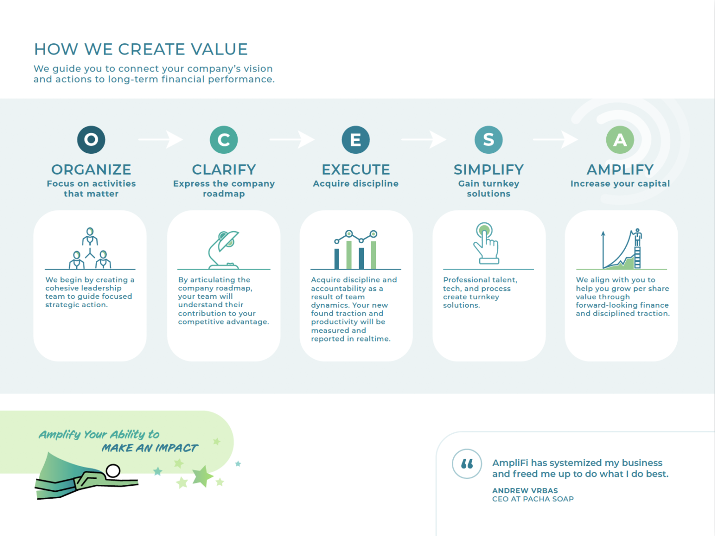
Horizontal table with columns titled Inputs, Activities, Outputs, and Outcomes, with icons and color code to show how the items relate

ABOVE: This SpiralHealth Theory of Change was included in an impact report for investors. We used color coding to explain which stakeholder is affected by each outcome, showing the reader how their support makes a difference to each group.

We’ve developed Theory of Change infographics that were for primarily external audiences—potential donors, new collaborators, and community members. The main goal of these infographics is to explain the organization’s mission and give a brief overview of what they are doing to achieve it.

For other clients, the audience was primarily internal—board members, investors, subscribers to the organization’s publication. In these cases, the Theory of Change infographic could assume background knowledge and dedicate more space to the details.

Narrow down the content

What aspects of our organization do we want to include?
When preparing content for an infographic, it helps to think through these questions:

  • Which parts of the Theory of Change do you want to prioritize? Which can be combined or left out for simplicity?

  • What values and tone do you want to portray?

  • Is your Theory of Change more linear (input leads to output), or is it more circular (inputs and outputs reinforce each other)?

  • Does it make sense to use a visual metaphor, such as a garden?

For most projects, the client provides a content outline similar to the length of this example. Then, our design team makes recommendations to restructure—and sometimes condense—their text for a visual format. This process is collaborative and often takes back-and-forth discussions to find the right balance.
“The Background Stories team are not only incredible visual communicators, they're also fantastic facilitators. Working with them helped us break through to critical new clarity about our Theory of Change. The process was as transformative (and delightful) as the end product.”

—Julie Hanus, University of Minnesota Institute on the Environment
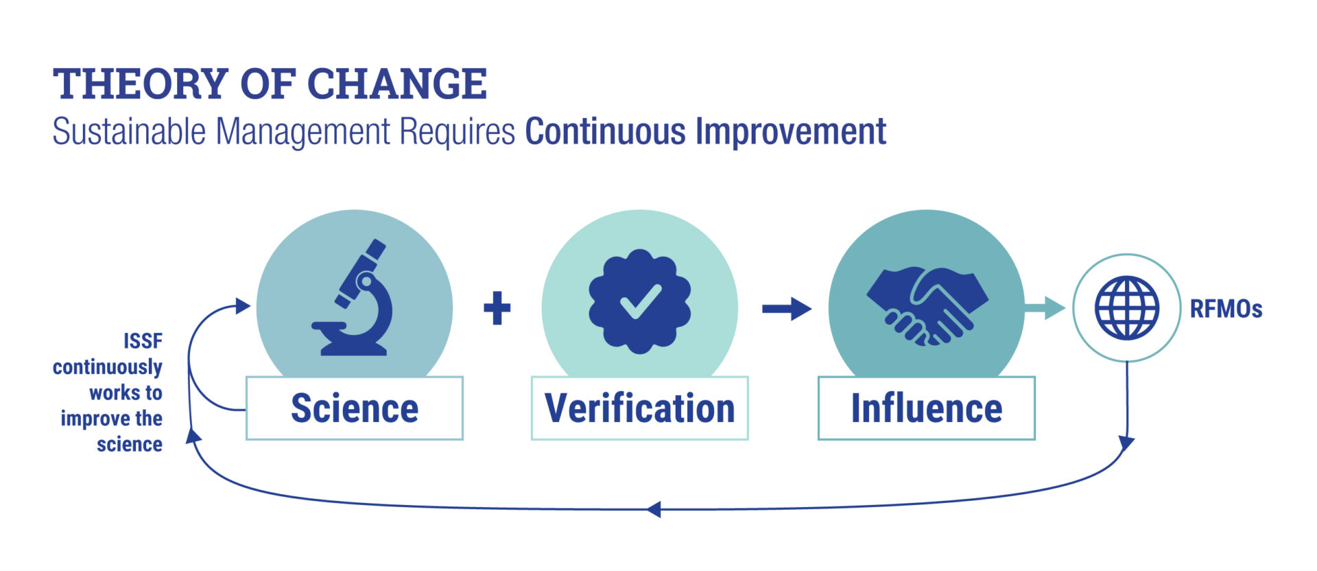
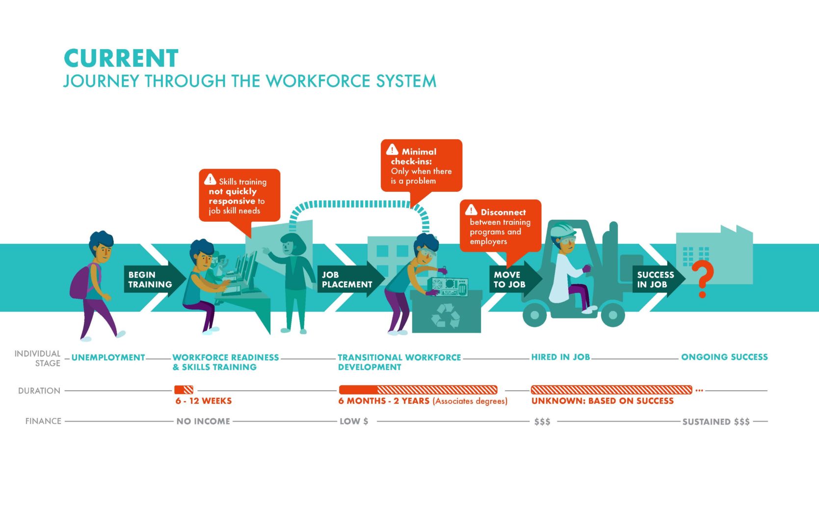
Graphic equation with large symbols showing that the organization uses science and verification to create influence and continuously improve
ABOVE: The International Seafood Sustainability Foundation wanted their Theory of Change to emphasize their dedication to continuous improvement. They included this straightforward overview in their Strategic Five-Year Plan to show how their organization approaches the work.

Build in time for feedback

How can we check that the infographic is accurate and works for its intended audiences?
When a infographic draft is ready for feedback, consider the following perspectives:

  • Who worked closely with the Theory of Change and/or infographic design process?

  • Who could tell you whether the infographic would work for your primary audience?

  • Who hasn’t seen the Theory of Change before and doesn’t know much about your organization?

Each of these viewpoints will give you valuable insight into how you can tune the infographic for your audience.
“Background Stories not only helped us break through to new clarity about our Theory of Change, they gave us a new common language and the visual tools to communicate about it.”

—Julie Hanus, University of Minnesota Institute on the Environment
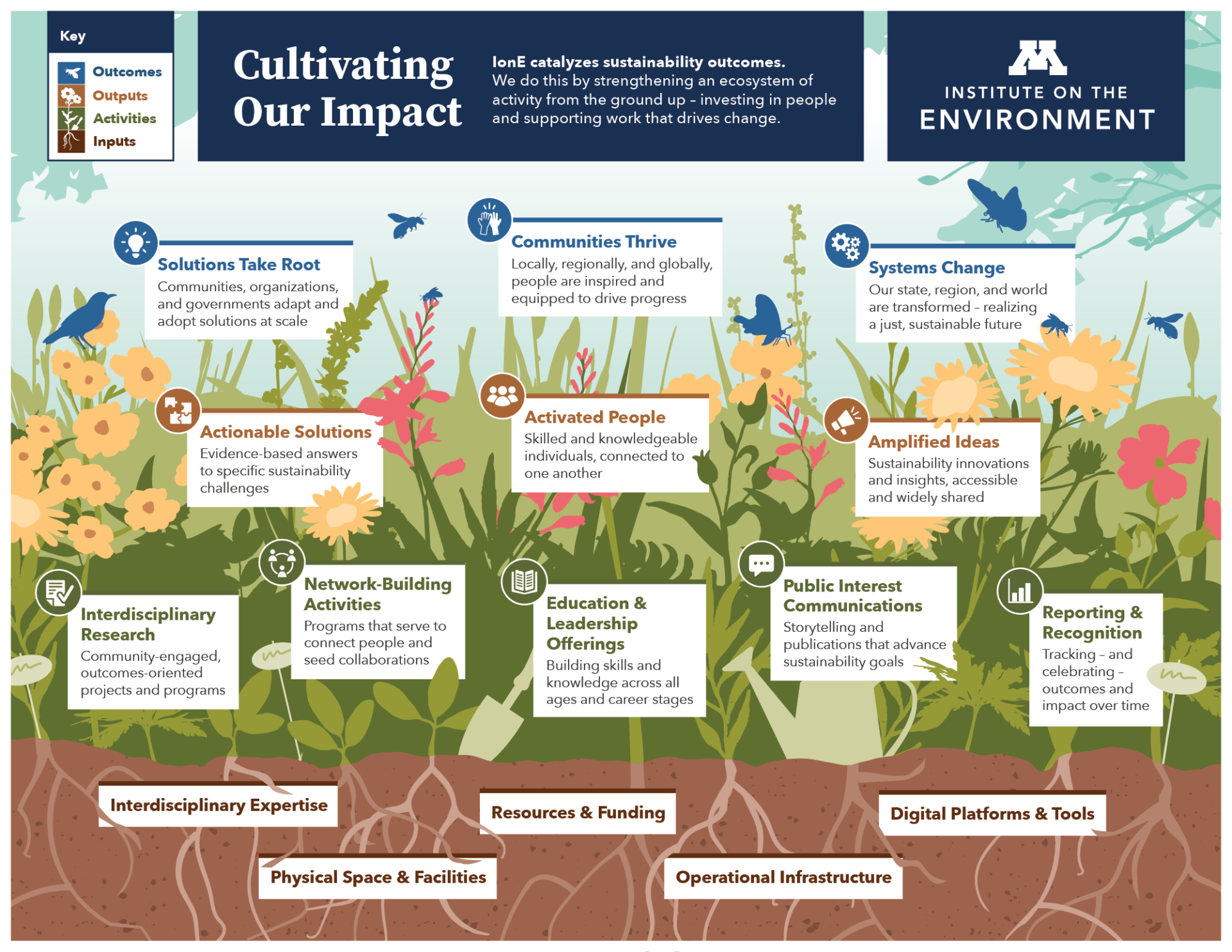
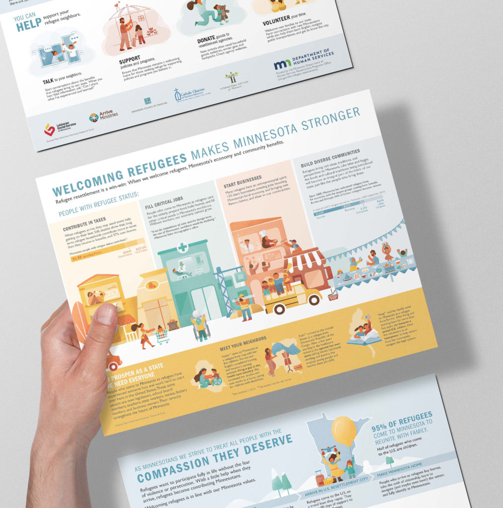
Illustration of a colorful garden with text boxes overlaid that describe the organization's Inputs, Activities, Outputs, and Outcomes
ABOVE: In focus group sessions with the University of Minnesota Institute on the Environment, team members discussed how the garden visual metaphor reflects the organization’s generative structure. We also learned how partners might use the infographic when talking to potential donors.

Focus group sessions are an excellent way to quickly gather first impressions and spark discussion. When we worked with the University of Minnesota Institute on the Environment to adapt their Theory of Change, we hosted two focus group sessions with team members and partners from across the organization. These conversations helped us understand how people might use it and how we could improve the design to make it more effective.

A Theory of Change is a versatile tool to reinforce the core values of your organization. By transforming it into an easy-to-follow infographic, you can jump-start the process of adopting it into your everyday work.


Ready to get started?

Recent Blog Posts

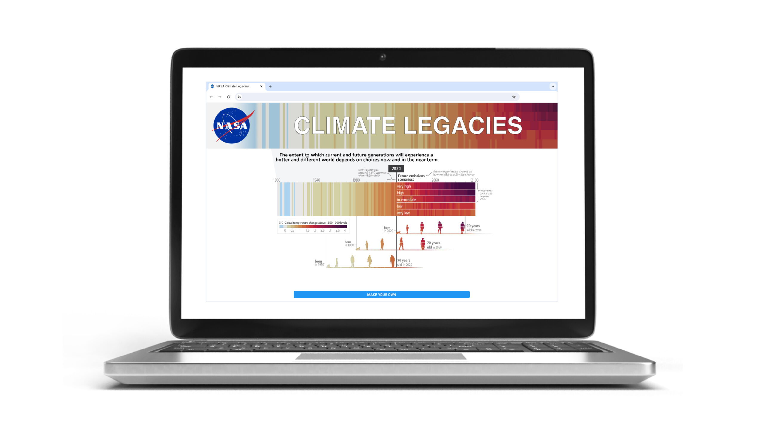
NASA climate legacies interactive tool to create climate generations

Create your Own Climate Generation Visual

Map your family's climate legacy We're excited that a UN Intergovernmental IPCC figure designed by our creative director has been adapted into a customizable digital...
Read More
BgStories_2023Wrapped_IntroVideo_6edited-ezgif.com-video-to-gif-converter

Happy 2024!

We're excited for another year of creating visuals people ‘get’ at a glance. Looking back at 2023, we’re really proud of the work we’ve done...
Read More

Path to a Successful Visual Story

A step-by-step guide to our collaborative process Visual storytelling is a powerful tool to help people understand and engage deeply with complex information. Whether developing...
Read More

Same Content: Different Audiences

When you design for everyone, you design for no one.

...so the saying goes.

And we often find understanding the variety of audiences and media for a project can lead to efficiencies in designing the same content speak across multiple audiencesBy tailoring a design approach to suit the preferences, background knowledge, and expectations of different groups, —even while using the same content— we can enhance engagement, strengthen connections, and achieve communication goals.

The following case studies show the importance of selecting the appropriate communication method for a variety of target audiences and strategies for effective communication across different platforms.

Great Plains Institute (GPI)

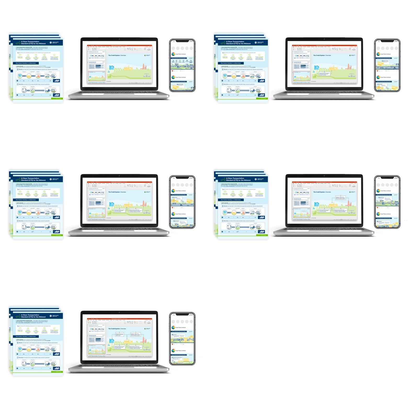
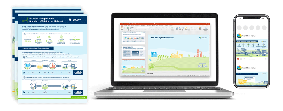
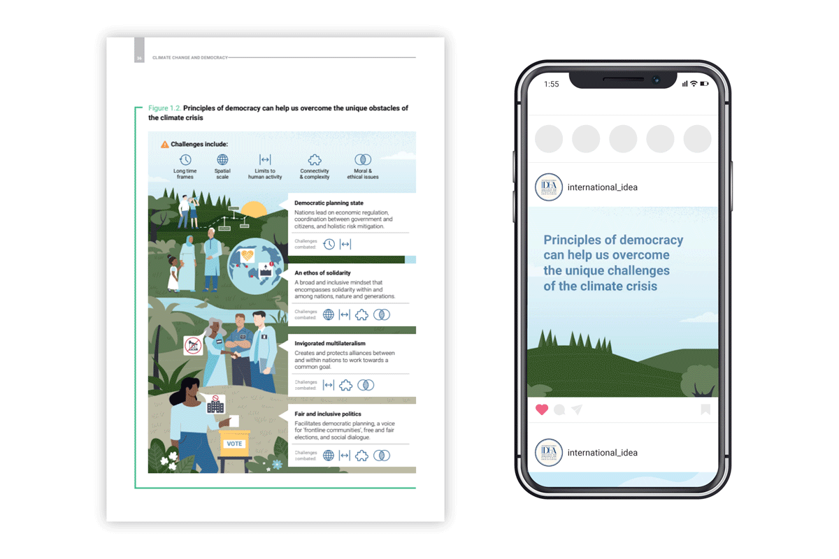
Mockup showing GPI infographic documents, Powerpoint slide, and social media post

OVERVIEW

  • Audiences: Farmers, policymakers, general public
  • Deliverables: Powerpoint presentation, one-pagers, & social media graphics
  • Unique challenges: Complex scientific & economic concepts, nuances in perspectives, sensitivities of each target audience

These infographics convey a Clean Transportation Standard (CTS): conveying complex information (including data, research, and policy details) through concise and appealing visuals. We worked directly with stakeholders to test the infographics for clarity and comprehension across audiences.

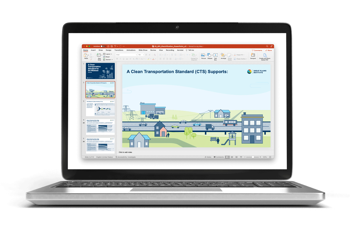
Mockup of a laptop showing GPI infographic in a Powerpoint slide

To communicate to farmers who grow grain for biofuels, we focused on potential cost savings, increased efficiency, and long-term benefits for farmers. Because there are nuances in what a Clean Fuels Standard (CFS) would look like state-to-state, all text in the design deliverables (presentation Powerpoints for meetings) was left editable so our client could make adaptations when sharing this resource across the Midwest.

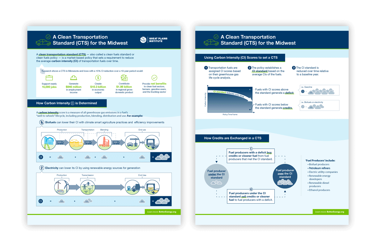
GPI one-page infographics

Policymakers have very little time to review new information and often do not have extensive background knowledge of new developments in environmental and social sustainability. To accommodate this type of audience, we worked with GPI to distill the most important content and structured it as a one-page document. This resource can be shared digitally, or printed and as a leave-behind for meetings with policymakers.

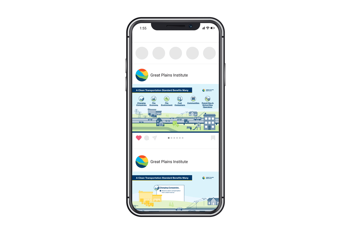
Mockup of a phone showing GPI infographic in a social media post

The expectations and background knowledge of a general audience varies significantly. If reaching people primarily through social media, it can be hard to compete with the large amounts of content shared daily. To combat this, we distilled the content of our graphics even further, pulling out only the most important, high-level content in small, highly visual graphics and short animations. Call to actions were added to visuals as a way to direct interested people to additional information.

International Institute for Democracy and Electoral Assistance (IDEA)

Infographics and social media showing democracy and Climate Vulnerability Index for countries in Asia

OVERVIEW

  • Audiences: Regional & international policymakers
  • Deliverables: Overview + conclusion infographics, infographic series for country-specific data, social media motion graphics
  • Unique challenges: Some data points not available consistently from one country to the next

We were conscious of the needs of the audience (regional & international policymakers) when we designed the infographics summarizing findings of a report with the International Institute for Democracy and Electoral Assistance (IDEA).

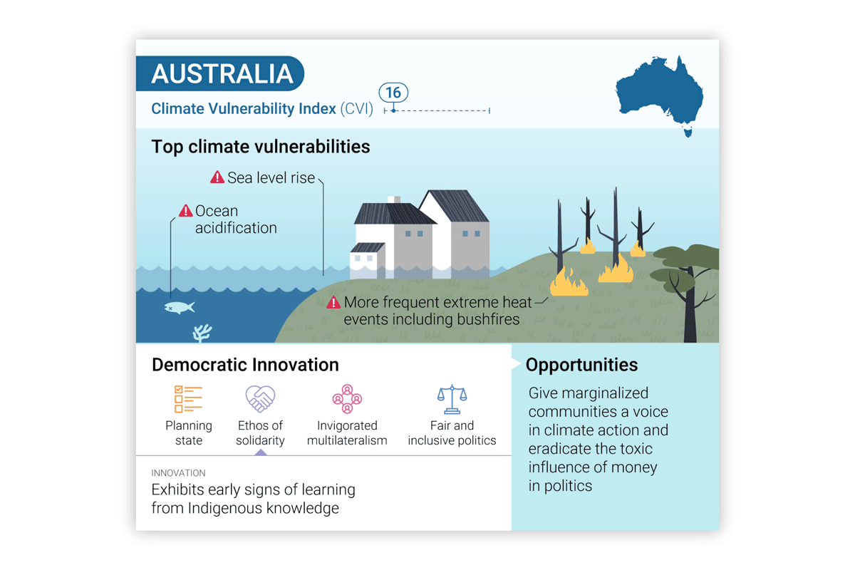
Infographic of Climate Vulnerability Index for countries in Asia

The series of infographics contain details on democratic innovation across 10 countries from the Asia and Pacific region and the audience needs both country-specific details as well as the ability to compare countries to one another. Our templated design facilitates this comparison and is structured so that data unavailable in some countries (due to the nuance of the information) doesn’t appear as a missing hole.

The infographics were developed so that a slight customization helps them work as both static graphics (for the report and presentations) as well as animated social media posts.

These 2 case studies demonstrate how –while it's impossible to design well for everyone– we can consciously design information and data to inform a variety of related audiances in an effective and budget-efficient manner. 

Recent Blog Posts

You’ve Finished Your Theory of Change – What’s Next?

Congratulations on finishing your Theory of Change! Capturing the heart of an organization in a single model is no small feat. Now that it’s finished,...
Read More
NASA climate legacies interactive tool to create climate generations

Create your Own Climate Generation Visual

Map your family's climate legacy We're excited that a UN Intergovernmental IPCC figure designed by our creative director has been adapted into a customizable digital...
Read More
BgStories_2023Wrapped_IntroVideo_6edited-ezgif.com-video-to-gif-converter

Happy 2024!

We're excited for another year of creating visuals people ‘get’ at a glance. Looking back at 2023, we’re really proud of the work we’ve done...
Read More

Spotlight on Sustainable Forestry

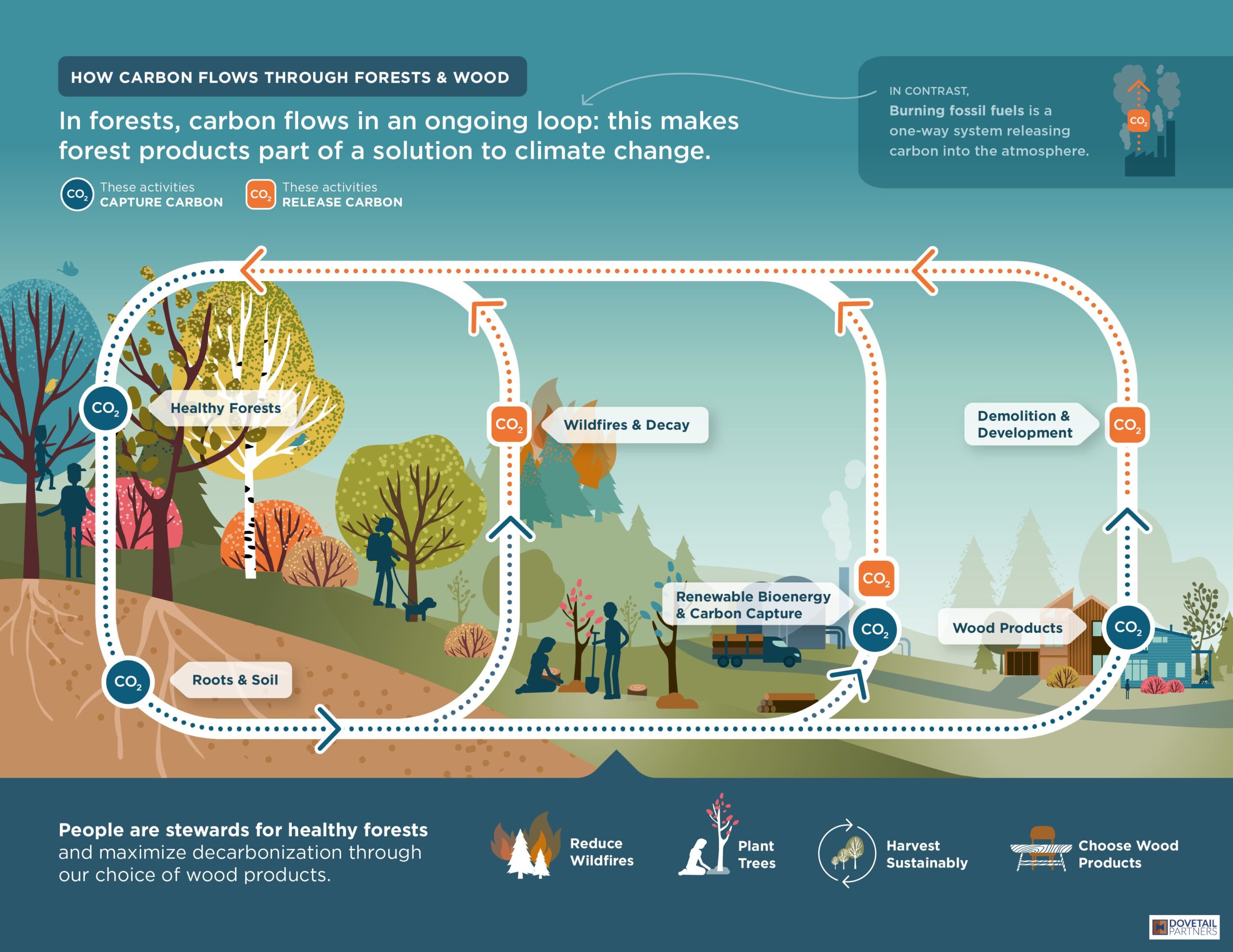
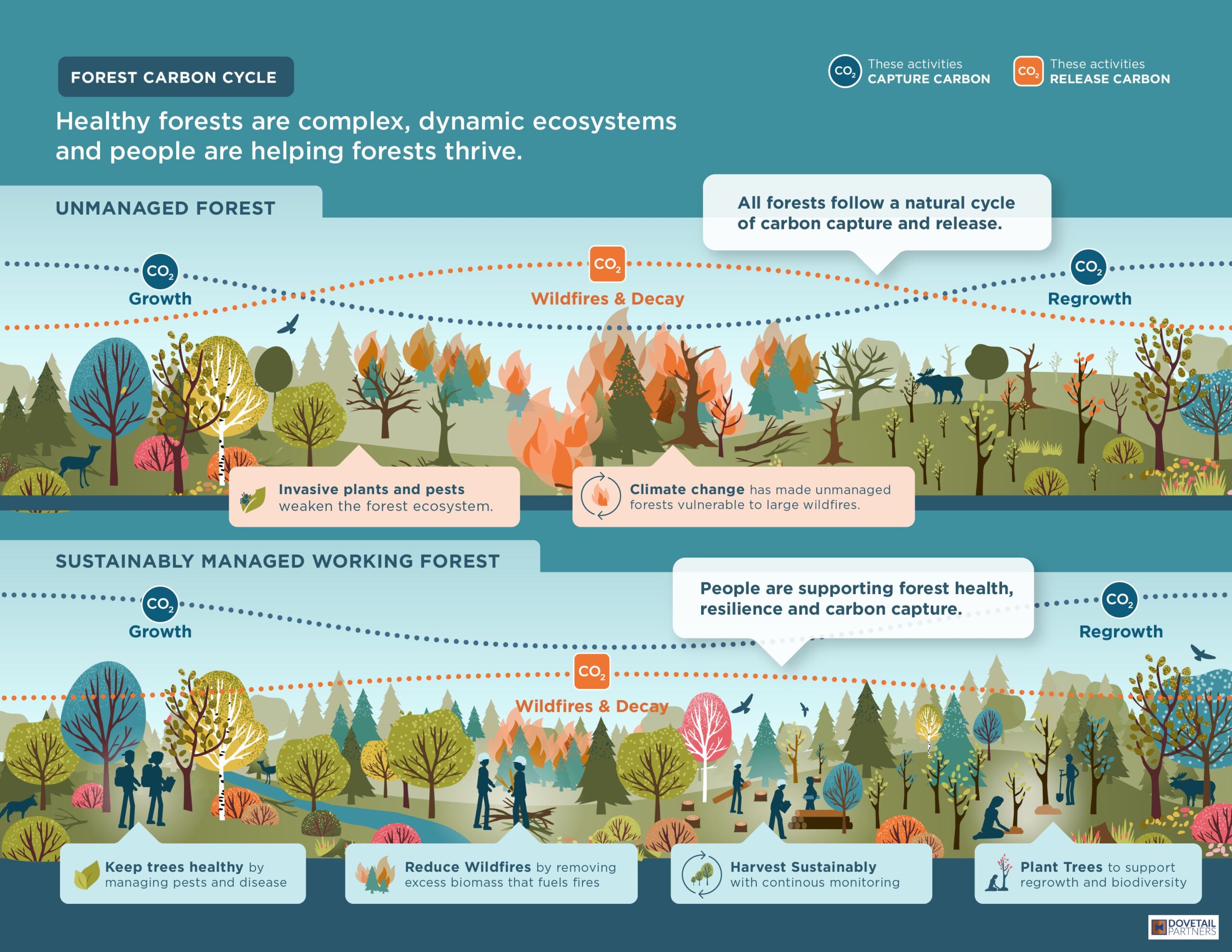
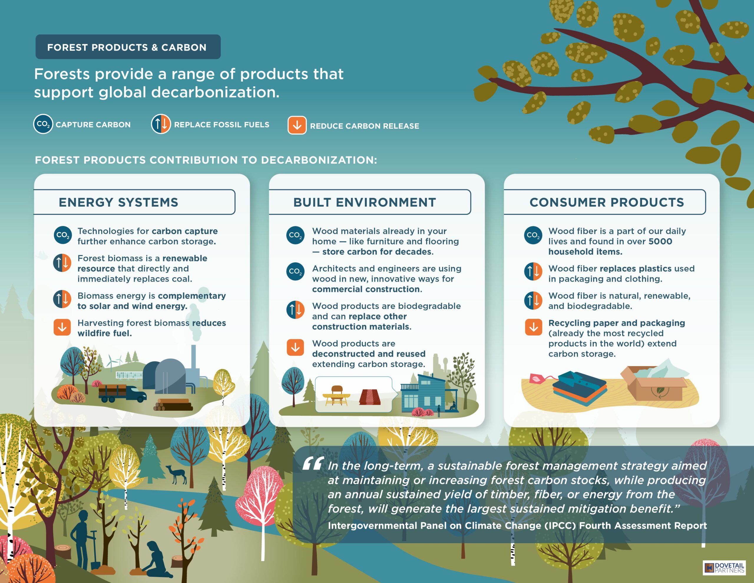
Climate change has led many people and organization to explore how we can pull more carbon out of the atmosphere and store it (carbon sequestration). This carbon collection can happen in many forms, and growing plants are one key method for storing carbon. Plants use CO2 from the atmosphere to grow, and they release oxygen as their “waste product” - the opposite of animal metabolism. Carbon sequestration is more complex than just planting trees. Background Stories recently partnered with Dovetail Partners to visually show how humans can more effectively support carbon sequestration while also meeting human needs for forest products.

Carbon flows through an ongoing loop in forests: certain events cause carbon to be released, and other events cause carbon to be captured. This series of infographics captures the complex and dynamic nature of healthy forests.

Recent Blog Posts

You’ve Finished Your Theory of Change – What’s Next?

Congratulations on finishing your Theory of Change! Capturing the heart of an organization in a single model is no small feat. Now that it’s finished,...
Read More
NASA climate legacies interactive tool to create climate generations

Create your Own Climate Generation Visual

Map your family's climate legacy We're excited that a UN Intergovernmental IPCC figure designed by our creative director has been adapted into a customizable digital...
Read More
BgStories_2023Wrapped_IntroVideo_6edited-ezgif.com-video-to-gif-converter

Happy 2024!

We're excited for another year of creating visuals people ‘get’ at a glance. Looking back at 2023, we’re really proud of the work we’ve done...
Read More
Sketches that show Scenario

Process vs. Scenario Visuals

Beginning any infographic project, a big question is 'How do I make this information visual?’ Lucky for us, clues exist within the information itself. Once we determine what message we’re aiming to communicate to a specific audience, the form of the infographic begins to emerge.

Designers from all disciplines talk about ‘form follows function’. For infographics, visual form follows the content.

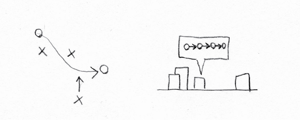
When working with narrative information (where we’re trying to explain something to the audience) there are two high-level visual structures that consistently re-occur: Processes and scenarios.

PROCESSES:


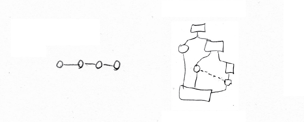
Sketches that show process

Processes include timelines and step-by-step flows of information. These can be visualized through any of the following sketches. A process has an entry/exit point (or points) and an order to the steps (at least some of them).

Examine your content and ask yourself:

  • Are we guiding the viewer through a series of steps?
  • Is the order of the elements important to the message we’re trying to communicate?

If so, you might have a visual process on your hands.  

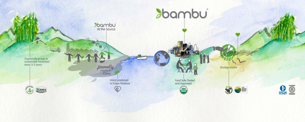
Here's some examples of process-focused infographics:

SCENARIOS: 


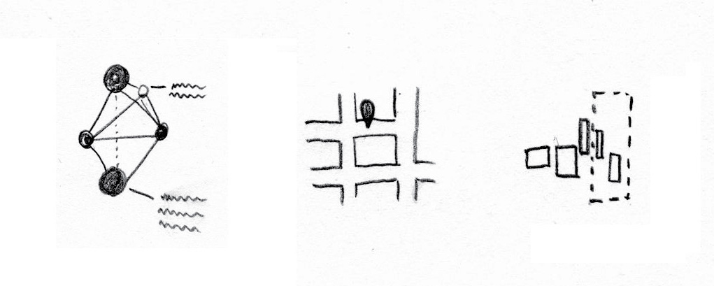
Sketches that show Scenario

Scenario-based visual structures include maps (both geographic and conceptual), systems, networks, and lay-of-the-lands. These show how pieces of info relate to other pieces, and to whole contexts. Scenarios are often annotated to help viewers understand the components of the visual.

Examine your content and ask yourself:

  • Is it important that viewers understand the big-picture of this message?
  • Is the organization of the pieces of content important?
  • Would a zoom-in or zoom-out of the information be interesting?

If so, a visual that shows the scenario could be useful.

Here's some examples of some scenario-focused infographics:

COMBO:


Sketches that show a combo of process and scenario

Sometimes, a combination of these two approaches leads to the most engaging and educational visual. In these cases, typically one or the other approach becomes the most prominent. 

Keep in mind that the more visual approaches you combine, the more complex your infographic gets: and the more careful you have to be about using the principles of design. And that’s a topic for another time 🙂 

Here are some examples of the combination of Scenarios & Processes used together in infographics:

Finding the Framing for Your Message

Part of the process of creating a visual story is developing the storyline. This determines what to emphasize in a message, how and what to explain, and what to leave out. Some call this the 'framing' of a message. 

There's a group doing evidence-based communication research to help frame some of the most challenging messages in the social and environmental space.

FrameWorks helps mission-driven organizations communicate about social issues in ways that build public will to support change. All of their research is available online. From communicating about Climate Change in the time of Covid-19 to How to Talk About the Ocean so that People Will Listen to Changing the Narrative on Public Education, there's research on a variety of topics.

We got to use FrameWork's stellar work in developing recent refugee advocacy infographics. Bookmark this resource for your next communication strategy!

Clear Writing + Clear Visuals = Powerful Visual Stories

As communicators, it's important we use the language of our audience. While Background Stories operates in the world of visuals, we need words + images to create visual stories. (Words and numbers are great for communicating specific details; visuals are great at showing context.)

The words we choose have to meet people where they're at in their understanding of a topic. Non-experts aren't familiar with the jargon that experts use.

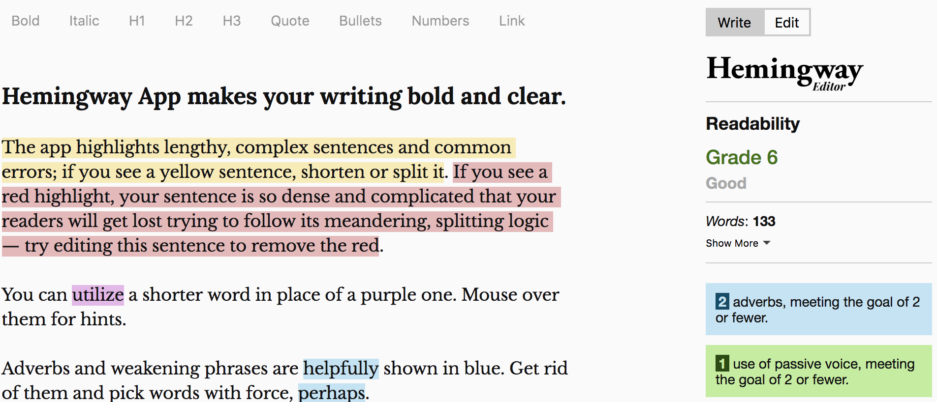
One tool that we love is the Hemingway Editor.

The website helps us edit text for clarity and alerts us if we jump from a 6th-grade reading level to a post-graduate reading level, which is easy to do in a scientific report. See what you think -- it could make your written work more concise and impactful. (Btw, we're not affiliated with the site, we just think it's cool -- and it's free!).

Happy writing!

Putting Climate Data into the Context of Human Lifespan

We humans have a hard time comprehending our future.

Fortunately, there's a lot of great science being done about our collective future. Unfortunately, this data is typically presented in a way that feels removed from our human experience. No matter how real data is — if we don't perceive it as having a direct, tangible impact on our own lives (and those of our friends and family) it will continue to be viewed as abstract and removed from our life experience.

Creativity can help answer the call to connect seemingly abstract data to people's emotions.

Arlene is exploring opportunities to annotate existing climate data to help people see themselves within the data. During a recent artist residency at MASS MoCA, Arlene worked on a series of projects to put our own life spans into climate data.

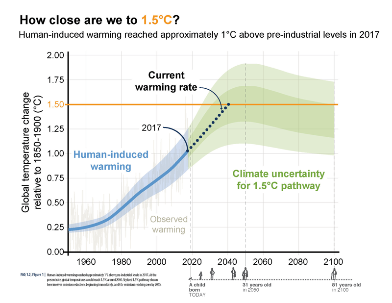
How Close Are We to 1.5˚C?ABOVE: A visual human lifespan is added to contextualize a series of future dates.
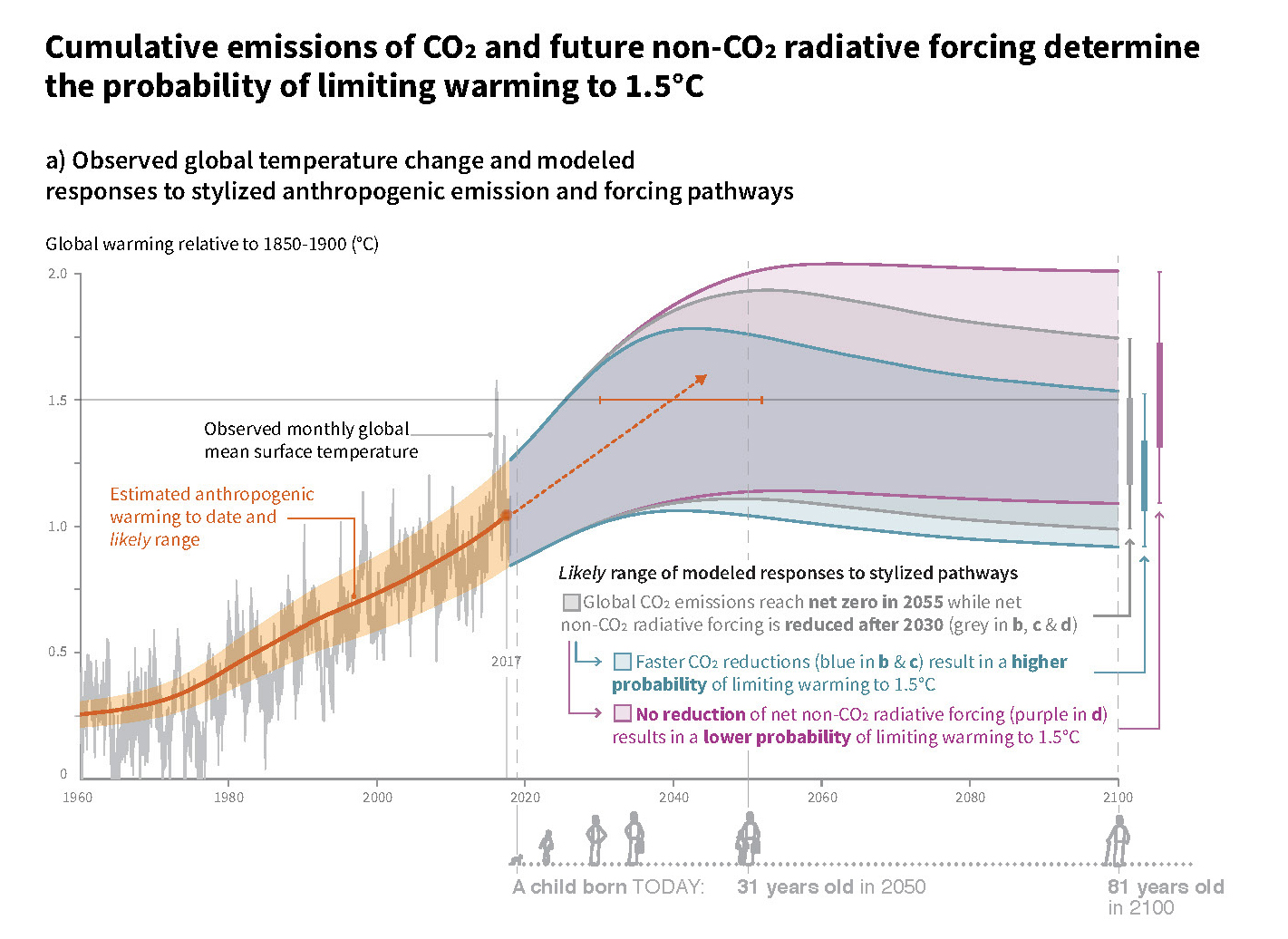
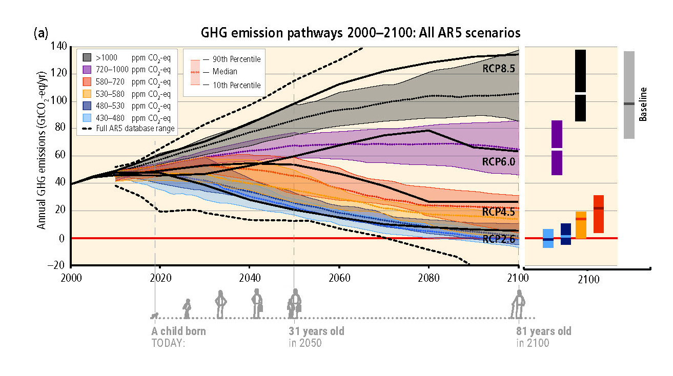
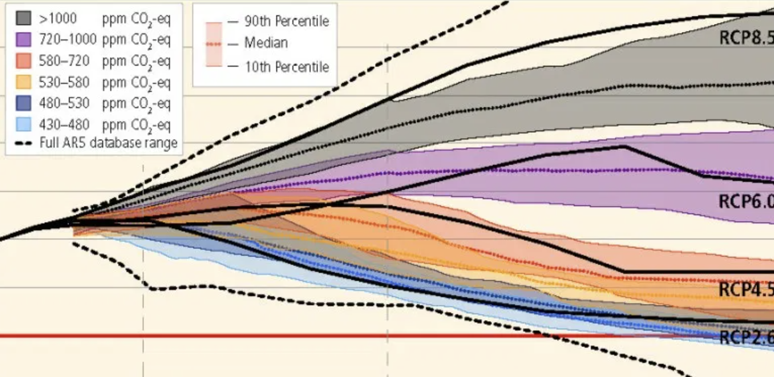
One project was to annotate graphs from Intergovernmental Panel on Climate Change (IPCC) reports that denote future climate trends. The graphs are annotated with a small illustration of an average human lifespan — starting with a child born today. The annotation shows how old the child will be in key years that are in the data. The inclusion of a human life span with this data helps remind us of the grand scale of the global changes that are being graphed, and how these changes will continue to impact our children, grandchildren, nieces and nephews long after we're gone.

BELOW: Additional examples of human life spans visualized as part of a graph's timeline.

Cumulative Emissions of CO2

GHG Emission Pathways

BELOW: Detail of the timeline with life span.

Detail of GHG Emission Pathways

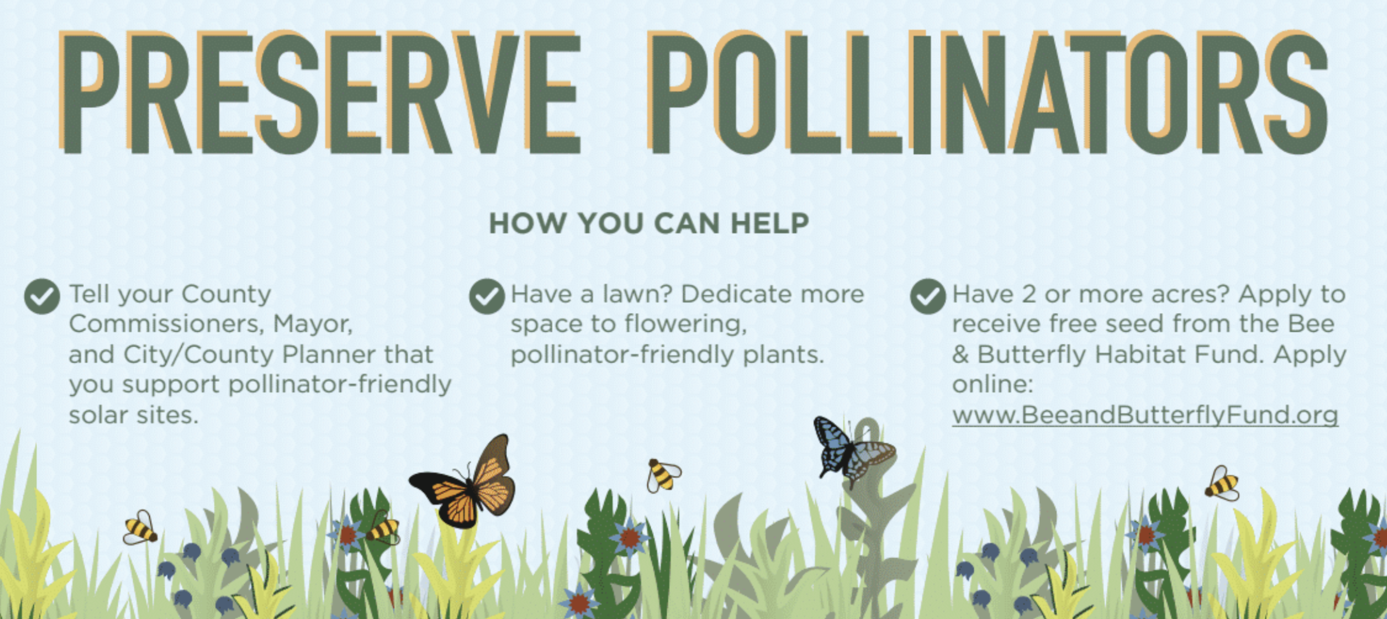
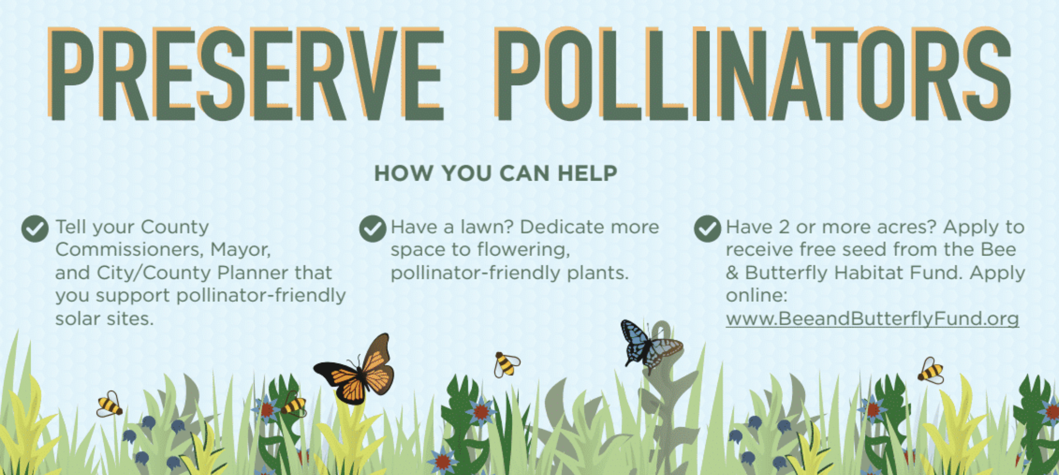
Pollinator-Friendly Solar at the Fair

For this year's Minnesota State Fair, we've teamed up with Fresh Energy and Connexus Energy to create a three-dimensional display to draw attention to a new way of thinking about renewable energy: Pollinator-friendly solar. Preserve Pollinators Our display, part of "The Common Table: Minnesota Eats" exhibit in the Agriculture Horticulture Building, highlights how our region is leading the way in policymaking and on-farm efforts to bring more pollinator habitat to otherwise underutilized land. You can see the exhibit in-person from August 23 through September 3, along with nearly two million other fair-goers (who famously flock to the event for all kinds of foods and creations "on a stick"). Of course, our sticks — a series of cutout landscape elements and hide-and-seek pollinators for you to find — will be glued down, but you're sure to learn a lot about the powerful partnership of pollinators and solar energy!

Selecting the Right Graph

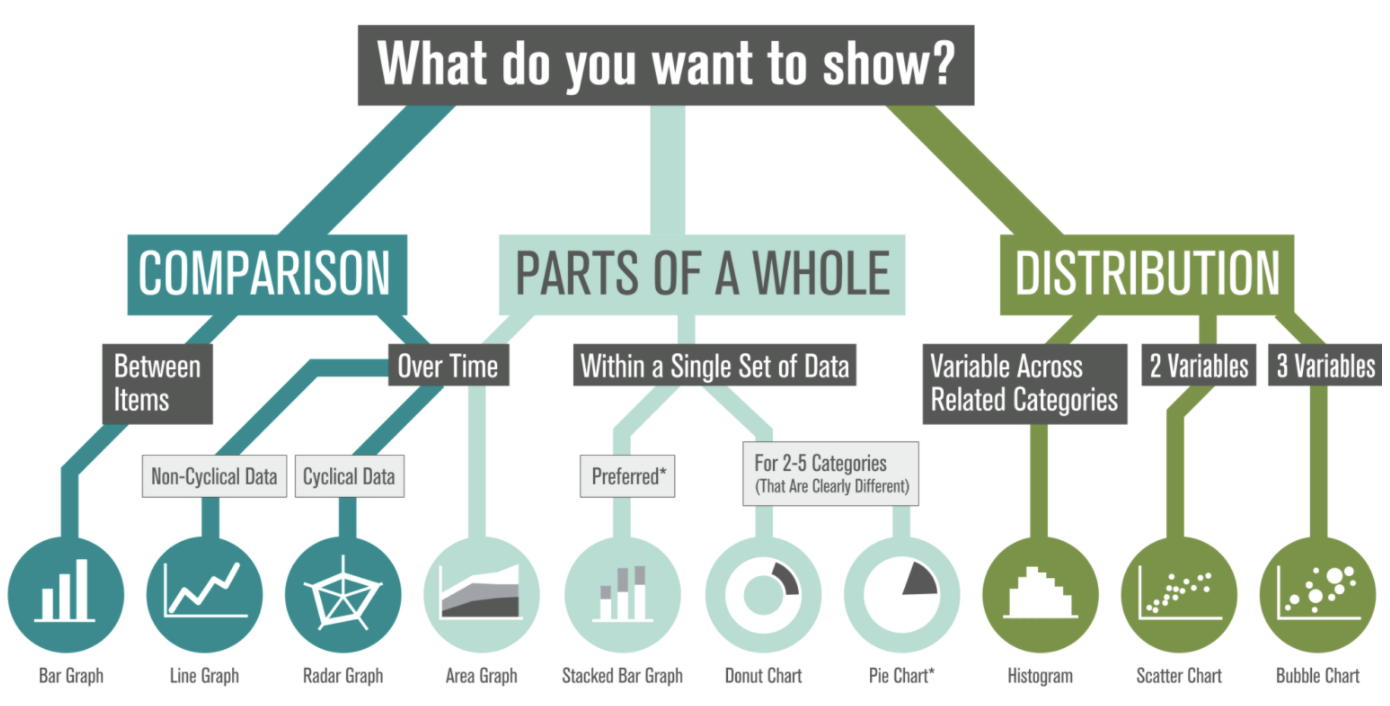
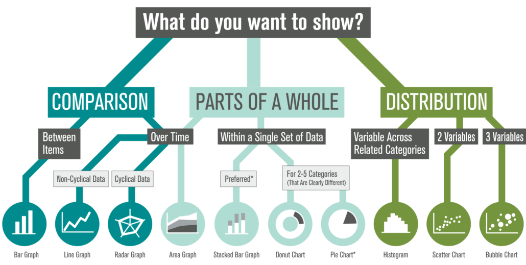
We're often asked, "What type of graph should I use for this data?" We also see a lot of variety in how similar data sets are visualized (some working better than others). There's plenty of debate out there, so how do you decide? Selecting The Right Graph We've created this visual guide to recommend best practices, which starts with a clear understanding of your content — what are you trying to show? There are options within each category based on the type of data in your set (and ironically, many of the standard graph types tend to share food-based titles... by the time you decide between Pies, Bars, and Donuts, you might be tempted to hit the bakery!). Which graph will you apply to your next datavis project?

Designing Information for the Understanding of Sustainability

Notes From the GreenID Conference

Recently presenting at the International Institute of Information Design’s (IIID) GreenID conference in Vienna, I was struck by the phrase, “Context brings understanding.” As information designers, we seek to clarify complex information. And sustainability is certainly a topic area that involves a lot of complexities in communicating related social, ecological and financial attributes of a product or service.

Green ID sustainable information design conference logo

My work focuses on developing ‘visual stories’ to help consumers understand how their individual actions play into the ‘big picture’ of sustainability. In my mind, it’s the communication of the context of sustainability that brings understanding to consumers.

To this aim, I presented research and techniques for communicating sustainability – gleaned through my work on narrative life cycles and with students at the Minneapolis College of Art and Design’s (MCAD) sustainability program. I aimed to demonstrate how a visually-compelling story can present complex sustainability data in an approachable, layered format that can act as a tool for consumer education.

The conference covered a wide variety of topics and projects related to the overlap of info design and sustainability. Three areas of interest for my work and the upcoming visual communication course at MCAD include techniques of designing for understanding, measuring impacts and questions on the effectiveness of info design in changing behavior.


Designing for Understanding:

When setting out to design information to aid in understanding, and to clarify context, there are a number of strategies to consider. 

Presenter Angela Morelli, who has done a thorough analysis of the hidden water footprints embedded behind everyday foods and activities, made a case for emotional connection with an audience. She presented 4 guidelines for designing for understanding: utilize empathy, reference cognitive science, observe beauty and play on an audiences’ interest.

To design for understanding, one must first thoroughly understand the content of what is being designed. In a workshop Morelli gave on data visualization, she also outlined the steps to creating information design: first we ‘look,’ then ‘read,’ ‘organize’ information then ‘cut & paste’ it into a format which communicates a message to others. This process mirrored the 4 steps of visual thinking outlined in Dan Roam’s book, “Back of the Napkin”: first we ‘look’ to scan what’s in our vision. Then we ‘see’ to make sense of that which is visible, and then ‘imagine,’ to use our mind to guess that which is not visible. At this point we ‘show’ to share with others (this is the actual stage of creating a visual info design).


Measuring Our Impacts:

Discussion at the conference considered methods of measurement for each of the 3 legs of sustainability in order to visualize data in a holistically-balanced way. 

Data obviously exists for financial measurement– all companies financial reports go into depth on this very important topic.

The ecological dimension is –relatively more recently- available through processes such as Life Cycle Analysis (LCA). In fact, my presentation showcased a variety of visual narrative approaches to information design, including examples from client work, creative practice and student work from a course I teach that concentrates on visualizing product life cycles and the more technical ecological measurements of sustainability known as Life Cycle Analysis (LCA).

However, defining measurement for the social component is much more slippery. (How exactly does one measure ‘happiness’?) As this field of ‘quality of life’ is based on qualitative research and varies based on cultural norms and individual expectations, it’s hard to make inclusive visualizations of the ‘social’ on-par with its financial and ecological counterparts.


Can Data Visualization Lead to Behavior Change?

Overwhelmingly, questions throughout conference discussion centered on ‘can visualization of information lead to behavior change?’ Fortunately, there was an environmental psychologist among the presenters to provide some guidelines for our research into this question. Dr. Karen Stanbridge of the University of Reading presented some theories to reference when designing for behavior change:

  • Theory of Planned Behavior – (Ajzen & Fishbein, 1980)
  • Stages of Change Model – (Prochaska & Diclemente, 1982)
  • Theory of Social Dilemmas

These theories can act as a starting point for research into measuring the effectiveness of this emerging field of information design for the communication of sustainability.